Embed Size (px)
Citation preview

Critical analysisDone by: Samra Awan

IntroductionMy final As level course work includes a magazine about prom. The Title
of the magazine is BELLEZZA. It is aimed at teenage girls between the
ages of 14 to 18. It contains tips and tricks on all things prom.
Bellezza US is for the modern teenage girl who wants to lead a fashionable
and beautiful life. She cares about the latest trends on the runway, and she
takes her beauty seriously! Reading Bellezza every month is essential
because it’s her stylish guide and her perfect escape


Questions• How does your product use or challenge conventions and
how does it represent social groups or issues?
• How does your product engage with audiences and how
would it be distributed as a real media text?
• How did your production skills develop throughout this
project?
• How did you intergrade technologies-software, hardware
and online- in this project?

How does it challenge conventions and
represent social groups?
• In this issue of Bellezza magazine,
representation is focused on young teenage girls.
It portrays them to be feminine and delicate. In
some ways we can say that it is a Stereotype of
what teenage girls are like, including all things
fashion, make up and hair.

The Conventions challenged and displayed in my
magazine include,
• Barcode- The reason as to why I placed my barcode at
the bottom left because it is always placed there in all
magazines and also so that it does not interfere with the
magazine cover. In some magazines, barcodes can be quite
large and tend to take the main attraction away from the
cover page, but in my instance I chose to make it small but
still visible and place it in front because I personally
thought it looked. The purpose of a barcode is always to
identify the amount or price of any magazine.

• Font(Masthead) - The font I used for the masthead is one known as ELEPHANT on word/publisher. The reason as to why I chose this font was because it is large and eye catching as to grab the audience attention. I chose the color PINK also to appeal to my target audience.
• The reason why I chose to add a word art font is to look girly and feminine again here, this font is shown to be more appealing to girls. Teenage boys would not be attracted to this kind of font, they are more appealed by straight lined fonts for example IMPACT .

• The name BELLEZZA in Spanish means
BEAUTY. I decided to use this name because in
my opinion All women and girls are beautiful no
matter what.

• color style- The color scheme and style that I
used in this magazine includes mostly Pinks,
Blues, Oranges and Black. These are colors that
teenage girls are more familiar with and those
that appeal most to them.
Black used
Oranges used
Pinks used

• Dates- These are the numbers placed right
underneath the masthead to show when the
release date of the magazine is.
• In some cases the price is included alongside
the release date

• Pugs- The use of Pugs in my magazine is a way
of advertising and grabbing the audiences
attention and just to add little more character to
the cover

• Puffs- This is also another way of advertising to
catch peoples attention. In other words to appeal
to the audience

• Another convention is the language used. Here the
language used is simple and clear for the ease of teenage
girls
• Here we see phrases like ‘BYE BYE FAT DAYS’ and
‘Dress heaven’ these kinds of phrases will not attract
teenage boys and this is why I chose my target audience
to be teenage girls.

How would it be distributed as a real media text?
• In terms of distribution The Bellezza magazine would
be sold at several book stores, make up stores and
grocery stores. This issue of The Bellezza magazine will
be advertised in such as billboards etc.

• Another way in which I will distribute my media text is
through high schools. I will distribute this magazine
edition because it is a prom edition and the high schools
can relate to this.
• Cinemas- another way to distribute my media text is to
sell it on stands at the cinemas as this is where teenagers
tent to ‘hang out’
• I will also have an app on Androids and Apple devices
for every monthly issue including special edition issues
too. This app will update the users on what the
magazines are about and will allow the users to read the
magazines online for free.

How did your production skills develop throughout
this project?
• When doing this project, several aspects of my
production skills had developed. From
familiarizing myself with the Photoshop tools to
the complications of exporting and importing
through InDesign. Doing this project helped me
know and understand more about how to work
with applications such as Photoshop and
InDesign. Getting my self familiar with such
apps help will definitely help me for future
purposes.

How did you intergrade technologies-software, hardware and online- in this project?
• I did so by combining online pictures and ideas and
making them into my own. By using editing software's such as Photoshop and InDesign. And by using hardware machinery such as printers, laptops and paper to bring all my ideas and work together.
• Here is an example of some of the inspiration I got onlinefor my final magazine project.

Inspiration My creation

My contents page
• My contents page includes the initial magazine cover on the top left with the pages clearly pointed out alongside the cover storylines.
• The contents font used is big and clearly visible as well as the font and language used is simple and straight to the point.
• The colors used in my contents page include mainly pink. In different shades and gradients. I also used a very pale and light yellow color as my background color.


Double page spread.
• My double page spread includes two different articles
including one about teenage girls self esteem and one
about different body types and how they should dress.
• The cover page font is quite clear and visible to the
audiences and this goes hand in hand with the font color
as well. Which is mostly Pink as the titling and black and
blue with the article itself

• I created my entire print project with a combination od
software's such as Windows Publisher, Photoshop, InDesign and even Microsoft word.
• Overall I faced several challenges in the making of
this magazine. One of the biggest challenges I faced was the clarity of the pictures and the colors. I over came these problems by seeking help from other professionals, in this case the help of a photographer. At first I did not know who my target audience would be or what the content of my magazine would consist of. During the course of this project I have learned and developed in several media skills.

• During the making of this magazine, I went through
several changes of the magazine layout, with the cover
especially. I changed my initial cover page picture to my
present cover page picture now. And to show the change
in images, I added my initial cover page to my contents
page

• In the next slides I show you how I integrated
my ideas and images into one final product for
my audiences
• Here are step by step pictures of how I brought
all my ideas and combined them into one.

STEP ONE
Add masthead,
font and color to
my magazine
Add an eye-
catching puff to
the cover

STEP TWO
Add cover story
Add pug. To grab
attention

STEP THREE
Add main cover
line story

STEP FOUR
Add the
rest of
the cover
lines.
Add cover
picture.

STEP FIVE
Combine
everything
together. Finished
product

Another way in which I integrated technologies-
software, hardware and online- in this project is by
creating my very own Blog to help a variety of
audience know more about what my final product
will consist and to allow them to see the step by step
stages of how the final product came together as one.
In my blog I also included, the budget used , the
actors/characters used, the location used and the
software as well as hardware products used.


1. On average how often do you purchase magazines
• Daily
• Once a week
• Once a month
2. What are your favorite types of magazines
• Fashion & beauty
• Celebrity/tabloid
• Music/entertainment
• Food/Travel
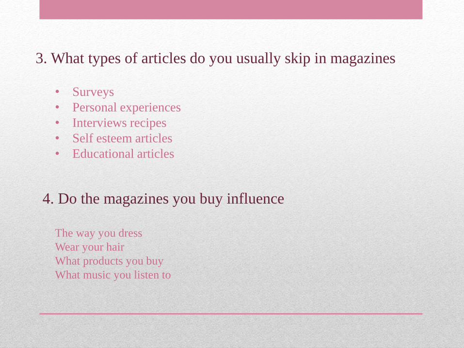
3. What types of articles do you usually skip in magazines
• Surveys
• Personal experiences
• Interviews recipes
• Self esteem articles
• Educational articles
4. Do the magazines you buy influence
The way you dress
Wear your hair
What products you buy
What music you listen to

I used questionnaires on my intended audience and
unintended audience. This helped me to know more
about what my audiences think of my finals product.
And most of the intended audiences gave positive
feedback and were pleased and happy with the
finished media text.

Thank you for
watching