Embed Size (px)
Citation preview
Digital Graphic Narrative
Development
Jamie Mellors
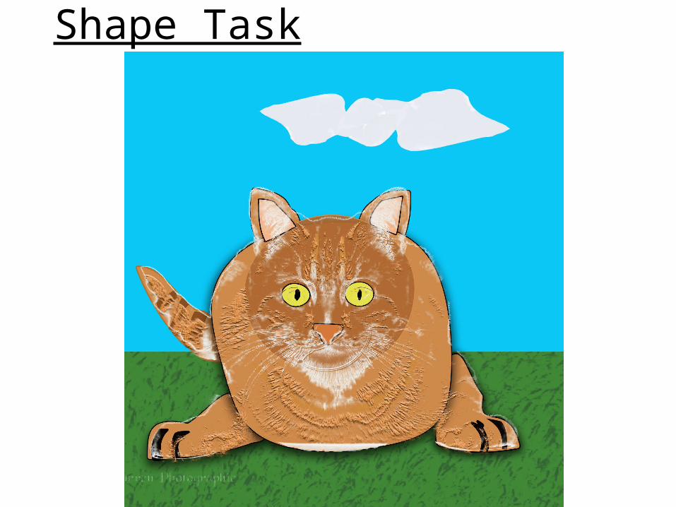
Shape Task
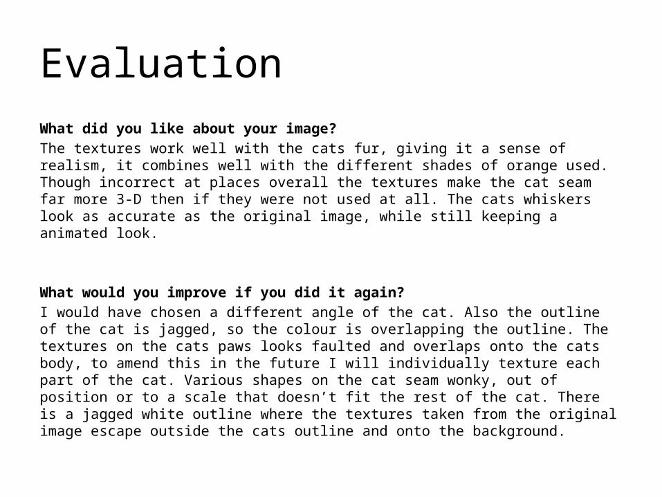
EvaluationWhat did you like about your image?The textures work well with the cats fur, giving it a sense of realism, it combines well with the different shades of orange used. Though incorrect at places overall the textures make the cat seam far more 3-D then if they were not used at all. The cats whiskers look as accurate as the original image, while still keeping a animated look.
What would you improve if you did it again?I would have chosen a different angle of the cat. Also the outline of the cat is jagged, so the colour is overlapping the outline. The textures on the cats paws looks faulted and overlaps onto the cats body, to amend this in the future I will individually texture each part of the cat. Various shapes on the cat seam wonky, out of position or to a scale that doesn’t fit the rest of the cat. There is a jagged white outline where the textures taken from the original image escape outside the cats outline and onto the background.
Rotoscope
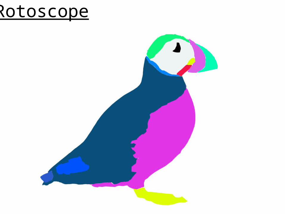
EvaluationWhat did you like about your image?The vibrant colours, that create a more interesting image that one that used dull ones. In my opinion the head is the best part, as I still keeps the look unmistakably of a puffin.
What would you improve if you did it again?The accuracy and detail in the puffins features, for example there are several gaps between blocks of colours. The puffins back keeps a very good shape compared to other areas, for example where the front and back meet it was difficult to determine where the stomach ended, and the back began as feathers overlap at different places along the split. This made it hard to separate the two leaving and uneven and jagged, unnatural looking split. This also left gaps in-between the two, though I tried to amend this by moving the shape over the stomach slightly to the left. By doing this it left an over hang where the neck meets the stomach. There was a large amount of detail in the puffins beak making it challenging to colour every part of it.
Rotoscope
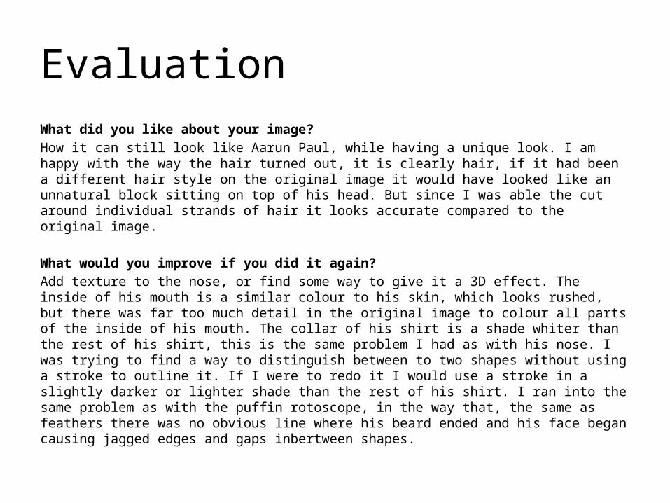
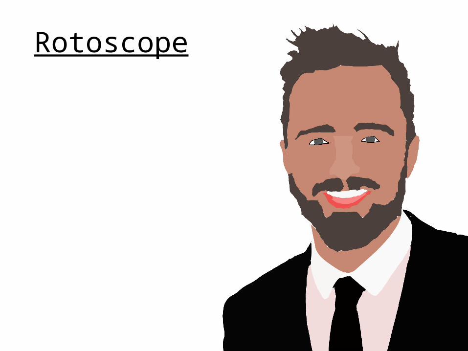
EvaluationWhat did you like about your image?How it can still look like Aarun Paul, while having a unique look. I am happy with the way the hair turned out, it is clearly hair, if it had been a different hair style on the original image it would have looked like an unnatural block sitting on top of his head. But since I was able the cut around individual strands of hair it looks accurate compared to the original image.
What would you improve if you did it again?Add texture to the nose, or find some way to give it a 3D effect. The inside of his mouth is a similar colour to his skin, which looks rushed, but there was far too much detail in the original image to colour all parts of the inside of his mouth. The collar of his shirt is a shade whiter than the rest of his shirt, this is the same problem I had as with his nose. I was trying to find a way to distinguish between to two shapes without using a stroke to outline it. If I were to redo it I would use a stroke in a slightly darker or lighter shade than the rest of his shirt. I ran into the same problem as with the puffin rotoscope, in the way that, the same as feathers there was no obvious line where his beard ended and his face began causing jagged edges and gaps inbertween shapes.
Text Based
Evaluation
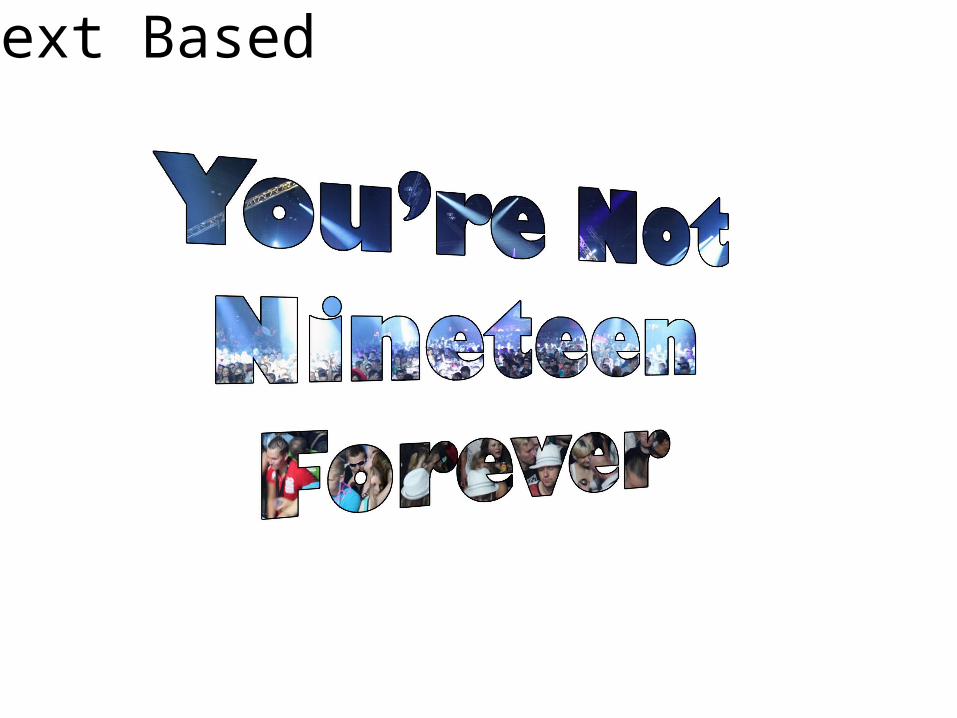
What did you like about your image?How it captures the songs lyrics, in a vibrant and upbeat way.
What would you improve if you did it again?I would reposition the image of the crowd so that the people behind the word “forever” were not shown in the text.

Text Based
Evaluation
What did you like about your image?The borderless outline gives it a smart professional look, and prevents the text from appearing over the top. What would you improve if you did it again?I could have chosen a different city skyline that showed more buildings.

Comic Book
Evaluation
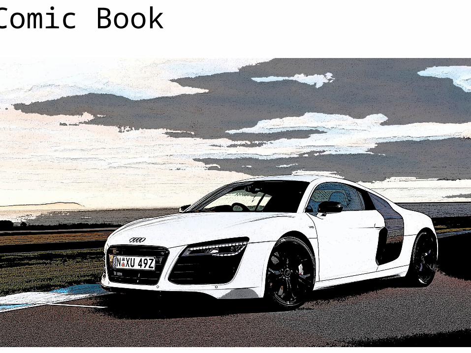
What did you like about your image?How the darker shades I have chosen creates a good contrast of colours. Therefore giving it a comic book style look without appearing childish. What would you improve if you did it again?I would have removed the crowd from the image, to leave only the players and the basket on the black background.
Comic Book

Evaluation
What did you like about your image?How it capture a comic book feel, but for maybe an adult comic with a dark feel. I believe the image looks quite classy and smart without being elitist.
What would you improve if you did it again?The image looks a little washed out, the top left has turned completely white, therefore I would darken the image to improve it. The image contains a very large amount of noise covering the photo, although I could claim that this adds to the comic book effect.

Photography

Evaluation
What did you like about your image?It shows excitement in a subtle way, it does not patronize by making it overly obvious what it represents. What would you improve if you did it again?I would have used a white based background ( a white painted wall ) to help hint at the reference to marriage. The ring appears out of focus with a slight if glare as well.
Evaluation
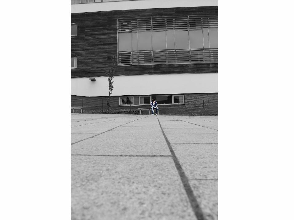
What did you like about your image?The image is very effective at showing loneliness, the foreground being far more dominant in the picture helps to make the person in it seam isolated. I chose a filter that removed the face, and feature making him seam unnoticeable. The outside world is dark and uninviting, to a lonely person, so I adjusted the background layer to be black and white. What would you improve if you did it again?I would have made to shot taller to have more of the building showing, to make the surroundings seam even bigger compared to the person in the image. I would ton down the gray areas on the legs and arms as it looks clumsy. The gray area on the face also extends of the outline of the head. This makes the head look disfigured.
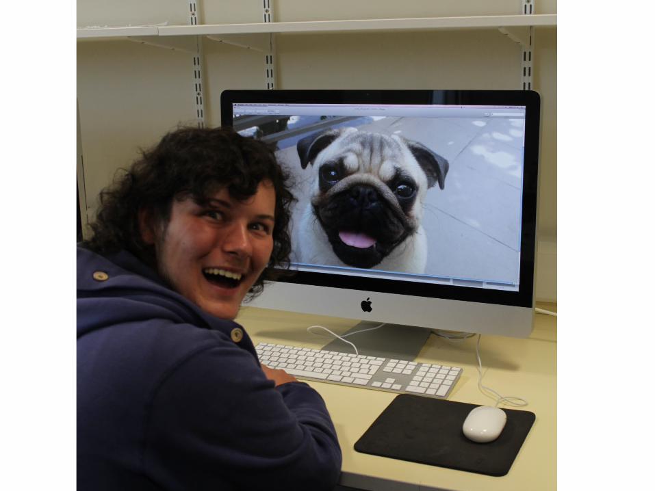
Evaluation
What did you like about your image?It shows that happiness is simple and can be made from anything. The image on the screen is the main focus of the photo. What would you improve if you did it again?I would have used a different angle to take the picture from so that it didn’t seam so artificial. Nick’s (in the picture) is slightly out of focus, again it would have helped to take the photo from another angle. The shelving in the background interrupts the picture as does the massy looking wired, a different work station would have been a better choice.

Illustration

Evaluation
What did you like about your image?
What would you improve if you did it again?I found it very difficult to draw the right facial expression. It looks extremely distorted and uneven, if given the opportunity to do it again I would redraw the face with an entirely different expression. The left fist of the character also appears too small when compared to the right hand, though this way difficult to correct as the arms and torso would then become disproportionate. Not only do the hands have a poor scale, but the feet do as well. Each foot shows a completely different shape.
While the drawing does not look as originally intended, the joker still looks evil and sinister which is a very good thing for him to be displaying. The mouth is bucktoothed, while this was unintentional it does make the character look far more disturbing.

Initial Ideas
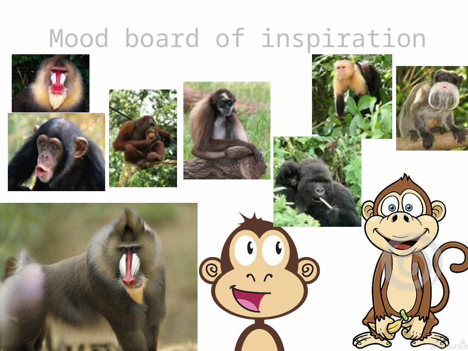
Mood board of inspiration


Idea Generation

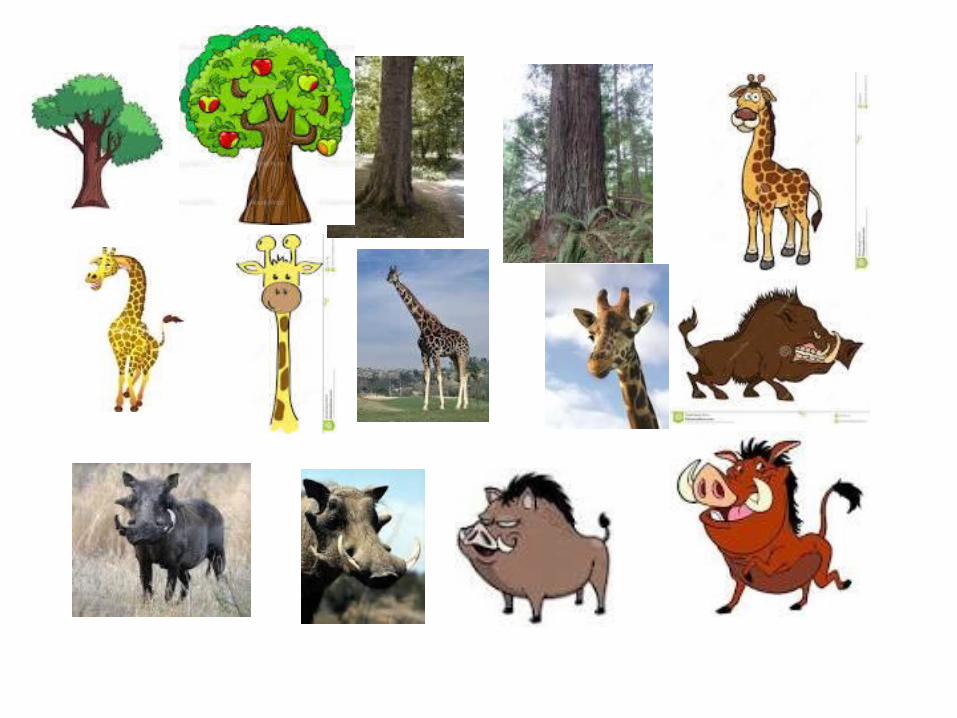
Mood board of chosen idea
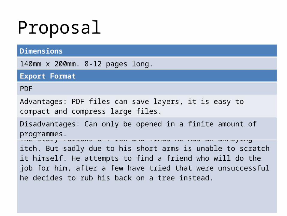
ProposalDimensions
140mm x 200mm. 8-12 pages long.
Story Overview
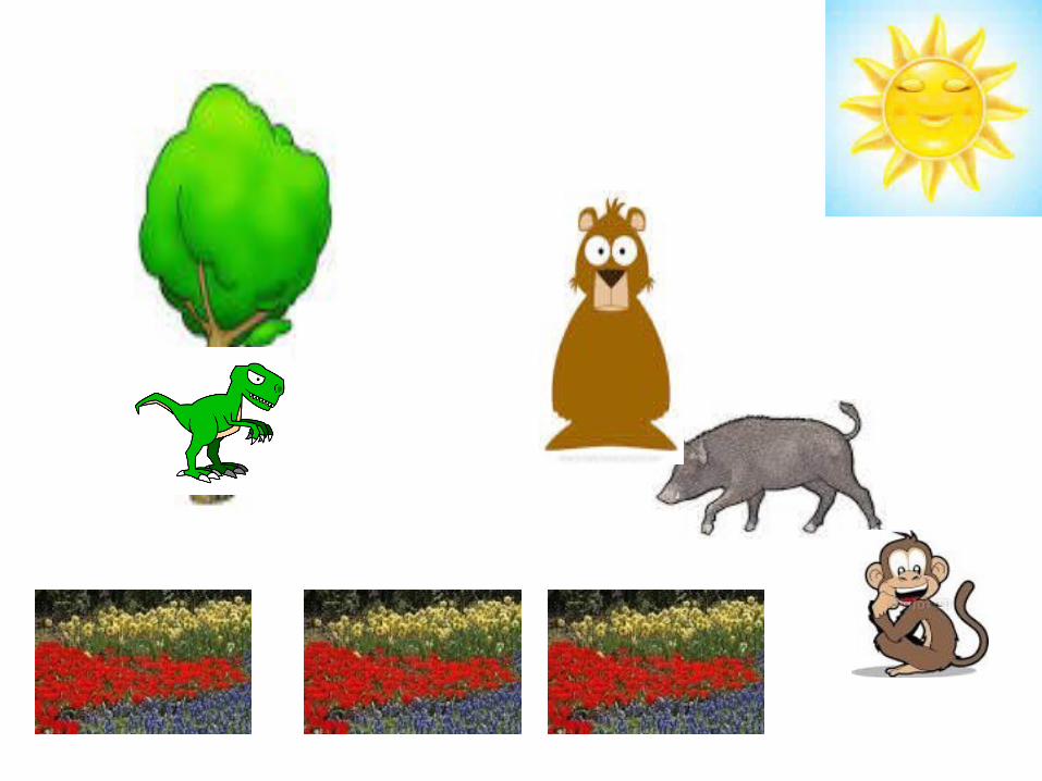
The story follows a T-rex who finds he has an annoying itch. But sadly due to his short arms is unable to scratch it himself. He attempts to find a friend who will do the job for him, after a few have tried that were unsuccessful he decides to rub his back on a tree instead.
Export Format
Advantages: PDF files can save layers, it is easy to compact and compress large files.
Disadvantages: Can only be opened in a finite amount of programmes.

Deadline
16/10/14
Audience
The target audience for my book is aged between 3-6, of any class and gender. It should be able to be read either with a parent or by them selves. Therefore the text will not be very complicated, but designed to use words that are easy and comfortable to read. This does not mean the words will all be basic and simple. I will also attempt to use words that are new to children.
Production Methods
The characters in the book will be hand drawn, and scanned onto the computer then coloured with rotoscoping. The background and jungle will be rotoscoped as well. I will place text on top of the illustrations as well as under or surrounding it. I will also draw in various features of the scenery, scan it in a colour on photoshop.
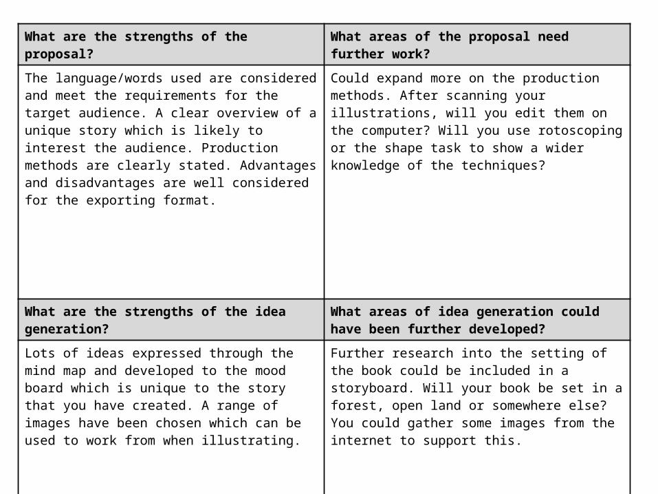
What are the strengths of the proposal? What areas of the proposal need further work?
The language/words used are considered and meet the requirements for the target audience. A clear overview of a unique story which is likely to interest the audience. Production methods are clearly stated. Advantages and disadvantages are well considered for the exporting format.
Could expand more on the production methods. After scanning your illustrations, will you edit them on the computer? Will you use rotoscoping or the shape task to show a wider knowledge of the techniques?
What are the strengths of the idea generation? What areas of idea generation could have been further developed?
Lots of ideas expressed through the mind map and developed to the mood board which is unique to the story that you have created. A range of images have been chosen which can be used to work from when illustrating.
Further research into the setting of the book could be included in a storyboard. Will your book be set in a forest, open land or somewhere else? You could gather some images from the internet to support this.
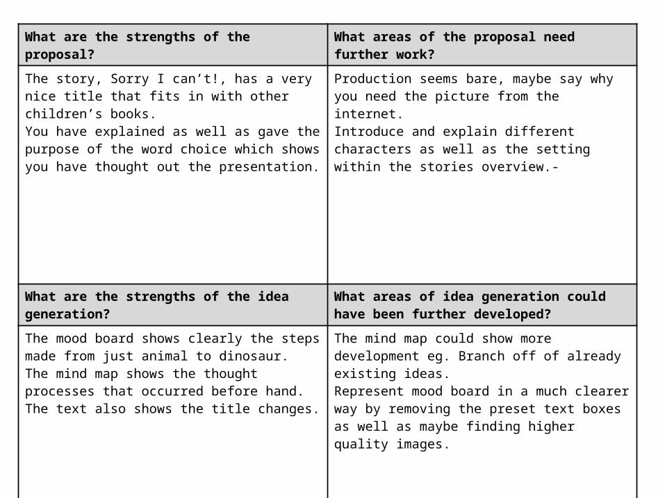
What are the strengths of the proposal? What areas of the proposal need further work?
The story, Sorry I can’t!, has a very nice title that fits in with other children’s books.You have explained as well as gave the purpose of the word choice which shows you have thought out the presentation.
Production seems bare, maybe say why you need the picture from the internet.Introduce and explain different characters as well as the setting within the stories overview.-
What are the strengths of the idea generation? What areas of idea generation could have been further developed?
The mood board shows clearly the steps made from just animal to dinosaur.The mind map shows the thought processes that occurred before hand.The text also shows the title changes.
The mind map could show more development eg. Branch off of already existing ideas.Represent mood board in a much clearer way by removing the preset text boxes as well as maybe finding higher quality images.
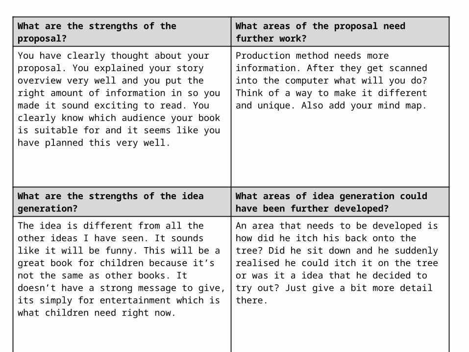
What are the strengths of the proposal? What areas of the proposal need further work?
You have clearly thought about your proposal. You explained your story overview very well and you put the right amount of information in so you made it sound exciting to read. You clearly know which audience your book is suitable for and it seems like you have planned this very well.
Production method needs more information. After they get scanned into the computer what will you do? Think of a way to make it different and unique. Also add your mind map.
What are the strengths of the idea generation? What areas of idea generation could have been further developed?
The idea is different from all the other ideas I have seen. It sounds like it will be funny. This will be a great book for children because it’s not the same as other books. It doesn’t have a strong message to give, its simply for entertainment which is what children need right now.
An area that needs to be developed is how did he itch his back onto the tree? Did he sit down and he suddenly realised he could itch it on the tree or was it a idea that he decided to try out? Just give a bit more detail there.
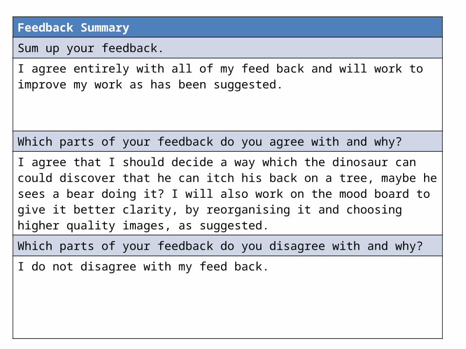
Feedback Summary
Sum up your feedback.
I agree entirely with all of my feed back and will work to improve my work as has been suggested.
Which parts of your feedback do you agree with and why?I agree that I should decide a way which the dinosaur can could discover that he can itch his back on a tree, maybe he sees a bear doing it? I will also work on the mood board to give it better clarity, by reorganising it and choosing higher quality images, as suggested.
Which parts of your feedback do you disagree with and why?
I do not disagree with my feed back.

Storyboards
Storyboards
Storyboards


Final Script
Script
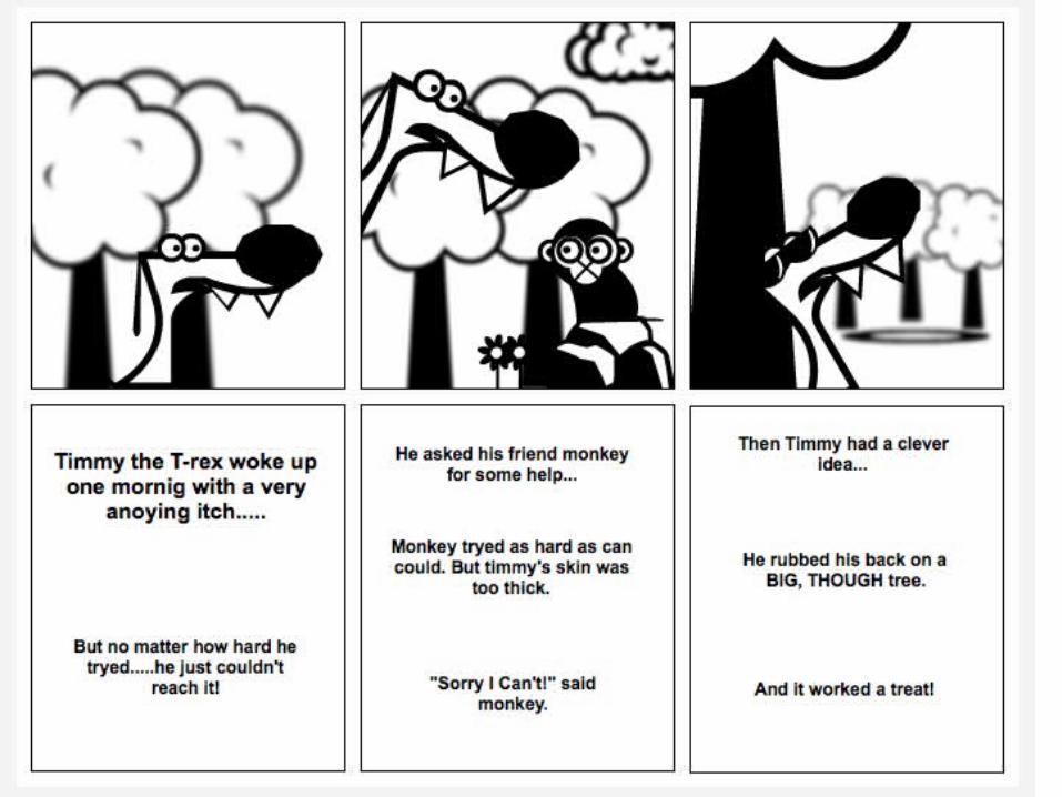
Page 1,2-double page
Timmy the T-rex woke up one morning, the same as always, but today he had a very annoying itch!
He reached and reached and reached, as far round his back as he could, but he just couldn’t’ reach it.
Page 3-single
Timmy sees his friend monkey hip-hopping along.
“Hello their monkey can you help me?” said Timmy.
“You see I’ve got most annoying itch, I just can’t reach!”
Page 4-single
“Of course I can!”
He jumped up with a bounce, onto Timmy’s back,He scratched with all he could but Timmy’s skin was too thick!
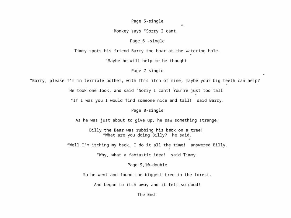
Page 5-single
Monkey says “Sorry I cant!”
Page 6 –single
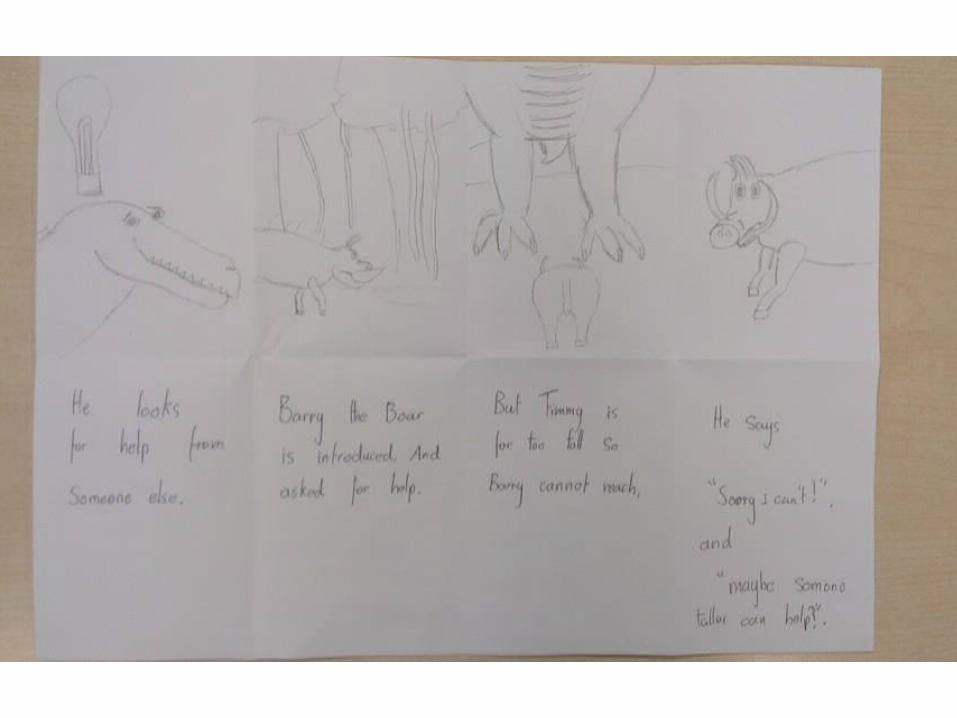
Timmy spots his friend Barry the boar at the watering hole.
“Maybe he will help me he thought”
Page 7-single
“Barry, please I’m in terrible bother, with this itch of mine, maybe your big teeth can help?”
He took one look, and said “Sorry I cant! You’re just too tall”
“If I was you I would find someone nice and tall!” said Barry.
Page 8-single
As he was just about to give up, he saw something strange.
Billy the Bear was rubbing his back on a tree! “What are you doing Billy?” he said.
“Well I’m itching my back, I do it all the time!” answered Billy.
“Why, what a fantastic idea!” said Timmy.
Page 9,10-double
So he went and found the biggest tree in the forest.
And began to itch away and it felt so good!
The End!
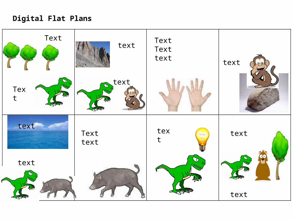
Digital Flat Plans
Text
Text
text
text
TextTexttext text
text
textTexttext
text
text
text