Embed Size (px)
Citation preview
Double page spreadJack O’Regan

This is the start of my Double page spread. I chosen the split screen design I drawn to become my
final design for my double page spread. I want to have pictures that I was given at the transport
museum in Coventry by the leader of the world war department. I want the split screen to
represent the stone glass windows in the cathedral .

In this screen shot I have added a image to show how the page will be laid out. In the image you
will see Coventry Cathedral just after the bombing. The cathedral is covered in rubble from the
roof collapsing. I intend to have the large slanted box to have text in explaining the
documentary.

In this screen shot I have added text, a image from a interview of Jack and Tom and another world war
image of Coventry ruins. I plan to add more images of the war to fill the smaller boxes. Under the image of
Jack and Tom I will write about there interview and what they talk about but not revealing all so people
will have to watch the documentary to see the full interview.

In this screen shot I have added the title of the documentary at the top so people who read the magazine
will know what the documentary is called. I have added another image Of Churchill walking through
Coventry City’s Cathedrals ruins because it revels that if the conspiracy is true , he is guilty and visited
Coventry to see what could have been stopped. I have also added a large text on the right sided page to
stand out and tell the audience when the documentary is on.

After seeing how my double page spread made people react with that it doesn’t stand out and that it doesn’t
look professional , I got some ideas and started to add them. In the screen shot you will see that I have added
different images I gave gained from the Transport Museum. I have used black and white images so that the
images blend in with each other. This making the double page spread stand out more and looking professional
I intend to stick with this design.

In this screen shop I have turned down the black and white images capacity so that when I insert text on top
it will stand out more. I have also deleted the white lines that separated the images so that the images blend
in more. At the top, I have inserted a header banner to have my tittle on. On this I will have other
information that will help the page be more proffsional.

In this screen shot I have inserted the text that explains what the documentary is about and a background
on what the conspiracy is. I have changed some of the font sizes and the style to make certain words stand
out. I have also highlighted the font in red so that it stands out to the reader.

In this screen shot I have a image of tom in the interview. I have used a lighting effect because I want
him to stand out but I need to edit the edges of him because the image has not been cut round properly.
I have also shadowed him in a bit to help him blend into the page. Next to him I have written what the
interview is about and some things that have been said in the interview. I have changed the look of the
large text I wanted to stand out. I have changed the font style so it is more noticeable . I have added a
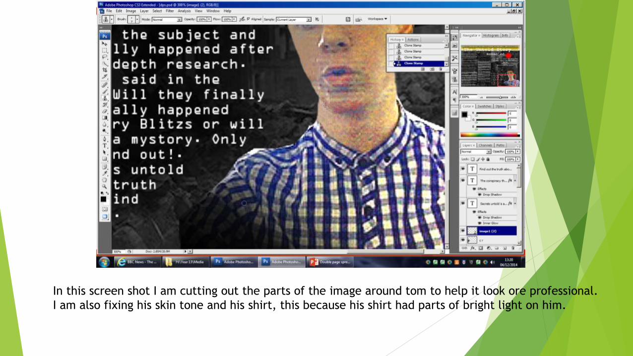
In this screen shot I am cutting out the parts of the image around tom to help it look ore professional.
I am also fixing his skin tone and his shirt, this because his shirt had parts of bright light on him.

In this screen shot I got told by my teacher that the text needs to be a bit smaller. This making me adding
more description which is needed to help the audience understand the story more. I have used the right side
of the page for more of the information to help the text be more spread out.
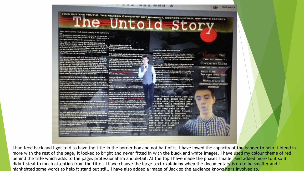
I had feed back and I got told to have the title in the border box and not half of it. I have lowed the capacity of the banner to help it blend in
more with the rest of the page, it looked to bright and never fitted in with the black and white images. I have used my colour theme of red
behind the title which adds to the pages professionalism and detail. At the top I have made the phases smaller and added more to it so it
didn’t steal to much attention from the title . I have change the large text explaining when the documentary is on to be smaller and I
highlighted some words to help it stand out still. I have also added a image of Jack so the audience knows he is involved to.

In this screen shot I have added to the title ‘Revealed’ because it helped make the page and title stand out
more. I also added three red lines to make the title look more visible to the reader. I have added the page
numbers in a red box at the bottom of the page. I have used a small white line behind it to help the page
number be more visible.
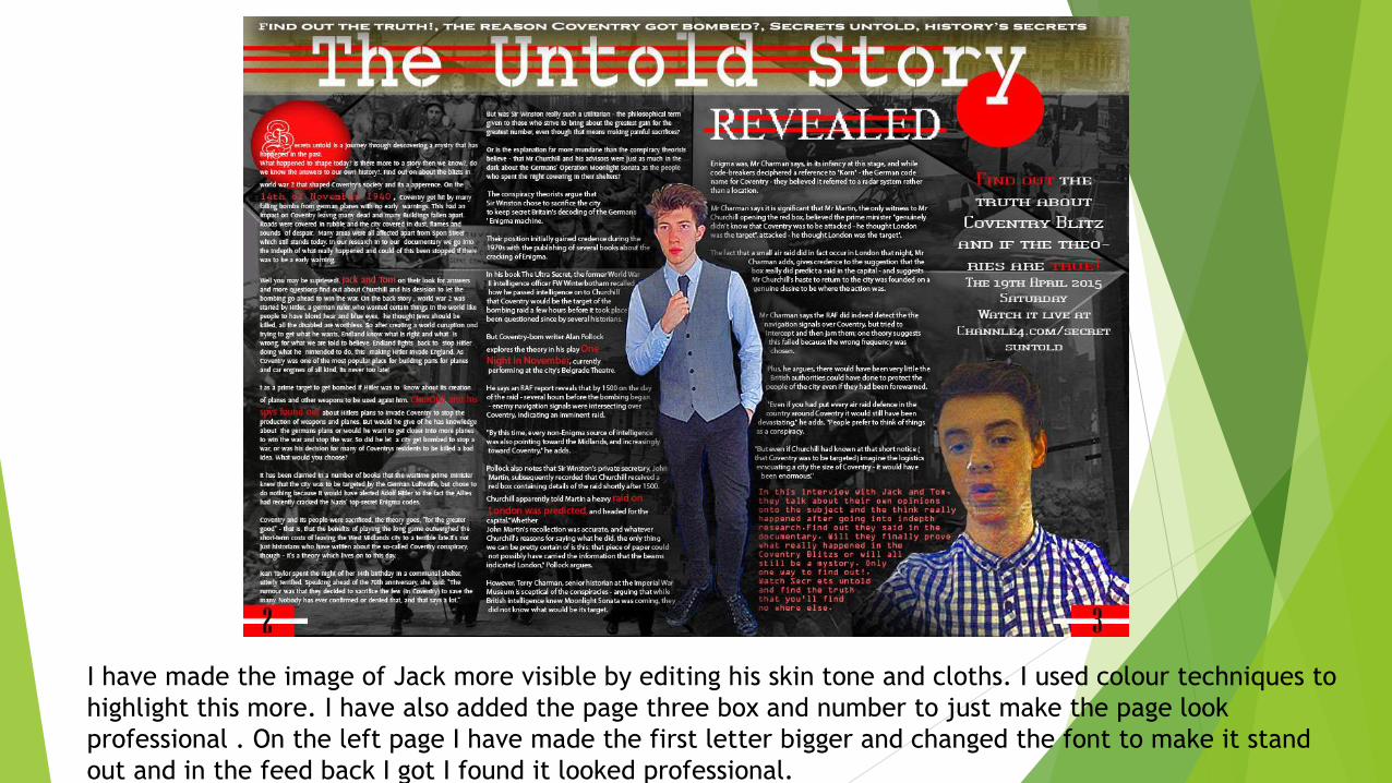
I have made the image of Jack more visible by editing his skin tone and cloths. I used colour techniques to
highlight this more. I have also added the page three box and number to just make the page look
professional . On the left page I have made the first letter bigger and changed the font to make it stand
out and in the feed back I got I found it looked professional.

This is my final edit on the double page spread. I have added the date at the top left and the network the show
is on at the bottom with the network channels website. I found this competes it professionalism and made the
page effective.