Embed Size (px)
Citation preview
Q1. In what way does your media product use, developOr challenge forms or conventions of real media products?
MUSIC VIDEO
My final music video uses conventions of actual music videos in the way that it’s filmed and edited. The final edit is edited to fit the beat and timing of the song, This was a technique I found commonly used in music videos. An example to support this would be my research into music videos of different genres. I found that this was most commonly used in indie and pop music videos such as The 1975’s ‘GIRLS’ music video and Paloma Faith ft. Sigma's video for ‘Changing’. These videos also contained lot’s of shots of landscapes and scenic shots which we tried to incorporate into our final edit.
The video challenges the conventions of music videos as we have used a narrative enigma. We decided as a group that our music video should have a deeper meaning rather than such a straight forward narrative. Rather than having such an obvious storyline we decided to go with the deeper message which was ;
Capturing the innocence of youth and that time should not be wasted.
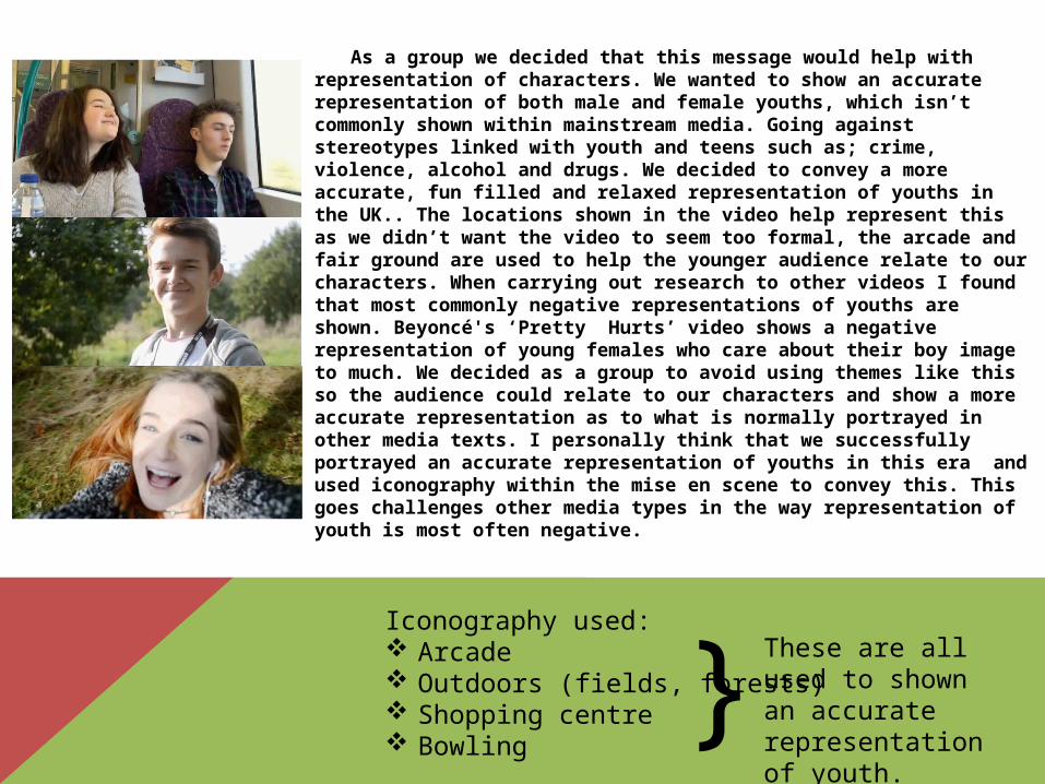
As a group we decided that this message would help with representation of characters. We wanted to show an accurate representation of both male and female youths, which isn’t commonly shown within mainstream media. Going against stereotypes linked with youth and teens such as; crime, violence, alcohol and drugs. We decided to convey a more accurate, fun filled and relaxed representation of youths in the UK.. The locations shown in the video help represent this as we didn’t want the video to seem too formal, the arcade and fair ground are used to help the younger audience relate to our characters. When carrying out research to other videos I found that most commonly negative representations of youths are shown. Beyoncé's ‘Pretty Hurts’ video shows a negative representation of young females who care about their boy image to much. We decided as a group to avoid using themes like this so the audience could relate to our characters and show a more accurate representation as to what is normally portrayed in other media texts. I personally think that we successfully portrayed an accurate representation of youths in this era and used iconography within the mise en scene to convey this. This goes challenges other media types in the way representation of youth is most often negative.
Iconography used: Arcade Outdoors (fields, forests) Shopping centre Bowling
}These are all used to shown an accurate representation of youth.
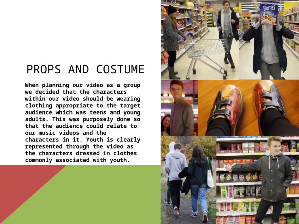
PROPS AND COSTUMEWhen planning our video as a group we decided that the characters within our video should be wearing clothing appropriate to the target audience which was teens and young adults. This was purposely done so that the audience could relate to our music videos and the characters in it. Youth is clearly represented through the video as the characters dressed in clothes commonly associated with youth.
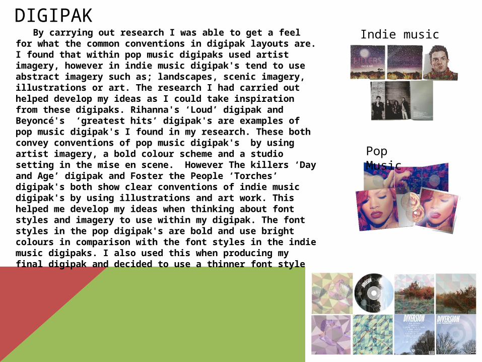
DIGIPAK By carrying out research I was able to get a feel for
what the common conventions in digipak layouts are. I found that within pop music digipaks used artist imagery, however in indie music digipak's tend to use abstract imagery such as; landscapes, scenic imagery, illustrations or art. The research I had carried out helped develop my ideas as I could take inspiration from these digipaks. Rihanna's ‘Loud’ digipak and Beyoncé's ‘greatest hits’ digipak's are examples of pop music digipak's I found in my research. These both convey conventions of pop music digipak's by using artist imagery, a bold colour scheme and a studio setting in the mise en scene. However The killers ‘Day and Age’ digipak and Foster the People ‘Torches’ digipak's both show clear conventions of indie music digipak's by using illustrations and art work. This helped me develop my ideas when thinking about font styles and imagery to use within my digipak. The font styles in the pop digipak's are bold and use bright colours in comparison with the font styles in the indie music digipaks. I also used this when producing my final digipak and decided to use a thinner font style.
Pop Music
Indie music
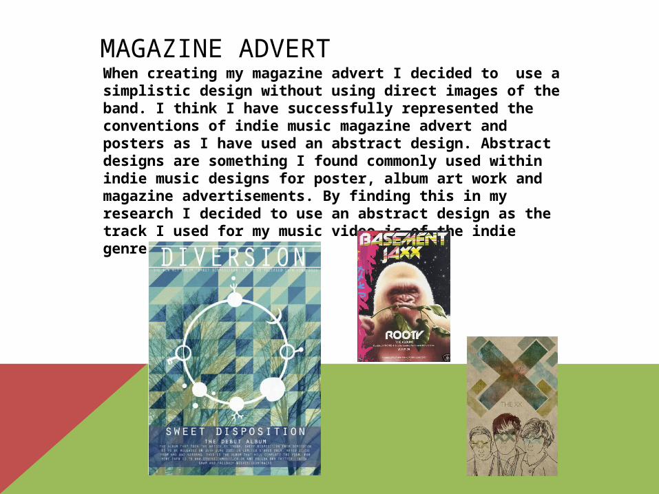
MAGAZINE ADVERTWhen creating my magazine advert I decided to use a simplistic design without using direct images of the band. I think I have successfully represented the conventions of indie music magazine advert and posters as I have used an abstract design. Abstract designs are something I found commonly used within indie music designs for poster, album art work and magazine advertisements. By finding this in my research I decided to use an abstract design as the track I used for my music video is of the indie genre.