Embed Size (px)
Citation preview
Evaluation
In what ways does your media product use, develop or challenge forms and conven-tions of real media products?
In my initial research I looked into various existing magazines of varying genres. I de-cided that I wanted my magazine to follow convention as these conventions have proven to be effective for the rest of the market and would ensure my magazine would attract an audi-ence. The first thing I noticed was that, on all of the magazine covers I analysed, the mast-head was always at the top and either aligned to the left or took up the entire width of the magazine’s cover. So, because the name of my magazine was short, I decided to align it to the left of the page as this is the side of the page from which the eye reads and if the maga-zine was staggered on a shop shelf the masthead would still be visible.
Another thing was the colour scheme. All of the magazines I looked at had a very similar colour scheme despite the fact that they were all of a dif-ferent genre. Red, yel-low, white
and black featured as a reoccurring colour scheme on all of the magazines I analysed and also on many I didn’t analyse.
Studio photo shoots were also another convention I followed. The ma-jority of magazines used studio shots for their covers and their double page arti-cle. This gave a more professional and clean look to the products and due to the minimalistic theme I wanted to convey in my product I went with studio pho-tography for the majority of my photography.
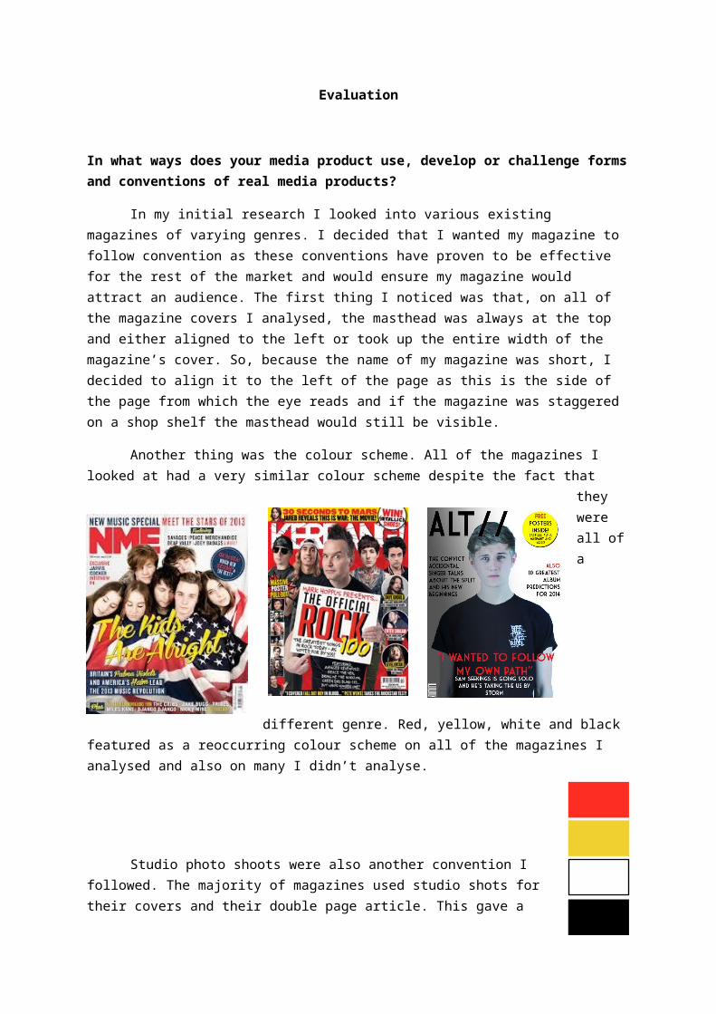
For my font I used a clean and angled font to continue the clean mini-malistic image of my product. Other magazines used bold fonts that stood. Kerrang! Used very bold, angular explosive fonts but this did not fit the theme of my magazine and so I fol-lowed the style of NME more than the others as this magazine follows a similar genre to mine
One of the major products thats influenced mine was NME. In their more recent is-sues they have adopted a more minimalistic and simple style for their covers and this is something that jumped out at me for my product as a lot of other products, such as Kerrang! , have very cluttered and busy covers so a more minimalistic cover is something that would stand out on newsstand. Here you can see an example of an NME cover and my cover in contrast to each other. I used a different colour scheme but the overall style is simi-lar in its neatness and minimalism.
How does your media product represent particular social groups?
My magazine is geared toward people interested in indie and alternative music. This kind of music often comes hand in hand with a style and is particularly popular with young adults and older teenagers, especially in today’s culture. My media product focuses mainly on new artists that have taken inspiration from previous artists. Many of these artists are not necessarily celebrities in the sense of being famous and rich like many pop artists but in-stead are viewed more as ‘regular people’. This constitutes the style that comes with this genre of music, which can often be a very vintage fashion and an appreciation for older styles and less what is in the ‘mainstream’ now. Even the name itself ‘Alt’ represents the al-ternative culture of young adults today and reaches out to them in their need and want to be different and set apart from the crowd.
Following through with this the social class of my magazines readers is mainly geared towards middle class people. The magazine is affordable and its contents fit this too. In the media, teenagers and young adults can be often represented as wild, unruly and re-bellious. My magazine embodies this, promoting festivals and gigs that the readers will ap-preciate and that they can use to go be all these stereotypical things but it also represents the younger generations as a group with appreciation for the arts and the creative.
The gender representations in my magazine are as equal as possible. There is not an over sexualisation of either of the gender’s to try and appeal to one specifically because as a genre, Indie/Alternative music is very wide and, by aiming to appeal to people inter-ested in the music despite gender, I have widened my audience.
My magazine does not represent so much the fashions and personal lives of the artists featured but is instead geared towards bringing the audience everything about the music as people who listen to this genre of music usually have a deep appreciation for the music itself and less for the gossip surrounding the people making it, as is common with pop music.
What kind of media institution might distribute your magazine and why?
When researching for my magazine I looked at various pub-lishing companies and media companies. In the end I decided on IPC media as they publish a similar magazine to my own,
NME. As they already publish NME I thought they would have ex-perience in publishing a magazine of mine’s style and would be able to do so successfully. Also, IPC media reaches over 26 million UK adults every month and this would mean that as a distributor they would be able to successfully market my magazine. Also because of the fact that they already distribute NME they would be able to distribute my magazine without the two magazines affecting each other. However a downside to this choice in distributer would be that, because NME is already a well-established products, they might not push my magazine to be as successful for fear that I might push NME out and render it obsolete. This being the case the other option would have been to choose a distributor that does not pub-lish a magazine of my genre already, one with a gap in their market that could be filled such as Bauer media. Bauer might be keener to distribute my magazine as it covers an area of the market that they have not explored yet and this would mean they could push it out and extend their reach in terms of brand diversity. However I still went with IPC due to their expe-rience and how well established they already are in distributing a magazine of this genre al-ready.
Who would be the audience for your media product?
This is the reader profile I created in the earlier stages of producing my magazine. The target audience will be mainly 15-24 year olds as this is popular age range across all other music magazines published. I am publishing my mag-azine weekly because music is a fast moving industry and this will keep readers up to date. However, the magazine will only cost £1.80 due to the young age of my target audience and the fact that this may mean not many of them will have much disposable income. It will also be published by IPC media as they have had experience publishing magazines of a similar style (NME) in the past.
Due to the young age of my audience I plan on keeping the magazine very informal, publishing weekly about new music, up and coming artists, reviews, gig guides, album charts and various other features. Also, free posters will be offered weekly to attract the audience and to make them feel like they are getting more than they are paying for.
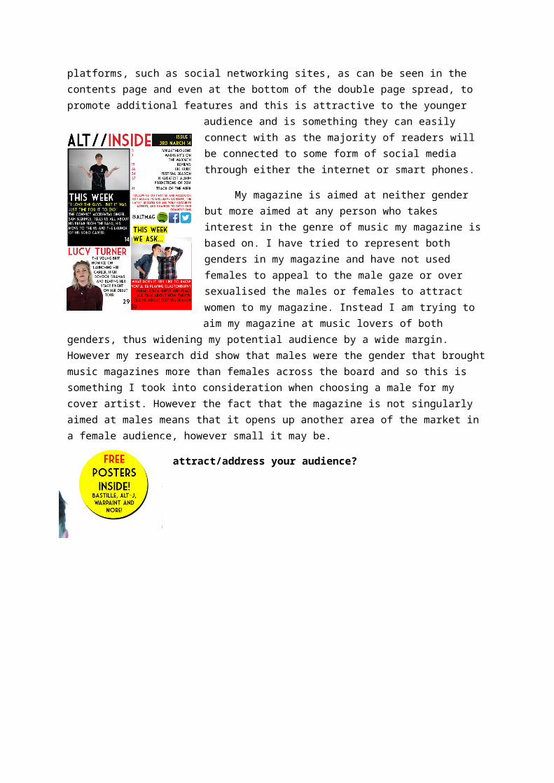
Originally I specified my target audience as 15-24 year olds and now that my product has been finalised I think this age group still stands. The magazine is minimalistic and clean yet informal, appealing to the younger audiences. It also uses other media platforms, such as social networking sites, as can be seen in the contents page and even at the bottom of
the double page spread, to promote additional features and this is attractive to the younger audience and is something they can easily connect with as the majority of readers will be connected to some form of social media through either the in-ternet or smart phones.
My magazine is aimed at neither gender but more aimed at any person who takes interest in the genre of music my magazine is based on. I have tried to represent both gen-ders in my magazine and have not used females to appeal to the male gaze or over sexualised the males or females to at-tract women to my magazine. Instead I am trying to aim my magazine at music lovers of both genders, thus widening my potential audience by a wide margin. However my research did show that males were the gender that brought music mag-azines more than females across the board and so this is
something I took into con-sideration when choosing a male for my cover artist. However the fact that the magazine is not singularly aimed at males means that it opens up another area of the market in a fe-male audience, however small it may be.
How did you attract/ad-dress your audience?
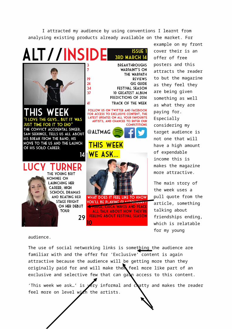
I attracted my audience by using conventions I learnt from analysing ex-isting products already available on the market. For example on my front cover their is an offer of free posters and this at-tracts the reader to but the magazine as they feel they are being given something as well as what they are paying for. Espe-cially considering my tar-get audience is not one
that will have a high amount of expendable income this is makes the magazine more attrac-tive.
The main story of the week uses a pull quote from the article, something talking about friend-ships ending, which is relatable for my young audience.
The use of social networking links is something the audience are familiar with and the offer for ‘Exclusive’ content is again attractive because the audience will be getting more than they originally paid for and will make them feel more like part of an exclusive and selective few that can gain access to this content.
‘This week we ask…’ is very informal and chatty and makes the reader feel more on level with the artists.
Talking about festivals and gigs relates to my audiences interests and so is something they can relate to and enjoy.
Informal and ‘jokey’ images entice the reader, giving the magazine a relaxed and informal feel and relating to my younger audience as they are very informal. This makes it easier for them to read and makes them feel more like they are on a more personal level with the artists.
What have you learnt about technologies from the process of constructing this product?
Technology has been detrimental in the cre-ation of my magazine and has been involved at ev-
ery stage of its production. Ev-erything I have used and created to create my mag-azine has been uploaded and recorded on Wordpress.
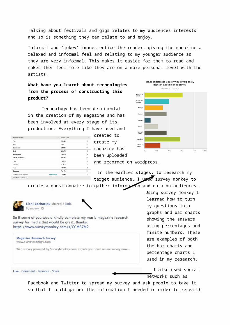
In the earlier stages, to research my target audience, I used survey monkey to cre-ate a questionnaire to gather information and data on audi-ences. Using survey monkey I learned how to turn my questions into graphs and bar charts showing the an-swers using percentages and finite numbers. These are ex-amples of both the bar charts and percentage charts I used in my research.
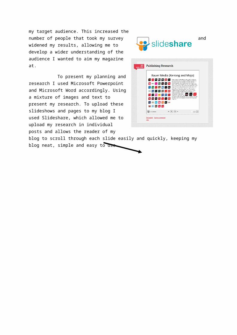
I also used social networks such as Facebook and Twitter to spread my survey and ask people to take it so that I could gather the information I needed in order to research my target audience. This increased the number of peo- ple that took my survey and widened my results, allow- ing me to develop a wider understanding of the audi- ence I wanted to aim my magazine at.
To present my planning and re-search I used Microsoft Powerpoint and Microsoft Word accordingly. Using a mixture of images and text to present my research. To upload these slideshows and pages to my blog I used Slideshare, which allowed me to upload my re-search in individual posts and allows the reader of my blog to scroll through each slide easily and quickly, keeping my blog neat, simple and easy to use.
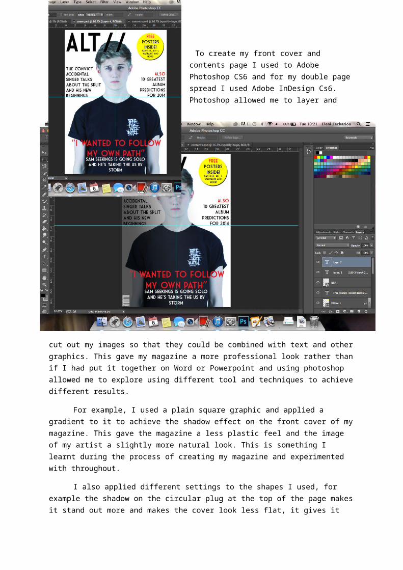
To create my front cover and contents page I used to Adobe Photoshop CS6 and for my double page spread I used Adobe InDesign Cs6. Photo-
shop allowed me to layer and cut out my images so that they could be combined with text and other graphics. This gave my magazine a more professional look rather than if I had put it together on Word or Powerpoint and using photoshop allowed me to explore using differ-ent tool and techniques to achieve different results.
For example, I used a plain square graphic and applied a gradient to it to achieve the shadow effect on the front cover of my magazine. This gave the magazine a less plastic feel and the image of my artist a slightly more natural look. This is something I learnt during the process of creating my magazine and experimented with throughout.
I also applied different settings to the shapes I used, for example the shadow on the circular plug at the top of the page makes it stand out more and makes the cover look less flat, it gives it more of a definition and combined with the bright yellow of the circle, attracts the reader’s eye.
In InDesign I used text wrapping to keep the text to my image and wrap it round it as this is a convention I
noticed in other magazines. This makes the page flow better and links it all visually.
I also wrapped my pull quote around the other side of the image and had to do this carefully to make sure none of the words were hyphoned. Here is an example of a magazine article from NME and how the text is wrapped around the image in the middle so that the page mixes better than if the two were obviously separate from each other.
I also used youtube to upload my interview and then linked it to my blog. I think using video for the interview was a better idea than just audio or a script as it lends a reality to it and is a lot easier to watch than having to read a script.
Looking back at the preliminary task, what do you feel you have learnt in the profession from it to the full product?
From the two images you can see that my col- lege magazine is much more basic than my final product and that my photoshop skills were considerably less de- vel-oped as the only technique I used in the preliminary task was to layer some text over an image I took. There was no editing on the image it is simple imported and ordered behind all the text. Whereas with my final product there is obvious editing on the image and I have used a professional studio shot for my cover image.
There is also a distinct lack of colour scheme on my college magazine cover and the the colours I have used are hard to read and do not fit with the image be-hind. The best example of this being the bright red mast-head set across the top of the cover and in front of the im-age. Because of the busyness of the image behind the red is hard on the eyes and hard to focus on, making the name of my magazine hard to decipher. Whereas on my final product cover the background of the image is simple, neutral and not overpowering, and the image relatively muted, allowing me to use bright colours for my text. Also my final product has a distinct and obvious colour scheme of red, white, yellow and black and this is uniformed in the other pages I created for my final product. Overall my final product is considerably improved and a lot more sophisticated. I have used more appropriate photography and experimented with different techniques to achieve this.
The other difference between my preliminary task and my final product is the fact that I based my final product on research I did of existing music magazines and of the appropri-ate audiences. With the college magazine I just made it with no previous work or research and this means that my final product follows convention more closely and is also more likely to appeal to its intended audience which means it serves its purpose a lot better.