Embed Size (px)
Citation preview

Evaluation Question 1
Masthead
I believe that my masthead could be seen to be quite similar to ‘Loud and Quiet’. This is because, like my magazine, the masthead does not have anything on top or underneath of it. The image on the magazine does not begin until under the masthead. This gives originality to the magazine, as a lot of magazines do not have this effect. I felt as though it was best for my magazine as I felt it worked a lot better with the image and the style that I was trying to portray. My masthead could also be seen to be similar because of the fact all of the letters are large, capitalized and bold. I used this in my magazine because I felt as though it would grab attention more than if it were not to be this way. This is obviously a popular feature to display a magazine title as it is used in a lot of other magazines meaning it was a good choice to make. Both titles are also black, which is another similarity between the two. There are difference between the two mastheads also, the information about my magazine is placed to the left of the title where as it is under the title in Loud and Quiet. The font is also not the same.
Graphology & Page LayoutFront Cover
I believe that my magazine goes against a lot of existing magazine page layouts and looks different to current music magazines. There are a lot of examples of my magazine looking different from magazines that already exist. Some of these are Clash, iD and NME. Although they are all different from each other, none of them look like my magazine that I feel could be seen as a good thing. If there are no other magazines that look like mine this means that there is space in the market for my magazine, meaning there is a chance for it to become popular. As you can see iD is very simplistic, only including the title, image and a little bit of text on the front cover. There is also a coloured background. This is different to my front cover for how everything it layout on the magazine. The masthead is to the side and there is little information on the page. The colour on the background of the magazine is another reason the two are different as my magazine has a plain background as I felt as though this complimented my models and the clothes they wore better. However, it could be seen to be similar for the simple reason of where the ‘come as you are’ is placed, as this is similar to where I have placed ‘Indeed’. Clash also has a yellow coloured background with a lot more text on the front cover. I feel as though this magazine is different to mine for not only the colour but also the amount of text on the page. My front cover does not contain a lot of text as I felt it was a better look for my magazine. Although still including bands that were included within my magazine on the top of the page, there is not a lot more text. I feel as though the amount of text works on this magazine but would not work with mine. It is also different for the amount of colour on the magazine. Not only the yellow background but also the same of white, yellow, black and red writing that is used. The text on my front cover does not change as much; it is mostly black, only using green for

the name of the band and white for the quote under it. The masthead is different between the two magazines. ‘CLASH’ is placed partly over the models head, with text placed above it meaning it is not directly at the top. This is different to my magazine for these reasons. However, there are some similarities of the two magazines. The placing of ‘James Blake’ is similar to where ‘Indeed’ is placed on my magazine. They are also similar for the artists pose; a ‘moody’ looking pose staring directly in to the camera. I have also chosen ‘NME’ to show the differences. One of the reasons that they are different is the shot that is used of the musician. I have used a mid-shot of the two models whereas the show used on this issue of NME uses a close up which adds originality. The masthead between these two magazines are also different, NME not covering the whole top of the page whilst Daydream covering most. However, although not being displayed the same, the pull out quote is similar between the two magazines due to the fact they have one. I felt as though this would work with my magazine as it would introduce my band to the reader.
Contents PageI see my contents page being quite similar to the contents page of Q magazine. Before creating my contents page, I found this contents page whilst researching and thought it had a good layout that was easy to follow and worked well with the magazine. For this reason, I chose to follow some of its conventions. One of the features I chose to follow was the page number in the colour theme with the page name displayed next to it and a little description places underneath. I thought this was a good way to easily separate the page number from the rest of the text. However, I chose to make my page numbers bigger than the ones shown in Q magazine. This was because I wanted to make them more prominent, I also thought it was a better effect to have the number running along with the text. I chose to make this green as this was the colour from my colour scheme. There is then the page name to the right hand side; this was to inform people what was on the page of the page number that was just given. There is then a short description underneath on both magazines. This was to give people a little information about the page so they were more likely to go to that page. I have also split my pages up into two fields, features and every month. This was to inform people was special in this magazine as well as including items that could be featured
every month in the magazine for the re-occurring readers. However, although these two pages share a lot of similarities, they also share differences. There is a large picture of the band that takes up most of the page in Q but there are two images of Indeed in my magazines that do not take up as much space. I felt as though it was more important to focus on the text and the pages instead of the band on the contents page. I also did not include the ‘review’ section.
Double Page SpreadMy double page spread does not follow the conventions of a typical double page spread. This is because, generally, there is an image on the right hand side whilst all the text displayed on the left. I chose to not follow this as I wanted my page to be original and to interest the readers. For this reason, I chose to place one of the duo on either side of the page, with the text presented in columns around them. I felt as though this was a layout that is not widely used and people may be interested by this and therefore read the interview. However, there are some magazines that I could say are similar to mine. One of these being the Nicki Minaj double page spread. I feel as though my double page spread could be seen to be similar to this is because of the placing of
text around the image of Nicki. The text is evenly placed around the cut out image, providing an outline. This is what the layout of text is in my magazine, which is more prominent on the left hand side. When looking at this in the research, I thought it looked interesting because it did not look like other double page spreads I had found. My magazine is also similar for the bold font of each title heading. Although the two are different, this being a ‘gospel’ whilst mine an interview, you are still able to easily differentiate between the heading and the rest of the text, meaning you are able to break up the text easily.
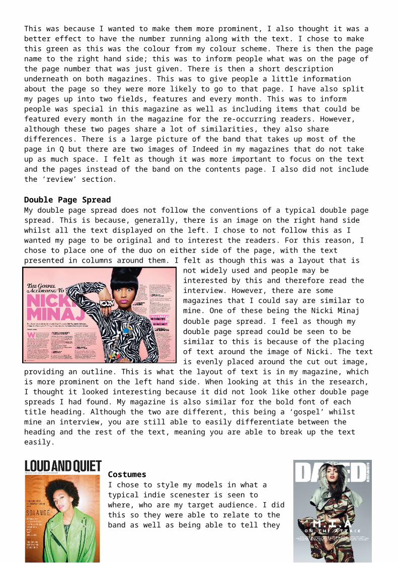
CostumesI chose to style my models in what a typical indie scenester is seen to where, who are my target audience. I did this so they were able to relate to the band as well as being able to tell they are an indie band at first glance. For this reason, I did not focus on what other musicians in this genre where wearing as I wanted to portray the band in a way that made them look like their fans. Indie scenesters are typically seen to wear denim jackets, patterned shirts and skinny jeans and this is also what I chose to style my models in. The models wear the same clothing throughout the magazine, meaning that the styling of them is the same on every page. I was hoping to take shots where they were wearing different clothes. However, I did not get this chance so therefore had to work with the images of them wearing the same clothes. I do believe the clothes that they are wearing work well with the magazine genre so I was not worried to use these images throughout the magazine. The
musicians in magazines do not typically wear casual clothing, which is one reason why they are different to my styling of models. As you can see, the musician in ‘Loud and Quiet’ is wearing a green coat with a green top underneath. Although this could be seen as being casual, there are still some elements of dressing up in this styling. In ‘Dazed & Confused’ the musician is wearing a camouflage outfit. This outfit is interesting and is not something that you typically see people to wear. I feel as though, even though it is not like other magazines, the casual feel to my models styling works well with the magazine, the band and their fans.
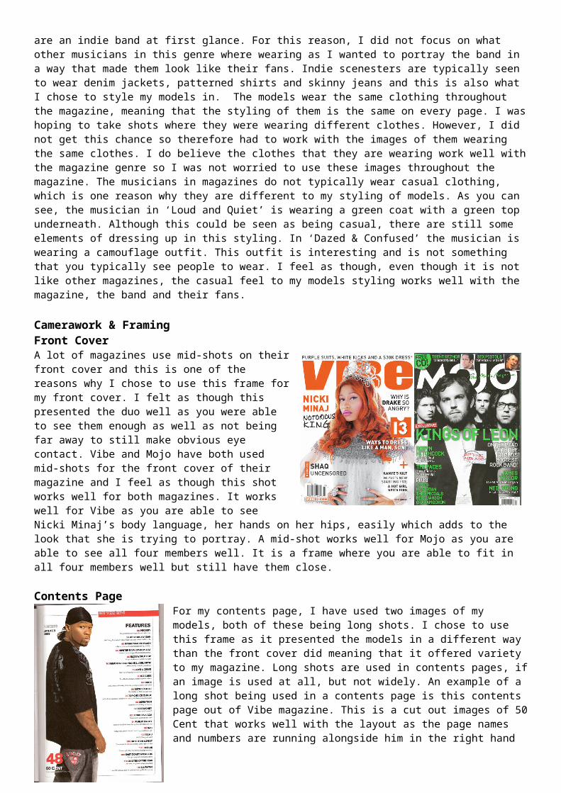
Camerawork & FramingFront CoverA lot of magazines use mid-shots on their front cover and this is one of the reasons why I chose to use this frame for my front cover. I felt as though this presented the duo well as you were able to see them enough as well as not being far away to still make obvious eye contact. Vibe and Mojo have both used mid-shots for the front cover of their magazine and I feel as though this shot works well for both magazines. It works well for Vibe as you are able to see Nicki Minaj’s body language, her hands on her hips, easily which adds to the look that she is trying to portray. A mid-shot works well for Mojo as you are able to see all four members well. It is a frame where you are able to fit in all four members well but still have them close.
Contents PageFor my contents page, I have used two images of my models, both of these being long shots. I chose to use this frame as it presented the models in a different way than the front cover did meaning that it offered variety to my magazine. Long shots are used in contents pages, if an image is used at all, but not widely. An example of a long shot being used in a contents page is this contents page out of Vibe magazine. This is a cut out images of 50 Cent that works well with the layout as the page names and numbers are running alongside him in the right hand side. I feel as though a long shot offers more sight of the outfit he is wearing which is the same for my duo. Contents pages offer a variety of frames in their images meaning that it is not odd for a long shot to be different. There are close up used, mid shots, long shots and in some cases extreme long shots or close ups.
Double Page SpreadI used two long shots for my double page spread. I chose these shots purely for the design I wanted to use for my spread. I felt as though a long shot would work better with my layout as I wanted to have one image at each side. One of these images would be one of my models whilst the other image being the other model. I felt having text running along the side of long shot would look a lot better than a mod-shot or a close up. This also meant
the image was tall enough to take up the correct amount of space without being too wide. For this reason, I did not base the type of image I took on existing double page spreads. A lot of existing magazines use mid shots as the layout of their pages are different to how I set mine out. An example of a mid-shot being used is this one of Lady Gaga that was in Q magazine. I mid shot was used as the image takes up a whole page rather than the side of one. This image works well with this magazine as it offers a connection between the reader and musician. This image also works in this context as you are able to see that she is naked without it being too revealing.
ArtistsAs my magazine has an Indie genre, I found that the artists in this genre are very diverse and therefore they strive to be different. Indie scenesters enjoy finding the newest talent and listening to new music, not music that sounds like the rest. For this reason, it is a good thing if my duo does not compare to an existing couple. Indie is mainly a male guitar based genre so any female entering this genre is new and different. This means that two females entering this genre very different, there are not a lot of popular indie duos out there. Magazines seem to focus on single artists of a band that usually consists of four members meaning that for mine to include two is unusual. I see this to be a good thing, however, as I think it will work better to attract more readers.
Colour SchemeMy colour scheme purposely is original, there are not a lot of magazines that tend to use green in their colour scheme. My colour scheme is black, white and a pastel green. Black and white is used a lot in colour schemes as these are easy to work with. However, I chose to include one other colour which I would be able to work with throughout my magazine. I chose green for the originality, I wanted to interest people through the colour I used rather than using popular colours such as red. I’m glad that I chose this colour as I found it good to work with throughout my magazine, for example the page numbers on my contents page.