Embed Size (px)
Citation preview

How effective is the combination of your main product with ancillary texts?BY SORREL GRUNDY

Digipak – Panel 1My ancillary texts combine well with my main product to create a coherent promotional package as the images used in my ancillary texts are from my music video. This is the first panel of my digipak, the image I chose to use was a powerful one of the female performer lying on the road.
I chose this image because it is shown throughout the music video and so will be familiar to the audience, also it is a striking image which I was able to enhance during editing. This links not only to the visual of the music video but also to a key part in the storyline as at this point the female performer had just been hit by a car and so brings up many questions about whether she is injured or even if she survives.
My first panel uses similar conventions to other artists such as Rhianna as the album cover for her album “Loud” featured herself with striking red lip stick which is a key element of my digipak cover. This technique is slightly voyeuristic as the bright colour draws the audiences attention to both the image and the performers lips. But it does not objectify the female performer which links back to the music video as there are voyeuristic elements but no objectification.

Digipak – Panel 2+3 These are my two central panels which includes the disk tray for my CD. The images for these panels are both taken from my music video and edited. I chose these images because they link both to the main product but also to each other well as they will be seen together I thought that this was an important aspect of these two panels. Both images are overlays and include a shot of Earlham Park which is a popular park in Norwich and so reinforces the locality of the main and ancillary products. Both images link to the themes of confusion and guilt from the music video. The confusion is shown through the use of overlays and so the distortion of the image and the guilt is shown through the images of a road in panel 2 and a car door in panel 3 as this links to the car accident.

Digipak – Panel 4 This is the final panel of my digipak and includes both a track list and bar code. The image I have chosen for this panel is also from my music video although it has been changed through editing. I decided to keep the image in mostly black and white even though all of the other panels are in full colour so that it would stand out and get the consumers attention. I chose this image because of the composition as it worked well with the track list. I also chose this image because of the placard as they were a vital part of the music video and so links the ancillary text to the main product once again which increases the relation to the audience. This image also links to the other images of the female performer in the digipak as in all of the images a road is part of the composition of the image which reinforces the themes of guilt and key parts of the storyline.
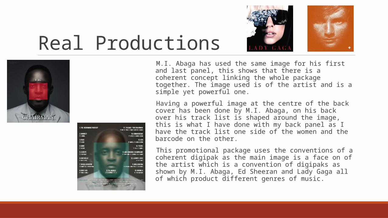
Real Productions M.I. Abaga has used the same image for his first and last panel, this shows that there is a coherent concept linking the whole package together. The image used is of the artist and is a simple yet powerful one.
Having a powerful image at the centre of the back cover has been done by M.I. Abaga, on his back over his track list is shaped around the image, this is what I have done with my back panel as I have the track list one side of the women and the barcode on the other.
This promotional package uses the conventions of a coherent digipak as the main image is a face on of the artist which is a convention of digipaks as shown by M.I. Abaga, Ed Sheeran and Lady Gaga all of which product different genres of music.
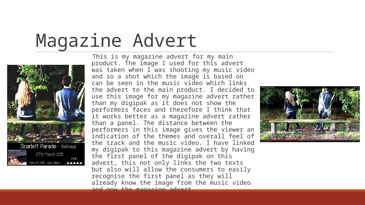
Magazine Advert This is my magazine advert for my main product. The image I used for this advert was taken when I was shooting my music video and so a shot which the image is based on can be seen in the music video which links the advert to the main product. I decided to use this image for my magazine advert rather than my digipak as it does not show the performers faces and therefore I think that it works better as a magazine advert rather than a panel. The distance between the performers in this image gives the viewer an indication of the themes and overall feel of the track and the music video. I have linked my digipak to this magazine advert by having the first panel of the digipak on this advert, this not only links the two texts but also will allow the consumers to easily recognise the first panel as they will already know the image from the music video and now the magazine advert.