Embed Size (px)
Citation preview

How does your media product represent particular social groups?
Evaluation Question 2

What my model is wearing
This is the original image I used for my front cover. The model used fits in to my chosen target audience/ social group, as she is young and fashionable. In the photo I have dressed her in a patterned blue dress, top hat and heels as it is in the latest style for the spring season. This helps in displaying a representing my targeted social group, as they are likely to like what she is wearing and post probably wear similar style clothing also stereotypically teenagers want to look and be styled like celebrities and there idols. Also the colours used fit in to the indie/ rock genre I have chosen.

The Pose
The model is looking straight at the camera, as if she is giving the reader eye contact, this gives a confident vibe and shows her self-confidence. Which yet again can represent my targeted social group, as they are young adults, growing up in a social environment with a party attitude. The pose also is also quite shy looking as her body posture is quite reserved this gives a friendly welcoming vibe.

On The Cover
Text, colour and fontThe text/cover lines I have used such as ‘up coming gigs + events’ fit in to my targeted social group as it is about getting out of the house going to gigs and events, festivals and artist which relate to the genre I have chosen. The colours I used are stereotypically what you would associate with my targeted social group and would appeal to my audience. They are simplistic colours and colours you would associate with both boys and girls. This relates to my targeted social group and the genre of my magazine as the music the majority of them would listen to is quite subtle, calm and relaxing. I used red, blue, white and black as they are colours you would see as relating to being young, however more mature than pink and light blue also they look modern. The fonts I used are basic and simple so easy to read and look professional.

The cover
Representation of the target audience and social groupI think my magazine cover represents my target audience clearly. From the stylish clothing I have dressed my model in, to the outgoing cover lines and simplistic colours I have used. Also not to forget the confident eye contact from my model. All of these representations I display surly support and show common ideologies and interests of my targeted social group and audience.

Contents Page
Representation of the target audience and social group The model is fairly passive and holding/ playing around with her hair which makes her look young. Which my social group are. She is wearing plain casual clothes as I wanted to make her look like a normal person as the article she is about not being able to be normal when your famous. So by making her look normal she fits in with the target audience and social group as they are normal people. The colours used are simple and minimal, so easy to look at. All of these elements are strongly supporting the dominant ideologies of my target audience/ social group.
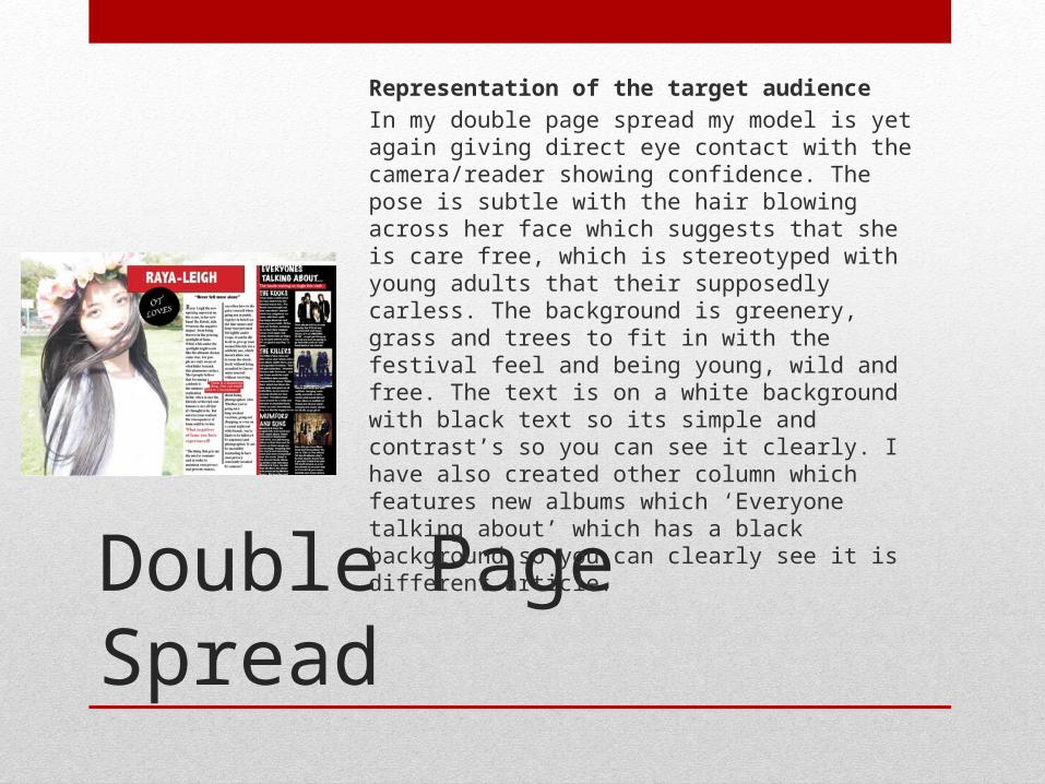
Double Page Spread
Representation of the target audienceIn my double page spread my model is yet again giving direct eye contact with the camera/reader showing confidence. The pose is subtle with the hair blowing across her face which suggests that she is care free, which is stereotyped with young adults that their supposedly carless. The background is greenery, grass and trees to fit in with the festival feel and being young, wild and free. The text is on a white background with black text so its simple and contrast’s so you can see it clearly. I have also created other column which features new albums which ‘Everyone talking about’ which has a black background so you can clearly see it is different article.