Embed Size (px)
Citation preview
FILM POSTER & WEBSITE ANALYSISShola Radford

THE RIOT CLUB (2014)
Main image: The main image on the poster of The Riot Club depicts three men, presumably the main characters, with a low angle shot looking up at them representing them as being powerful and superior. The men have moody-looking facial expressions to reinforce the idea of their power and dominance. The two men on the left side of the poster have a direct gaze whereas the man on the right does not, suggesting that he may not have as much involvement with the club as the other two; the man on the right is positioned more in the foreground compared to the others, representing him as having more status. As well as this, the costume connotes the ideology of the Bullingdon Club and post-colonialism which gives the audience an idea of what the film is portraying.
Colours and Lighting: The colour of the film title is a bright, loud pink that stands out to the audience to grab their attention; also, the idea that the loud, ‘in-your-face’ pink could relate to the characters’ lifestyle and the narrative. The tagline is positioned directly above the word ‘riot’ in a dark grey colour to suggest that it will not all be about the lifestyle being good and all fun – it shows a juxtaposition in their lives and suggests to the audience that the equilibrium of the film will be disrupted (Todorov). The lightning is a natural lighting to reflect a surface realism about the film.
Text: The font of the text is bold and brick-like, which contrasts the men’s appearance, representing the idea that the narrative goes against the stereotypical ideologies of the way upper class-men behave. The tagline is straight to the point, as shown by the full stops after the brief words; the words used give an indication into what the young men’s lives are like. The smaller text at the bottom of the poster includes the cast names underneath the title, the strapline ‘from the award winning director of..’ to entice the audience by making them think of previous work from the director, and the crew and film companies involved in making, producing and distributing the film.
Target audience: The film is targeted towards women because the young men cast in the film. It also targets women because of the colours used for the text, bright pink is often associated with passion and women. As well as this, the film targets an audience with middle class status, or views, and those familiar with politics and the Bullingdon Club as it is not portrayed as an action film etc., but rather a cerebral film.
STARRED UP (2014)
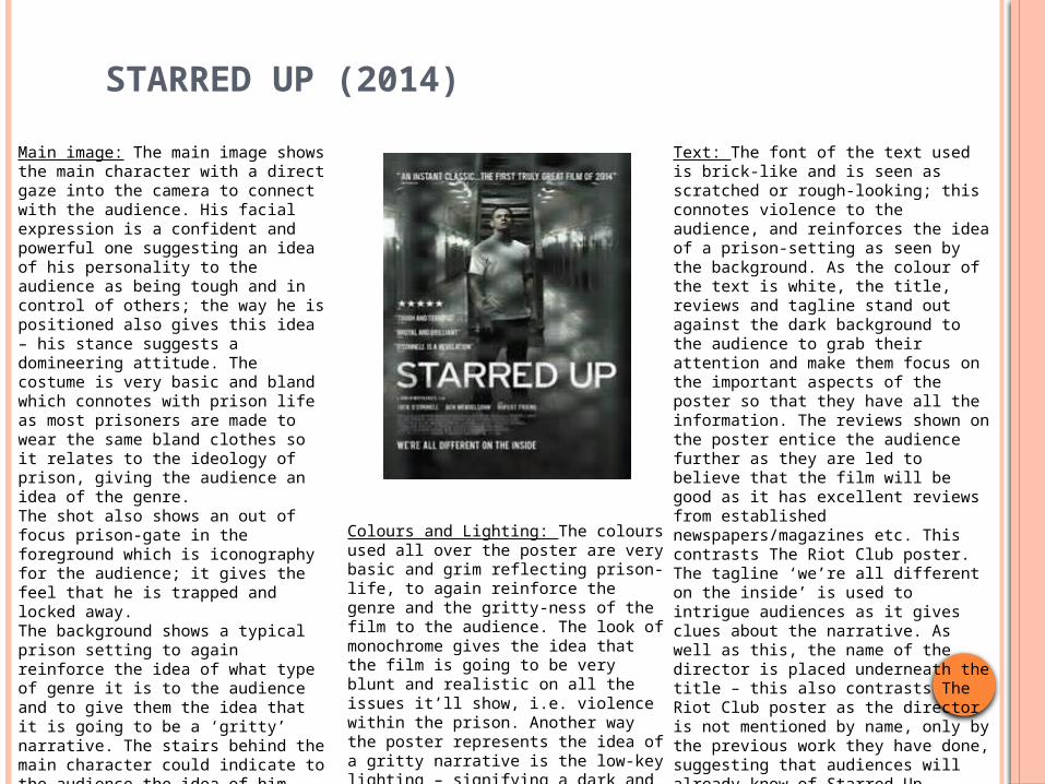
Main image: The main image shows the main character with a direct gaze into the camera to connect with the audience. His facial expression is a confident and powerful one suggesting an idea of his personality to the audience as being tough and in control of others; the way he is positioned also gives this idea – his stance suggests a domineering attitude. The costume is very basic and bland which connotes with prison life as most prisoners are made to wear the same bland clothes so it relates to the ideology of prison, giving the audience an idea of the genre. The shot also shows an out of focus prison-gate in the foreground which is iconography for the audience; it gives the feel that he is trapped and locked away.The background shows a typical prison setting to again reinforce the idea of what type of genre it is to the audience and to give them the idea that it is going to be a ‘gritty’ narrative. The stairs behind the main character could indicate to the audience the idea of him having an escape, even though he is seen behind the out-of-focus bars, and that the prospect of an escape could be a part of the narrative or the idea of him wanting to escape due to the trapped feeling.
Colours and Lighting: The colours used all over the poster are very basic and grim reflecting prison-life, to again reinforce the genre and the gritty-ness of the film to the audience. The look of monochrome gives the idea that the film is going to be very blunt and realistic on all the issues it’ll show, i.e. violence within the prison. Another way the poster represents the idea of a gritty narrative is the low-key lighting – signifying a dark and gritty plot.
Text: The font of the text used is brick-like and is seen as scratched or rough-looking; this connotes violence to the audience, and reinforces the idea of a prison-setting as seen by the background. As the colour of the text is white, the title, reviews and tagline stand out against the dark background to the audience to grab their attention and make them focus on the important aspects of the poster so that they have all the information. The reviews shown on the poster entice the audience further as they are led to believe that the film will be good as it has excellent reviews from established newspapers/magazines etc. This contrasts The Riot Club poster. The tagline ‘we’re all different on the inside’ is used to intrigue audiences as it gives clues about the narrative. As well as this, the name of the director is placed underneath the title – this also contrasts The Riot Club poster as the director is not mentioned by name, only by the previous work they have done, suggesting that audiences will already know of Starred Up director, David Mackenzie’s, work so this may be another feature to entice them. As well as this, cast and crew are mentioned underneath the title.
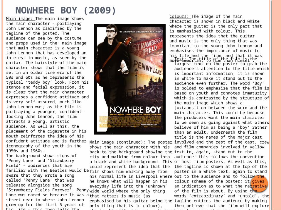
NOWHERE BOY (2009)Main image: The main image shows the main character – portraying John Lennon as clarified by the tagline of the poster. The audience can see by the costume and props used in the main image that main character is a young John Lennon that has developed an interest in music, as seen by the guitar. The hairstyle of the main character shows that the film is set in an older time era of the 50s and 60s as he represents the typical ‘teddy boy’ look. From his stance and facial expression, it is clear that the main character expresses a confident attitude and is very self-assured, much like John Lennon was; as the film is portraying a younger, confident-looking John Lennon, the film attracts a young, artistic audience. As well as this, the placement of the cigarette in his mouth reinforces the idea of his confident attitude and is further iconography of the youth in the 1950s and 1960s.The background shows signs of ‘Penny Lane’ and ‘Strawberry Field’ – audiences that are familiar with The Beatles would be aware that they wrote a song called ‘Penny Lane’ that was released alongside the song ‘Strawberry Fields Forever’. Penny Lane was named so because it was a street near to where John Lennon grew up for the first 5 years of his life – this then tells the audience the film will be based on his upbringing and those who are interested in the band will be attracted to watching it. Furthermore, the background shows aspects of the seaside city Liverpool, again giving an indication to the audience where it is set.
Colours: The image of the main character is shown in black and white where the guitar is the only part that is emphasised with colour. This represents the idea that the guitar and music is the only thing that was important to the young John Lennon and emphasises the importance of music to his life and the film, and that it was more important to him than himself.
Main image (continued): The poster shows the main character with his back to the background showing the city and walking from colour into a black and white background. This could represent the idea that the film shows him walking away from his normal life in Liverpool where he knows what will happen in his everyday life into the ‘unknown’ wide world where the only thing that matters is music (as emphasised by his guitar being the only thing that is in colour), showing his life journey up to the start of The Beatles.
Text: The title of the film is the largest text on the poster to grab the audience’s attention to the title which is important information; it is shown in white to make it stand out to the audience even further. The word ‘Boy’ is bolded to emphasise that the film is based on youth and connotes immaturity which is contrasted by the structure of the main image which shows a juxtaposition between the word and the main character. This could be because the producers want the main character to be seen as going against what others believe of him as being a ‘boy’ rather than an adult. Underneath the film title is the names of the major cast involved and the rest of the cast, crew and film companies involved in yellow text to, again, stand out to the audience; this follows the convention of most film posters. As well as this, the tagline is shown at the top of the poster in a white text, again to stand out to the audience and to follow the colour scheme of the poster; it gives an indication as to what the narrative of the film is about. By using the words ‘extraordinary’ and ‘untold’, the tagline entices the audience by making them believe that the film will explore his story more than they already know, fulfilling their information and entertainment needs (Blumler & Katz). Furthermore, the website for the film is shown in white text amidst the cast and crew credits, making it stand out more – giving a chance for the audience to get involved and actively find out more about the film.
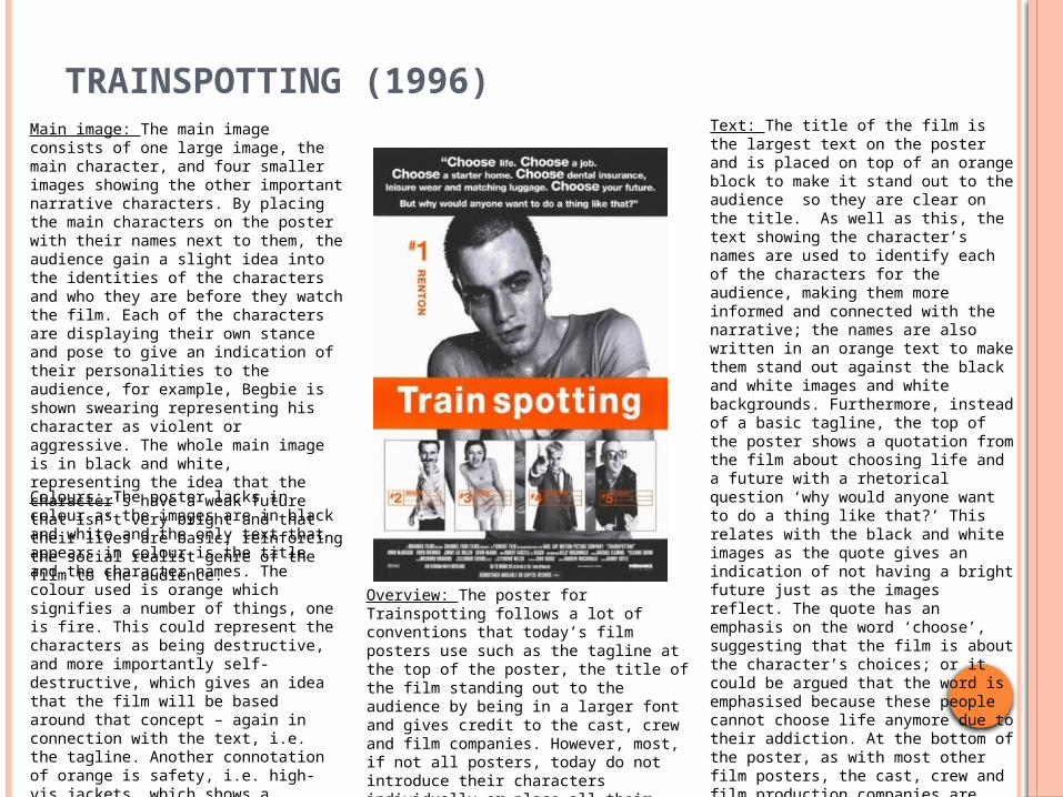
TRAINSPOTTING (1996)Main image: The main image consists of one large image, the main character, and four smaller images showing the other important narrative characters. By placing the main characters on the poster with their names next to them, the audience gain a slight idea into the identities of the characters and who they are before they watch the film. Each of the characters are displaying their own stance and pose to give an indication of their personalities to the audience, for example, Begbie is shown swearing representing his character as violent or aggressive. The whole main image is in black and white, representing the idea that the character’s have a weak future that isn’t very bright and that their lives are basic; reinforcing the social realist genre of the film to the audience.
Text: The title of the film is the largest text on the poster and is placed on top of an orange block to make it stand out to the audience so they are clear on the title. As well as this, the text showing the character’s names are used to identify each of the characters for the audience, making them more informed and connected with the narrative; the names are also written in an orange text to make them stand out against the black and white images and white backgrounds. Furthermore, instead of a basic tagline, the top of the poster shows a quotation from the film about choosing life and a future with a rhetorical question ‘why would anyone want to do a thing like that?’ This relates with the black and white images as the quote gives an indication of not having a bright future just as the images reflect. The quote has an emphasis on the word ‘choose’, suggesting that the film is about the character’s choices; or it could be argued that the word is emphasised because these people cannot choose life anymore due to their addiction. At the bottom of the poster, as with most other film posters, the cast, crew and film production companies are mentioned in small print – the logo of the production company, Miramax is placed at the bottom so audiences can relate the previous films by them to this one and be more attracted to watching it if they have enjoyed previous Miramax films.
Colours: The poster lacks in colour as the images are in black and white and the only text that appears in colour is the title and the character names. The colour used is orange which signifies a number of things, one is fire. This could represent the characters as being destructive, and more importantly self-destructive, which gives an idea that the film will be based around that concept – again in connection with the text, i.e. the tagline. Another connotation of orange is safety, i.e. high-vis jackets, which shows a juxtaposition between the film’s narrative, which is based on Class A drug use, and the safety connotation shown.
Overview: The poster for Trainspotting follows a lot of conventions that today’s film posters use such as the tagline at the top of the poster, the title of the film standing out to the audience by being in a larger font and gives credit to the cast, crew and film companies. However, most, if not all posters, today do not introduce their characters individually or place all their images in black and white – representing the idea that the film subverts the norm.
FILM WEBSITE PAGES
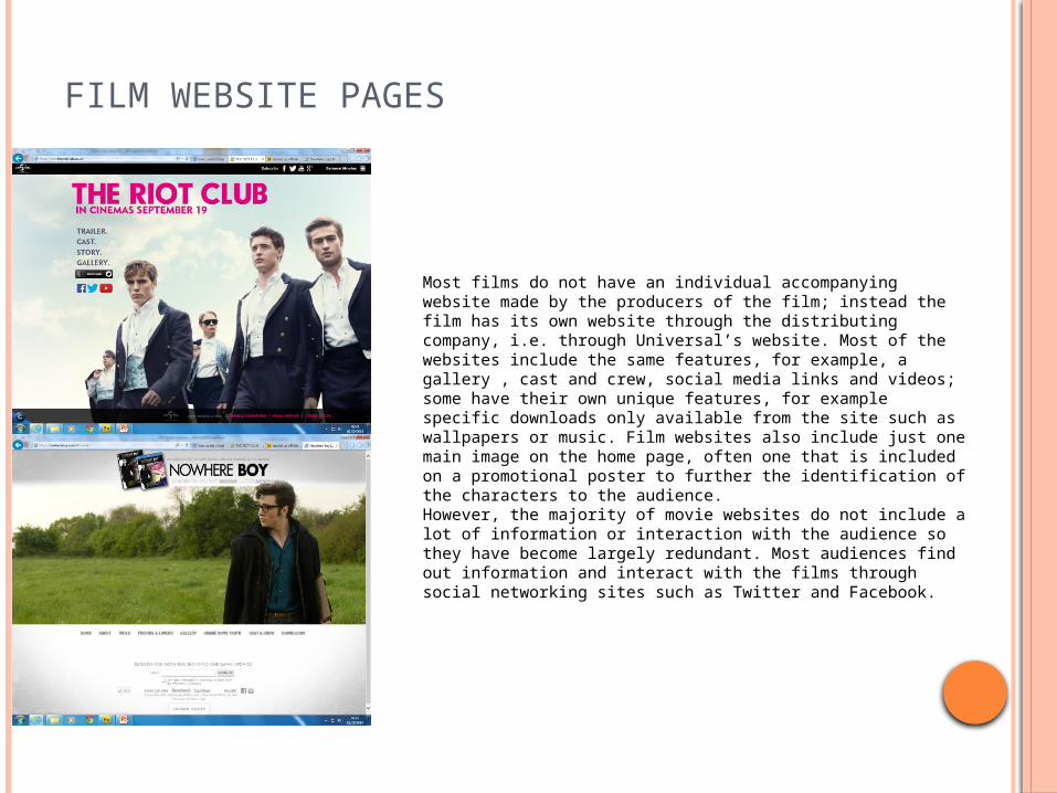
Most films do not have an individual accompanying website made by the producers of the film; instead the film has its own website through the distributing company, i.e. through Universal’s website. Most of the websites include the same features, for example, a gallery , cast and crew, social media links and videos; some have their own unique features, for example specific downloads only available from the site such as wallpapers or music. Film websites also include just one main image on the home page, often one that is included on a promotional poster to further the identification of the characters to the audience. However, the majority of movie websites do not include a lot of information or interaction with the audience so they have become largely redundant. Most audiences find out information and interact with the films through social networking sites such as Twitter and Facebook.