Embed Size (px)
Citation preview
Font ideas for Mirage
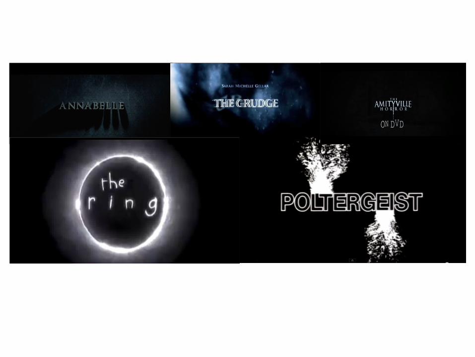
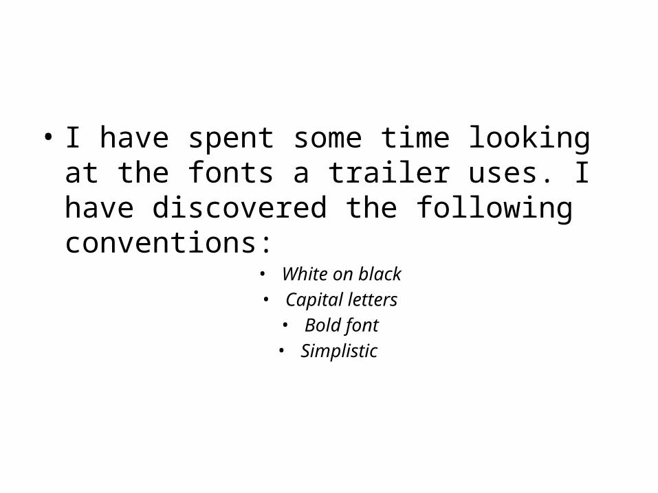
• I have spent some time looking at the fonts a trailer uses. I have discovered the following conventions:
• White on black• Capital letters• Bold font• Simplistic
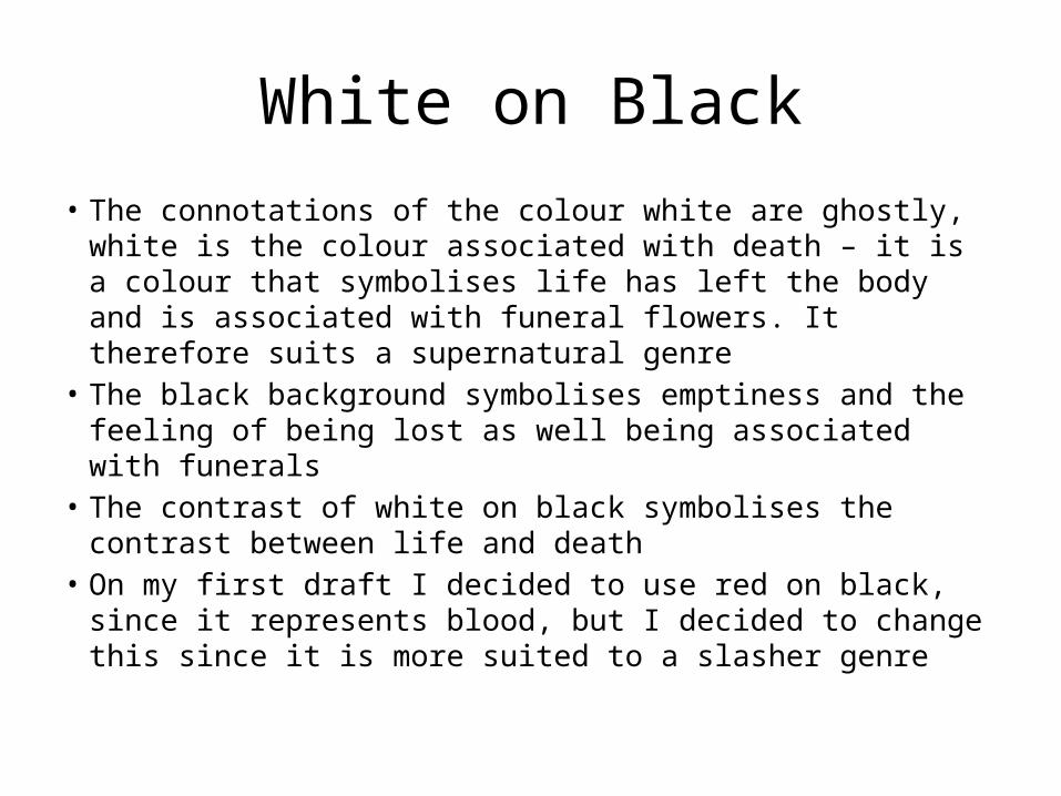
White on Black
• The connotations of the colour white are ghostly, white is the colour associated with death – it is a colour that symbolises life has left the body and is associated with funeral flowers. It therefore suits a supernatural genre
• The black background symbolises emptiness and the feeling of being lost as well being associated with funerals
• The contrast of white on black symbolises the contrast between life and death
• On my first draft I decided to use red on black, since it represents blood, but I decided to change this since it is more suited to a slasher genre
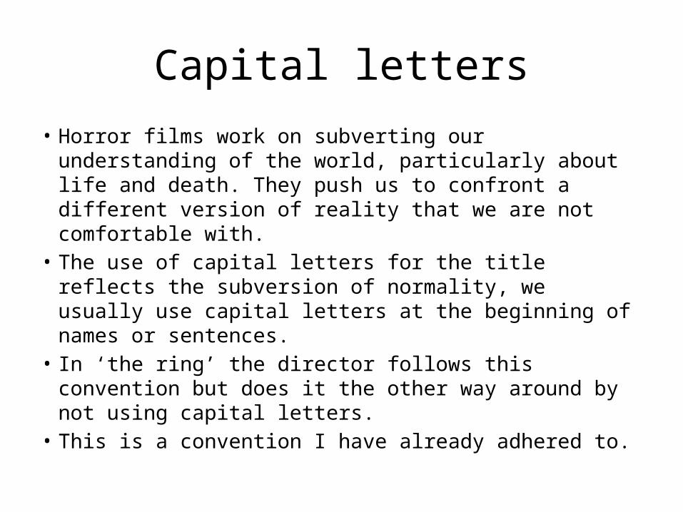
Capital letters
• Horror films work on subverting our understanding of the world, particularly about life and death. They push us to confront a different version of reality that we are not comfortable with.
• The use of capital letters for the title reflects the subversion of normality, we usually use capital letters at the beginning of names or sentences.
• In ‘the ring’ the director follows this convention but does it the other way around by not using capital letters.
• This is a convention I have already adhered to.
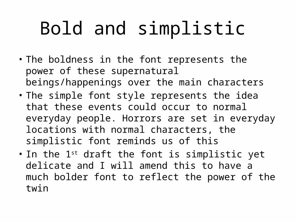
Bold and simplistic
• The boldness in the font represents the power of these supernatural beings/happenings over the main characters
• The simple font style represents the idea that these events could occur to normal everyday people. Horrors are set in everyday locations with normal characters, the simplistic font reminds us of this
• In the 1st draft the font is simplistic yet delicate and I will amend this to have a much bolder font to reflect the power of the twin
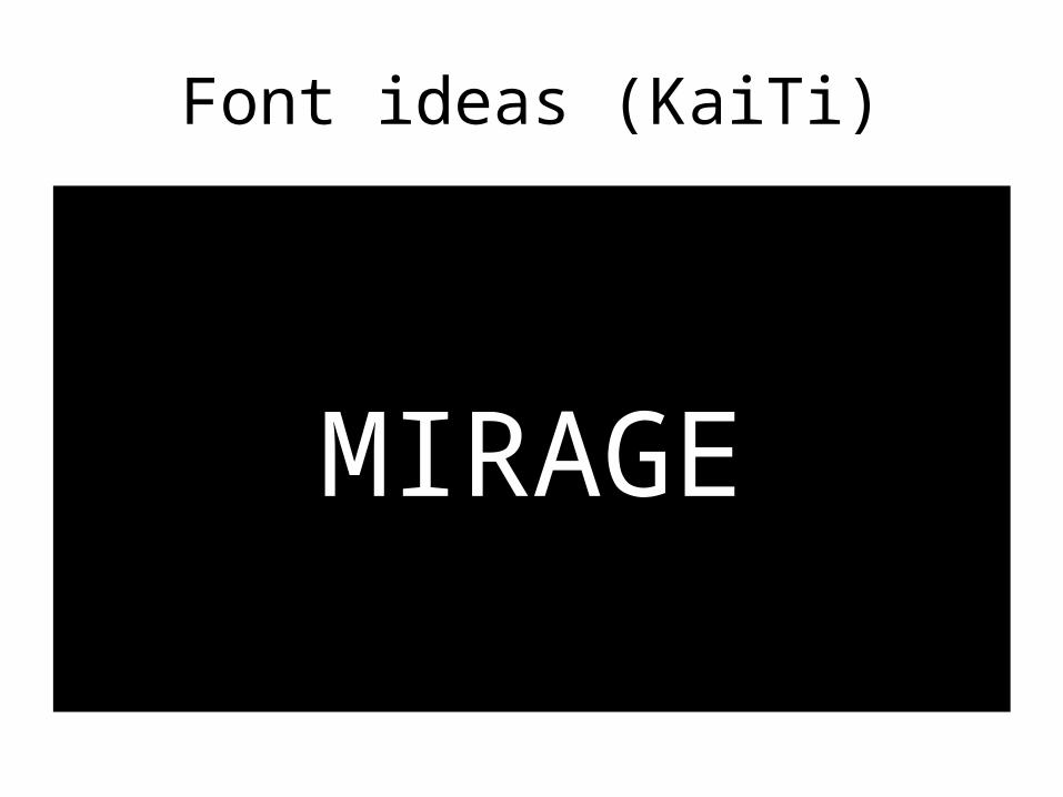
Font ideas (KaiTi)
MIRAGE
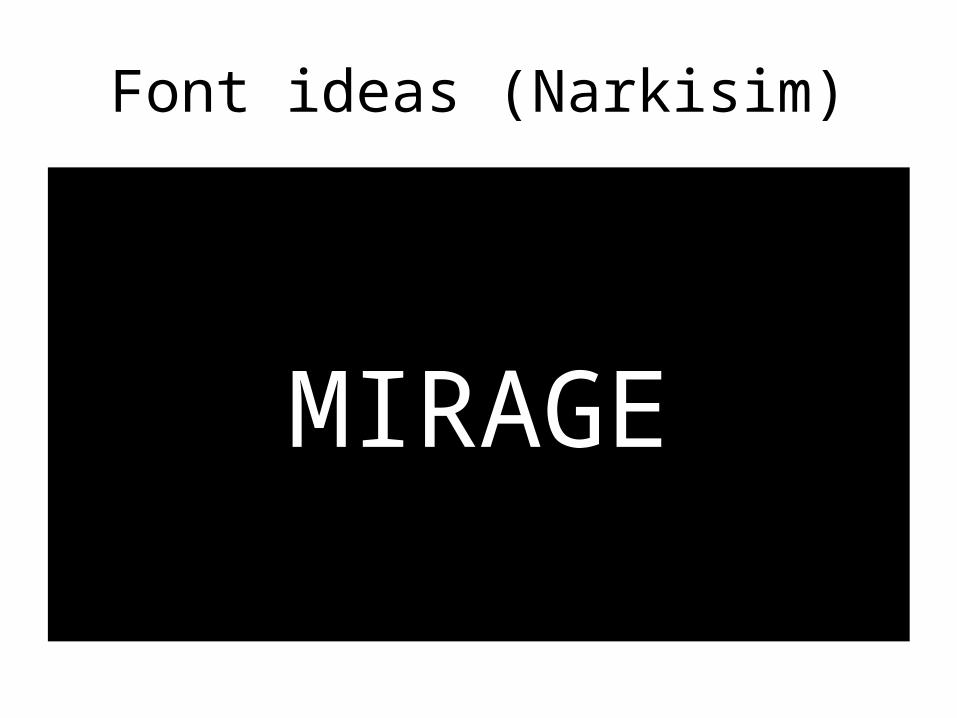
Font ideas (Narkisim)
MIRAGE
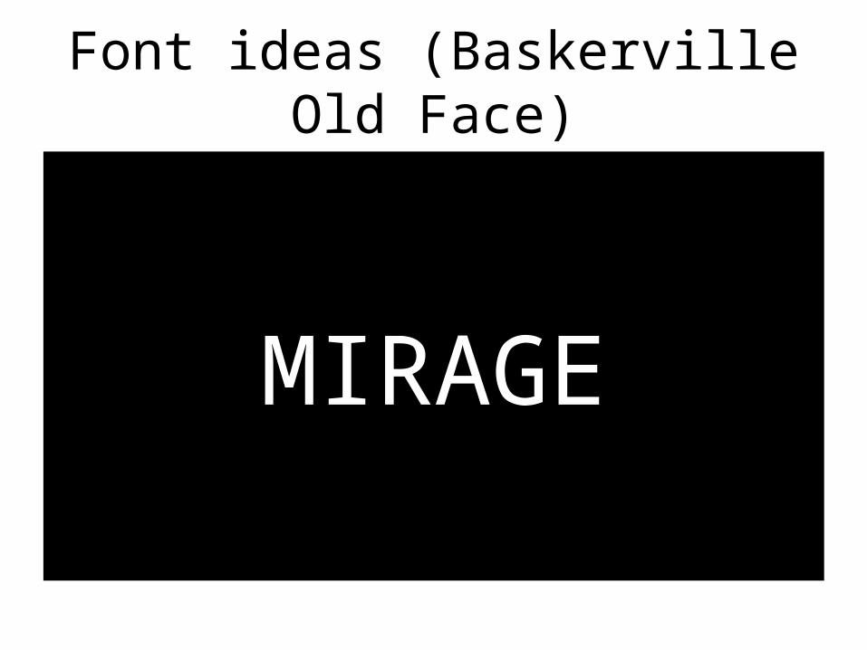
Font ideas (Baskerville Old Face)
MIRAGE
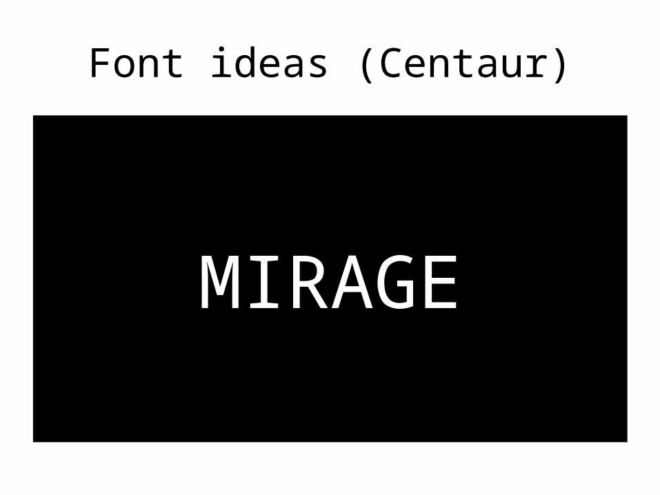
Font ideas (Centaur)
MIRAGE
Audience feedback
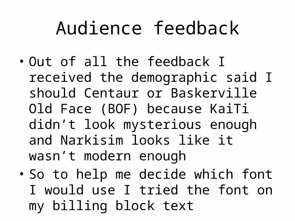
• Out of all the feedback I received the demographic said I should Centaur or Baskerville Old Face (BOF) because KaiTi didn’t look mysterious enough and Narkisim looks like it wasn’t modern enough
• So to help me decide which font I would use I tried the font on my billing block text
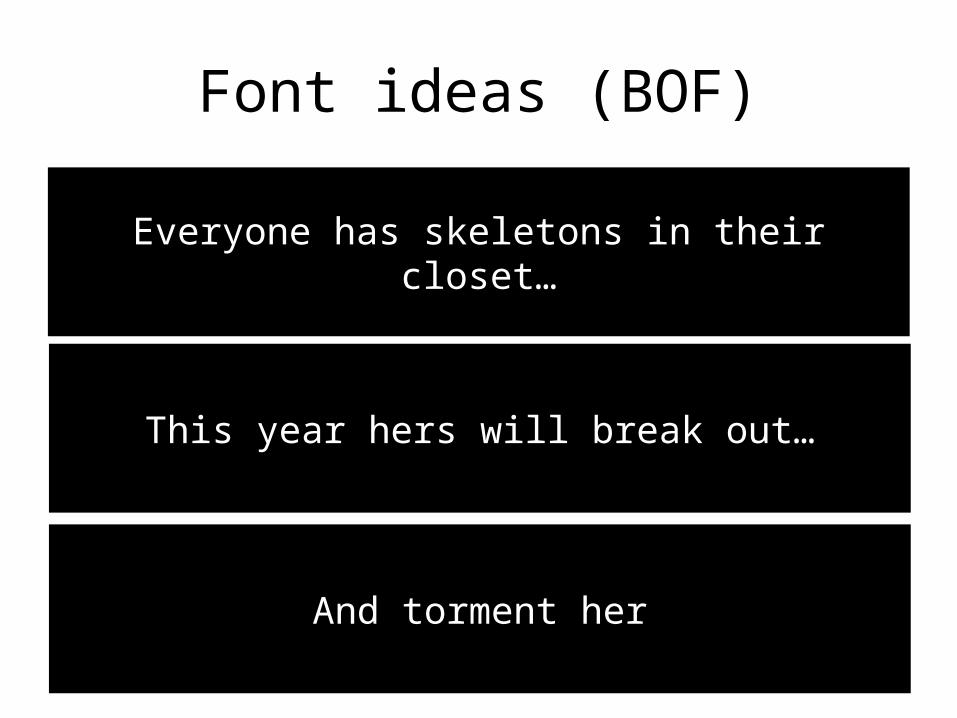
Font ideas (BOF)
Everyone has skeletons in their closet…
This year hers will break out…
And torment her
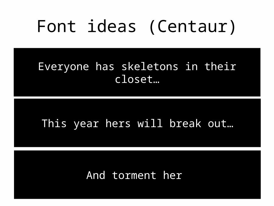
Font ideas (Centaur)
Everyone has skeletons in their closet…
This year hers will break out…
And torment her
Audience feedback
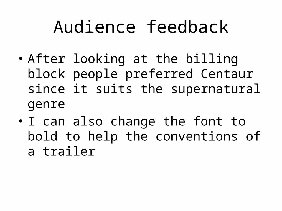
• After looking at the billing block people preferred Centaur since it suits the supernatural genre
• I can also change the font to bold to help the conventions of a trailer