Embed Size (px)
Citation preview
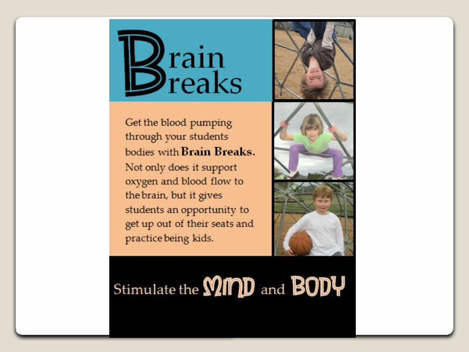
Final Interpretive Sign Design
Goals: To encourage elementary school teachers to implement brain breaks into their daily classroom routines.
Audience: Elementary school teachers
Message: Brain Breaks are a positive way to increase oxygen and blood flow to the brain to help students achieve academic success.
Bailey Rueck
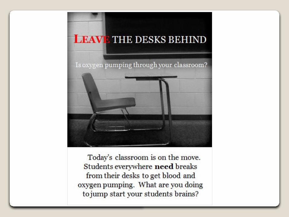
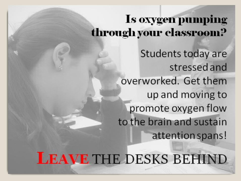
Design Changes, Week 2
When I started designing I went with the approach of showing the “serious side” of brain breaks. I wanted the desk to seem like a jail to students. For my second design;◦I changed the picture to a student looking stressed out◦I aligned the text right to create a strong line of text ◦I moved the bold heading to the bottom of the page
and started my design with a question to catch the readers attention.
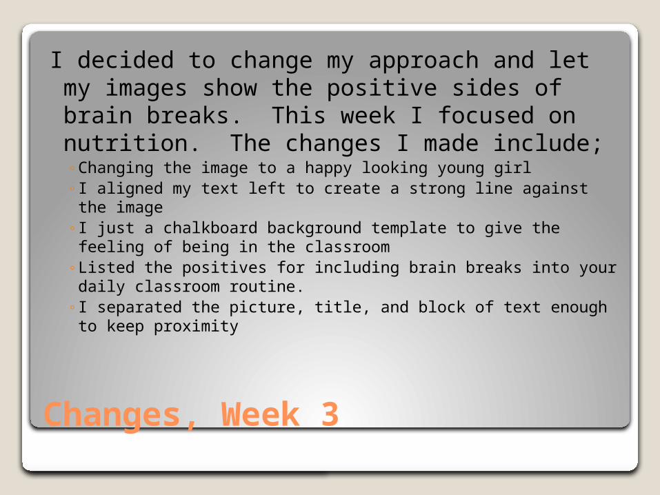
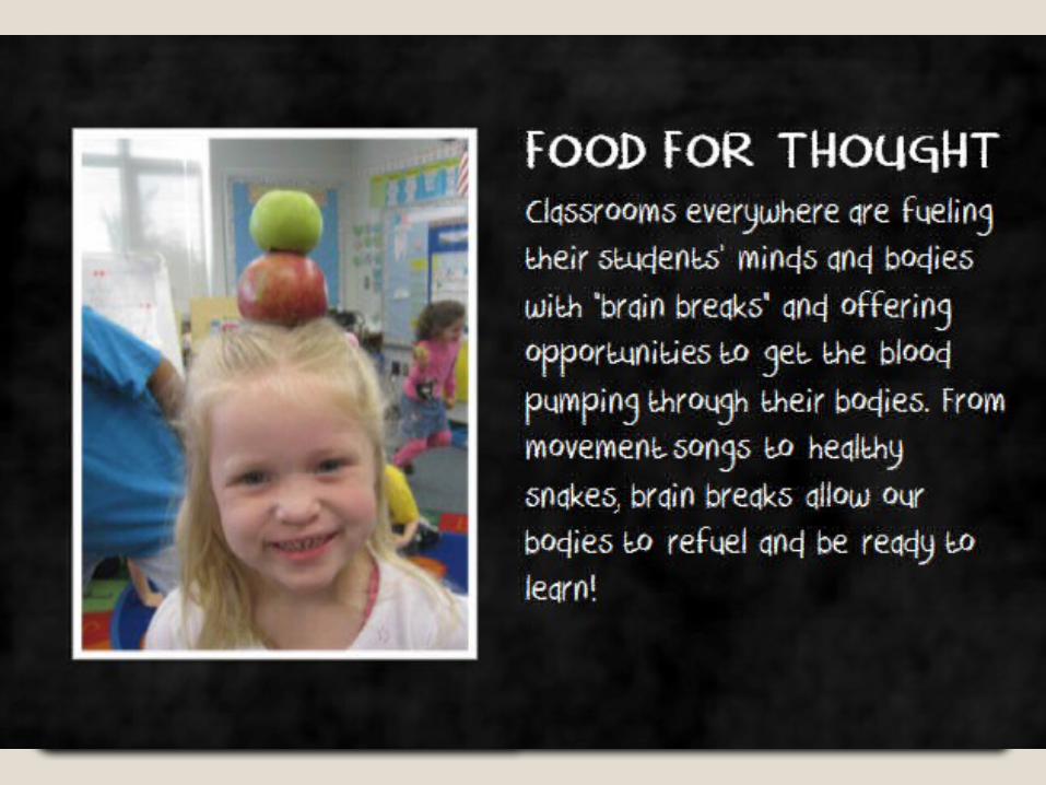
Changes, Week 3
I decided to change my approach and let my images show the positive sides of brain breaks. This week I focused on nutrition. The changes I made include;◦Changing the image to a happy looking young girl◦ I aligned my text left to create a strong line against the image◦ I just a chalkboard background template to give the feeling of
being in the classroom ◦Listed the positives for including brain breaks into your daily
classroom routine.◦ I separated the picture, title, and block of text enough to
keep proximity
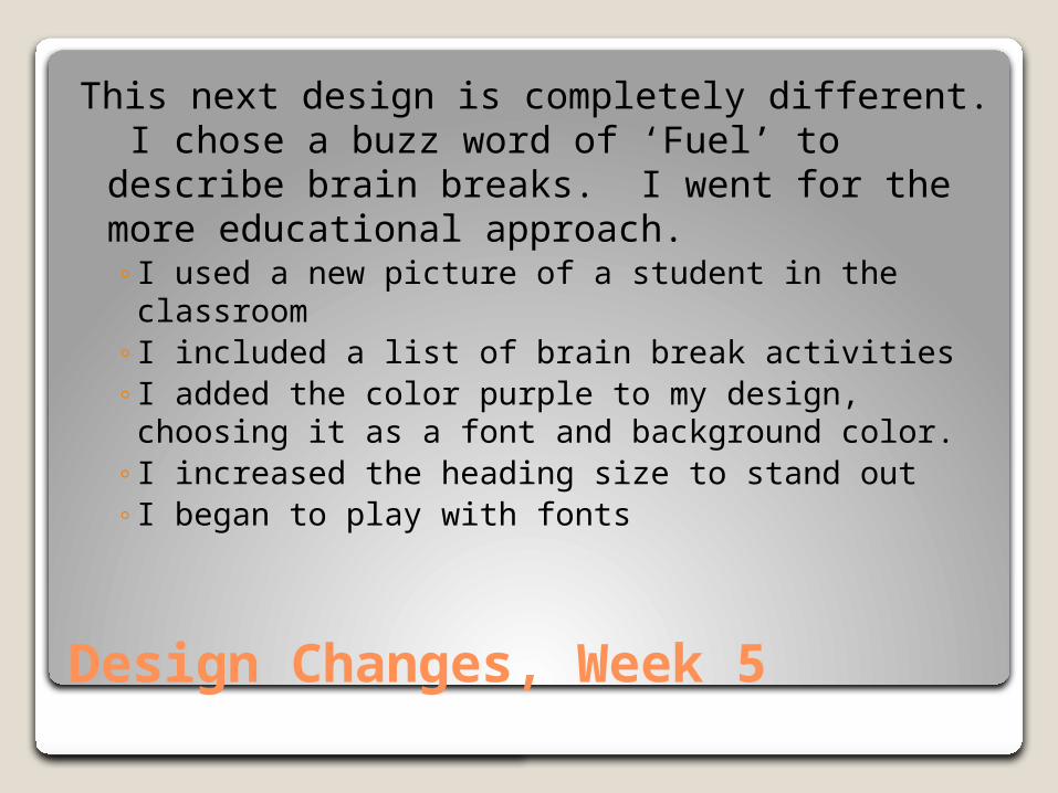
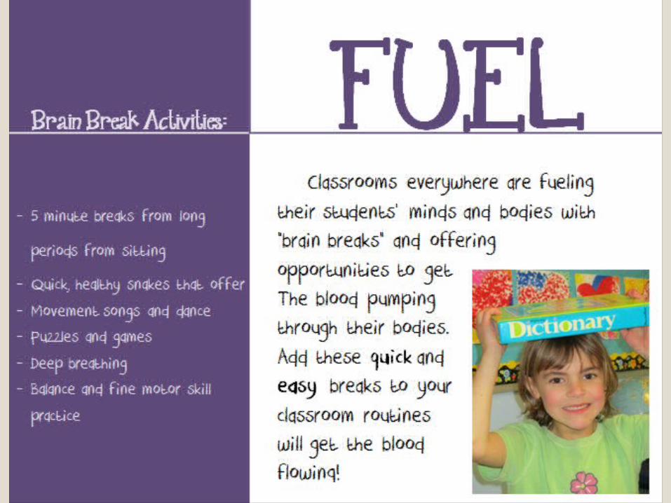
Design Changes, Week 5
This next design is completely different. I chose a buzz word of ‘Fuel’ to describe brain breaks. I went for the more educational approach.◦I used a new picture of a student in the classroom◦I included a list of brain break activities◦I added the color purple to my design, choosing it
as a font and background color. ◦I increased the heading size to stand out◦I began to play with fonts
Design Changes, Week 8
For this next design I eliminated the block of text and used a catch phrase instead. ◦Increased to three pictures◦Repetition with the complementary color
scheme ◦Chose two type faces◦Contrasted big/small
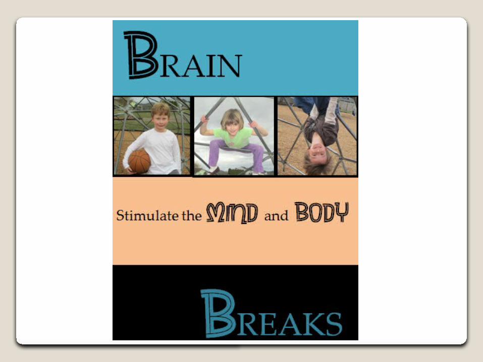
Final Design
◦Created repetition with the decorative and serif fonts
◦Complementary color scheme◦Used an old style serif font for my block of text
for readability◦Aligned the text and heading left ◦Contrasted with big/small and light/dark◦Used a decorative and serif font