1
I started by moving the website address so that it is underneath the magazine title. This worked better and people are also more likely to see the website and therefore are more likely to visit the website. Putting the text here also meant that all of the text was white. Around Sophie’s head, I felt that it didn’t look right where I had to separate it from the original image. Therefore, I used the spot healing tool to go over some sections and fill them in so that the image looked as it should. I then felt that the anchorage text underneath the headline was too big so I decided to make it slightly smaller using the transform tools on the move tool. On a lot of magazines, the price is not just for one country and tends to include others too. I decided to include a price for America too underneath the British price. This also works as I have stated on the cover that the magazine looks at world cinema and would therefore be sold worldwide. Next, I darkened the background. To do this I had to select the rest of Sophie’s body and create a new layer via cut using the magnetic wand tool. I then used the brightness tool to make the background darker only. To finish the poster I then edited the cover line on the left. I used the text tools to spread the text out more so that ‘music’ ended where ‘stop’ did.

Magazine Cover Screenshots - Final Draft of Cover

Embed Size (px)

Citation preview

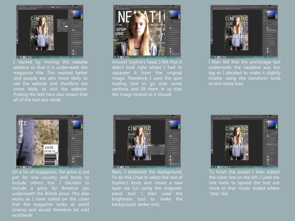
I started by moving the websiteaddress so that it is underneath themagazine title. This worked betterand people are also more likely tosee the website and therefore aremore likely to visit the website.Putting the text here also meant thatall of the text was white.

Around Sophie’s head, I felt that itdidn’t look right where I had toseparate it from the originalimage. Therefore, I used the spothealing tool to go over somesections and fill them in so thatthe image looked as it should.

I then felt that the anchorage textunderneath the headline was toobig so I decided to make it slightlysmaller using the transform toolson the move tool.

On a lot of magazines, the price is notjust for one country and tends toinclude others too. I decided toinclude a price for America toounderneath the British price. This alsoworks as I have stated on the coverthat the magazine looks at worldcinema and would therefore be soldworldwide.

Next, I darkened the background.To do this I had to select the rest ofSophie’s body and create a newlayer via cut using the magneticwand tool. I then used thebrightness tool to make thebackground darker only.

To finish the poster I then editedthe cover line on the left. I used thetext tools to spread the text outmore so that ‘music’ ended where‘stop’ did.