Embed Size (px)
Citation preview

Mika- ‘The Boy Who Knew Too Much

LAYOUT/ CONTENT
The layout does conform to the conventional layout as there is the large title of the artists name and underneath the name of the album, which will catch the audiences attention. Also at the bottom it includes hit single and a release date, which
builds hype for the audience as they have something to look forward to. However it doesn't have much artist imagery apart
from the mid close up shot of him where he has direct eye contact with the audience which draws their attention. His
facial expression is neutral and he wears casual clothes. The picture is made to look like its a photograph by being in black
and white. This may suggest how the audience are more aware of him because of his name or that he doesn't focus
much on how he looks to influence his music/ fans but is more aware of the meanings behind his music.

DESIGN/IMAGERY The whole of the adverts' background is of one animated image,
of a room which is in space. The imagery of space is used which normally has this fantastical and mind oaring but here it
is coloured in black and white which is then contrasted with this brightly coloured room which suggests how this boy 'who knew
too much' is much greater than space and is filled with more wonder. This can also be seen through the angle of the
animated boy's room as we look down on him which creates this sense of never ending walls which are full with colourful
pictures which suggests a wider knowledge. Also the view out of the window differs as is colourful conveying how this boy
sees the world in a different way. This suggests that the type of music in this album is different and may cover difficult subjects
viewed in a different way. The typography that is used is a stencil style and is bold and made to look 3D which makes it
stand out to the audience as creates impact, bold and confident style which can link to the artist.

AUDIENCE APPPEAL
The audience would be attracted to the abstract style of the advert, with the use of bright colours and cartoon design as its quite different to the typical music advert, which I think this also shows the unique style of the artists music itself.
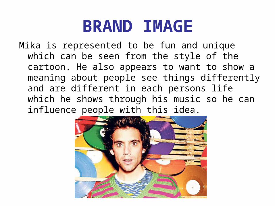
BRAND IMAGEMika is represented to be fun and unique which
can be seen from the style of the cartoon. He also appears to want to show a meaning about people see things differently and are different in each persons life which he shows through his music so he can influence people with this idea.

BRAND IMAGEMika often uses cartoon/animated style
and use of bright colours throughout his promotional material and also in other albums which helps to create his brand image and makes him more memorable to the audience.
Life in Cartoon Motion album cover-2007
Music video of ‘Lollipop’
The Boy Who Knew Too Much album cover

GENRE CONVENTIONS
• Bright colours convey the pop genre• Unique design and styling could convey
the alternative rock genre
SYNERGYThe only website that is given on the advert is Mika’s official website, this is so that the audience can go there to find out more about him and his music.