Embed Size (px)
Citation preview

How effective is the combination of your main product and ancillary
texts?

Section A:What key aspects did you include in your poster?
In my poster I wanted to reflect the trailer in the best possible way, creating links without giving too much away but still intriguing the audience. I did this by linking the two in style, for instance, on the poster there is a strong sense of subtle but effective body horror, which ties in with my auteur style that I put into the trailer. I have also linked in with body horror with the fonts and colour scheme that I have chosen.
The primarily black composition really allows the red to stand out and become very apparent. My colour palette was very important because it connotes to lots of different things: including the body horror seen in the trailer and the anticipation of it, the danger the psycho killer towards his victims, and also the lust and passion that the killer has towards blonde women, causing him to feel so threatened that he kills. Instantly this subconsciously sends messages to the audience’s brain, which realises connotations associated with this colour.

Section A:What key aspects did you include in your poster?
The title font is torn, broken and scratched which is a visual metaphor of the male antagonist’s personality. In Cut, our psycho killer uses a phallic symbol slashing his victims, hence the cut and tears; he also does this for power, dominance of his victims which is why the font is bold. However, this does also connote to the final girl archetype and the psycho killer’s marriage. Initially they are happy until an argument breaks that down, causing cracks to appear until she eventually discovers who he is.
The main image is the back of the male antagonist with a bloodied phallic knife in his hand. Only the outline of his head can be seen, this is due to the fact that in the trailer, you only discover who the killer is at the very end. This means my poster does not reveal too much information, because I was aware it would be released well in advance of the trailer. Behind the figure you can see a close up of the final girl, although this would be unknown looking at it from the audience. The large close-up of her eyes makes the audience feel uncomfortable, as this makes the audience fell like that their personal space has been invaded, especially with one of the eyes looking straight out of the poster at them. The idea of the poster is much a like the trailer, it’s designed to make the audience fell on edge a build of suspense to then get shocked by body horror or intense use of colour. This makes it reminiscent of the uncomfortable close-up shots of Sally’s green eyes during the dinner scene in Texas Chain Saw Massacre (1973).

Section A:What key aspects did you include in your poster?
The poster uses a voyeuristic killer which is reminiscent of the voyeuristic killer in Psycho Norman Bates. This links to the storyline to one of sexual frustration, not only are all of the victims in CUT female, but the killer is also obsesses by their blonde hair. This is called ‘The Male Gaze’ theory and the critic behind it is Laura Mulvey, she said that Cinema represented women in such a way that it would give pleasure to the Male Gaze viewers; backing up the patriarchy Male dominated Cultural Dominant Ideology, especially in cinema with the amount of male producers and directors.
To get all of these conventions of this poster working together wasn’t easy and it took a lot of research to get me there, I looked at many horror posters critically analysing them so I could get an insight into how horror posters work which helped me massively when producing my own. This is shown by the strong link with my poster and current horror posters such as for The Grudge (2004). This poster holds a lot of similarities to my own. For example, the contrast of colour scheme with the primarily black background allowing for the red to stand out more effectively. The main image has one eye looking at the audience to make it eye catching and difficult to avoid making the audience feel uncomfortable. The poster is subtle but very effective, it merely implies the horror narrative and the conventions that come with that, which makes the poster successfully “tease”, something that I have tried to replicate.

Section A:What key aspects did you include in your magazine cover?
After analysing many magazine covers, I discovered that there are many different types of magazines on the horror genre, ranging from intense gore to psychological. After gathering a deep insight into the industry I made a decision on what I thought would be the best avenue to go down and this was by aiming at mainstream horror fans. I thought the best way to achieve this visually was by making the colour scheme very eye-catching yet aesthetically pleasing.

Section A:What key aspects did you include in your magazine cover?
For the main image I have a portrait photo of the main character due to the fact this will be a lot more relatable for a larger audience, giving the photo a lot of presence and impact. In addition, the image is intimate with the character being in close-up; it almost feels as if the character is looking you straight in the eye. Main images don’t normally have writing over them but in this case I have decided to break that convention. This is because the transparency of it allows all of the main features to come through while still possessing this blood-like red.
Arrangement of the cover was important. I included sub-images; these are images that are normally related with smaller features in the magazine, a convention that was common in real-life horror magazines. I decided to follow this convention showing the making of ‘Cut’, as having a look behind the scenes creates intrigue. I have also included many cover lines, to show that there are other features to the magazine and it is not primarily based on my horror film, as no magazine is about one film.

Section A:What key aspects did you include in your magazine cover?
All of these different conventions are tied together with a strong colour scheme; I have again used the contrasting colours of red, white and black. These colours are very strong and hold a lot of presence due to their vividness, especially when you use them to clash against each other. These colours are also very common with in horror magazines due to the connotations related with them, red is often connoted with blood, black is often connoted with evil etc. an example that shows this is ‘HorrorHound’s’ magazine cover.

Section B:How does your poster and magazine link to your trailer in style?
I created as many links as possible when it came to ties my film poster and magazine cover to my trailer; I did this in a number of different ways. One of these was lighting of shots, I made the lighting very focused throughout the shots of my magazine and poster, for instance the main image on both has a very intense light on the main character to create an intimate close up that reveals flaws and reduces any perfections. This again unnerves the audience because it feels as if their personal space is being invaded and this is something that I have made a main feature throughout the trailer, there are many shots that include intense lighting and close ups to create this emotion effect, as seen by the screenshot above and to the right.

Section B:How does your poster and magazine link to your trailer in style?
Another feature common throughout the poster, magazine and trailer is the colour scheme. They are unified in black, red and white and even in the trailer I ensured that the colours are contrasting with each other as much as possible.
Another feature that is common is the slow reveal of the storyline, I think that the magazine and poster give an indication to the storyline almost as effectively as the trailer. Each piece of advertising shows different parts of the narrative of Cut. I think that the main images show the blonde women is going to be in danger but due to her being replicated in the main images it shows that she holds some importance, indicating she will be a ‘final girl’, unlike Marion Crane in Hitchcock’s Psycho.

Section B:What audience were you aiming for?Poster:
This poster would be the product of social networking with big campaigns being networked all over the internet which would appeal to our target demographic very effectively. The target audience for this is 15-25 year olds of both genders, which have a social class of D but is an aspirer to make a change to the world, making it a better place and challenging the “male gaze” of the killer. This is a similar audience to the likes of Scream 4 and Cabin in the Woods.
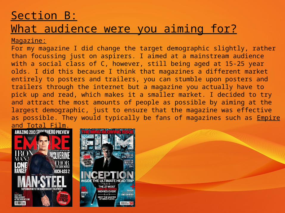
Section B:What audience were you aiming for?Magazine:For my magazine I did change the target demographic slightly, rather than focussing just on aspirers. I aimed at a mainstream audience with a social class of C, however, still being aged at 15-25 year olds. I did this because I think that magazines a different market entirely to posters and trailers, you can stumble upon posters and trailers through the internet but a magazine you actually have to pick up and read, which makes it a smaller market. I decided to try and attract the most amounts of people as possible by aiming at the largest demographic, just to ensure that the magazine was effective as possible. They would typically be fans of magazines such as Empire and Total Film.