Embed Size (px)
Citation preview

LAYOUT PETA“ A MAP THAT IS NOT CLEAR IS WORTHLESS. CLARITY INVOLVES EXAMINING THE OBJECTIVES OF THE MAP,
EMPHASIZING THE IMPORTANT POINTS, AND ELIMINATING ANYTHING THAT DOES NOT ENHANCE THE MAP MESSAGE”
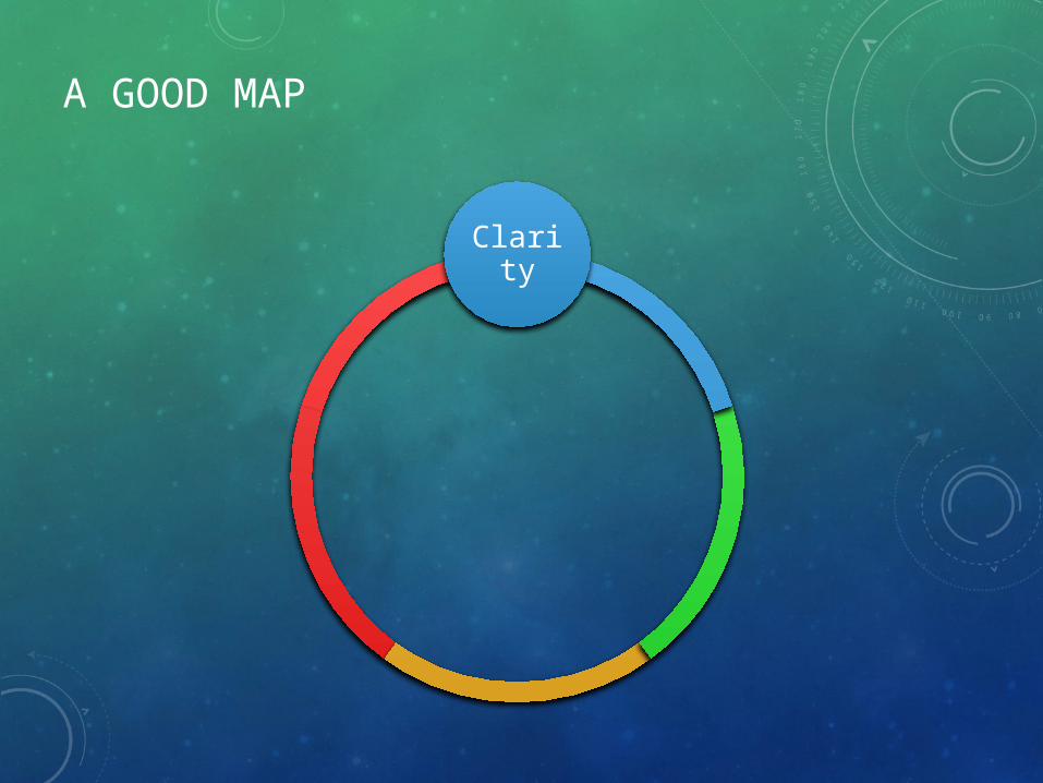
A GOOD MAP
Clarity

CLARITY
PETA KOTA KENDARI

A GOOD MAP
Clarity
Order
Balance

BALANCE DAN ORDER

A GOOD MAP
Clarity
Order
BalanceContras
Unity

CONTRAS AND UNITY

A GOOD MAP
Harmoni
Clarity
Order
BalanceContras
Unity

MENCIPTAKAN HARMONI
SNI 6502.
xx:2010Spesifikasi Teknis Penyajian Peta RBI
PP. No. 8 Tahun
2013Ketelitian Peta untuk
Penataan Ruang
SOPPemutakhiran Peta Infrastruktur Bidang Pekerjaan Umum (Rencana)


NORMATIF
LAYOUT PETA MENURUT SNI1
2
3
Legenda, simbol dan keterangan
6
Skala Peta
7
4
5
Pemb. Wil administrasi
Judul Peta dan Skala Peta (angka)
Riwayat/sumber data peta

PRAKTEK:
• Sesuai Modul (Hal 33)
• Semua bahan dapat diunduh di: http://sdrv.ms/15AaZjt

TUGAS (PER KELOMPOK)
• PETA SESUAI DENGAN TEMA MASING-MASING (SDA, BM, CK, atau TARU)• Save format PDF/JPEG • Kirim ke [email protected] /
MENCIPTAKAN HARMONI
• ClarityA map that is not clear is worthless. Clarity involves examining the objectives of the map, emphasizing the important points, and eliminating anything that does not enhance the map message- OrderOrder refers to the logic of the map. Is there visual clutter or confusion? Are the various elements placed logically? Is the reader’s eye led through the map appropriately? Since the map is a synoptic, not a serial, communication, cartographers cannot assume that readers will look first at the title, then at the legend, and so on- BalanceEvery element of the map has visual weight. These weights should be distributed evenly about the optical center of the page, which is a point slightly above the actual center, or the map will appear to be weighted to one side or unstable- ContrastA large part of the clarity of the map derives from contrast. Contrast is the difference between light and dark, thick and thin, heavy and light. A map created with only one line weight, one font size, and one font lacks contrast, is boring to look at, and is hard to read- UnityUnity refers to the interrelationships between map elements. Lettering is not chosen in isolation; it must be legible over any background colors and shades, must not conflict with chosen symbols, and must suit the topic of the map- HarmonyDo all of the elements work well together? Do the chosen colors clash? Are patterns jarring to the eye?