Embed Size (px)
Citation preview
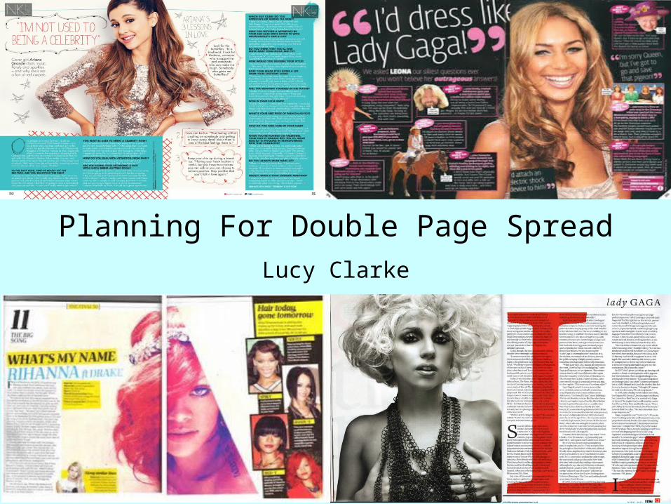
Planning For Double Page SpreadLucy Clarke
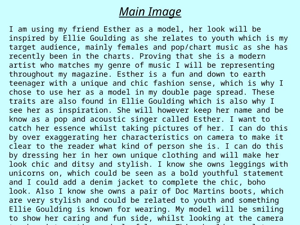
Main ImageI am using my friend Esther as a model, her look will be inspired by Ellie Goulding as she relates to youth which is my target audience, mainly females and pop/chart music as she has recently been in the charts. Proving that she is a modern artist who matches my genre of music I will be representing throughout my magazine. Esther is a fun and down to earth teenager with a unique and chic fashion sense, which is why I chose to use her as a model in my double page spread. These traits are also found in Ellie Goulding which is also why I see her as inspiration. She will however keep her name and be know as a pop and acoustic singer called Esther. I want to catch her essence whilst taking pictures of her. I can do this by over exaggerating her characteristics on camera to make it clear to the reader what kind of person she is. I can do this by dressing her in her own unique clothing and will make her look chic and ditsy and stylish. I know she owns leggings with unicorns on, which could be seen as a bold youthful statement and I could add a denim jacket to complete the chic, boho look. Also I know she owns a pair of Doc Martins boots, which are very stylish and could be related to youth and something Ellie Goulding is known for wearing. My model will be smiling to show her caring and fun side, whilst looking at the camera to show interaction and playfulness. This should appeal to a younger audience as this is the type of person teenagers look up to. I will use a prop to make sure readers know this is a music magazine, so they don’t mistake it for fashion, as I will be using a guitar for Esther to pose with to emphasise the genre of the magazine. Also, Ellie Goulding is known for playing the guitar which I can develop and use this as inspiration. I want Esther to make fun poses with the guitar to show her youth and to show she is energetic, outgoing and playful. Which would all appeal to a younger audience.
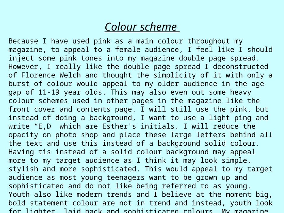
Colour scheme Because I have used pink as a main colour throughout my magazine, to appeal to a female audience, I feel like I should inject some pink tones into my magazine double page spread. However, I really like the double page spread I deconstructed of Florence Welch and thought the simplicity of it with only a burst of colour would appeal to my older audience in the age gap of 11-19 year olds. This may also even out some heavy colour schemes used in other pages in the magazine like the front cover and contents page. I will still use the pink, but instead of doing a background, I want to use a light ping and write “E,D” which are Esther's initials. I will reduce the opacity on photo shop and place these large letters behind all the text and use this instead of a background solid colour. Having tis instead of a solid colour background may appeal more to my target audience as I think it may look simple, stylish and more sophisticated. This would appeal to my target audience as most young teenagers want to be grown up and sophisticated and do not like being referred to as young. Youth also like modern trends and I believe at the moment big, bold statement colour are not in trend and instead, youth look for lighter, laid back and sophisticated colours. My magazine needs to appeal to a modern generation and the colour scheme is a very important aspect for this. I will continue to use a lighter ping for the masthead of Esther’s name, drop caps ad the question for the article as I am basing my article around a Q+A with questions sent in from readers of the magazine and answered by Esther.
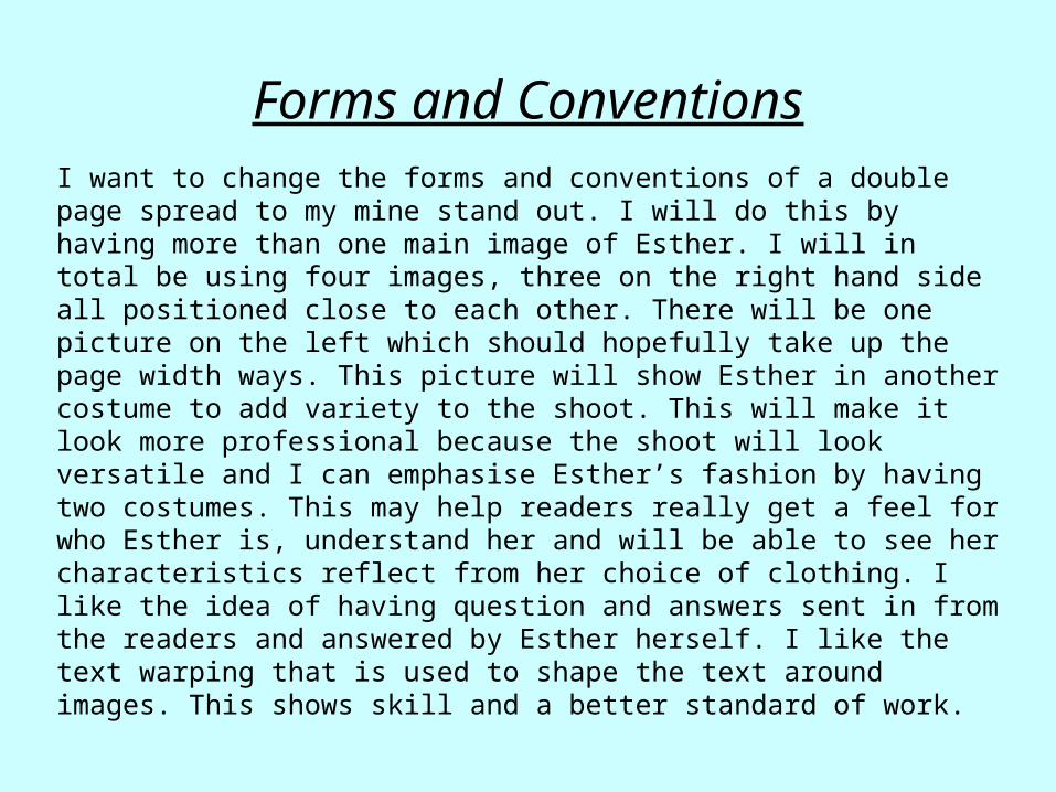
Forms and ConventionsI want to change the forms and conventions of a double page spread to my mine stand out. I will do this by having more than one main image of Esther. I will in total be using four images, three on the right hand side all positioned close to each other. There will be one picture on the left which should hopefully take up the page width ways. This picture will show Esther in another costume to add variety to the shoot. This will make it look more professional because the shoot will look versatile and I can emphasise Esther’s fashion by having two costumes. This may help readers really get a feel for who Esther is, understand her and will be able to see her characteristics reflect from her choice of clothing. I like the idea of having question and answers sent in from the readers and answered by Esther herself. I like the text warping that is used to shape the text around images. This shows skill and a better standard of work.