Embed Size (px)
Citation preview
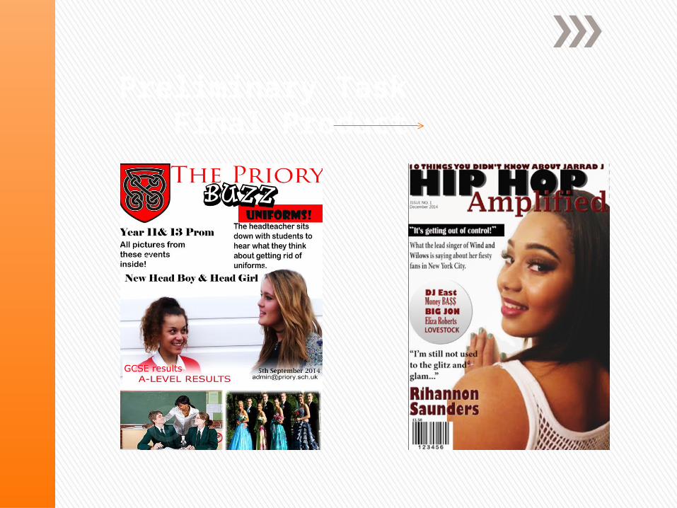
Preliminary Task Final Product
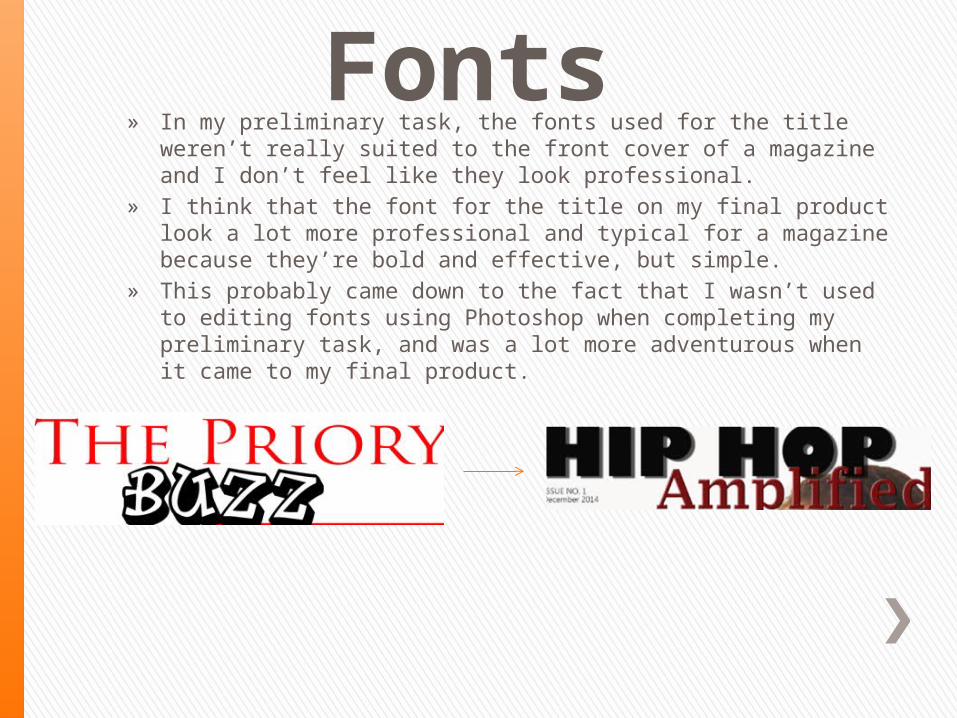
Fonts » In my preliminary task, the fonts used for the title weren’t really suited to
the front cover of a magazine and I don’t feel like they look professional.» I think that the font for the title on my final product look a lot more
professional and typical for a magazine because they’re bold and effective, but simple.
» This probably came down to the fact that I wasn’t used to editing fonts using Photoshop when completing my preliminary task, and was a lot more adventurous when it came to my final product.
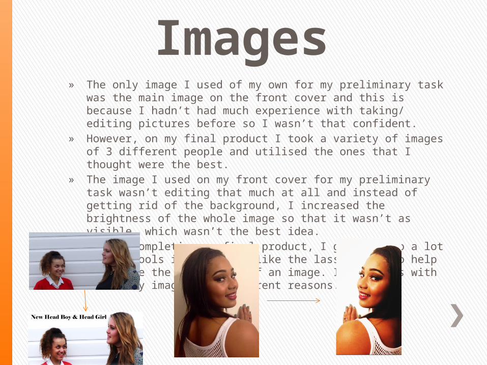
Images » The only image I used of my own for my preliminary task was the main image on the
front cover and this is because I hadn’t had much experience with taking/ editing pictures before so I wasn’t that confident.
» However, on my final product I took a variety of images of 3 different people and utilised the ones that I thought were the best.
» The image I used on my front cover for my preliminary task wasn’t editing that much at all and instead of getting rid of the background, I increased the brightness of the whole image so that it wasn’t as visible, which wasn’t the best idea.
» Whilst completing my final product, I got used to a lot of the tools in Photoshop like the lasso tool, to help me delete the background of an image. I used this with all of my images for different reasons.
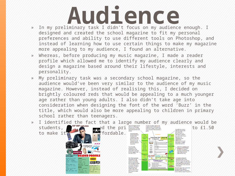
Audience» In my preliminary task I didn’t focus on my audience enough. I designed and created
the school magazine to fit my personal preferences and ability to use different tools on Photoshop, and instead of learning how to use certain things to make my magazine more appealing to my audience, I found an alternative.
» Whereas, before producing my music magazine, I made a reader profile which allowed me to identify my audience clearly and design a magazine based around their lifestyle, interests and personality.
» My preliminary task was a secondary school magazine, so the audience would’ve been very similar to the audience of my music magazine. However, instead of realising this, I decided on brightly coloured reds that would be appealing to a much younger age rather than young adults. I also didn’t take age into consideration when designing the font of the word ‘Buzz’ in the title, which would also be more appealing to children in primary school rather than teenagers.
» I identified the fact that a large number of my audience would be students, so I decreased the price of my music magazine to £1.50 to make it much more affordable.
Photoshop » I have developed my knowledge of Photoshop massively throughout the completion
of my final product from my preliminary task. » During my preliminary task I was only able to use the basic aspects of Photoshop to
create basic changes to images that needed a lot more attention in order for them to look professional and effective.
» In addition to this, I think that if my Photoshop skills were better when completing my preliminary task my images wouldn’t have looked as over-edited and would’ve looked much cleaner on the page. For example, the main image on the front cover is much too over-exposed because I wasn’t familiar with the background eraser tool, so I increased the brightness of the whole image to make the dull background look cleaner. However, this wasn’t the case and my magazine would’ve benefitted from the background being cropped out completely.
» Since my preliminary task, I have learnt how to edit images effectively, finding the correct balance between brightness and contrast and being careful not to make an image look over-exposed. I have also become more familiar with tools like the Lasso tool and Polygonal Lasso tool to erase the background of an image.
OverallOverall, I feel like I have improved my skills massively through the transition from my preliminary task to my final product. My experience of taking and editing photos has affected the way I would deal with them in another project because I’ve learnt that the better quality an original image is, the easier and more effective the editing will be. Similarly, I’ve learnt that taking time to choose and edit a font is extremely important because the title is one of the first things someone looks at on a magazine, so if the font isn’t great it sets a low standard for the whole product.