Embed Size (px)
Citation preview
Generic Conventions of a Double-Page Spread in a Music Magazine
Alice Martin
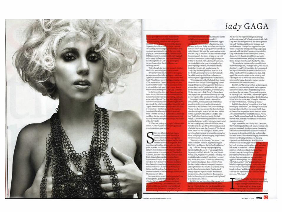
Representation of the artist is important because how an artist is shown in the media effects how popular and how successful they are, if they are shown as boring or as rude readers and fans will lose interest or not bother to read what they have to say. In this feature Lady Gaga is represented and shown as someone who is wacky and very over the top. The image used on the front cover shows her as a raunchy and confident person, but also someone who makes themselves look very different to most people.
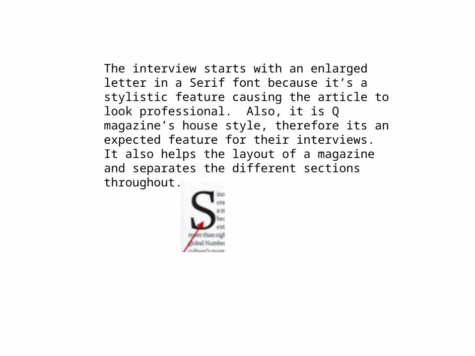
The interview starts with an enlarged letter in a Serif font because it’s a stylistic feature causing the article to look professional. Also, it is Q magazine’s house style, therefore its an expected feature for their interviews. It also helps the layout of a magazine and separates the different sections throughout.
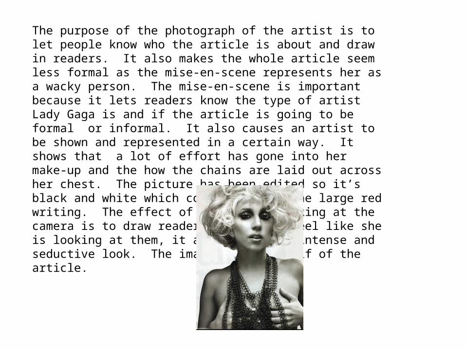
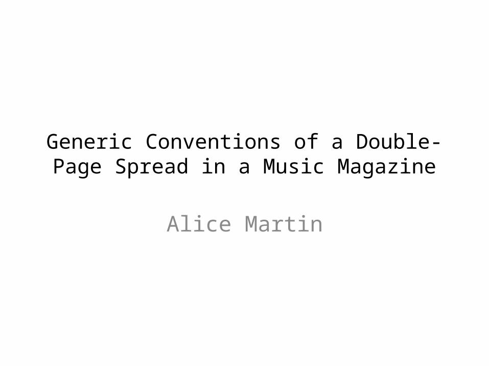
The purpose of the photograph of the artist is to let people know who the article is about and draw in readers. It also makes the whole article seem less formal as the mise-en-scene represents her as a wacky person. The mise-en-scene is important because it lets readers know the type of artist Lady Gaga is and if the article is going to be formal or informal. It also causes an artist to be shown and represented in a certain way. It shows that a lot of effort has gone into her make-up and the how the chains are laid out across her chest. The picture has been edited so it’s black and white which contrasts with the large red writing. The effect of the artist looking at the camera is to draw readers in so they feel like she is looking at them, it also causes an intense and seductive look. The image takes up half of the article.
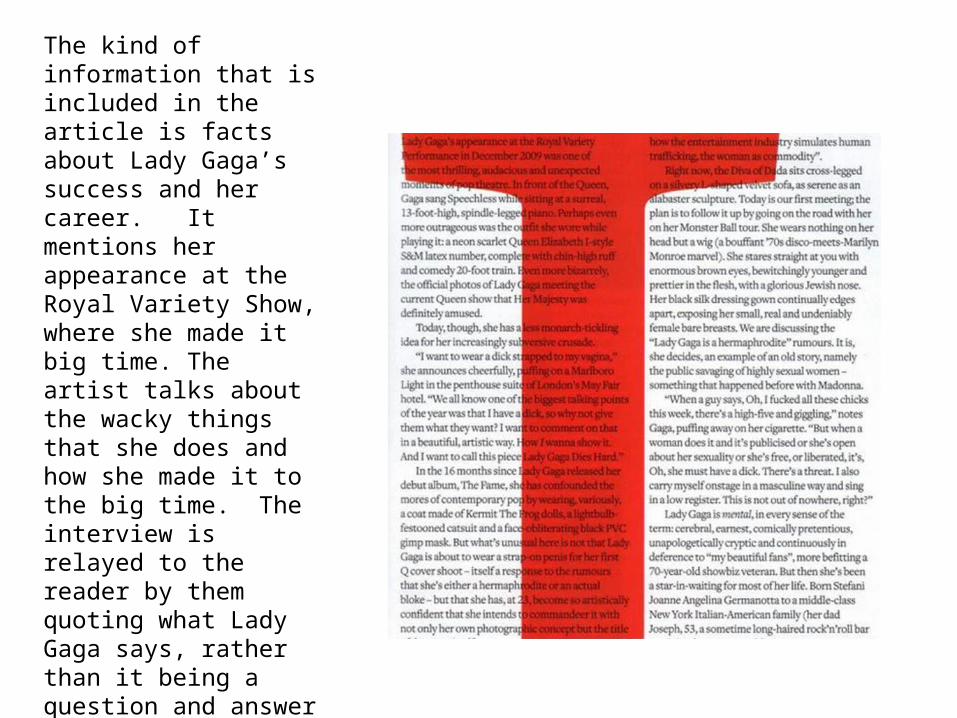
The kind of information that is included in the article is facts about Lady Gaga’s success and her career. It mentions her appearance at the Royal Variety Show, where she made it big time. The artist talks about the wacky things that she does and how she made it to the big time. The interview is relayed to the reader by them quoting what Lady Gaga says, rather than it being a question and answer interview. It informs the reader of Lady Gaga’s information and latest stories with statements which have come from her but the journalist has put into sentences.
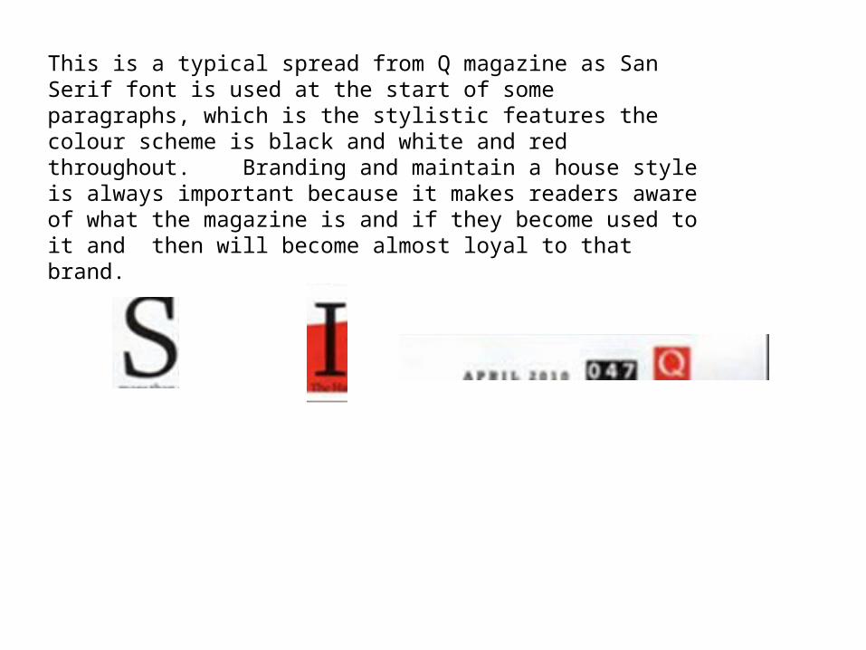
This is a typical spread from Q magazine as San Serif font is used at the start of some paragraphs, which is the stylistic features the colour scheme is black and white and red throughout. Branding and maintain a house style is always important because it makes readers aware of what the magazine is and if they become used to it and then will become almost loyal to that brand.
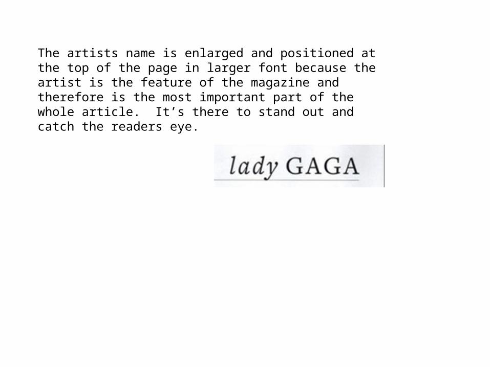
The artists name is enlarged and positioned at the top of the page in larger font because the artist is the feature of the magazine and therefore is the most important part of the whole article. It’s there to stand out and catch the readers eye.
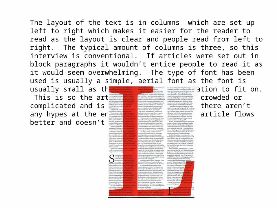
The layout of the text is in columns which are set up left to right which makes it easier for the reader to read as the layout is clear and people read from left to right. The typical amount of columns is three, so this interview is conventional. If articles were set out in block paragraphs it wouldn’t entice people to read it as it would seem overwhelming. The type of font has been used is usually a simple, aerial font as the font is usually small as there’s a lot of information to fit on. This is so the article doesn't look too crowded or complicated and is easy to read. Also, there aren’t any hypes at the end of the lines so the article flows better and doesn’t get confusing.
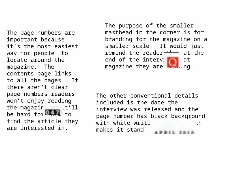
The page numbers are important because it’s the most easiest way for people to locate around the magazine. The contents page links to all the pages. If there aren't clear page numbers readers won’t enjoy reading the magazine as it’ll be hard for them to find the article they are interested in.
The purpose of the smaller masthead in the corner is for branding for the magazine on a smaller scale. It would just remind the reader that at the end of the interview what magazine they are reading.
The other conventional details included is the date the interview was released and the page number has black background with white writing on top which makes it stand out.
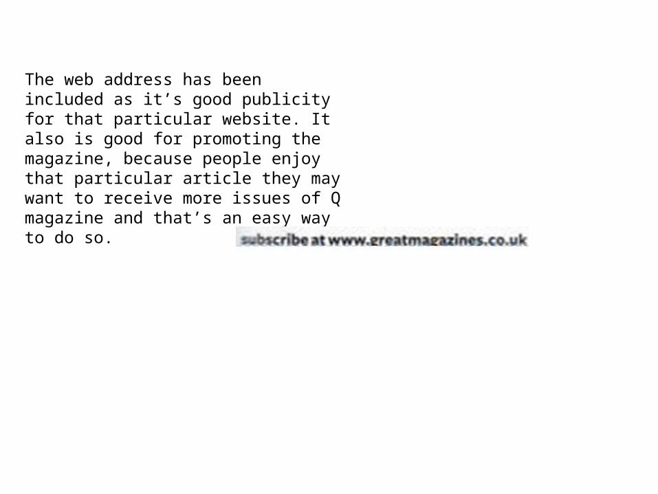
The web address has been included as it’s good publicity for that particular website. It also is good for promoting the magazine, because people enjoy that particular article they may want to receive more issues of Q magazine and that’s an easy way to do so.