Embed Size (px)
Citation preview
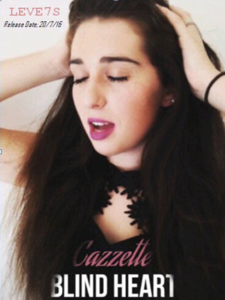
POSTER ANALYSIS We decided to use a close up photo of
our protagonist and artist Rosie as its a common feature of music posters for the artist to appear as a means of maintaining the image.
The colour scheme is pink and black and therefore reflects the femininity star image of the artist as well as creating a dark contrast that reflects the dark storyline of the video.
The filters added to the picture make the poster look more professional and polished, also we decided that the filter ensures the artists appearance looks polished.
One specific feature that we put on the poster was the words blending into the image, this therefore giving the poster a original feel that is eye catching for potential listeners and also reflects the modern cutting edge style of the genre.