Embed Size (px)
Citation preview

QUESTION 1 – FRONT COVERIn what ways does your media
product use, develop or challenge forms and conventions of real
media products?
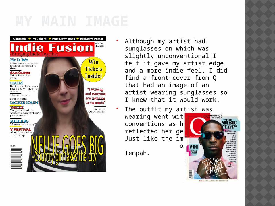
MY MAIN IMAGE Although my artist had
sunglasses on which was slightly unconventional I felt it gave my artist edge and a more indie feel. I did find a front cover from Q that had an image of an artist wearing sunglasses so I knew that it would work.
The outfit my artist was wearing went with the conventions as her clothing reflected her genre of music Just like the image of Tinie Tempah.

DATE/PRICE/BARCODE/ All magazines I looked at in my
research phase included the date, price, issue number and barcode. Which is why I included them on my front cover.
This NME front cover have these features so I am following with the normal media conventions.
I added them on my front cover as its what people expect to see. They give the reader information on how much it is and if it is a recent copy. This will make them be more likely to but it.
I used the price £2.20 as this was around the price my audience was happy to pay for their magazines.
THE MASTHEAD
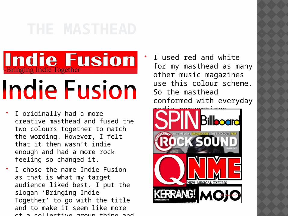
I used red and white for my masthead as many other music magazines use this colour scheme. So the masthead conformed with everyday media conventions. I originally had a more creative
masthead and fused the two colours together to match the wording. However, I felt that it then wasn’t indie enough and had a more rock feeling so changed it.
I chose the name Indie Fusion as that is what my target audience liked best. I put the slogan ‘Bringing Indie Together’ to go with the title and to make it seem like more of a collective group thing and involve my audience more.

THE BANNER
Music magazines like NME often use banners to promote competitions and important things. NME often use the red on yellow for their banner but I felt using that colour scheme for mine would look out of place so I challenged media conventions by using different colours.
When creating my banner I added things that I felt would entice my audience into buying the magazine. Posters, Voucher, Contests and Free things are items that my target audience would be attracted to.
I used the white on the black background, with the yellow separators to make it more eye catching. If I was to do it again I would make it brighter to make it more appealing.

THE PUG Most magazines have a pug on the front cover to
entice their audience members. Q use theirs to either promote competitions or for information they know that there audience wants. Knowing that as part of my article I had a win a tickets section with my artist I thought that promoting that next to a picture of my artist on the front cover would be a good link.
Just like Q I used yellow and black as I felt it stood out more on the page. So my pug followed the conventions for music magazines as it followed the colour scheme and typical content. I liked the way the pug looked but next time I would make the shape more interesting.