Embed Size (px)
Citation preview

How did you attract/address your audience? Question 5

0 I wanted to take inspiration from other magazines such as NME. Their approach attracts the same target audience I would want for my magazine. The average age of their readers are 23 and still studying. My target audience was people of the both genders aged between 16 to 24 and therefore I knew that using a similar approach to NME would work. I knew my magazine needed to be eye catching and attract my audience by the style and mode of address and I believe I have captured this is in my product.

Front Cover I used a bold headline in red to grab the readers attention. The bright colour scheme of red, yellow, black and blue make it equally attractive to both genders. These colours made the features of my magazine for distinguished which is why I used them for my sell lines, pug, pull quote and splash.The language on the front cover is slightly informal to connect with my youthful audience. I used direct mode of address such as ‘we 'and ‘your 'to make the reader feel more important and involved. This will make my reader more attracted to the magazine and then more likely to purchase it. The pug also helps attract the audience as it promotes a competition and then gets the reader reading the rest of the cover.The image also engages my reader through the way she looks. Although you can not see her eyes, she is looking forward at the camera to engage with the audience more. Her costume is very indie/indie rock with the stripes and leather jacket and the sunglasses give her edge which attracts my audience more.

Contents PageAgain in my contents page I used informal language so I could directly engage my audience. I added a twitter link, Facebook link and web link to attract my audience who are technophiles and would be very interesting in having a more interactive magazine. I also included a subscribe section that you have to use the web link for to grab their attention and keep them engaged. I used the word ‘our’ for the monthly review section to make it more engaging for my audience. My audience have a big interest in music and want to know lots about it so I felt this would attract my audience as its what they want.All my images have an indie/indie rock feel to them. I used the prop of the guitar as I know my target audience may play and instrument so this would interest them. My other image has indie feel to it and the style of clothing is similar to what my audience would wear so this mould appeal to them. The bands and artists featured on my contents page are ones I know my audience like and enjoy so I know that this will entice them.
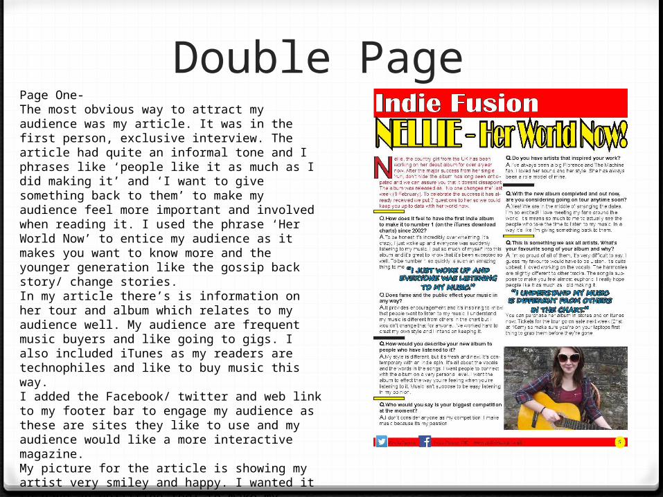
Double Page Page One-The most obvious way to attract my audience was my article. It was in the first person, exclusive interview. The article had quite an informal tone and I phrases like ‘people like it as much as I did making it’ and ‘I want to give something back to them’ to make my audience feel more important and involved when reading it. I used the phrase ‘Her World Now’ to entice my audience as it makes you want to know more and the younger generation like the gossip back story/ change stories. In my article there’s is information on her tour and album which relates to my audience well. My audience are frequent music buyers and like going to gigs. I also included iTunes as my readers are technophiles and like to buy music this way. I added the Facebook/ twitter and web link to my footer bar to engage my audience as these are sites they like to use and my audience would like a more interactive magazine. My picture for the article is showing my artist very smiley and happy. I wanted it to have an uplifting feel to make my audience feel more happy. Her clothing here is very indie appeals to my viewers. The background to my picture is country bricks and links to my opening line ‘country girl’. I did this to make it more of a story which will engager my audience more.

Double PagePage Two-I stuck to the red, blue, black and yellow colour scheme for my article as I knew that it would be attractive. The main focus on this page is the image of my artist. She’s looking at the camera to make it more personal with the reader. Her clothing is very indie with the check shirt, jeans and boots. This would appeal to my audience as its similar to what they would wear. The background is country brick to add more interest and explain more of my artist back story to make it more visually interesting for my audience. I used the splash ‘WIN TICKETS’ in capitals to grab my readers attention and knowing my audience likes going to concerts/ festivals and gigs I knew they would be interested in my competition. I put the winner will ‘be announced on Facebook’ as I know that technology is a big part of my reader lives so this would engage them more.