Embed Size (px)
Citation preview

Magazine Survey

For the font text for my masthead i used
cambria as this was a popular vote.
I used school colours for my magazine as
many people had said it would be more
suitable.

Many people voted for the magazine to be
called ‘Plumnews’ hence why i named the
magazine ‘Plumnews’
I made the layout of my magazine organized
and chose high quality images because this
would attract the audience, as more people
voted for this.

I included a quiz in my school magazine, this
is because it would make the magazine more
entertaining, also more people voted ‘yes’ for
this.
Many people voted for the content to be about
school news, so i decided to do this as it is
more suitable for the magazine.

I had made the information box a
medium size as people thought it
would be more suitable.

I made the masthead bold and bright by adding
a bright colour (red) as many people thought it
would look better.
I didn't add any boarders in my magazine as
more people preferred this.

I added medium sized images in my
magazine as many people voted for this.
I added subheadings above my text as
more people chose this.

Final school magazine
Magazine Evaluation

I had used the font Calibri in the size 72pt and I made
it bold for the mastered, this is because I found it very
suitable for the magazine and the target audience, as
the font is simple and basic which makes the product
look more professional which also has a pleasing
appearance, in addition the size and the type of font
make it is easier to read. Moreover I used the school
magazine to give me inspiration on how to do my
magazine and so therefore I used the features of the
mastered from Plumline and added them to mine as it
includes the colours of the school, which matches the
school colours. Furthermore for the headline I had
used the font Book Antiqua in the size 48pt for the
headline as this strikes the audience’s attention and
intrigues them to look more into the magazine. I had
added a dark red colour for the headline as it is the
colour of the school uniform; in addition the colour isn't
too bright but yet not too dark, it still manages to grabs
the audience’s attention. The headline ‘Expelliarmus!’
Is a quote from Harry potter, which relates to the
information box I included an information box, I use
this to talk about a trip AS students went on, this
makes the magazine look more entertaining and this
gives an overview of what sort of trips students can
get to go on and what opportunities the school gives
to students. The font I have used for the information
box is Calibri, this is something I would change if I
were to do it again as the font is very plain. Moreover I
have added the school website at the bottom of the
page and I filled it in red and the text in white, this
allows people to easily find the contact detail for the
school due to the colour. Furthermore I have also
added the school slogan on the bottom of the page as
this represents the school also the colour red is the
school colour. I have used varieties of colours such
as, red white and blue due to the fact that they are the
school colour, also they are pleasing to both genders
and age group and this fits in with my target audience.
However what I would also change about my
magazine is the information box colour as it’s very
blunt and to improve it I would make it more gradient,
also I would also change the logo that I have used
and instead I would use a smaller one so that it
doesn't look cramped at the top of the page.
I have used four images that focuses’ on the school
buildings and blocks. I have included an image of
Lerner so that people can see how the building
looks like, the lighting of the image is bright and
high quality, this looks appealing to the audience.
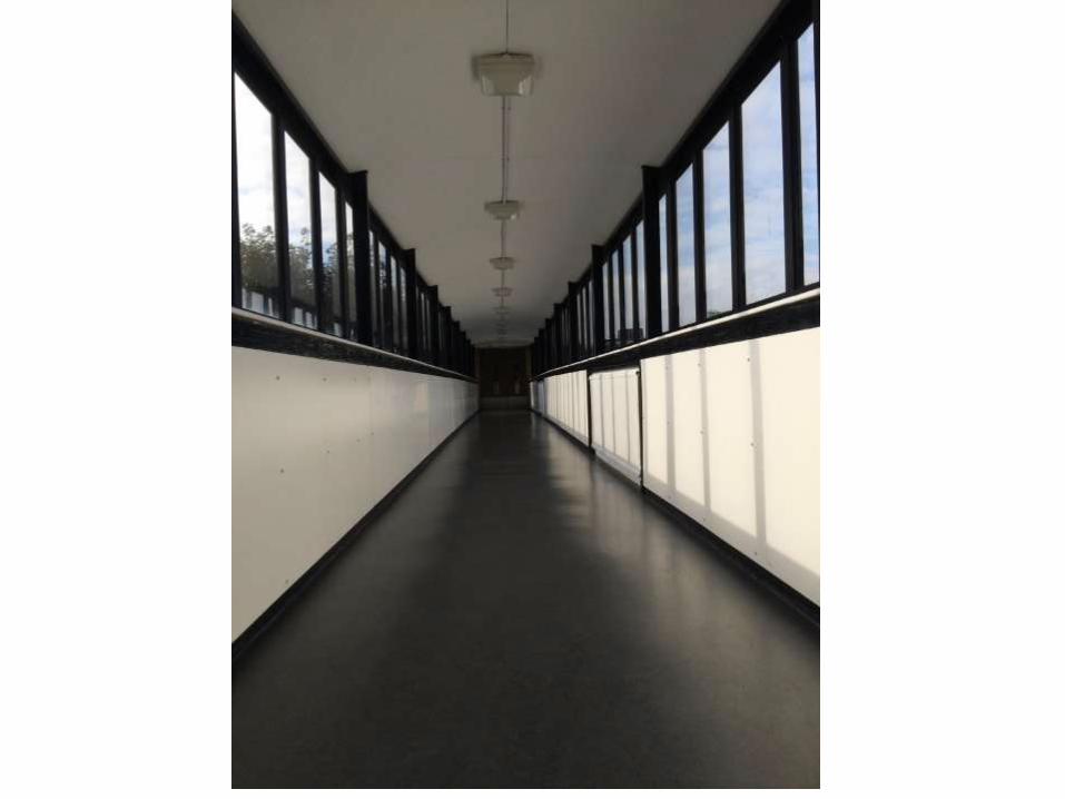
In addition I have taken a low shot angle of the
hallway in Waverly as this creates an illusion effect
which is very eye catching. Furthermore I have
taken a side angle shot of the front entrance of the
sixth form; the lighting is bright and so grabs the
audience's attention this allows people to see what
the front entrance of the sixth form looks like if they
may ever want to visit the school. Lastly I have
added a side angle shot of the school lockers in
Lerner, the lighting is bright and also the image
compliments the colours that have been used in
the magazine; in addition the image clearly shows
how the lockers are like in Lerner. Moreover I have
added captions for each of the images in the font
Calibri size 10pt and in the colour white in italic as
this is easy to read, this shows what or where the
images are taken and this allows the audience to
understand the image, also the caption doesn’t
take way the attention from the images.
The target audience of my media product is aimed
at teenagers and teachers. The magazine focuses
on the school and what goes on, this is so that
student and teachers can have access to find out
what is the latest news. Furthermore people who
may not attend the school can see what the school
is about and what it specializes in. My media
product appeals to the target audience as I have
used colours that are eye-catching but yet formal
as this makes the magazine look professional, this
suits teenagers as well as adults; in addition to this
the colours that have been used are the colours of
the school uniform therefore this is appealing and is
effective to the audience. The layout of my
magazine is organized and simple as this looks
efficient and is easier to operate.

Blocking (planning) school magazine –
hand drawn

Layout 1

Layout 1

Layout 2

Layout 2

Layout 3

Layout 3

Blocking (planning) school magazine
& contents

School logo
Issue
Caption Caption
Caption
Masthead
Headline
Image Image Image
Image
School website School slogan
Caption
main text
Layout 1

Title – contents
School trips
New library
Litter problems
Quiz
After school clubs
New lunch money
Image Image Image Image Image Image
page number
page number
page number
page number
page number
page number
Layout 1

masthead
school slogan logo issue
headline
caption
caption
caption
caption
main text
school website
Layout 2

title (contents)
image image image imageimage image
school trips
new library
new school block
quiz
after school clubs
new lunch menu
page number
page number
page number
page number
page number
page number
Layout 2

masthead
logo issueheadline
image
image
image image
school website school slogan
caption
caption
captioncaption
main text
Layout
3

title (contents)
school trips
new library
new school block
quiz
after school clubs
new lunch menu
page number
page number
page number
page number
page number
page number
image
image
image
image
image
image
Layout 3

Images of the school (used in the
magazine)