Embed Size (px)
Citation preview

The Seven Basic Tools of Quality
Brian Wells, MD, MS, MPH
Today’s Objectives• To familiarize you with the seven basic tools of quality• To provide a foundation for understanding
process/operations management• To provide a common vocabulary when discussing quality
improvement methods


Seven Basic Tools of Quality• The Seven Basic Tools of Quality is a designation given to a fixed set of
graphical techniques identified as being most helpful in troubleshooting issues related to quality.
• The Seven Basic Tools stand in contrast to more advanced statistical methods such as survey sampling, acceptance sampling, statistical hypothesis testing, design of experiments, multivariate analysis, and various methods developed in the field of operations research.
• The seven tools are• Pareto chart• Cause-and-effect diagram (also known as the "fishbone" or Ishikawa
diagram)• Check sheet• Control chart• Histogram• Scatter diagram• Stratification
• Alternates: Flow chart or Run chart)

Pareto Chart• One of the seven basic tools of quality control• Contains both bars and a line graph, where individual values are
represented in descending order by bars, and the cumulative total is represented by the line.
• The left vertical axis is the frequency of occurrence; the right vertical axis is the cumulative percentage of the total number of occurrences

Cause-and-Effect Diagram• Ishikawa diagrams (also called fishbone diagrams,
herringbone diagrams, cause-and-effect diagrams, or Fishikawa) are causal diagrams created by Kaoru Ishikawa (1968) that show the causes of a specific event.
• Known as a fishbone diagram because of its shape, similar to the side view of a fish skeleton.
• It is used to identify possible causes for a problem.• It is also used in root cause analysis (RCA)• Created by first agreeing on the problem statement
(effect), major causes of the problem (branches from the main arrow), asking why each happens and searching for sub-causes.

Ishikawa Diagram• Basic Structure

Ishikawa Diagram• Example:

Check Sheet• The check sheet is a form (document) used to collect data
in real time at the location where the data is generated. The data it captures can be quantitative or qualitative.
• Sometimes referred to as a concentration diagram or location plot
• Is the most basic statistical tool in measuring the frequency of events
• Best used with binary data, i.e. yes/no questions

Using A Check Sheet• Decide what you’re going to measure• Establish the time period during which you will collect
data• Decide whether you need to sample and, if so, what the
sample size should be• In many cases, you will want all relevant events

Check Sheet Example• Tracking Medication Delays
Type of Medication Delay
Morning Evening Night
Physician Ordering
Pharmacist Approval
Transportation
Nurse Administration
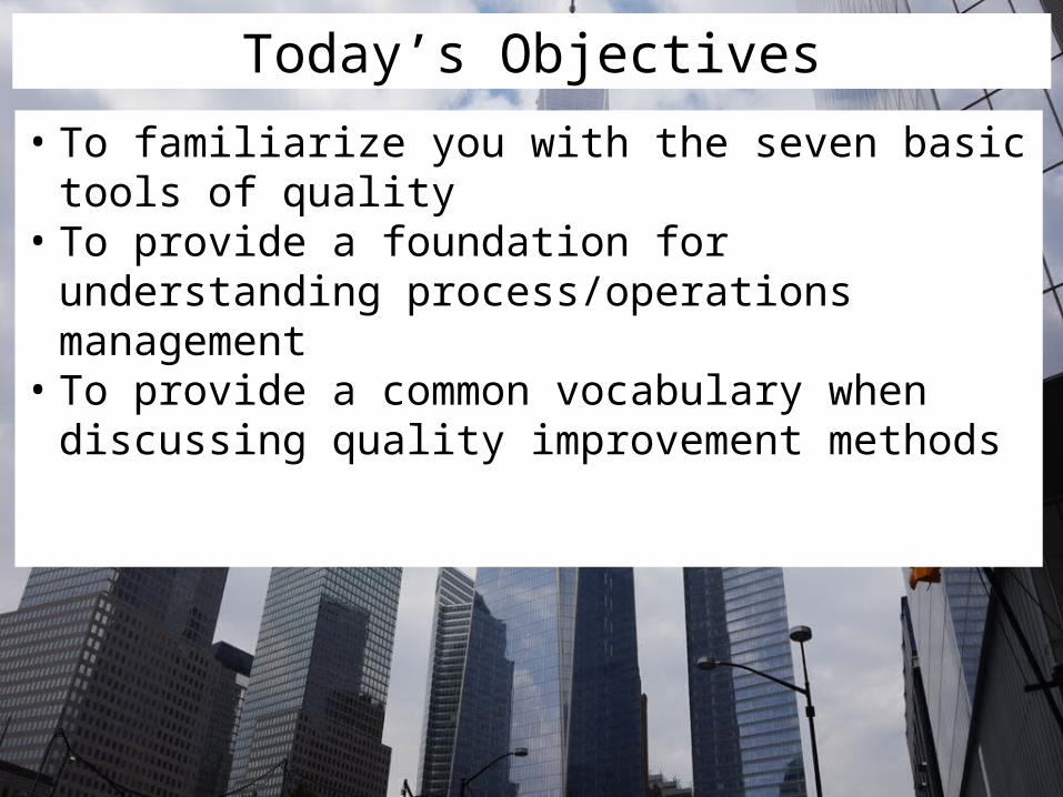
Control Chart• Control charts, also known as Shewhart or process-behavior charts,
in statistical process control are tools used to determine if a manufacturing or business process is in a state of statistical control.
• Each point represents a summary statistic computed from a sample of measurements of a quality characteristic. • For example, the summary statistic might be the average value
of a critical dimension of five items selected at random, or it might be the proportion of nonconforming items in a sample of 100 items.
• The central line on a Shewhart chart indicates the average (expected value) of the summary statistic when the process is in statistical control.
• The upper and lower control limits (UCL and LCL) indicate the range of variation to be expected in the summary statistic

Control Chart Terminology
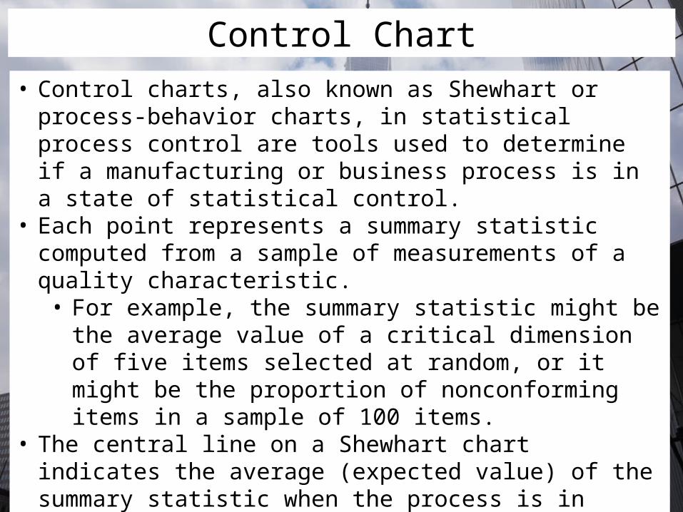
Control Chart Example
Histogram• Also known as frequency distribution• Graphical representation of the distribution of numerical
data• Used to quickly and easily demonstrate a data set’s
distribution• Disadvantage: Does not provide a definitive indication of
a normal distribution

Histogram Example• Histogram analysis could be used to understand the patterns of
variation in electrocardiogram (EKG) turnaround time. The average turnaround time of 8.3 days reveals relatively little information about the performance of the process.

Scatter Diagram• A scatter plot, scatterplot, or scattergraph is a type of
mathematical diagram using Cartesian coordinates to display values for typically two variables for a set of data.
• A scatter plot can be used either when one variable that is under the control of the experimenter and the other depends on it or when both variables are independent.
• If one variable is known or thought to influence the other, it is represented on the horizontal axis.

Scatter Diagram• Generally show one of six possible correlations between
the variables:• Strong positive correlation (Y increases with X)• Strong negative correlation (Y decreases with X)• Weak positive correlation• Weak negative correlation• Complex correlation (Y seems to be related to X, but
the relationship is not easily determined)• No correlation

Scatter Diagram Examples
Stratification• Stratified sampling is a method of sampling from a
population• Stratification is the process of dividing members of the
population into homogeneous subgroups before sampling.
• When subpopulations within an overall population vary, it is advantageous to sample each subpopulation (stratum) independently

Stratification• Advantages over simple random sampling:• If measurements in a strata have less standard
deviation, the stratification gives smaller error in estimation (ex: Amount of Lasix needed in CHF v. general population)
• Measurements are often cheaper/more manageable when population is grouped into strata
• Often desirable to have estimates of population parameters for groups within the population
• Disadvantage: Not useful when the population can not be exhaustively partitioned into subgroups.

Flowchart• Allows one to draw a picture of the way a process actually
works so that one can understand the existing process and develop ideas about how to improve it.
• High-level flowcharts are especially useful in the early phases of a project
• A detailed flowchart is a close-up view of the process, typically showing dozens of steps• These make it easy to identify rework loops and
complexity in the process

Flowchart• Using a flowchart has a variety of benefits:• It helps to clarify complex processes• It identified steps that do not add value to the internal
or external customer• It helps team members gain a shared understanding of
the process and use this knowledge to collect data, identify problems, focus discussions, and identify resources.
• It serves as a basis for designing new processes


Flowchart• Flowchart example:

Run chart• Developed by Shewart to distinguish common cause
variation from special cause variation• Are graphs of data over time and are one of the most
important tools for assessing the effectiveness of change• Have a variety of benefits• Help improvement teams formulate aims by depicting
how well or poorly a process is performing• They help in determining when changes are truly
improvements by displaying a pattern of data that one can observe as one makes changes
• They give direction as one works on improvement and information about the value of particular changes

Run Chart• What makes up a run chart?

Run Chart• What is a run?• One or more consecutive data points on the same side
of the median• Do not include points falling on the median
• Non-random patterns are indicated by• A shift in the data process, or too many data points in
a run (6 or more consecutive points)• A trend (5 or more consecutive points all increasing or
decreasing)• Too many or too few runs• An “astronomical” data point

Run Chart• Run example:

Run Chart• Non-random Patterns

Run chart• Example:


![Seven Tools [Autosaved]](https://img.pdfslide.net/doc/110x75/55cf9af1550346d033a41fc4/seven-tools-autosaved.jpg)