Embed Size (px)
Citation preview
Signs and signifiers
By Emily Johnson
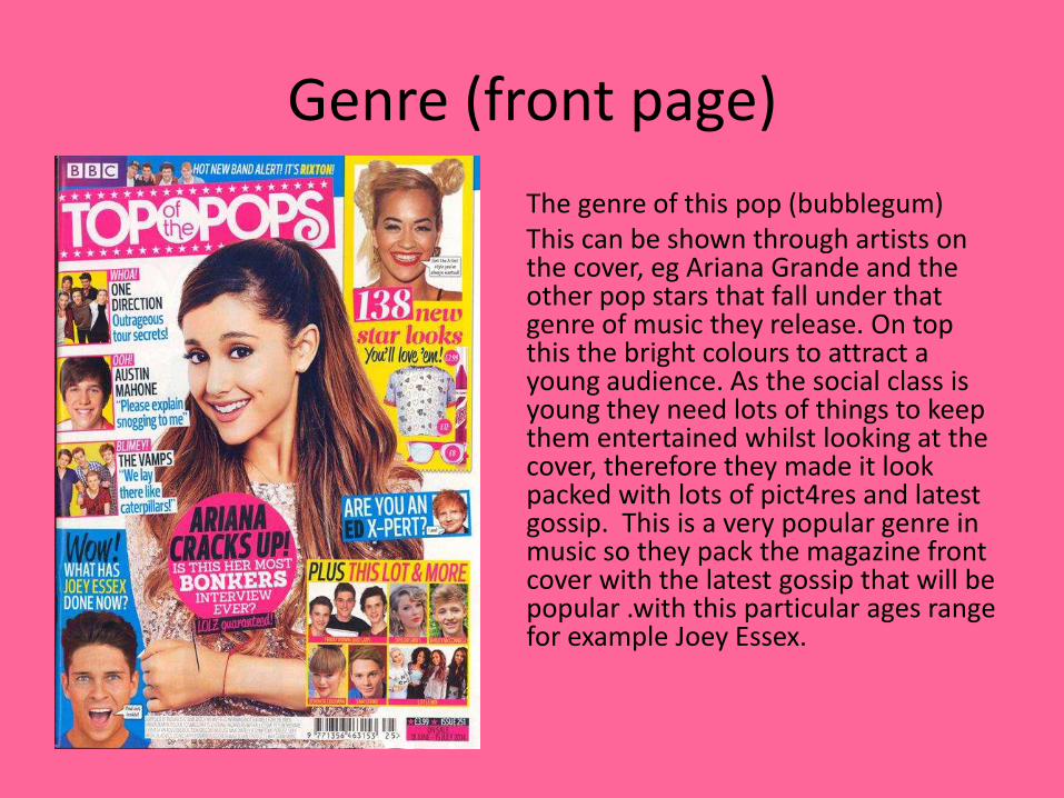
Genre (front page)
The genre of this pop (bubblegum) This can be shown through artists on the cover, eg Ariana Grande and the other pop stars that fall under that genre of music they release. On top this the bright colours to attract a young audience. As the social class is young they need lots of things to keep them entertained whilst looking at the cover, therefore they made it look packed with lots of pict4res and latest gossip. This is a very popular genre in music so they pack the magazine front cover with the latest gossip that will be popular .with this particular ages range for example Joey Essex.
Iconic signs
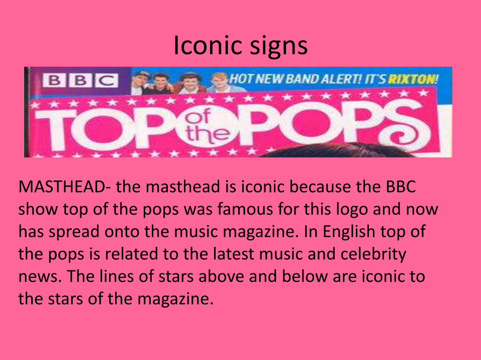
MASTHEAD- the masthead is iconic because the BBC show top of the pops was famous for this logo and now has spread onto the music magazine. In English top of the pops is related to the latest music and celebrity news. The lines of stars above and below are iconic to the stars of the magazine.

Symbolic signs
The colour scheme of this magazine is the bright colours showing a positive magazine and the happy subject they are covering. As it is aimed at younger audience these colours also appeal to them. Pink, appeals to girl, blue, appeals to boy, yellow, unisex. This shows clearly that the magazine appeals to any sex however, through the medium of the celebrities will mainly appeal to girls. The body language on the front cover of the magazine shows that its aimed at girls who are shy. The crossed arms and smiling innocently done by the main image ‘Ariana Grande’. As she is a teen sensation we can see that a girl can blossom. If the audience read the magazine then they can blossom too. This is the proffered reading of the magazine. In which you can become a fashionable young teen if you purchase the magazine.
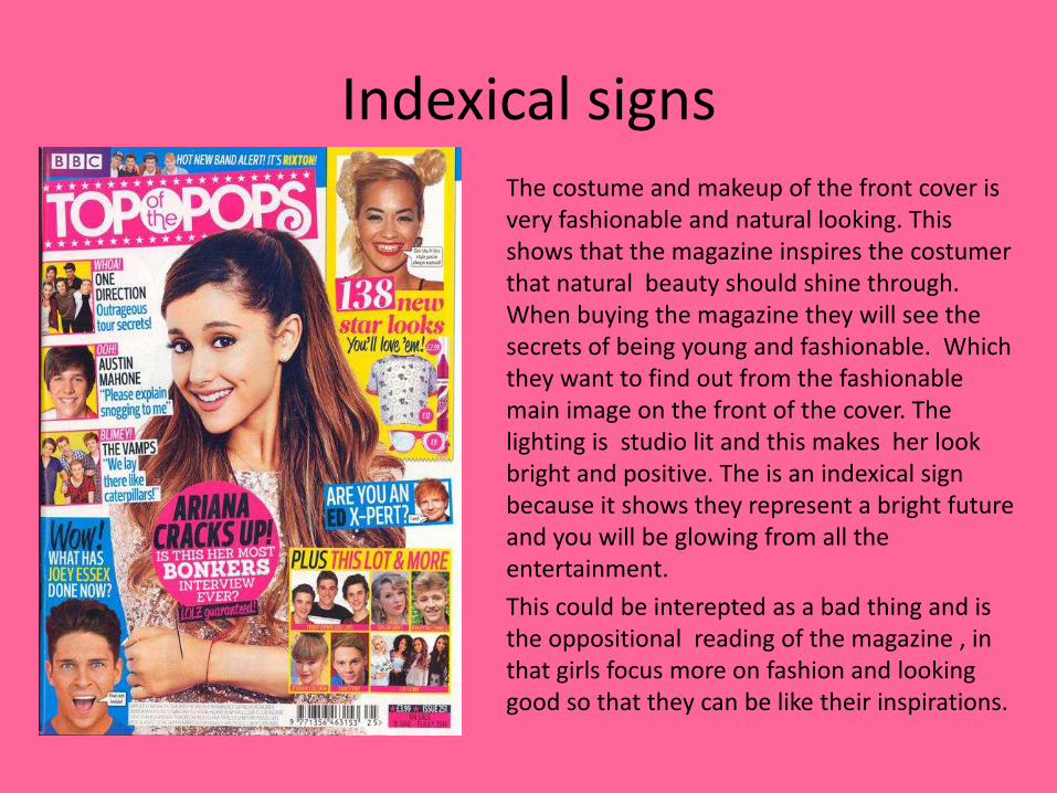
Indexical signsThe costume and makeup of the front cover is very fashionable and natural looking. This shows that the magazine inspires the costumer that natural beauty should shine through. When buying the magazine they will see the secrets of being young and fashionable. Which they want to find out from the fashionable main image on the front of the cover. The lighting is studio lit and this makes her look bright and positive. The is an indexical sign because it shows they represent a bright future and you will be glowing from all the entertainment.
This could be interepted as a bad thing and is the oppositional reading of the magazine , in that girls focus more on fashion and looking good so that they can be like their inspirations.
Genre
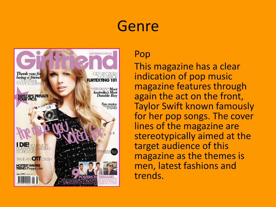
PopThis magazine has a clear indication of pop music magazine features through again the act on the front, Taylor Swift known famously for her pop songs. The cover lines of the magazine are stereotypically aimed at the target audience of this magazine as the themes is men, latest fashions and trends.

Iconic signs
The masthead of ‘girlfriend’ is an iconic sign as it will be on every issue produced. The saying ‘girlfriend’ is used for and by stereotypical females, so clearly shows the target market. The fact that it is superimposed over the main image shows that the magazine wants the mats head to stand out. The typography of the mast head is sans sarif and shows the magazine is very informal. This applies to the fact the target audience is younger.
Symbolic signs
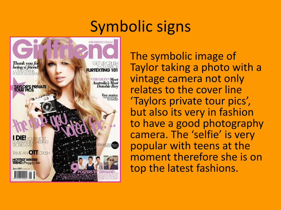
The symbolic image of Taylor taking a photo with a vintage camera not only relates to the cover line ‘Taylors private tour pics’, but also its very in fashion to have a good photography camera. The ‘selfie’ is very popular with teens at the moment therefore she is on top the latest fashions.
Indexical signs
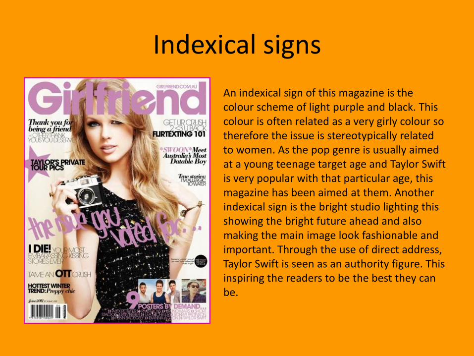
An indexical sign of this magazine is the colour scheme of light purple and black. This colour is often related as a very girly colour so therefore the issue is stereotypically related to women. As the pop genre is usually aimed at a young teenage target age and Taylor Swift is very popular with that particular age, this magazine has been aimed at them. Another indexical sign is the bright studio lighting this showing the bright future ahead and also making the main image look fashionable and important. Through the use of direct address, Taylor Swift is seen as an authority figure. This inspiring the readers to be the best they can be.

Different readings
The preferred reading of this magazine is that you can become successful and fashionable through buying the magazine. The use of the main image of Taylor Swift will inspire that age group. As Taylor was a successful teenage pop star so will inspire the target audience with her story.
The oppositional reading of the magazine is that girls spend too long on their makeup and aren’t inspired to make a difference. By buying the magazine teens, at an age of important educational matters, are distracted by makeup, fashion and boys.
Contents (genre)
Pop
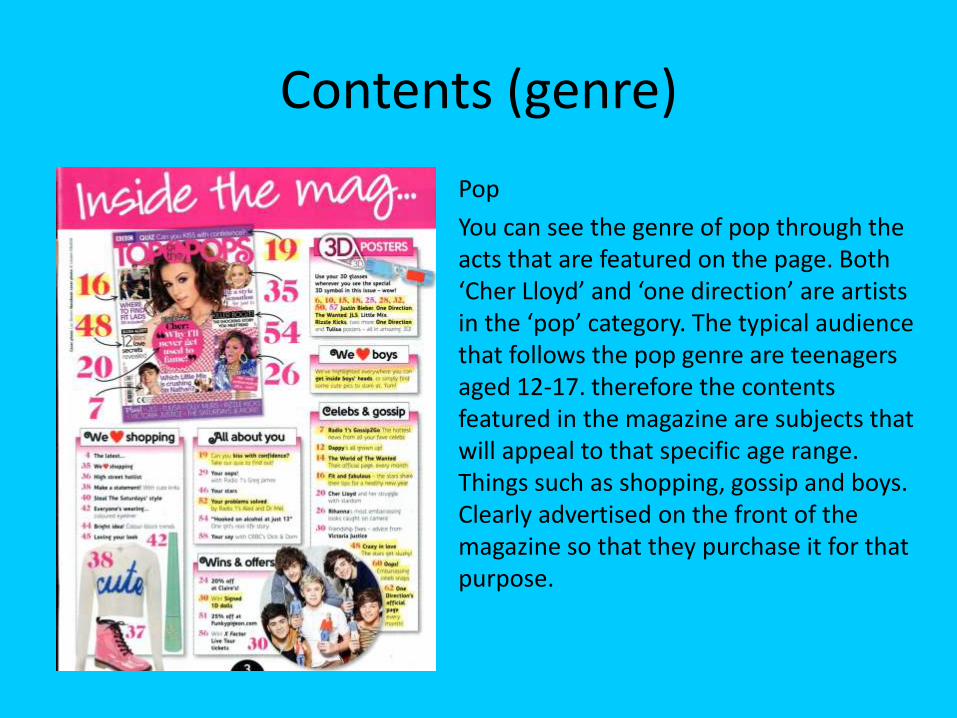
You can see the genre of pop through the acts that are featured on the page. Both ‘Cher Lloyd’ and ‘one direction’ are artists in the ‘pop’ category. The typical audience that follows the pop genre are teenagers aged 12-17. therefore the contents featured in the magazine are subjects that will appeal to that specific age range. Things such as shopping, gossip and boys. Clearly advertised on the front of the magazine so that they purchase it for that purpose.
Iconic signs
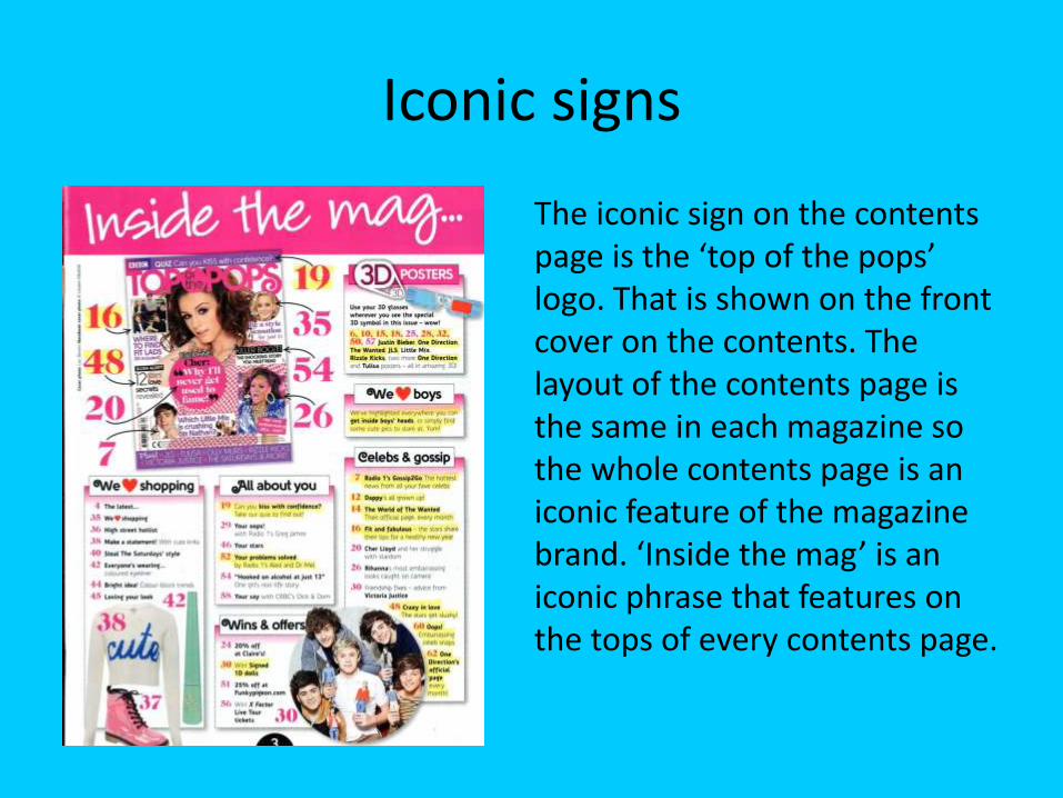
The iconic sign on the contents page is the ‘top of the pops’ logo. That is shown on the front cover on the contents. The layout of the contents page is the same in each magazine so the whole contents page is an iconic feature of the magazine brand. ‘Inside the mag’ is an iconic phrase that features on the tops of every contents page.
Symbolic signs
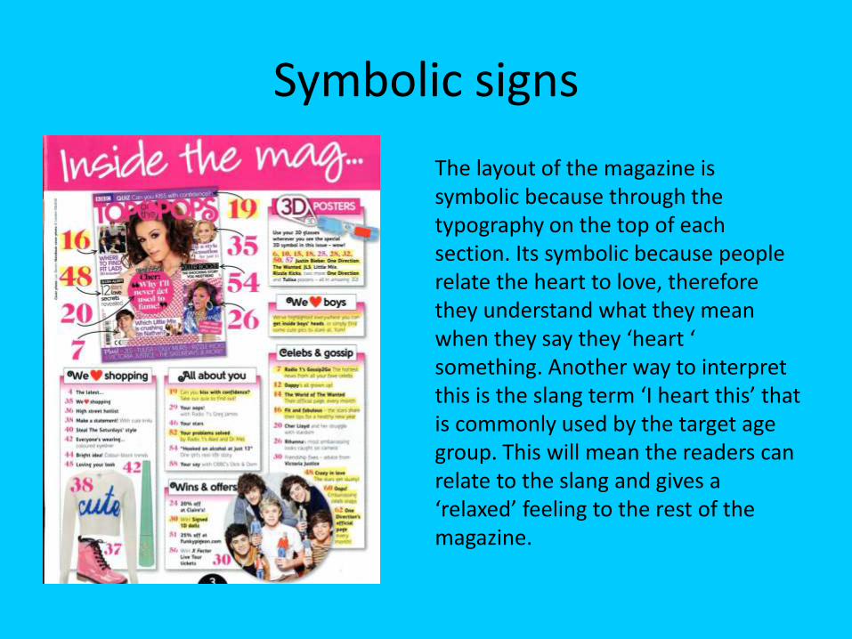
The layout of the magazine is symbolic because through the typography on the top of each section. Its symbolic because people relate the heart to love, therefore they understand what they mean when they say they ‘heart ‘ something. Another way to interpret this is the slang term ‘I heart this’ that is commonly used by the target age group. This will mean the readers can relate to the slang and gives a ‘relaxed’ feeling to the rest of the magazine.

Indexical signs
The indexical signs of this contents page is the colour scheme, through using colours such as pinks and purples. By doing this we can see that this aimed at stereotypical girls through the use of feminine colours. The use of images on the page shows the kind of contents in the magazine such as boy bands and fashion. The use of boy bands shows the interest in this genre of music of this particular age range, with rising boy band one direction.
Different readings
The preferred reading of this magazine is that girls can see the latest gossip and become more fashionable through the latest tips and hints.
The oppositional reading of the magazine is that girls spend too long on their makeup and aren’t inspired to make a difference. By buying the magazine teens, at an age of important educational matters, are distracted by makeup, fashion and boys.
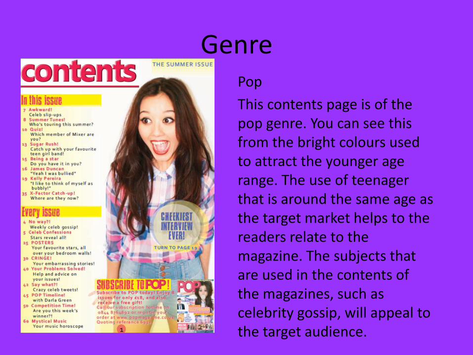
Genre Pop
This contents page is of the pop genre. You can see this from the bright colours used to attract the younger age range. The use of teenager that is around the same age as the target market helps to the readers relate to the magazine. The subjects that are used in the contents of the magazines, such as celebrity gossip, will appeal to the target audience.
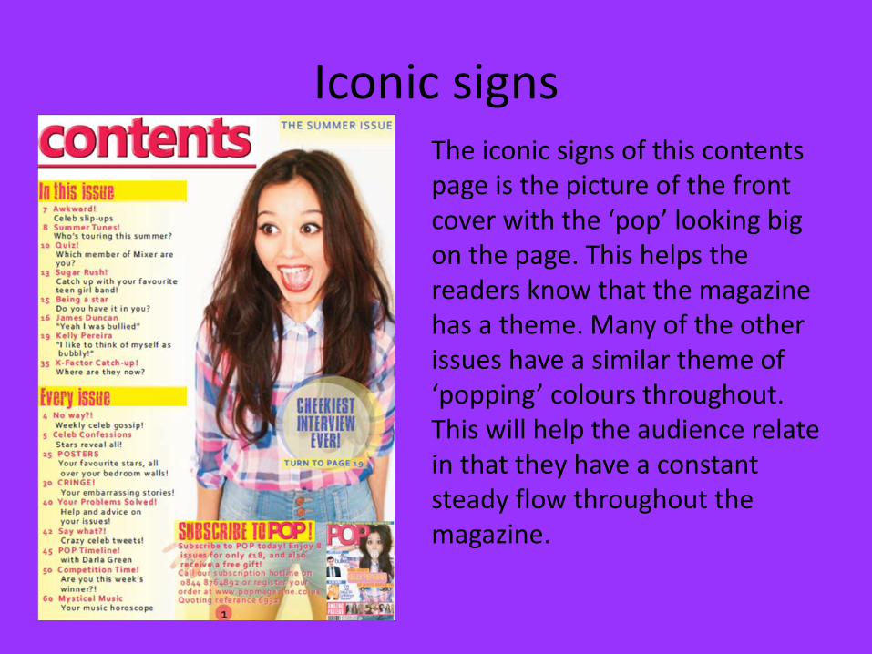
Iconic signsThe iconic signs of this contents page is the picture of the front cover with the ‘pop’ looking big on the page. This helps the readers know that the magazine has a theme. Many of the other issues have a similar theme of ‘popping’ colours throughout. This will help the audience relate in that they have a constant steady flow throughout the magazine.

Symbolic signs
The symbolic signs of this page is the excited smile. It gives the impression that the page and content is really exciting and new. The smile is culturally learnt to relate to excited news. Another is the layout, the superimposed text over the girl shows a more informal approach and relaxes the readers. This is the preferred reading of the magazine.
Indexical signs
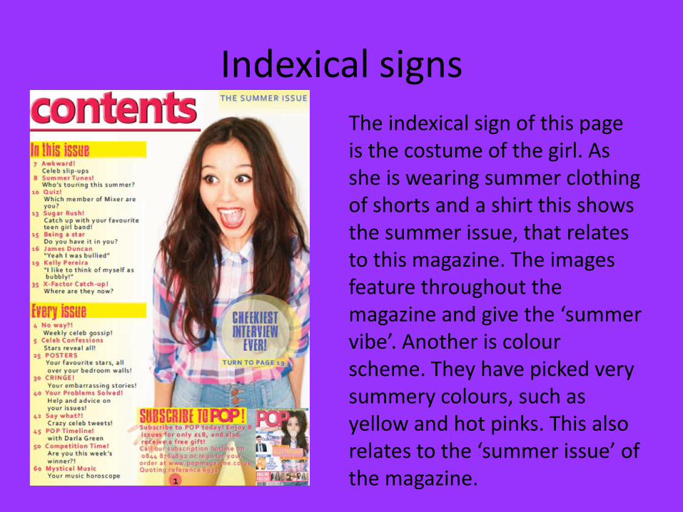
The indexical sign of this page is the costume of the girl. As she is wearing summer clothing of shorts and a shirt this shows the summer issue, that relates to this magazine. The images feature throughout the magazine and give the ‘summer vibe’. Another is colour scheme. They have picked very summery colours, such as yellow and hot pinks. This also relates to the ‘summer issue’ of the magazine.

Different readings
The preferred reading of this page is that girls are relaxed and having fun, whilst being up to date with music and fashion over the summer.
The oppositional reading of this piece of work is that girls spend too much time of their music and fashion than more important things eg studies.
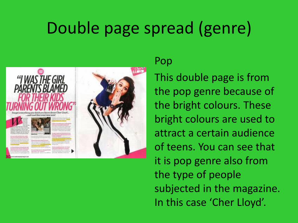
Double page spread (genre)
Pop
This double page is from the pop genre because of the bright colours. These bright colours are used to attract a certain audience of teens. You can see that it is pop genre also from the type of people subjected in the magazine. In this case ‘Cher Lloyd’.
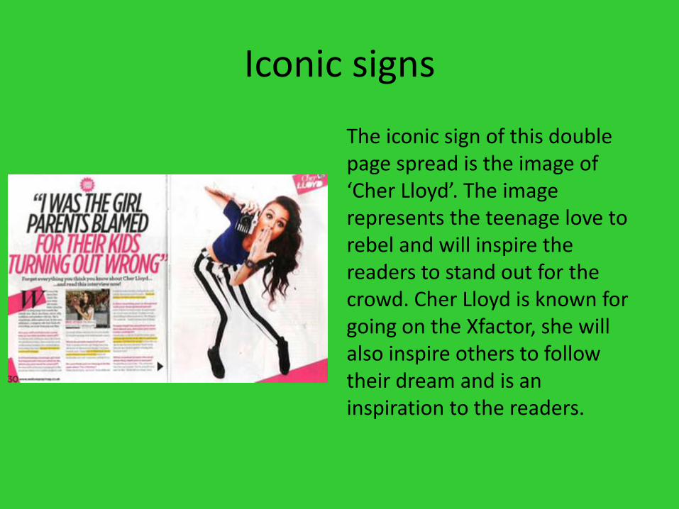
Iconic signs
The iconic sign of this double page spread is the image of ‘Cher Lloyd’. The image represents the teenage love to rebel and will inspire the readers to stand out for the crowd. Cher Lloyd is known for going on the Xfactor, she will also inspire others to follow their dream and is an inspiration to the readers.
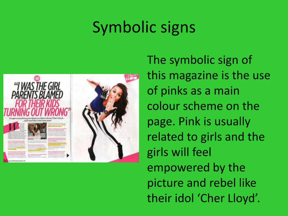
Symbolic signs
The symbolic sign of this magazine is the use of pinks as a main colour scheme on the page. Pink is usually related to girls and the girls will feel empowered by the picture and rebel like their idol ‘Cher Lloyd’.
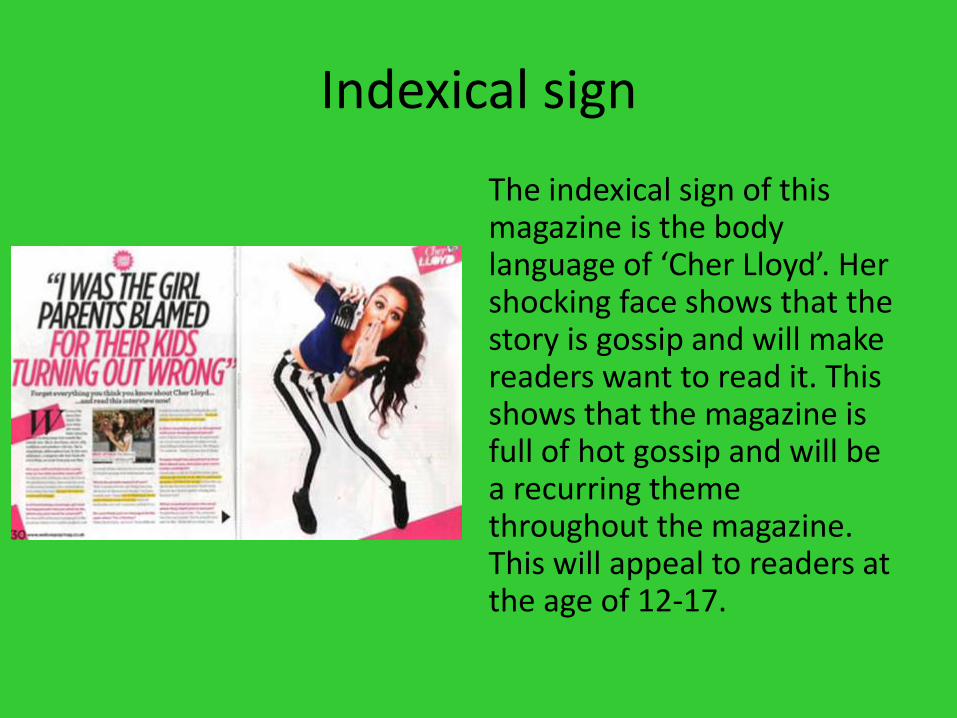
Indexical sign
The indexical sign of this magazine is the body language of ‘Cher Lloyd’. Her shocking face shows that the story is gossip and will make readers want to read it. This shows that the magazine is full of hot gossip and will be a recurring theme throughout the magazine. This will appeal to readers at the age of 12-17.
Different reading
The preferred reading of this magazine is that girls will be inspired to be different and stand out of the crowd when seeing cherlloyds picture.
The oppositional reading is that girls will become rebels and badly behaved instead of focusing on studies.

genre
Pop
The genre of this is pop. You can see this from choice of person to feature on the page, and the use of speak bubbles shows chatty talking. Something popular in pop magazines.
Iconic sign
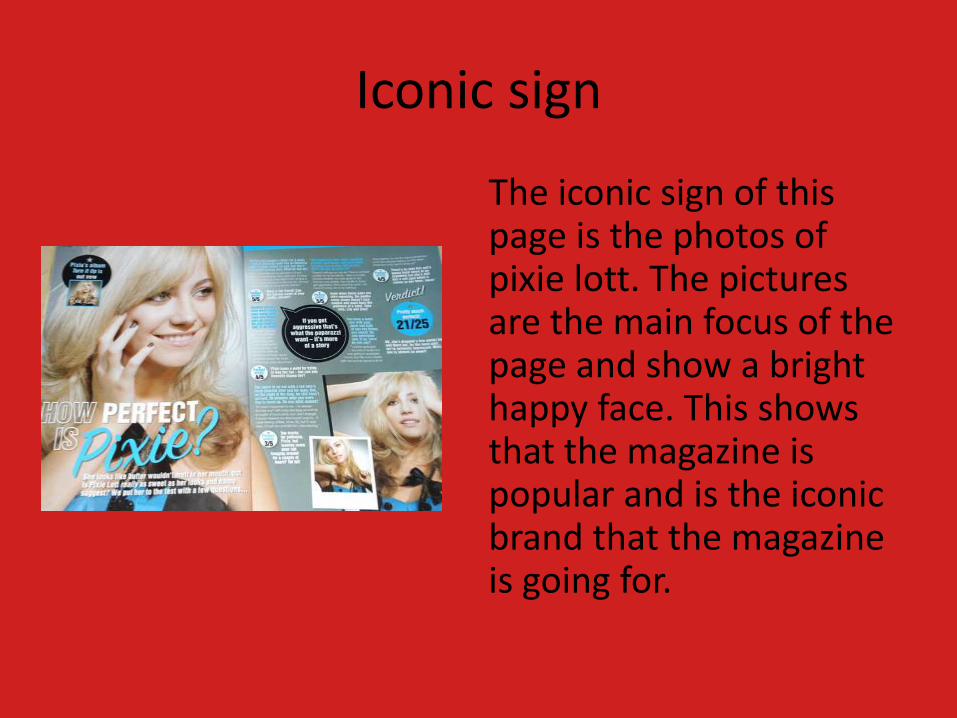
The iconic sign of this page is the photos of pixie lott. The pictures are the main focus of the page and show a bright happy face. This shows that the magazine is popular and is the iconic brand that the magazine is going for.

Symbolic signs
The symbolic sign of this magazine is the use of light blue, the blue makes the page look soft and gentle. This shows the personality of ‘pixie lott’. That is calm and a sweet personality. The perfect use of a pop star instead of a diva, the usual stereotype of a pop star. Using the colour blue says that she is very immature and maybe too young for the industry, this is the oppositional reading of the magazine.

Indexical signs
The indexical sign of this magazine is the use of polaroid photos in the layout. the polaroid is very popular with the teens of today so the use of fashionable images will appeal to the readers. This also shows that the magazine is fashionable. This is the preferred reading of the magazine.;