Embed Size (px)
Citation preview
Social Action and Community Media
Existing Product Research
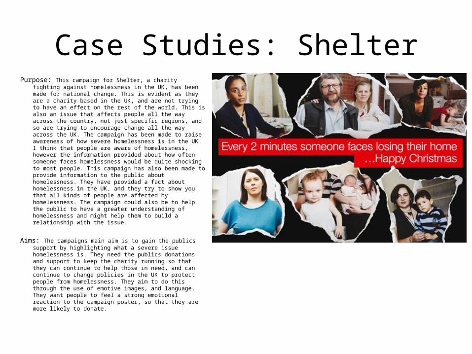
Case Studies: ShelterPurpose: This campaign for Shelter, a charity fighting against
homelessness in the UK, has been made for national change. This is evident as they are a charity based in the UK, and are not trying to have an effect on the rest of the world. This is also an issue that affects people all the way across the country, not just specific regions, and so are trying to encourage change all the way across the UK. The campaign has been made to raise awareness of how severe homelessness is in the UK. I think that people are aware of homelessness, however the information provided about how often someone faces homelessness would be quite shocking to most people. This campaign has also been made to provide information to the public about homelessness. They have provided a fact about homelessness in the UK, and they try to show you that all kinds of people are affected by homelessness. The campaign could also be to help the public to have a greater understanding of homelessness and might help them to build a relationship with the issue.
Aims: The campaigns main aim is to gain the publics support by highlighting what a severe issue homelessness is. They need the publics donations and support to keep the charity running so that they can continue to help those in need, and can continue to change policies in the UK to protect people from homelessness. They aim to do this through the use of emotive images, and language. They want people to feel a strong emotional reaction to the campaign poster, so that they are more likely to donate.
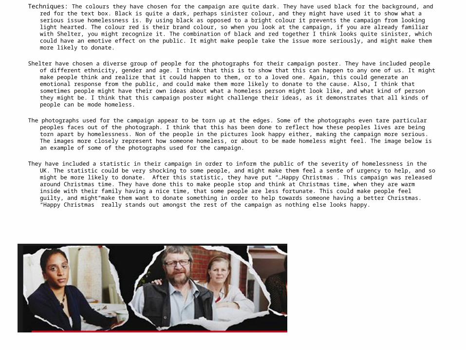
Techniques: The colours they have chosen for the campaign are quite dark. They have used black for the background, and red for the text box. Black is quite a dark, perhaps sinister colour, and they might have used it to show what a serious issue homelessness is. By using black as opposed to a bright colour it prevents the campaign from looking light hearted. The colour red is their brand colour, so when you look at the campaign, if you are already familiar with Shelter, you might recognize it. The combination of black and red together I think looks quite sinister, which could have an emotive effect on the public. It might make people take the issue more seriously, and might make them more likely to donate.
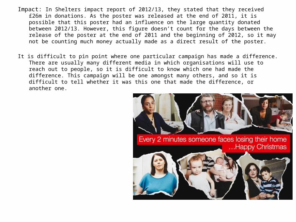
Shelter have chosen a diverse group of people for the photographs for their campaign poster. They have included people of different ethnicity, gender and age. I think that this is to show that this can happen to any one of us. It might make people think and realize that it could happen to them, or to a loved one. Again, this could generate an emotional response from the public, and could make them more likely to donate to the cause. Also, I think that sometimes people might have their own ideas about what a homeless person might look like, and what kind of person they might be. I think that this campaign poster might challenge their ideas, as it demonstrates that all kinds of people can be mode homeless.
The photographs used for the campaign appear to be torn up at the edges. Some of the photographs even tare particular peoples faces out of the photograph. I think that this has been done to reflect how these peoples lives are being torn apart by homelessness. Non of the people in the pictures look happy either, making the campaign more serious. The images more closely represent how someone homeless, or about to be made homeless might feel. The image below is an example of some of the photographs used for the campaign.
They have included a statistic in their campaign in order to inform the public of the severity of homelessness in the UK. The statistic could be very shocking to some people, and might make them feel a sense of urgency to help, and so might be more likely to donate. After this statistic, they have put “…Happy Christmas”. This campaign was released around Christmas time. They have done this to make people stop and think at Christmas time, when they are warm inside with their family having a nice time, that some people are less fortunate. This could make people feel guilty, and might make them want to donate something in order to help towards someone having a better Christmas. “Happy Christmas” really stands out amongst the rest of the campaign as nothing else looks happy.
Impact: In Shelters impact report of 2012/13, they stated that they received £26m in donations. As the poster was released at the end of 2011, it is possible that this poster had an influence on the large quantity donated between 2012/13. However, this figure doesn’t count for the days between the release of the poster at the end of 2011 and the beginning of 2012, so it may not be counting much money actually made as a direct result of the poster.
It is difficult to pin point where one particular campaign has made a difference. There are usually many different media in which organisations will use to reach out to people, so it is difficult to know which one had made the difference. This campaign will be one amongst many others, and so it is difficult to tell whether it was this one that made the difference, or another one.
Case Study: Labour Party Election Campaign
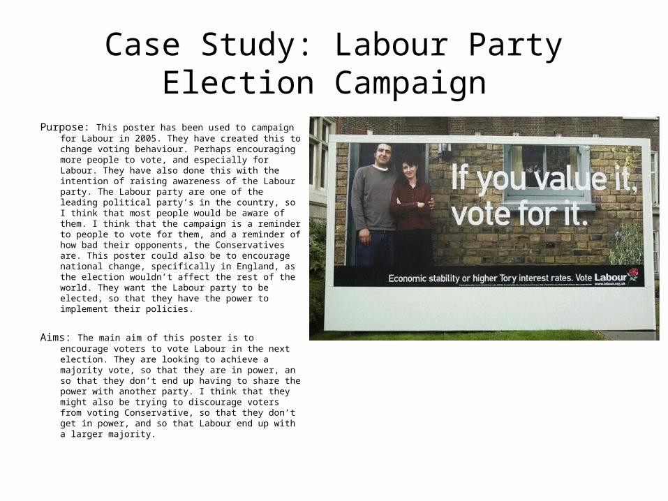
Purpose: This poster has been used to campaign for Labour in 2005. They have created this to change voting behaviour. Perhaps encouraging more people to vote, and especially for Labour. They have also done this with the intention of raising awareness of the Labour party. The Labour party are one of the leading political party’s in the country, so I think that most people would be aware of them. I think that the campaign is a reminder to people to vote for them, and a reminder of how bad their opponents, the Conservatives are. This poster could also be to encourage national change, specifically in England, as the election wouldn’t affect the rest of the world. They want the Labour party to be elected, so that they have the power to implement their policies.
Aims: The main aim of this poster is to encourage voters to vote Labour in the next election. They are looking to achieve a majority vote, so that they are in power, an so that they don’t end up having to share the power with another party. I think that they might also be trying to discourage voters from voting Conservative, so that they don’t get in power, and so that Labour end up with a larger majority.
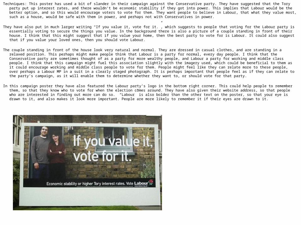
Techniques: This poster has used a bit of slander in their campaign against the Conservative party. They have suggested that the Tory party put up interest rates, and there wouldn’t be economic stability if they got into power. This implies that Labour would be the better option, and so this would encourage voters to vote for them. They want people to believe in Labour, that what they value most, such as a house, would be safe with them in power, and perhaps not with Conservatives in power.
They have also put in much larger writing “If you value it, vote for it.”, which suggests to people that voting for the Labour party is essentially voting to secure the things you value. In the background there is also a picture of a couple standing in front of their house. I think that this might suggest that if you value your home, then the best party to vote for is Labour. It could also suggest that if you value your loved ones, then you should vote Labour.
The couple standing in front of the house look very natural and normal. They are dressed in casual clothes, and are standing in a relaxed position. This perhaps might make people think that Labour is a party for normal, every day people. I think that the Conservative party are sometimes thought of as a party for more wealthy people, and Labour a party for working and middle class people. I think that this campaign might fuel this association slightly with the imagery used, which could be beneficial to them as it could encourage working and middle class people to vote for them. People might feel like they can relate more to these people, over perhaps a Labour MP in a suit in a clearly staged photograph. It is perhaps important that people feel as if they can relate to the party’s campaign, as it will enable them to determine whether they want to, or should vote for that party.
In this campaign poster they have also featured the Labour party’s logo in the bottom right corner. This could help people to remember them, so that they know who to vote for when the election comes around. They have also given their website address, so that people who are interested in finding out more can do so. “Labour” is also bolder than the other text on the poster, so that your eye is drawn to it, and also makes it look more important. People are more likely to remember it if their eyes are drawn to it.
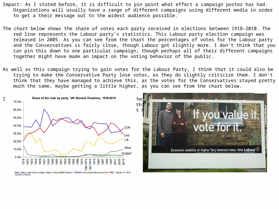
Impact: As I stated before, it is difficult to pin point what effect a campaign poster has had. Organizations will usually have a range of different campaigns using different media in order to get a their message out to the widest audience possible.
The chart below shows the share of votes each party received in elections between 1918-2010. The red line represents the Labour party’s statistics. This Labour party election campaign was released in 2005. As you can see from the chart the percentages of votes for the Labour party and the Conservatives is fairly close, though Labour got slightly more. I don’t think that you can pin this down to one particular campaign, though perhaps all of their different campaigns together might have made an impact on the voting behavior of the public.
As well as this campaign trying to gain votes for the Labour Party, I think that it could also be trying to make the Conservative Party lose votes, as they do slightly criticize them. I don’t think that they have managed to achieve this, as the votes for the Conservatives stayed pretty much the same, maybe getting a little higher, as you can see from the chart below.
In the 2005 election, the turnout of voters in the UK rose by 2% from the previous election in 2001. Again, I don’t think that you can pin this down to this one campaign poster, though perhaps all Labour’s campaigns together might have made an impact of the turnout.
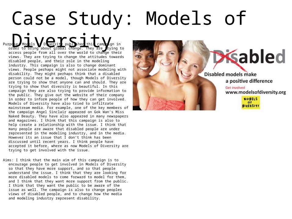
Purpose: Models of Diversity published this campaign in order to bring about global change. They are trying to access people from all over the world to change their views. They are trying to change the attitudes towards disabled people, and their role in the modeling industry. This campaign is also to change dominant views. People perhaps might not associate modeling with disability. They might perhaps think that a disabled person could not be a model, though Models of Diversity are trying to show that anyone can and should. They are trying to show that diversity is beautiful. In this campaign they are also trying to provide information to the public. They give out the website of their company in order to inform people of how they can get involved. Models of Diversity have also tried to infiltrate mainstream media. For example, one of the key members of the campaign Angel Sinclair appeared on Gok Wan’s Miss Naked Beauty. They have also appeared in many newspapers and magazines. I think that this campaign is also to help create a relationship with the issue. I think that many people are aware that disabled people are under represented in the modeling industry, and in the media. However its an issue that I don’t think has been discussed until recent years. I think people have accepted it before, where as now Models of Diversity are trying to get involved with the issue.
Aims: I think that the main aim of this campaign is to encourage people to get involved in Models of Diversity so that they have more support, and so that people understand the issue. I think that they are looking for more disabled models to come forward to model for them, and I think that they want more support from the public. I think that they want the public to be aware of the issue as well. The campaign is also to change peoples views of disabled people, and to change how the media and modeling industry represent disability.
Case Study: Models of Diversity
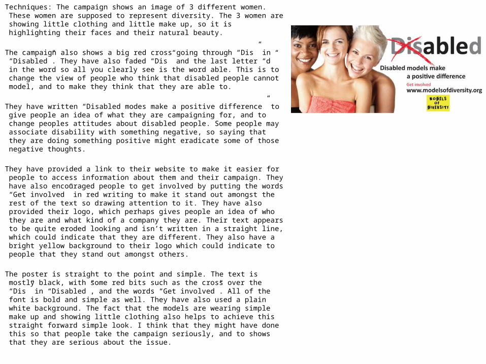
Techniques: The campaign shows an image of 3 different women. These women are supposed to represent diversity. The 3 women are showing little clothing and little make up, so it is highlighting their faces and their natural beauty.
The campaign also shows a big red cross going through “Dis” in “Disabled”. They have also faded “Dis” and the last letter “d” in the word so all you clearly see is the word able. This is to change the view of people who think that disabled people cannot model, and to make they think that they are able to.
They have written “Disabled modes make a positive difference” to give people an idea of what they are campaigning for, and to change peoples attitudes about disabled people. Some people may associate disability with something negative, so saying that they are doing something positive might eradicate some of those negative thoughts.
They have provided a link to their website to make it easier for people to access information about them and their campaign. They have also encouraged people to get involved by putting the words “Get involved” in red writing to make it stand out amongst the rest of the text so drawing attention to it. They have also provided their logo, which perhaps gives people an idea of who they are and what kind of a company they are. Their text appears to be quite eroded looking and isn’t written in a straight line, which could indicate that they are different. They also have a bright yellow background to their logo which could indicate to people that they stand out amongst others.
The poster is straight to the point and simple. The text is mostly black, with some red bits such as the cross over the “Dis” in “Disabled”, and the words “Get involved”. All of the font is bold and simple as well. They have also used a plain white background. The fact that the models are wearing simple make up and showing little clothing also helps to achieve this straight forward simple look. I think that they might have done this so that people take the campaign seriously, and to shows that they are serious about the issue.
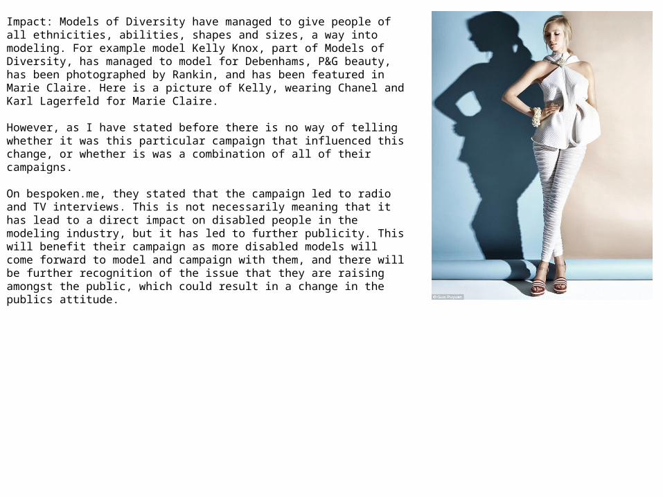
Impact: Models of Diversity have managed to give people of all ethnicities, abilities, shapes and sizes, a way into modeling. For example model Kelly Knox, part of Models of Diversity, has managed to model for Debenhams, P&G beauty, has been photographed by Rankin, and has been featured in Marie Claire. Here is a picture of Kelly, wearing Chanel and Karl Lagerfeld for Marie Claire.
However, as I have stated before there is no way of telling whether it was this particular campaign that influenced this change, or whether is was a combination of all of their campaigns.
On bespoken.me, they stated that the campaign led to radio and TV interviews. This is not necessarily meaning that it has lead to a direct impact on disabled people in the modeling industry, but it has led to further publicity. This will benefit their campaign as more disabled models will come forward to model and campaign with them, and there will be further recognition of the issue that they are raising amongst the public, which could result in a change in the publics attitude.