Embed Size (px)
Citation preview
Mood boards
Aby Jones

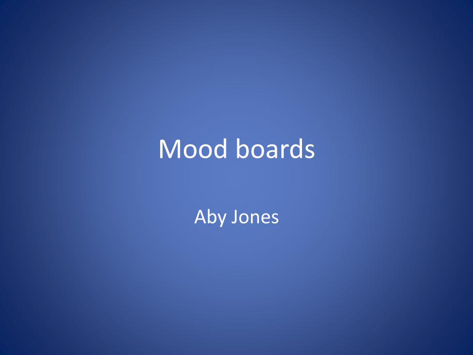
Colour Schemes
6B9A33C4E79A294D00
Greens: Light, Blue/GreenWhen a viewer looks at
green, they’ll immediately relate it with something
environmental
27755278BB9D01331C
Blues: Light, PastelWhen a viewer looks at
blue, they’ll immediately relate it with something to
do with the ocean
2266666BA7A7012C2C
5B657636517B828488
Oranges: Pastel, redWhen a viewer looks at
orange, they’ll immediately relate it with something to
do with the sun
B39A86BA7A47CEC8C3
A85E38973300B99886
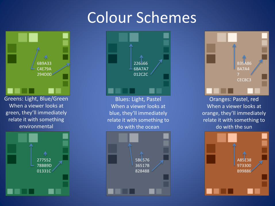
Poster: Marine Litter
dark
Hard hitting images
Clearly showing the problem: litter/pollution
Show/get the point out there that the oceans/beaches/coastal areas are paying the price
Pictures like this show the problem, the state of the water and what’s causing it/whose fighting against it
Use clever techniques like this – it’s gross but it gets the point across
Hidden meanings: looking in to the death of surfing and the state of beaches/coastal areas
Old ideas from the SAS’ previous campaigns will help bring up points and followers/audience will appreciate it
Hard hitting images aimed at more adult audiences: 20+, both genders, national etc.
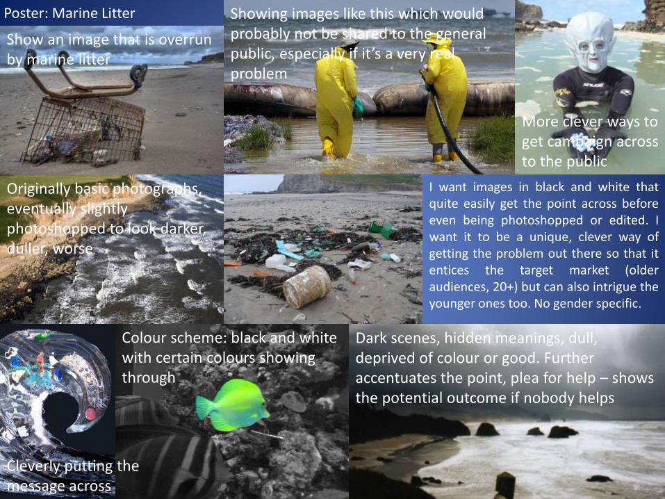
Poster: Marine Litter
Colour scheme: black and white with certain colours showing through
Cleverly putting the message across
Dark scenes, hidden meanings, dull, deprived of colour or good. Further accentuates the point, plea for help – shows the potential outcome if nobody helps
Originally basic photographs, eventually slightly photoshopped to look darker, duller, worse
Showing images like this which would probably not be shared to the general public, especially if it’s a very real problem
Show an image that is overrun by marine litter
More clever ways to get campaign across to the public
I want images in black and white thatquite easily get the point across beforeeven being photoshopped or edited. Iwant it to be a unique, clever way ofgetting the problem out there so that itentices the target market (olderaudiences, 20+) but can also intrigue theyounger ones too. No gender specific.
Poster: Marine Litter
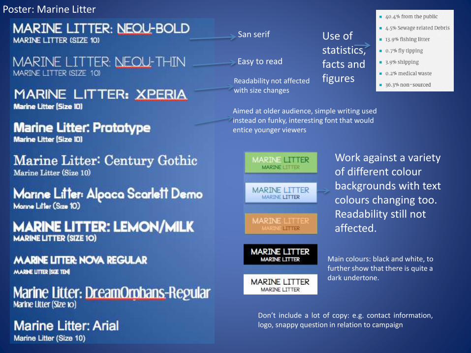
San serif
Easy to read
Readability not affected with size changes
Work against a variety of different colour backgrounds with text colours changing too. Readability still not affected.
Use of statistics, facts and figures
Don’t include a lot of copy: e.g. contact information,logo, snappy question in relation to campaign
Main colours: black and white, to further show that there is quite a dark undertone.
Aimed at older audience, simple writing used instead on funky, interesting font that would entice younger viewers
The common features of this campaign poster includes: dark colours including black andwhite photographs to photographs that have an overall dark look, this can be a lot ofshading or very little light. The images themselves are very similar in the sense that theyare all evidence of marine litter and beaches or parts of the sea that are overrun by thisproblem, they are also all ideas of what I want to include in my own campaign design.The fonts that I have chosen are all san serif fonts, this is so that when seen by a reader -no matter what size the font is – they will be able to read it clearly, not only that but theyare sensible and clean looking, which is what the campaign will be aiming for – it’s a littlebit of imagery, even though there already is some.
I like the images that I have collected, I think they very quickly and easily sum up what itis I’m wanting to achieve and what kind of style I’m going to go for. The fact that I havepicked some images that have hard evidence of marine litter on UK beaches help me tothink of ideas I could come up with that could show that to the audience. I think that theimages I have picked have a very dark tone to them, especially the first picture on thefirst slide, it’s an abandoned swing set on an abandoned beach, if I could capturesomething dark or disturbing like that, it could bring in a lot of the viewers attention.
I’ve included these images and fonts in this mood board because I think they contributeto my future efforts, without the use of a mood board, I wouldn’t be able to think ofideas as quickly as I have when creating these, the content of this is going to be verysimilar to the ones I intend to make/use.
Poster: Marine Litter
Poster : Water Quality
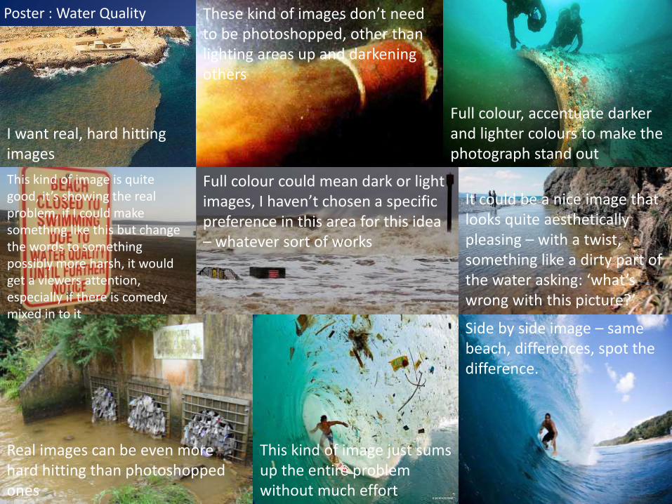
I want real, hard hitting images
These kind of images don’t need to be photoshopped, other than lighting areas up and darkening others
Full colour, accentuate darker and lighter colours to make the photograph stand out
This kind of image is quite good, it’s showing the real problem, if I could make something like this but change the words to something possibly more harsh, it would get a viewers attention, especially if there is comedy mixed in to it
Full colour could mean dark or light images, I haven’t chosen a specific preference in this area for this idea – whatever sort of works
It could be a nice image that looks quite aesthetically pleasing – with a twist, something like a dirty part of the water asking: ‘what’s wrong with this picture?’
Real images can be even more hard hitting than photoshopped ones
This kind of image just sums up the entire problem without much effort
Side by side image – same beach, differences, spot the difference.
Poster : Water Quality
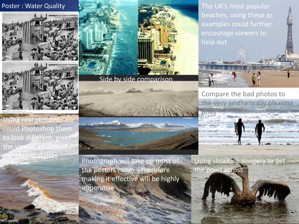
Side by side comparison
The UK’s most popular beaches, using these as examples could further encourage viewers to help out
Using real pictures, could Photoshop them to look different, gives the viewer an idea of the potential risks
Using shocking imagery to get the point across
Photograph will take up most of the posters room – therefore making it effective will be highly imperative
Compare the bad photos to the very aesthetically pleasing ones

Poster : Water Quality
Informing the viewers on the risks associated with bad water quality
Use of both serif and san-serif fonts
Only use 2 fonts –both work with smaller and larger fonts without readability being affected
Some look quite aquatic and water related – further accentuate point
Works against a variety of different colour backgrounds, readability not affected
Main colours, quite bright to show that what the SAS are hoping to achieve is a happy, positive ending with good results
Not a lot of copy: contact information, snappy remark
Spot the difference? Does this look right to you? Etc.
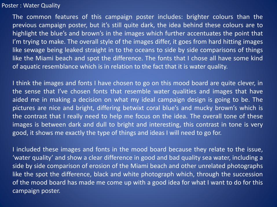
The common features of this campaign poster includes: brighter colours than theprevious campaign poster, but it’s still quite dark, the idea behind these colours are tohighlight the blue’s and brown’s in the images which further accentuates the point thatI’m trying to make. The overall style of the images differ, it goes from hard hitting imageslike sewage being leaked straight in to the oceans to side by side comparisons of thingslike the Miami beach and spot the difference. The fonts that I chose all have some kindof aquatic resemblance which is in relation to the fact that it is water quality.
I think the images and fonts I have chosen to go on this mood board are quite clever, inthe sense that I’ve chosen fonts that resemble water qualities and images that haveaided me in making a decision on what my ideal campaign design is going to be. Thepictures are nice and bright, differing betwixt coral blue’s and mucky brown’s which isthe contrast that I really need to help me focus on the idea. The overall tone of theseimages is between dark and dull to bright and interesting, this contrast in tone is verygood, it shows me exactly the type of things and ideas I will need to go for.
I included these images and fonts in the mood board because they relate to the issue,‘water quality’ and show a clear difference in good and bad quality sea water, including aside by side comparison of erosion of the Miami beach and other unrelated photographslike the spot the difference, black and white photograph which, through the successionof the mood board has made me come up with a good idea for what I want to do for thiscampaign poster.
Poster : Water Quality

Poster : Toxic Chemicals
Dark, hard hitting images
Pictures of deformities that could occur
Pictures that relate to the chemicals being pumped in to the oceans
Frightening images that will intrigue viewers and show them ‘over-the-top’ views on potential risks
Unique, clever representations
Images that cover the entire spectrum of toxic chemicals and their effects, I need to include the chemicals that the SAS are working against, Parabens, Phthalates and Organotins. I need scary, horrific images that are on the verge of being turned away by the ASA but still make the point very clear.
Poster : Toxic Chemicals
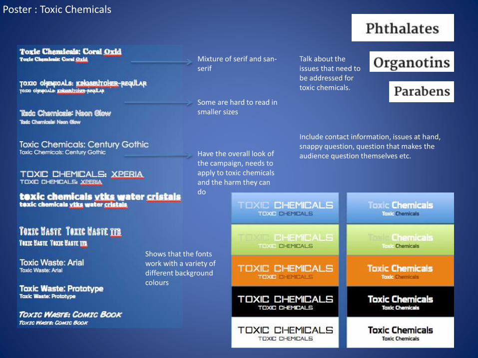
Talk about the issues that need to be addressed for toxic chemicals.
Mixture of serif and san-serif
Some are hard to read in smaller sizes
Have the overall look of the campaign, needs to apply to toxic chemicals and the harm they can do
Shows that the fonts work with a variety of different background colours
Include contact information, issues at hand, snappy question, question that makes the audience question themselves etc.
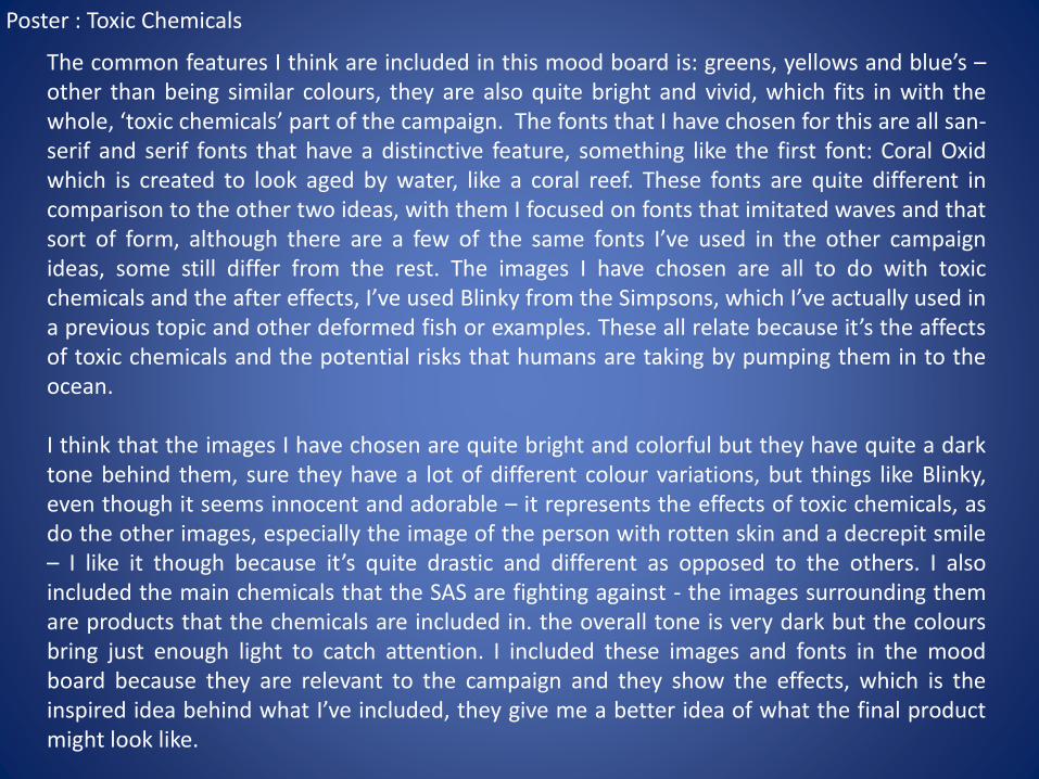
The common features I think are included in this mood board is: greens, yellows and blue’s –other than being similar colours, they are also quite bright and vivid, which fits in with thewhole, ‘toxic chemicals’ part of the campaign. The fonts that I have chosen for this are all san-serif and serif fonts that have a distinctive feature, something like the first font: Coral Oxidwhich is created to look aged by water, like a coral reef. These fonts are quite different incomparison to the other two ideas, with them I focused on fonts that imitated waves and thatsort of form, although there are a few of the same fonts I’ve used in the other campaignideas, some still differ from the rest. The images I have chosen are all to do with toxicchemicals and the after effects, I’ve used Blinky from the Simpsons, which I’ve actually used ina previous topic and other deformed fish or examples. These all relate because it’s the affectsof toxic chemicals and the potential risks that humans are taking by pumping them in to theocean.
I think that the images I have chosen are quite bright and colorful but they have quite a darktone behind them, sure they have a lot of different colour variations, but things like Blinky,even though it seems innocent and adorable – it represents the effects of toxic chemicals, asdo the other images, especially the image of the person with rotten skin and a decrepit smile– I like it though because it’s quite drastic and different as opposed to the others. I alsoincluded the main chemicals that the SAS are fighting against - the images surrounding themare products that the chemicals are included in. the overall tone is very dark but the coloursbring just enough light to catch attention. I included these images and fonts in the moodboard because they are relevant to the campaign and they show the effects, which is theinspired idea behind what I’ve included, they give me a better idea of what the final productmight look like.
Poster : Toxic Chemicals