Embed Size (px)
Citation preview
College of Engineering Engineering Statistics
Department of Dam & Water Resources Lecturer: Goran Adil & Chenar
Pictorial Description of Data Chapter 2-2 22
Chapter 2, Part Two: Pictorial (Graphical Description of Data
Learning outcomes
when you complete this chapter, you should be able to do the following:
1- Understanding graph and charts
2- How to make graph or charts
Graphical Presentation
A graph is a method of presenting statistical data in visual form. The main purpose of any
chart is to give a quick, easy-to-read-and-interpret pictorial representation of data which is
more difficult to obtain from a table or a complete listing of the data.
The type of chart or graphical presentation used and the format of its construction is incidental to its
main purpose. A well-designed graphical presentation can effectively communicate the data's
message in a language readily understood by almost everyone. they can be used to describe
either a sample or a population; quantitative or qualitative data sets.
Some basic rules for the construction of a statistical chart are listed below:
(a) Every graph must have a clear and concise title which gives enough identification of the
graph.
(b) Each scale must have a scale caption indicating the units used.
(c) The zero point should be indicated on the co-ordinate scale. If, however, lack of space makes it
inconvenient to use the zero point line, a scale break may be inserted to indicate its omission.
(d) Each item presented in the graph must be clearly labelled and legible even in black and white
reprint.
College of Engineering Engineering Statistics
Department of Dam & Water Resources Lecturer: Goran Adil & Chenar
Pictorial Description of Data Chapter 2-2 23
Stem-and Leaf Plot
Represents data by separating each value into two parts: the stem (such as the leftmost digit) and the
leaf (such as the rightmost digit).
Example 2.4
Concrete cube test. The following 28-day compressive strengths, in newtons per
square millimetre, were obtained from test results on concrete cubes in England. The
Results are shown in Table 2.4.
Table 2.4: Concrete Cube Test Results
43.3 45.7 45.8 47.3 47.3 47.7 47.7 48.1 48.5 48.5 48.8
49.1 49.3 49.4 49.5 49.5 49.6 50.2 50.5 51.0 51.0 51.1
52.0 52.2 52.5 52.7 52.8 52.9 53.1 53.1 53.4 53.4 53.8
Steam (Tens) Leaves (unit)
College of Engineering Engineering Statistics
Department of Dam & Water Resources Lecturer: Goran Adil & Chenar
Pictorial Description of Data Chapter 2-2 24
HINT
• Data that has at least two digits better exemplifies the value of a stem-leaf plot.
• Cover up the actual data and ask students to read the data from the stem-leaf plot.
• Data should be put in increasing order.
• A stem-leaf plot builds ‘side-ways’ histogram.
• The most common mistake students make when developing stem-leaf plots is leaving out a
‘stem’ if there is no data in that class.
The other mistake is, if there is no data in a class, putting a ‘0’ next to the stem - which, of course,
would indicate a data value with a right digit of ‘0’. Students confuse the use of ‘0’ indicating a
frequency in a frequency table with a ‘0’ in a stem-leaf plot indicating an actual data value.
DOT PLOTS
• Dots represent an actual data value.
• Dots representing the same value are stacked.
• Similar to a histogram in that the distribution of the data is shown
Example 2.5
The following series is the minimum monthly flow (m3 S-l ) in each of the 20 years 1957 to 1976 at
a certain river in United Kingdom.
Table 2.5: minimum monthly flow ( m3 S-l )
21 36 4 16 21 21 23 11 46 10
25 12 9 16 10 6 11 12 17 3
0 5 10 15
20 25
College of Engineering Engineering Statistics
Department of Dam & Water Resources Lecturer: Goran Adil & Chenar
Pictorial Description of Data Chapter 2-2 25
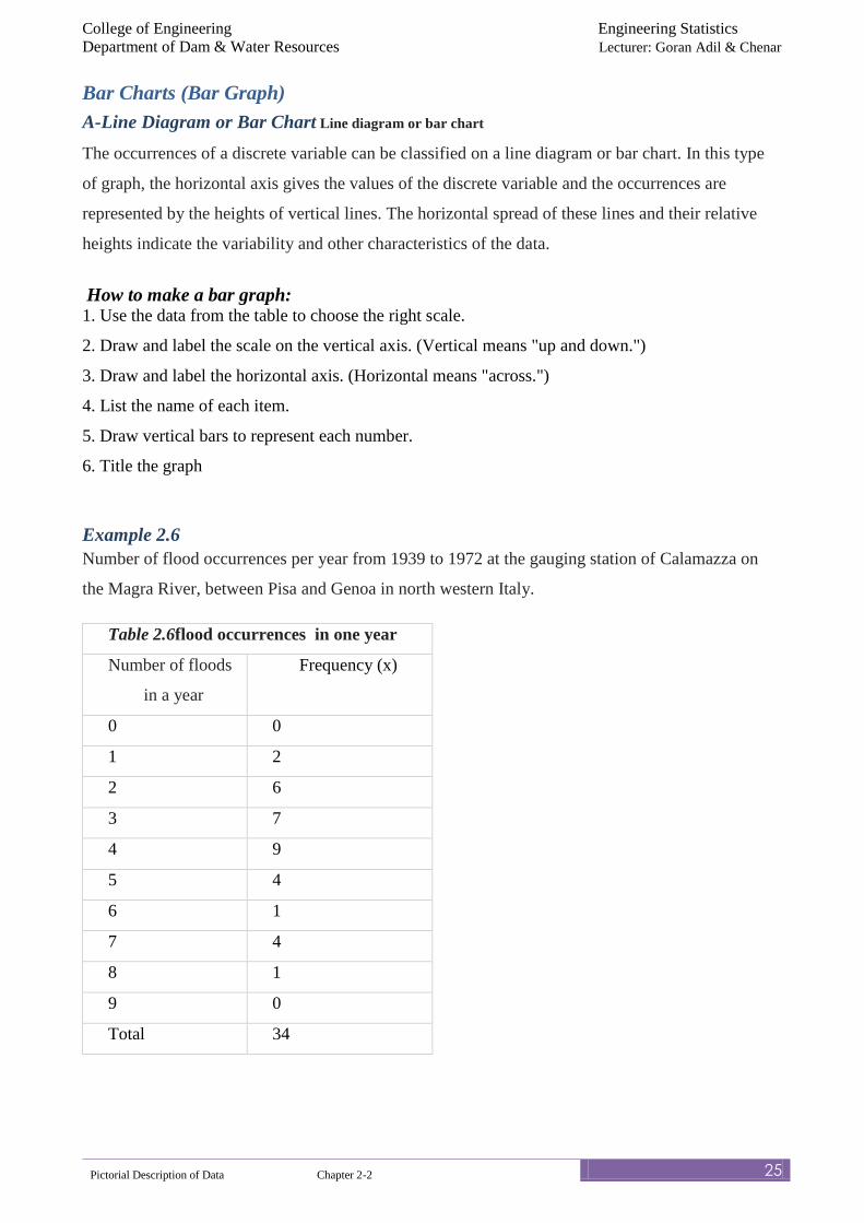
Bar Charts (Bar Graph)
A-Line Diagram or Bar Chart Line diagram or bar chart
The occurrences of a discrete variable can be classified on a line diagram or bar chart. In this type
of graph, the horizontal axis gives the values of the discrete variable and the occurrences are
represented by the heights of vertical lines. The horizontal spread of these lines and their relative
heights indicate the variability and other characteristics of the data.
How to make a bar graph: 1. Use the data from the table to choose the right scale.
2. Draw and label the scale on the vertical axis. (Vertical means "up and down.")
3. Draw and label the horizontal axis. (Horizontal means "across.")
4. List the name of each item.
5. Draw vertical bars to represent each number.
6. Title the graph
Example 2.6
Number of flood occurrences per year from 1939 to 1972 at the gauging station of Calamazza on
the Magra River, between Pisa and Genoa in north western Italy.
Table 2.6flood occurrences in one year
Number of floods
in a year
Frequency (x)
0 0
1 2
2 6
3 7
4 9
5 4
6 1
7 4
8 1
9 0
Total 34
College of Engineering Engineering Statistics
Department of Dam & Water Resources Lecturer: Goran Adil & Chenar
Pictorial Description of Data Chapter 2-2 26
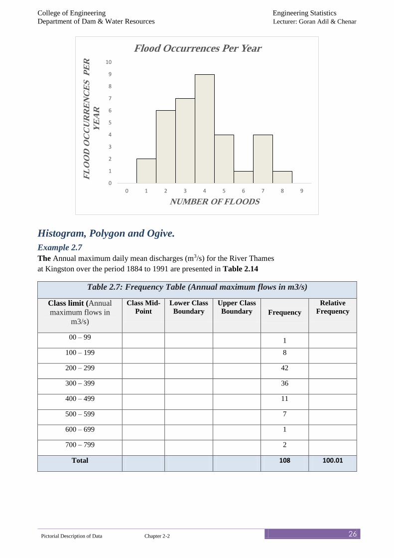
Histogram, Polygon and Ogive.
Example 2.7
The Annual maximum daily mean discharges (m3/s) for the River Thames
at Kingston over the period 1884 to 1991 are presented in Table 2.14
Table 2.7: Frequency Table (Annual maximum flows in m3/s)
Class limit (Annual
maximum flows in
m3/s)
Class Mid-
Point
Lower Class
Boundary
Upper Class
Boundary Frequency
Relative
Frequency
00 – 99 1
100 – 199 8
200 – 299 42
300 – 399 36
400 – 499 11
500 – 599 7
600 – 699 1
700 – 799 2
Total 108 100.01
0
1
2
3
4
5
6
7
8
9
10
0 1 2 3 4 5 6 7 8 9
FL
OO
D O
CC
UR
RE
NC
ES
P
ER
Y
EA
R
NUMBER OF FLOODS
Flood Occurrences Per Year
College of Engineering Engineering Statistics
Department of Dam & Water Resources Lecturer: Goran Adil & Chenar
Pictorial Description of Data Chapter 2-2 27
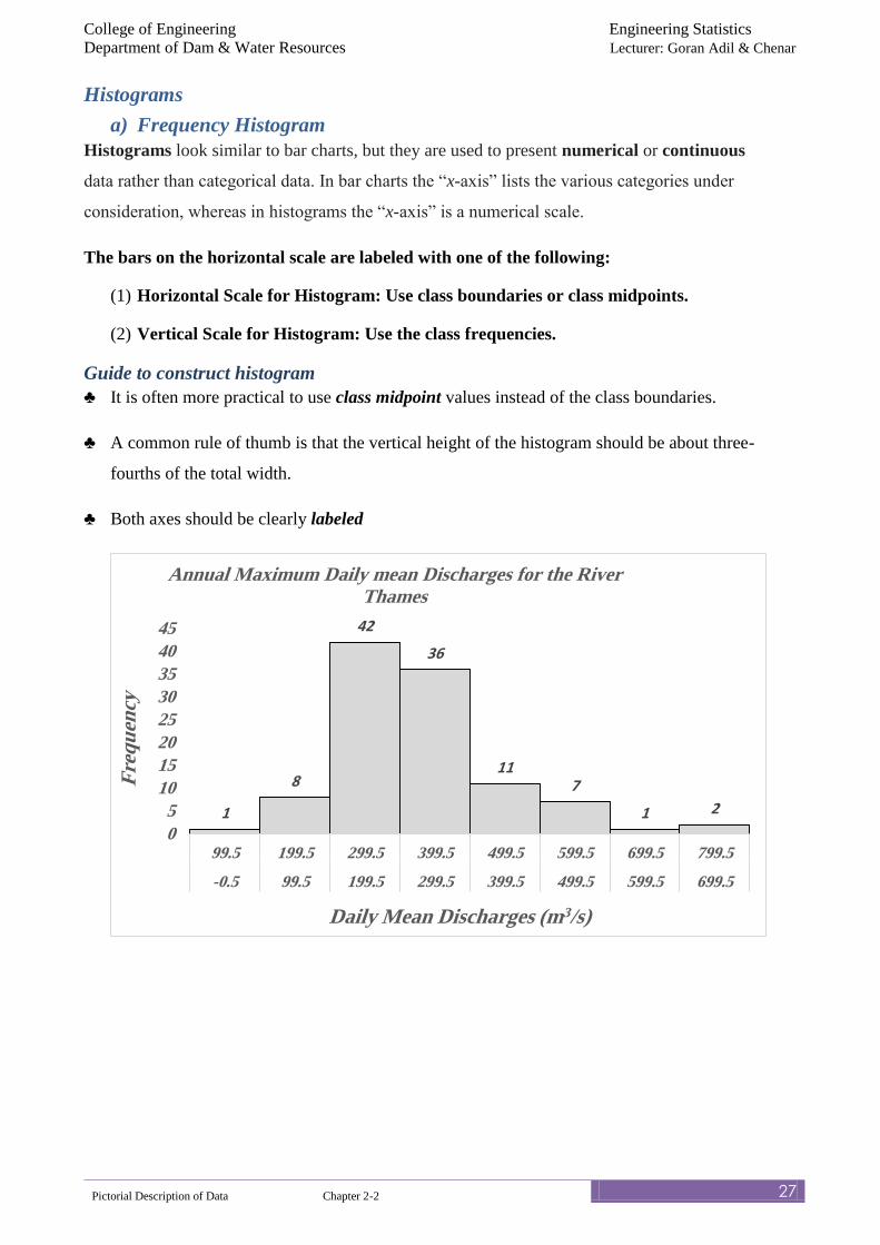
Histograms
a) Frequency Histogram
Histograms look similar to bar charts, but they are used to present numerical or continuous
data rather than categorical data. In bar charts the “x-axis” lists the various categories under
consideration, whereas in histograms the “x-axis” is a numerical scale.
The bars on the horizontal scale are labeled with one of the following:
(1) Horizontal Scale for Histogram: Use class boundaries or class midpoints.
(2) Vertical Scale for Histogram: Use the class frequencies.
Guide to construct histogram
♣ It is often more practical to use class midpoint values instead of the class boundaries.
♣ A common rule of thumb is that the vertical height of the histogram should be about three-
fourths of the total width.
♣ Both axes should be clearly labeled
1
8
42
36
117
1 2
0
5
10
15
20
25
30
35
40
45
99.5 199.5 299.5 399.5 499.5 599.5 699.5 799.5
-0.5 99.5 199.5 299.5 399.5 499.5 599.5 699.5
Fre
qu
ency
Daily Mean Discharges (m3/s)
Annual Maximum Daily mean Discharges for the River Thames
College of Engineering Engineering Statistics
Department of Dam & Water Resources Lecturer: Goran Adil & Chenar
Pictorial Description of Data Chapter 2-2 28
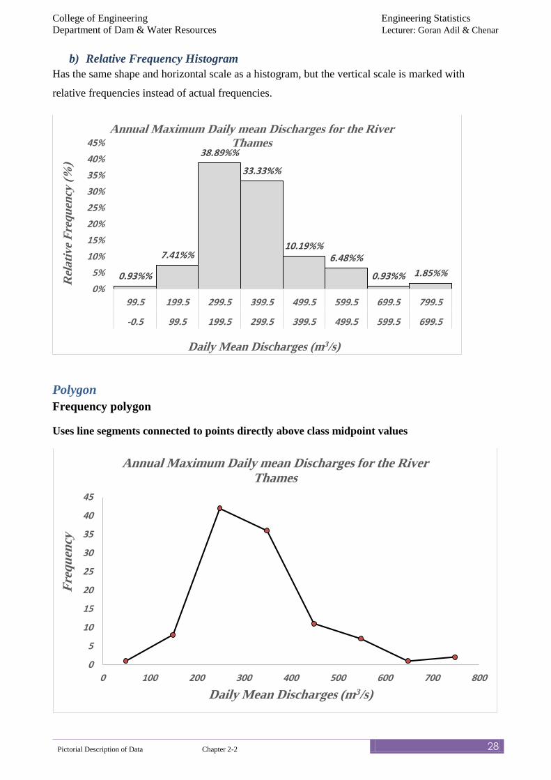
b) Relative Frequency Histogram
Has the same shape and horizontal scale as a histogram, but the vertical scale is marked with
relative frequencies instead of actual frequencies.
Polygon
Frequency polygon
Uses line segments connected to points directly above class midpoint values
0.93%%
7.41%%
38.89%%
33.33%%
10.19%%6.48%%
0.93%% 1.85%%
0%
5%
10%
15%
20%
25%
30%
35%
40%
45%
99.5 199.5 299.5 399.5 499.5 599.5 699.5 799.5
-0.5 99.5 199.5 299.5 399.5 499.5 599.5 699.5
Rel
ati
ve
Fre
qu
ency
(%
)
Daily Mean Discharges (m3/s)
Annual Maximum Daily mean Discharges for the River Thames
0
5
10
15
20
25
30
35
40
45
0 100 200 300 400 500 600 700 800
Fre
qu
ency
Daily Mean Discharges (m3/s)
Annual Maximum Daily mean Discharges for the River Thames
College of Engineering Engineering Statistics
Department of Dam & Water Resources Lecturer: Goran Adil & Chenar
Pictorial Description of Data Chapter 2-2 29
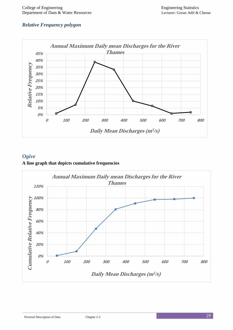
Relative Frequency polygon
Ogive
A line graph that depicts cumulative frequencies
0%
5%
10%
15%
20%
25%
30%
35%
40%
45%
0 100 200 300 400 500 600 700 800
Rel
ati
ve
Fre
qu
ency
Daily Mean Discharges (m3/s)
Annual Maximum Daily mean Discharges for the River Thames
0%
20%
40%
60%
80%
100%
120%
0 100 200 300 400 500 600 700 800
Cu
mu
lati
ve
Rel
ati
ve
Fre
qu
ency
Daily Mean Discharges (m3/s)
Annual Maximum Daily mean Discharges for the River Thames
College of Engineering Engineering Statistics
Department of Dam & Water Resources Lecturer: Goran Adil & Chenar
Pictorial Description of Data Chapter 2-2 30
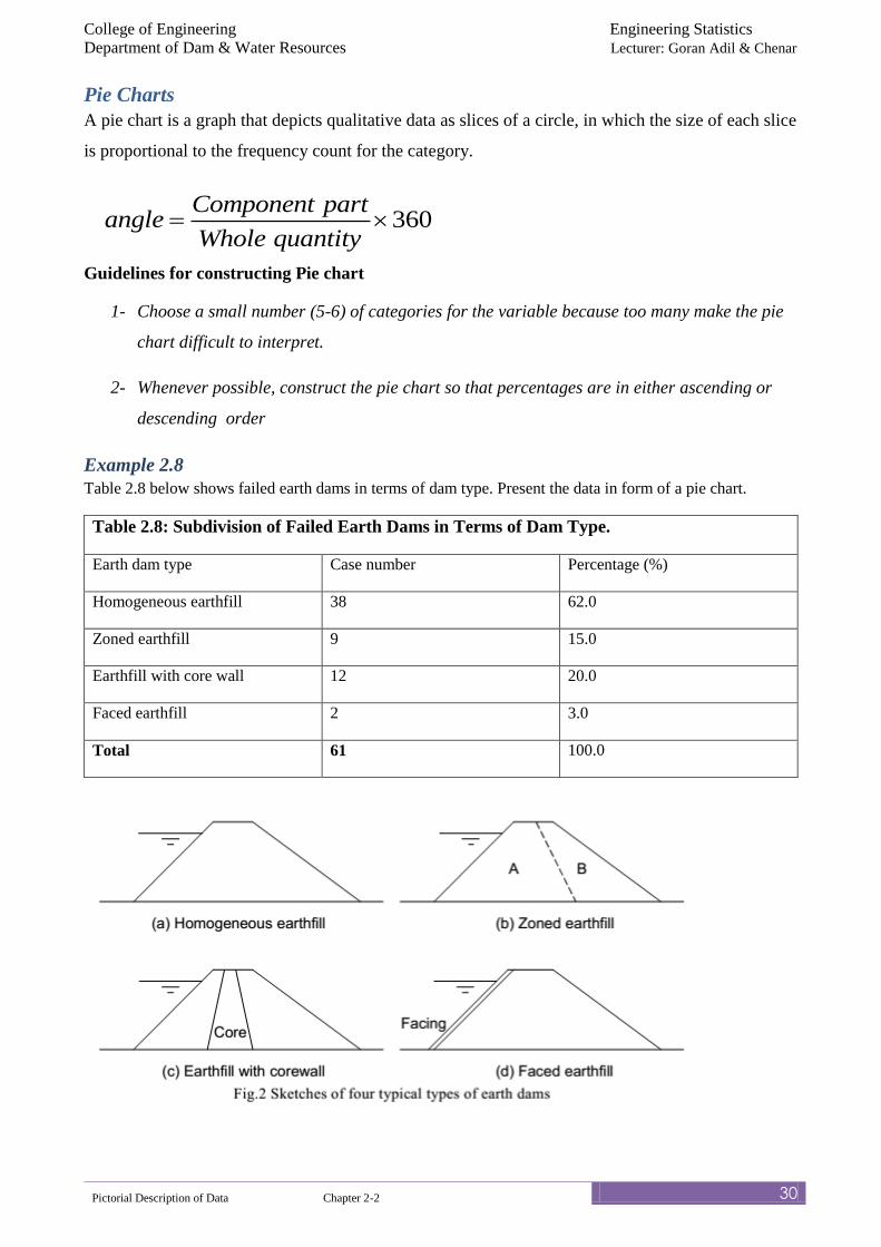
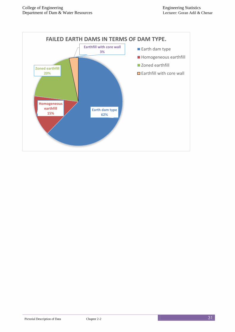
Pie Charts
A pie chart is a graph that depicts qualitative data as slices of a circle, in which the size of each slice
is proportional to the frequency count for the category.
Guidelines for constructing Pie chart
1- Choose a small number (5-6) of categories for the variable because too many make the pie
chart difficult to interpret.
2- Whenever possible, construct the pie chart so that percentages are in either ascending or
descending order
Example 2.8
Table 2.8 below shows failed earth dams in terms of dam type. Present the data in form of a pie chart.
Table 2.8: Subdivision of Failed Earth Dams in Terms of Dam Type.
Earth dam type Case number Percentage (%)
Homogeneous earthfill 38 62.0
Zoned earthfill 9 15.0
Earthfill with core wall 12 20.0
Faced earthfill 2 3.0
Total 61 100.0
360
Component partangle
Whole quantity
College of Engineering Engineering Statistics
Department of Dam & Water Resources Lecturer: Goran Adil & Chenar
Pictorial Description of Data Chapter 2-2 31
Earth dam type 62%
Homogeneous earthfill
15%
Zoned earthfill20%
Earthfill with core wall3%
FAILED EARTH DAMS IN TERMS OF DAM TYPE.
Earth dam type
Homogeneous earthfill
Zoned earthfill
Earthfill with core wall
College of Engineering Engineering Statistics
Department of Dam & Water Resources Lecturer: Goran Adil & Chenar
Pictorial Description of Data Chapter 2-2 32
Tutorial on Frequency Distribution and Pictorial Description of Data
For the following examples,
1- Prepare Frequency Distribution Table for Tutorial 1 to 8, Then
2- Whenever Relevant, present the data in form of
(a) Bar Charts/ multiple/ component bar charts
(b) Histograms and relative frequency Histogram
(c) Frequency Polygon and Relative Frequency Polygon
(d) Ogive (Whenever Relevant)
(e) Stem-and-leaf plot
(f) Dot Plot
(g) Pie Charts
Tutorial 2.1
The following data in Table 2.5 are the annual maximum flows in m3/s in the Colorado River at
Black Canyon for the 52-year period from 1878 to 1929. Prepare Frequency Distribution Table
Table 2.9: The annual maximum flows in m3/s in the Colorado River at Black Canyon for
the 52-year period from 1878 to 1929:
1980 1130 3120 2120 1700 2550 8500 3260 3960 2270
1700 1570 2830 2120 2410 2550 1980 2120 2410 2410
1420 1980 2690 3260 1840 2410 1840 3120 3290 3170
1980 4960 2120 2550 4250 1980 4670 1700 2410 4550
2690 2270 5660 5950 3400 3120 2070 1470 2410 3310
3230 3090
[Adapted from E. J. Gumbel (1954), “Statistical theory of extreme values and
some practical applications,” National Bureau of Standards, Applied
Mathematics Series 33, U.S. Govt. Printing Office, Washington, DC.]
Tutorial 2.2
For the following data shown in Table 2.6, Prepare Frequency Distribution.
Table 2.10: EPA Mileage Rating on 30 Cars Miles Per Gallon
36.3 30.1 40.5 36.2 42.1 38.5 37.5 40.0 35.6 38.8
38.4 37.1 37.0 41.0 36.3 38.6 35.9 40.2 32.9 44.9
39.8 39.9 38.1 34.8 33.9 36.7 37.0 37.1 39.0 40.5
College of Engineering Engineering Statistics
Department of Dam & Water Resources Lecturer: Goran Adil & Chenar
Pictorial Description of Data Chapter 2-2 33
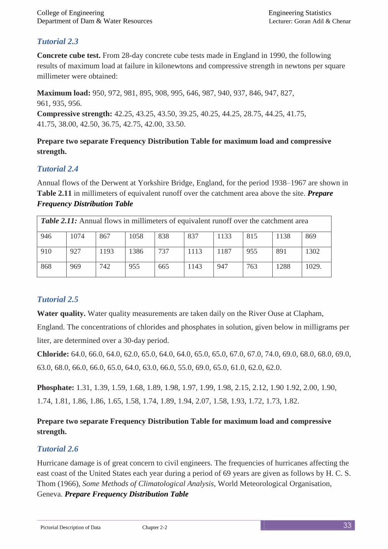
Tutorial 2.3
Concrete cube test. From 28-day concrete cube tests made in England in 1990, the following
results of maximum load at failure in kilonewtons and compressive strength in newtons per square
millimeter were obtained:
Maximum load: 950, 972, 981, 895, 908, 995, 646, 987, 940, 937, 846, 947, 827,
961, 935, 956.
Compressive strength: 42.25, 43.25, 43.50, 39.25, 40.25, 44.25, 28.75, 44.25, 41.75,
41.75, 38.00, 42.50, 36.75, 42.75, 42.00, 33.50.
Prepare two separate Frequency Distribution Table for maximum load and compressive
strength.
Tutorial 2.4
Annual flows of the Derwent at Yorkshire Bridge, England, for the period 1938–1967 are shown in
Table 2.11 in millimeters of equivalent runoff over the catchment area above the site. Prepare
Frequency Distribution Table
Table 2.11: Annual flows in millimeters of equivalent runoff over the catchment area
946 1074 867 1058 838 837 1133 815 1138 869
910 927 1193 1386 737 1113 1187 955 891 1302
868 969 742 955 665 1143 947 763 1288 1029.
Tutorial 2.5
Water quality. Water quality measurements are taken daily on the River Ouse at Clapham,
England. The concentrations of chlorides and phosphates in solution, given below in milligrams per
liter, are determined over a 30-day period.
Chloride: 64.0, 66.0, 64.0, 62.0, 65.0, 64.0, 64.0, 65.0, 65.0, 67.0, 67.0, 74.0, 69.0, 68.0, 68.0, 69.0,
63.0, 68.0, 66.0, 66.0, 65.0, 64.0, 63.0, 66.0, 55.0, 69.0, 65.0, 61.0, 62.0, 62.0.
Phosphate: 1.31, 1.39, 1.59, 1.68, 1.89, 1.98, 1.97, 1.99, 1.98, 2.15, 2.12, 1.90 1.92, 2.00, 1.90,
1.74, 1.81, 1.86, 1.86, 1.65, 1.58, 1.74, 1.89, 1.94, 2.07, 1.58, 1.93, 1.72, 1.73, 1.82.
Prepare two separate Frequency Distribution Table for maximum load and compressive
strength.
Tutorial 2.6
Hurricane damage is of great concern to civil engineers. The frequencies of hurricanes affecting the
east coast of the United States each year during a period of 69 years are given as follows by H. C. S.
Thom (1966), Some Methods of Climatological Analysis, World Meteorological Organisation,
Geneva. Prepare Frequency Distribution Table
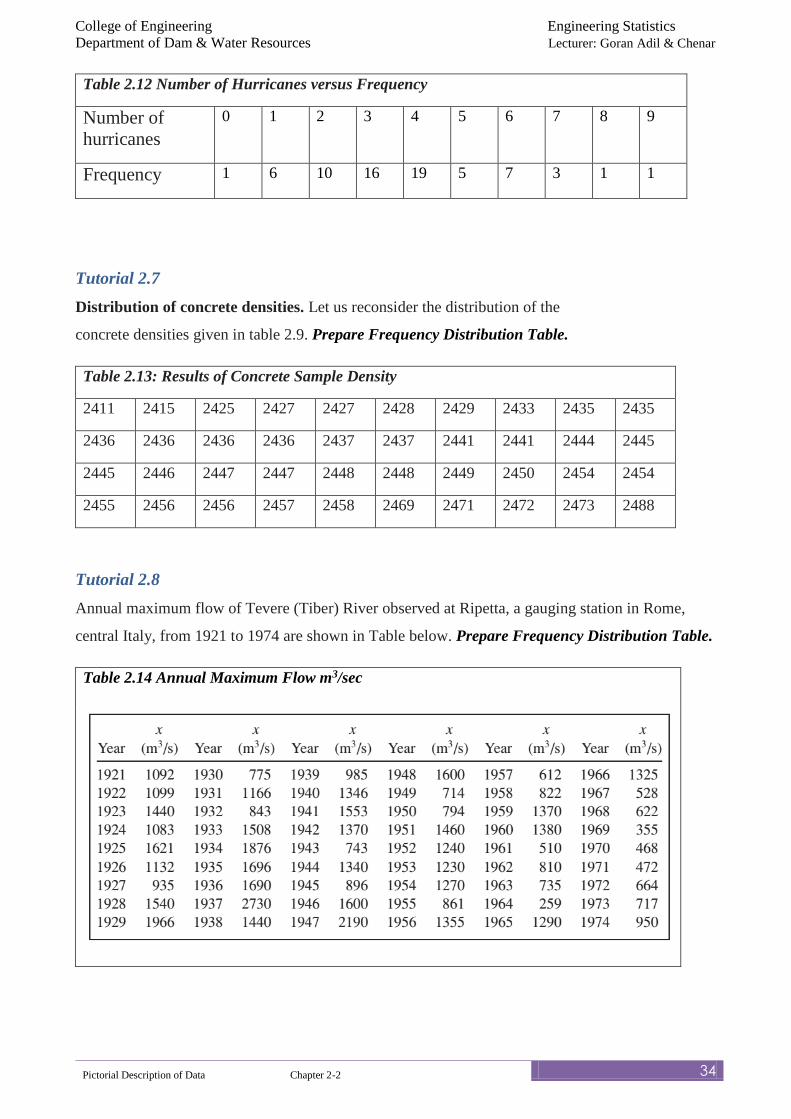
College of Engineering Engineering Statistics
Department of Dam & Water Resources Lecturer: Goran Adil & Chenar
Pictorial Description of Data Chapter 2-2 34
Table 2.12 Number of Hurricanes versus Frequency
Number of
hurricanes
0 1 2 3 4 5 6 7 8 9
Frequency 1 6 10 16 19 5 7 3 1 1
Tutorial 2.7
Distribution of concrete densities. Let us reconsider the distribution of the
concrete densities given in table 2.9. Prepare Frequency Distribution Table.
Table 2.13: Results of Concrete Sample Density
2411 2415 2425 2427 2427 2428 2429 2433 2435 2435
2436 2436 2436 2436 2437 2437 2441 2441 2444 2445
2445 2446 2447 2447 2448 2448 2449 2450 2454 2454
2455 2456 2456 2457 2458 2469 2471 2472 2473 2488
Tutorial 2.8
Annual maximum flow of Tevere (Tiber) River observed at Ripetta, a gauging station in Rome,
central Italy, from 1921 to 1974 are shown in Table below. Prepare Frequency Distribution Table.
Table 2.14 Annual Maximum Flow m3/sec
![CONVOCATORIA PICT 2018 PROYECTOS NO ADMISIBLES … DA PICT 2018 PROYECTOS NO ADMISIBLES.pdfy Pesquera Instituto Nacional de Tecnología Agropecuaria [INTA] PICT-2018-00615 Equipo de](https://img.pdfslide.net/doc/110x75/5e6de1c9589a1c5e2503a7c2/convocatoria-pict-2018-proyectos-no-admisibles-da-pict-2018-proyectos-no-admisiblespdf.jpg)