Embed Size (px)
Citation preview
The contents page for NME and most other magazine use images in their contents page. They do this because it gives them a better insight as to what is going to be inside the magazine. It also highlights what is interesting about the magazine and what they are focussing on. NME have done this here by putting the lead singer from The Wombats in the centre who is recognisable and readers are probably interested in. NME have obviously used text that links to the image and gives you more of an insight.
Even though there is a lot of information available on this contents page, the layout of it means that it is still clearly readable for the reader to use and take in information.
The colours used for this contents page are very simple and plain. However this works because it looks more professional and informative. This also links to the front cover of the magazine and the genre/style of the magazine.
Because NME use so much information in their contents page, I feel that i do not want to use this technique. This is because they overload it with information and sometimes you do not take it all in.
The main tag line ‘INSIDE THIS WEEK’ does not link to the masthead on the cover as it is a completely different font and colour. This is something that I am not going to do for my contents page as I believe it should be the same theme throughout the magazine.
NME magazine generally use indie/fashionable/detailed photographs for their contents page. This is because it suits the genre of audience that it aims at. It does not just focus on one story but a handful of others so there’s more variety
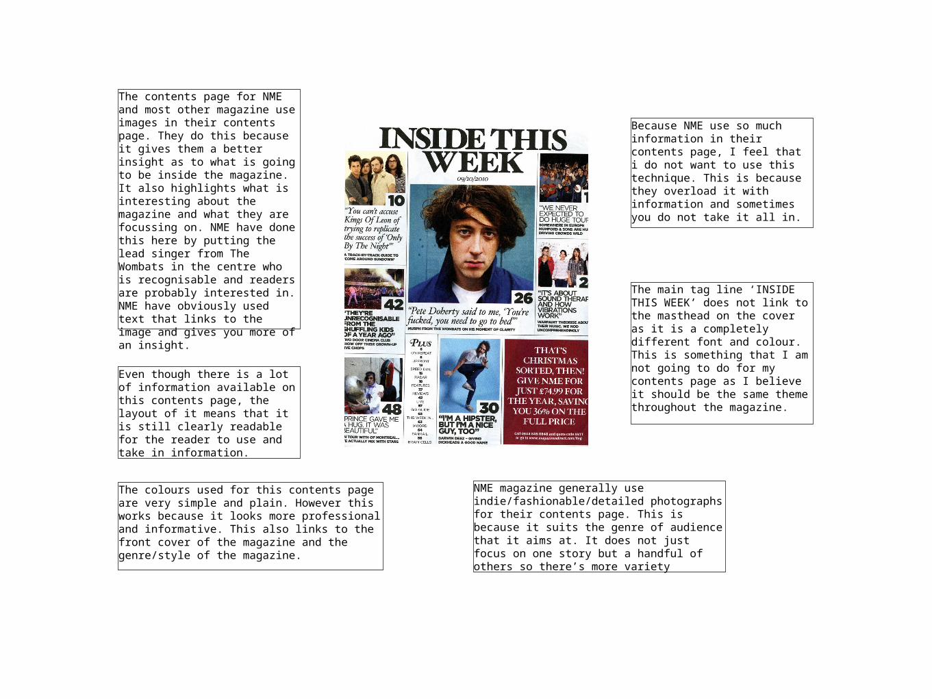
The title of the magazine Q is headlined at the top along with the contents headline. As you can see they are in a big text highlighting the fact that they are important because they are at the top in big bold text. Q is also in a red box which follow the Q logo on the cover associating the colours red and white together with black text.
The main column on the contents page is the features section, which presents the main features inside the magazine. It also has a brief description of what the feature is about. The features column uses the colours red, white and black. The red banner behind it draws more attention to the headline.
In the bottom left hand corner there is an every month information column showing what features they have inside the magazine in every month’s edition. They have highlighted ‘every month’ with a large red banner to make the text stand out more and appeal more eye catching to the customer. There is also a column showing ‘women’s music’ in the magazine.
In the top right hand corner of the page they have put the date and the issue number of the magazine. It is positioned here because the date needs to be clearly seen and it blends well with the colour. Q also used their website under the date so that people can easily access the website of the magazine company.
The main photo in the picture dominates the page and is the largest feature. The gesture of Adele is very simple but effective as she is gazing towards the camera. The photo takes up most of the page, which makes sense because it shows what the magazine is mainly featuring.
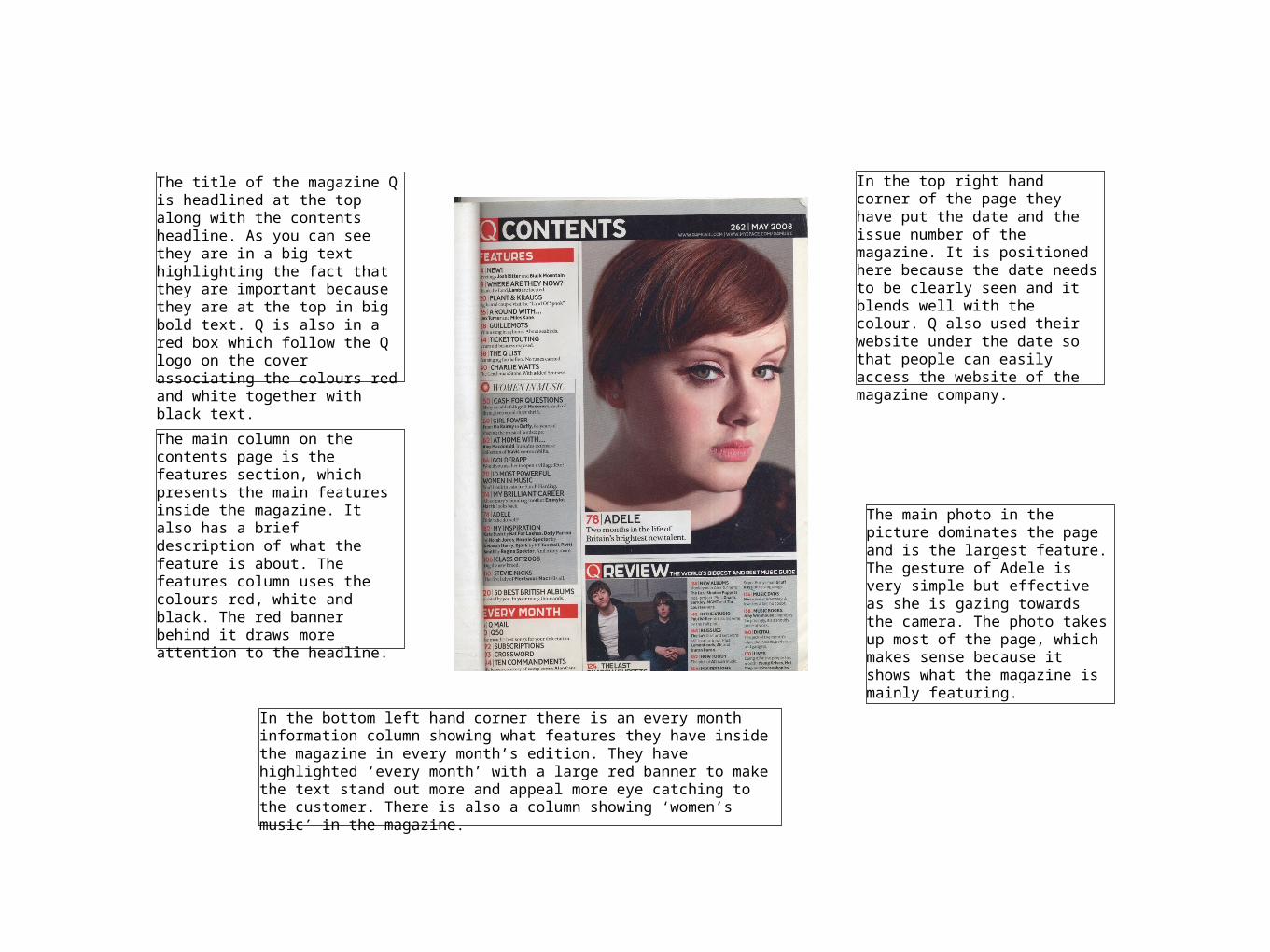
The layout of the contents page has different fonts and different stories in the magazine and the pictures are all different sizes probably depending on how important the story is. It is unusual but make the magazine unique.
NME uses quotes from the article for important stories in the magazine. This gives people a taster of what they are going to see in the magazine so it may make them more interested and make them want to read on.
They have the other page numbers in small black font as they are less important compared to the other main stories.
The heading in the contents page is big and bold as it is the title for the page. It also clearly states the date underneath it which is important.
The page numbers are in big bold red font. This makes them stand out more to readers so they can clearly see what it says so it is easier for them to go between pages.
They are offering a deal for NME in the bottom right hand corner. It displays this offer very big and brightly on the page so that it stands out and readers are drawn to it. The writing is bold and white so that it is eye popping and matches the rest of the magazines colour scheme. Readers may be more inclined to sign up for the deal because they would get discount.