Embed Size (px)
Citation preview


http://www.taliagaye.blogspot.co.uk/sear
ch?updated-min=2014-01-
01T00:00:00Z&updated-max=2015-01-
01T00:00:00Z&max-results=39
http://charlottermpalmer.blogspot.co.uk/?
zx=590ad79b6261851a

In what ways does your media product use, develop or challenge forms and conventions of
real media products?

Throughout my magazine I tried to used a variety of generic conventions. I learnt and experimented with these conventions whilst completing my Codes and Conventions task at the start of the year: http://j4k360.blogspot.co.uk/2014/10/c-task.html
I looked further into codes and conventions by lookingat magazines that cover the genre of music that I will look into to see how they used the codes and conventions: http://j4k360.blogspot.co.uk/2014/09/magazine-front-cover.html
Front Cover:
When making my front cover I tried to include as many codes and conventions that I could. The conventions that I have included have been highlighted in a blue box. One of the main conventions I used was the left third. To achieve this I put all of my cover lines into the left portion of the page and I have done the same with my mast head and the cover star credit.

the decisions for the layout and design of my magazine were greatly influenced by one of kerrangs front cover that featured Hayley Williams. I think I focused on that in particular cover because it featured a female rock artist which was the main focus of my magazine.
I have highlighted the similarities of my magazine and kerrangs to show where I have got my inspiration from. I tried to replicate the cover star credit and how they change the font and the font colour. If I included more text in cover star credit I think it would have looked more like kerrangs cover. I used similar fonts to kerrangs cover such as the font of the screamer at the bottom and the top of my magazine as they are near enough identical.
Influences:

Challenges and development:

Contents Page: The layout of my content page was mainly inspired by Kerrang as they. I started to look into different content pages so I could see what I should be aiming to make: http://j4k360.blogspot.co.uk/2014/09/content-page-analysis.html
What I liked the most about the Kerrang content pages was the layout. The layout inspired me to try my own version of it and i took my picture for the content page so it would go perfectly with the
layout I had chosen. I found that the layout Kerrang chose was more eye catching thanany of the other layouts as it has the huge image on the left third that grabs the attention of readers immediately. I replicated my own version of the screamer at the top of the page for my magazine but tomake sure it wasn’t completely copied I rotated mine so it wouldn’t take up as much space at the top of the content page.
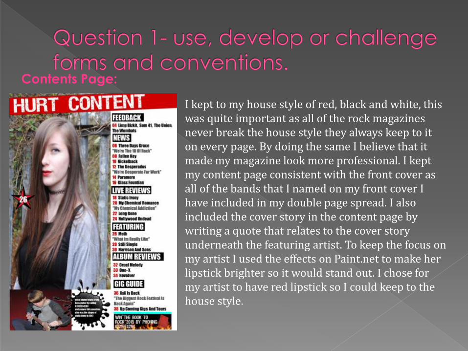
Contents Page:
I kept to my house style of red, black and white, this was quite important as all of the rock magazines never break the house style they always keep to it on every page. By doing the same I believe that it made my magazine look more professional. I kept my content page consistent with the front cover as all of the bands that I named on my front cover I have included in my double page spread. I also included the cover story in the content page by writing a quote that relates to the cover story underneath the featuring artist. To keep the focus on my artist I used the effects on Paint.net to make her lipstick brighter so it would stand out. I chose for my artist to have red lipstick so I could keep to the house style.

Double Page Spread:
My inspiration for the layout came from one of kerrangs double page spread: http://j4k360.blogspot.co.uk/2014/10/double-page-spread-analysis.html
I wanted my double page spread to look similar to this because I like the image to take up the whole right side of the magazine so it will grab the reader. Although I said in my blog post that I wouldn’t include a image on the left side of the magazine I changed my mind because the picture creates an effect of mystery and as it also relates to the article directly above the image.
I kept to the house style on my double page spread but I feel as if I didn’t really use black at all. My article is written in a Q & A format. The questions are written in red writing so they can easily be distinguished from the rest of the text. The Kerrang double page spread didn’t use the Q & A style of article but with my chosen house style and layout the question and answer style worked better.

How does your media product represent particular social groups?

My magazine was aimed at teenagers and young adults who enjoyed rock/Indi music. I kept to the same target audience as kerrang (15-24)and by doing so I was able to see how I can make my magazine to be suitable for the people I wanted to reach: http://j4k360.blogspot.co.uk/2014/11/target-audience_19.html
Cover Star:
My cover star “Meth” showed that she is someone who doesn’t show a lot of her self away which is shown by her appearance. She always looked at the camera and always hid her face which was exactly the way I wanted to portray my cover star. I did this so my cover star could relate to her target audience as teenagers are always quite secretive and they don’t want to share their emotions. I believe I that I captured that look from the pictures I used as I believe it shows the view of teenagers very well and my target audience will be able to relate to her.


What kind of media institution might distribute you media product why?

The genre and audience of “Hurt” magazine is very similar to the ones of Kerrang. I can see my magazine working with a major distributer that produces magazines of the same genre and target audience.
I researched into two major distribution companies: http://j4k360.blogspot.co.uk/2014/10/organisation-location.html
Including IPC media
IPC distribute huge magazines such as NME and UN CUT. But IPC only produce two music magazines and I don’t think that they are a suitable company for my magazine as they don’t make magazines that would reach my target audience and match the genre of my magazine.

The distributor I have chosen is Bauer Media Group http://www.bauermedia.co.uk/
I have chosen them because of their wide range of magazines, including Kerrang, Q magazine and more. I have also chosen them because they are involved in such a wide range of media as they are involved in Magazines, Radio, Television, Mobile and online.
Hurt magazine will fit in well with them as they produce the same genre of magazines and they are continually looking at my target audience.

Who would be the audience for your media product?

My magazine is aimed at male and female teenagers and young adults aged between 15-24. I asked people between 15-24 to answer a questionnaire that would help me with the development of my magazine: http://j4k360.blogspot.co.uk/2014/10/organisation_21.html
The results of the questionnaire helped me to find out how I could make my magazine appeal to my target audience as I got the target audience to tell me what they wanted in the magazine.

How did you attract/address your audience?

Masthead: I think the name of my magazine is quite catchy. I think it is a good way to describe the genre of the magazine as a lot of rock songs are about pain. I like the simplicity of the name makes it better for my target audience as the name is easy to remember which
works well for teenagers as they have a lot of pressure with exams and work so they wont have to think very hard to remember the name of the magazine. I used the font for Hurt because my target audience chose it when I asked them in my survey. The choice of red for the masthead was a god idea as it stands out when using my other house colours and it was easy to incorporate into the rest of the magazine.
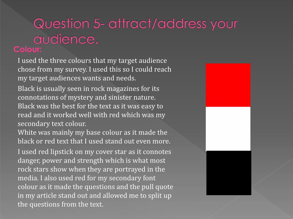
I used the three colours that my target audience chose from my survey. I used this so I could reach my target audiences wants and needs.
Black is usually seen in rock magazines for its connotations of mystery and sinister nature. Black was the best for the text as it was easy to read and it worked well with red which was my secondary text colour. White was mainly my base colour as it made the black or red text that I used stand out even more.
I used red lipstick on my cover star as it connotes danger, power and strength which is what most rock stars show when they are portrayed in the media. I also used red for my secondary font colour as it made the questions and the pull quote in my article stand out and allowed me to split up the questions from the text.
Colour:

Cover lines: Cover lines are used to show the audience what else is going to be included in the magazine and they draw in more attention from readers as they can see that other bands that they like are included. By using bold and bright colours for my cover lines it makes it easier for the reader to notice them when they walk past the magazine. I have also used a readable font so the reader can read the cover line without a problem.
Images:
In all of my pictures I made sure that my cover artist was making eye contact wit the audience. This built a relationship between the artist and the audience. However some of the relationship is broken as at all times we don’t see the other side of her face so the artist is only looking at you with her one eye. This can still attract the audience as the relationship between them is made complex and mysterious due to the eye contact.

What have you learnt about technologies from the process of constructing the product?
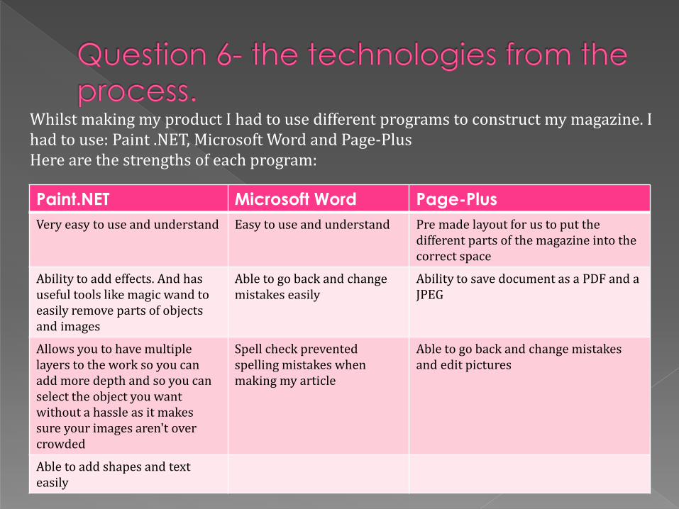
Whilst making my product I had to use different programs to construct my magazine. I had to use: Paint .NET, Microsoft Word and Page-Plus Here are the strengths of each program:
Paint.NET Microsoft Word Page-Plus
Very easy to use and understand Easy to use and understand Pre made layout for us to put the different parts of the magazine into the correct space
Ability to add effects. And has useful tools like magic wand to easily remove parts of objects and images
Able to go back and change mistakes easily
Ability to save document as a PDF and a JPEG
Allows you to have multiple layers to the work so you can add more depth and so you can select the object you want without a hassle as it makes sure your images aren't over crowded
Spell check prevented spelling mistakes when making my article
Able to go back and change mistakes and edit pictures
Able to add shapes and text easily

Here are the weaknesses of each program:
Paint.NET Microsoft Word Page-Plus
Unable to edit text after unselecting the layer which meant I had to re make a lot of my text for the magazine which took up a lot of time
Image placement wasn’t very responsive and took along time to be able to place my images in the correct place
The positioning of the text was very unresponsive as it would always place the text in a uneven manor
Limited choices of shapes meant that we had to import the shapes as images from other programs
Unable to save the documents as a JPEG format
The cut out studio wasn’t very responsive as it would always try to delete parts of my cover star instead of the background
the effects were of low quality and made images look extremely pixilated
The layers weren't divided so when trying to select the a shape it would select the text instead
All of the programs that I used helped me in the development of my magazine. The most useful was Paint.NET as it had the best tools like magic wand that made it possible for me to create my front cover and content page. The effects on Paint.NET were far superior to the effects on Page-Plus as they were of higher quality. I preferred the placement of text on Paint.NET over Microsoft word as Paint.NET gave me the freedom to place my text where I wanted it without a problem.

Photographic Choices Before taking photos of my cover star I had to have a general idea of how my cover star would look and act for the photo-shoot. I looked into other female rock stars and how they posed for their photos and the facial expressions they gave for the photo-shoot: http://j4k360.blogspot.co.uk/2014/11/organisation_21.html
This research made my photo-shoot a lot easier as I already knew how a rock-star should look. In a lot of the Kerrang front covers the cover star will either give eye contact and give no emotion or they will look away from the camera and give no emotion. I wanted to do the opposite so I could make my cover star relate to her target audience (15-24) so I wanted my cover star to give eye contact to create a relationship and give no emotion to give her the mysterious and dark look that most rock-stars have.

Blogger was a way that I could show the process I went through to whilst I was making my magazine. I found it difficult to use as I'm not very good at describing why I did certain things in my work. So my blog posts weren't as detailed as they could have been as I would struggle to write about my choices. Blogger was I good website though as I could access my work at anytime which made it easier than storing all of my work in a folder. And I liked the ability to go back and edit my work as much as I wanted so I could go and add another picture or more information to an old blog post.
Blogger:
Looking back to your preliminary task, what do you feel that you have learnt in the progression
from it to the full product?

Preliminary Task: Main Final Task:
In my preliminary task the cover lines are unreadable as the background clashes with them. The layout I used Is simple so it leaves a lot of space around the magazine which makes the magazine look empty.

Overall I am happy with the way that my magazine turned out. I think that I have fulfilled the brief in the making of my music magazine “Hurt”. I have created a Rock magazine with a appearance that stands out due to the use of bold fonts and eye catching colours. I think my strongest part of my product is the content page due to what is my favourite image and the layout of the content information.