Embed Size (px)
Citation preview
EVALUATION QUESTION 2: HOW EFFECTIVE IS THE COMBINATION OF YOUR MAIN PRODUCT (VIDEO) AND
ANCILLARY TEXTS (DIGIPAK AND ADVERTISEMENT)?
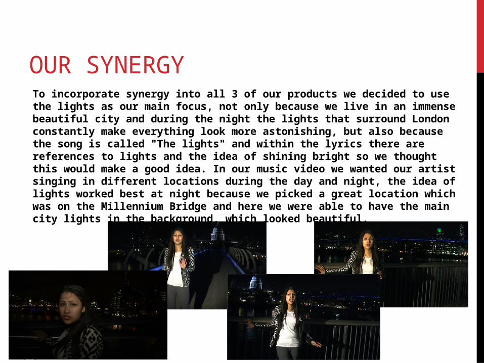
OUR SYNERGY To incorporate synergy into all 3 of our products we decided to use the lights as our main focus, not only because we live in an immense beautiful city and during the night the lights that surround London constantly make everything look more astonishing, but also because the song is called "The lights" and within the lyrics there are references to lights and the idea of shining bright so we thought this would make a good idea. In our music video we wanted our artist singing in different locations during the day and night, the idea of lights worked best at night because we picked a great location which was on the Millennium Bridge and here we were able to have the main city lights in the background, which looked beautiful.
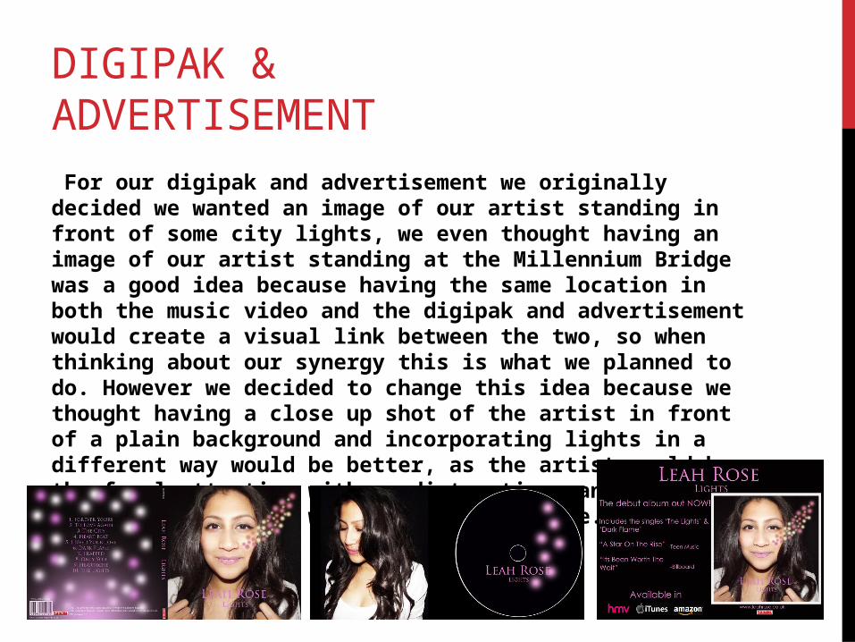
DIGIPAK & ADVERTISEMENT For our digipak and advertisement we originally decided we wanted an image of our artist standing in front of some city lights, we even thought having an image of our artist standing at the Millennium Bridge was a good idea because having the same location in both the music video and the digipak and advertisement would create a visual link between the two, so when thinking about our synergy this is what we planned to do. However we decided to change this idea because we thought having a close up shot of the artist in front of a plain background and incorporating lights in a different way would be better, as the artist would be the focal attention with no distractions and also creating the lights would be more creative.
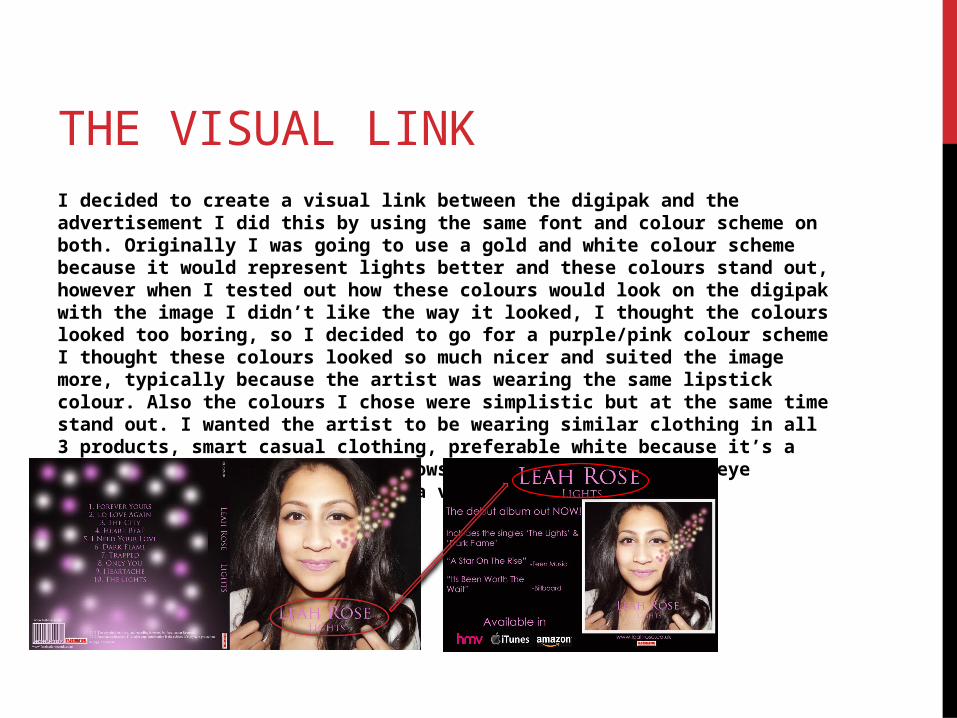
THE VISUAL LINK I decided to create a visual link between the digipak and the advertisement I did this by using the same font and colour scheme on both. Originally I was going to use a gold and white colour scheme because it would represent lights better and these colours stand out, however when I tested out how these colours would look on the digipak with the image I didn’t like the way it looked, I thought the colours looked too boring, so I decided to go for a purple/pink colour scheme I thought these colours looked so much nicer and suited the image more, typically because the artist was wearing the same lipstick colour. Also the colours I chose were simplistic but at the same time stand out. I wanted the artist to be wearing similar clothing in all 3 products, smart casual clothing, preferable white because it’s a relatively bright colour and allows the image to seem more eye catching this would also create a visual link between the 3 products.
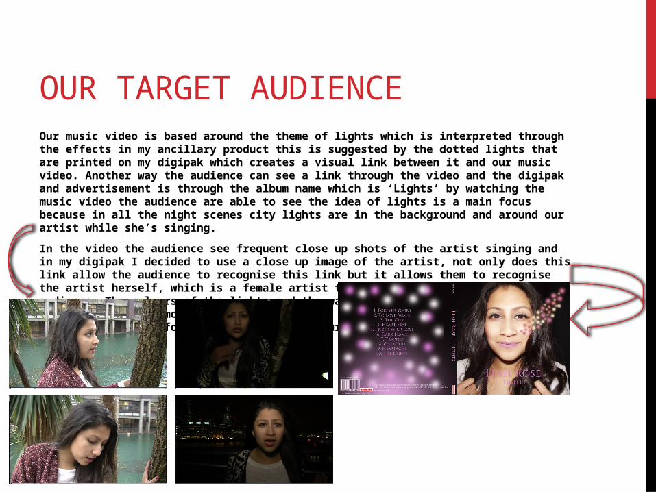
OUR TARGET AUDIENCE Our music video is based around the theme of lights which is interpreted through the effects in my ancillary product this is suggested by the dotted lights that are printed on my digipak which creates a visual link between it and our music video. Another way the audience can see a link through the video and the digipak and advertisement is through the album name which is ‘Lights’ by watching the music video the audience are able to see the idea of lights is a main focus because in all the night scenes city lights are in the background and around our artist while she’s singing.
In the video the audience see frequent close up shots of the artist singing and in my digipak I decided to use a close up image of the artist, not only does this link allow the audience to recognise this link but it allows them to recognise the artist herself, which is a female artist that instantly appeals to a female audience. The colours of the lights and the way that the lights are positioned on the digipak appeal more to a female audience as the colour pink creates a feminine feel, and for this reason I think our target audience would be attracted to them.
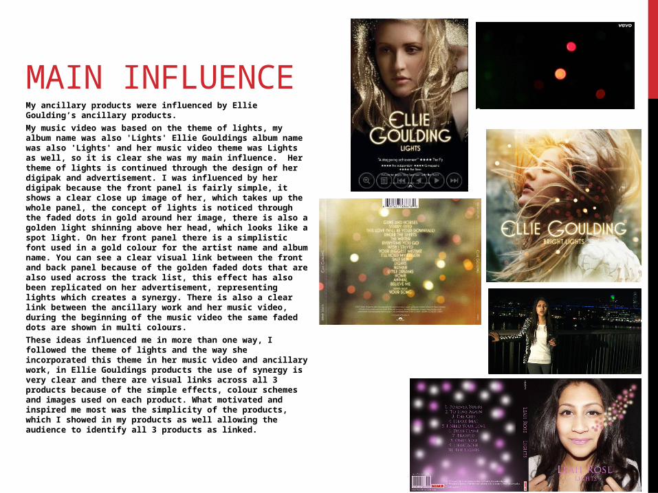
MAIN INFLUENCE My ancillary products were influenced by Ellie Goulding’s ancillary products.
My music video was based on the theme of lights, my album name was also 'Lights' Ellie Gouldings album name was also 'Lights' and her music video theme was Lights as well, so it is clear she was my main influence. Her theme of lights is continued through the design of her digipak and advertisement. I was influenced by her digipak because the front panel is fairly simple, it shows a clear close up image of her, which takes up the whole panel, the concept of lights is noticed through the faded dots in gold around her image, there is also a golden light shinning above her head, which looks like a spot light. On her front panel there is a simplistic font used in a gold colour for the artist name and album name. You can see a clear visual link between the front and back panel because of the golden faded dots that are also used across the track list, this effect has also been replicated on her advertisement, representing lights which creates a synergy. There is also a clear link between the ancillary work and her music video, during the beginning of the music video the same faded dots are shown in multi colours.
These ideas influenced me in more than one way, I followed the theme of lights and the way she incorporated this theme in her music video and ancillary work, in Ellie Gouldings products the use of synergy is very clear and there are visual links across all 3 products because of the simple effects, colour schemes and images used on each product. What motivated and inspired me most was the simplicity of the products, which I showed in my products as well allowing the audience to identify all 3 products as linked.