Embed Size (px)
Citation preview
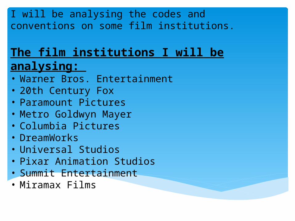
I will be analysing the codes and conventions on some film institutions.
The film institutions I will be analysing: • Warner Bros. Entertainment• 20th Century Fox • Paramount Pictures• Metro Goldwyn Mayer • Columbia Pictures • DreamWorks • Universal Studios • Pixar Animation Studios • Summit Entertainment • Miramax Films
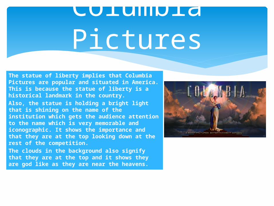
The statue of liberty implies that Columbia Pictures are popular and situated in America. This is because the statue of liberty is a historical landmark in the country.Also, the statue is holding a bright light that is shining on the name of the institution which gets the audience attention to the name which is very memorable and iconographic. It shows the importance and that they are at the top looking down at the rest of the competition.The clouds in the background also signify that they are at the top and it shows they are god like as they are near the heavens.
Columbia Pictures

Warner Bros. Entertainment
The gold on the logo implies that the institution is powerful and wealthy. This goes well with the design of the logo as the shield shows that they are dominant within the industry. The bright blue sky in the background connotes that they are above everyone and they have high standards.
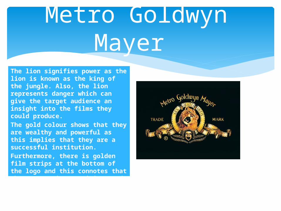
The lion signifies power as the lion is known as the king of the jungle. Also, the lion represents danger which can give the target audience an insight into the films they could produce.The gold colour shows that they are wealthy and powerful as this implies that they are a successful institution.Furthermore, there is golden film strips at the bottom of the logo and this connotes that the company is prestigious and shows that the company has been established a long time ago as film strips are associated with old cameras.
Metro Goldwyn Mayer
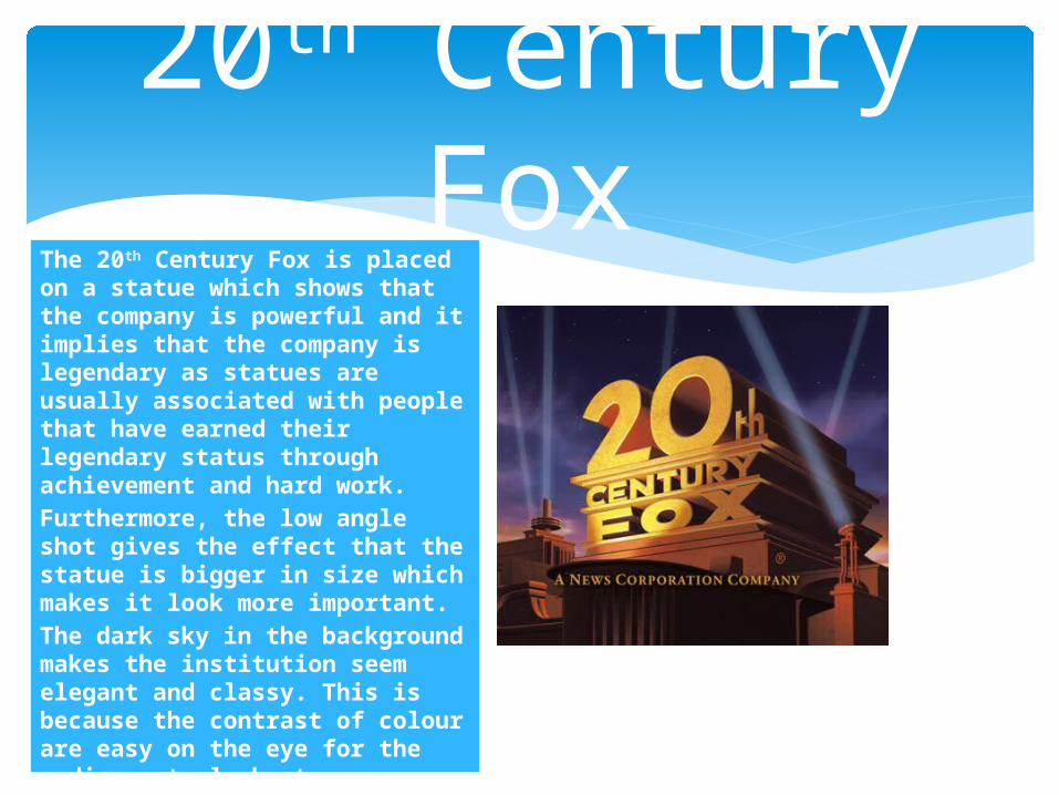
The 20th Century Fox is placed on a statue which shows that the company is powerful and it implies that the company is legendary as statues are usually associated with people that have earned their legendary status through achievement and hard work. Furthermore, the low angle shot gives the effect that the statue is bigger in size which makes it look more important. The dark sky in the background makes the institution seem elegant and classy. This is because the contrast of colour are easy on the eye for the audience to look at. Also, the lighting implies that they have a celebrity and important status as they are usually associated with events like movie premiers.
20th Century Fox
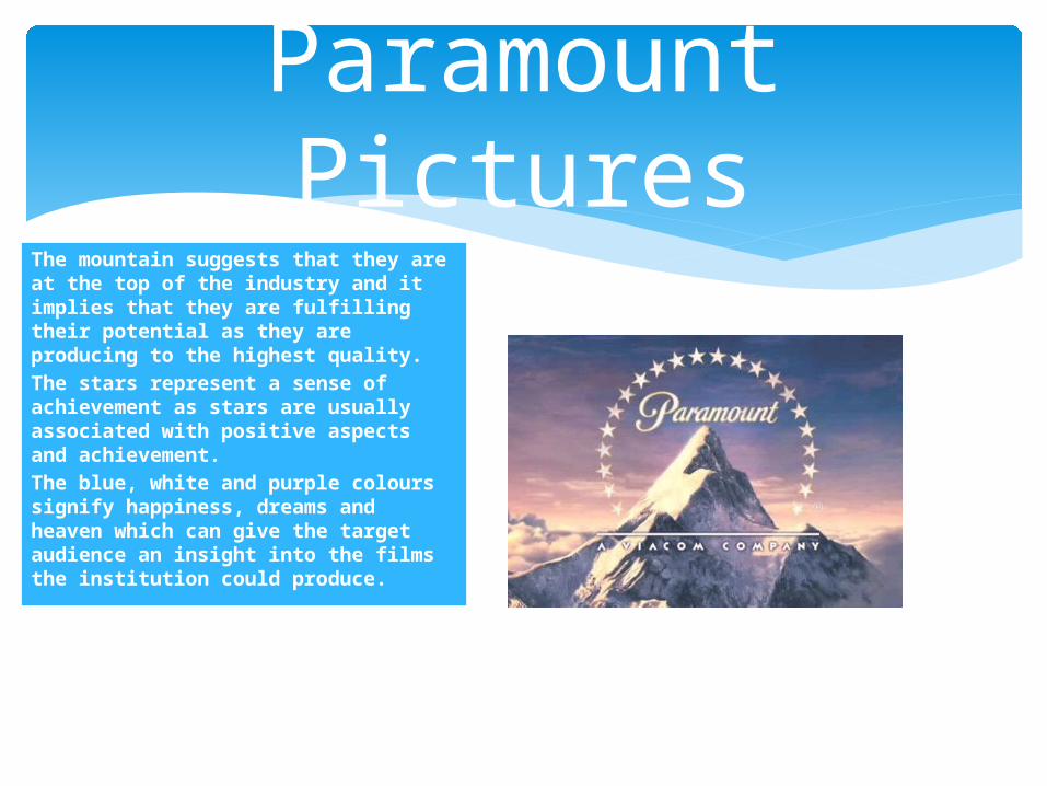
The mountain suggests that they are at the top of the industry and it implies that they are fulfilling their potential as they are producing to the highest quality.The stars represent a sense of achievement as stars are usually associated with positive aspects and achievement. The blue, white and purple colours signify happiness, dreams and heaven which can give the target audience an insight into the films the institution could produce.
Paramount Pictures
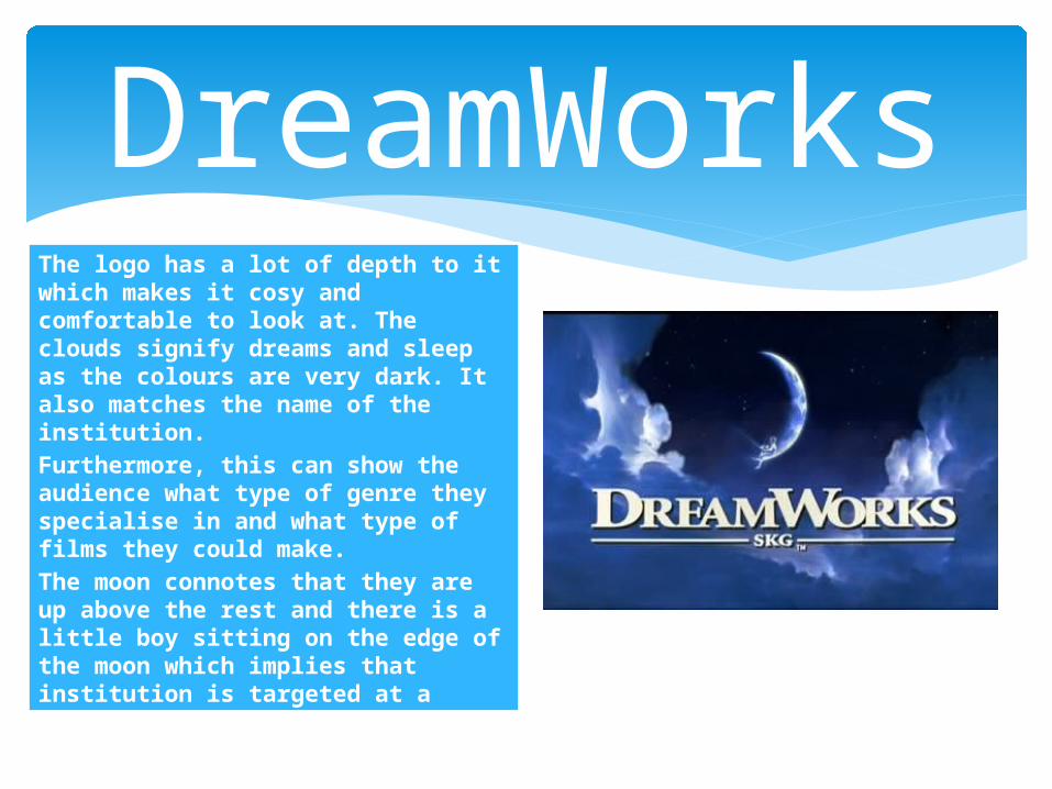
The logo has a lot of depth to it which makes it cosy and comfortable to look at. The clouds signify dreams and sleep as the colours are very dark. It also matches the name of the institution.Furthermore, this can show the audience what type of genre they specialise in and what type of films they could make. The moon connotes that they are up above the rest and there is a little boy sitting on the edge of the moon which implies that institution is targeted at a young audience. The little boy has a fishing rod which is aiming down through the clouds which shows that the films will be made out of the target audiences dreams and imagination.
DreamWorks

The black background with stars is usually associated with space which implies that they are out of the world. The long shot of the globe also suggest that they are out of this world. This shows that they are very powerful and are well known all around the world.The gold out line to their name makes them look wealthy and powerful as the colour gold signifies wealth.
Universal Studios
Pixar Animation Studios
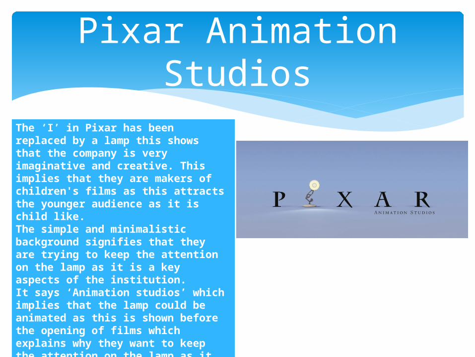
The ‘I’ in Pixar has been replaced by a lamp this shows that the company is very imaginative and creative. This implies that they are makers of children's films as this attracts the younger audience as it is child like.The simple and minimalistic background signifies that they are trying to keep the attention on the lamp as it is a key aspects of the institution.It says ‘Animation studios’ which implies that the lamp could be animated as this is shown before the opening of films which explains why they want to keep the attention on the lamp as it is iconographic to the audience.
Summit Entertainment
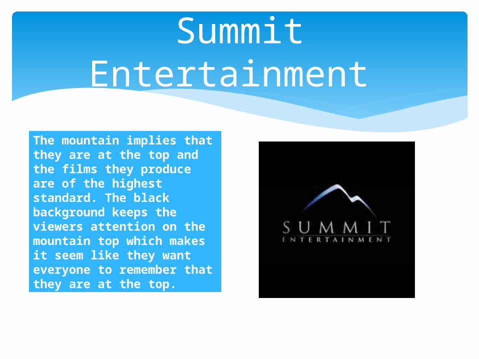
The mountain implies that they are at the top and the films they produce are of the highest standard. The black background keeps the viewers attention on the mountain top which makes it seem like they want everyone to remember that they are at the top.
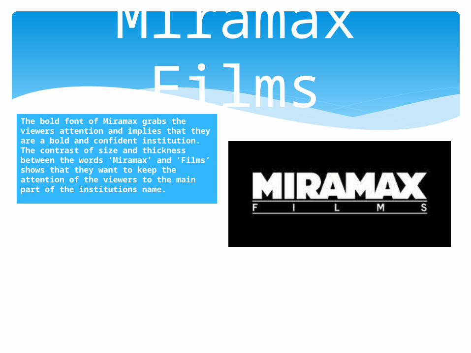
The bold font of Miramax grabs the viewers attention and implies that they are a bold and confident institution. The contrast of size and thickness between the words ‘Miramax’ and ‘Films’ shows that they want to keep the attention of the viewers to the main part of the institutions name.
Miramax Films