Embed Size (px)
Citation preview
Magazine cover analysis

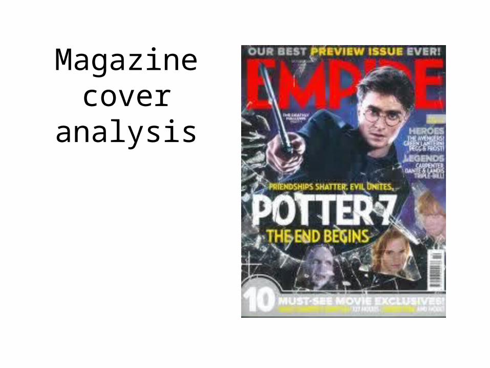
This image is the focal point of the whole cover, it shows the well known protagonist looking directly at us which would make the reader more interested in reading the magazine. We an see the protagonist is holding a wand out towards us but it isn't in focus meaning all of our attention is on his face where we can clearly see the iconic scar and some scratches which makes the readers want to know how he got them. Also, around Harry Potter, the protagonist, we can see broken glass which gives the impression he in breaking out of the magazine towards us, giving the reader a sense of urgency to read it and it will also target fans of Daniel Radcliff and Harry Potter because he is the focus.
The masthead of the magazine is in big bright red font and is very clear to read however, they have placed the picture of Harry Potter so that it is half covering the title. This could be so that the red will draw you in and cause you to pay more attention to the focal point of the cover. The font of the masthead is easy to read and has almost elongated points on the letters as if it was a certain tall building and makes it seem big and grand. Also, by using the color red for the title it gives a strong sense of importance and the need to read the magazine and it also contrasts with the dark blue background and stands out a lot.
The protagonist is dressed in what looks to be a suit and tie, this is associated with things being formal and having a sense of importance and also acts like a signifier to the audience of his ageing and his progression through the films which fans will be aware of and will be interested to see his appearance in this stage of his progression. This could be stating to the potential viewer that it is important that they see this film. The background to this cover is made up of a mixture of dark blues and purples which give the illusion of night and smoke, closely associated with the gothic genre giving the audience an impression of what the film will be like.

Along the top of the cover is a short sentence which reads ‘our best preview issue ever!’. Although this sentence doesn’t have a lot of focus as a whole cover the fact they’ve used language like ‘best’ and ‘preview’ makes the readers think they are getting something really special that no one else will have. Also, the words ‘preview issue’ are done is bright yellow bold font whereas the rest and in a light grey bold font, this draws attention to the fact it is a special issue.
Next, underneath the magazines name and to the left of the focal image is the name of the film that will be featured the most in the magazine. As a whole it is very small and barely noticeable, you would need to really look to be able to read it. However, this is a good technique to use on a magazine cover because it encourages the readers to look closer. The writing is in clear, bold white font which contrasts with the dark colors of the background making it easy to read and see up close.
On the right side of the focal image is the ‘plus’ section, this gives you a small insight into what else is in the magazine. There a two titles that are in bold grey font that read ‘heroes’ and ‘legends’ which entices the viewer into wanting to find out who the ‘heroes’ and ‘legends’ are. It then goes on to mention some other well know films and characters, this specifically targets their fans.

This part of the magazine cover sits below the main image on the magazine. It is the main cover line and it reveals that they will be featuring the 7th Harry Potter film, it is very short though but has a big impact on the reader because it doesn’t reveal much information and leaves the reader curious. There are two other pieces of txt above and below the main cover line. The top one provides more information on the film, ‘friendships shatter. Evil unites’, which in a way intrigues the reader as they want to now why friendships have broken down and what will happen when evil unites. The one below reads ‘the end begins’ which is a juxtaposition with the words ‘end’ and ‘begins’, this will again make the audience curious as to what is going to happen to Harry Potter. Also, fans of Harry Potter will be almost concerned with his well-being and want to know if he is ok. In the background we can see what looks to be shattered glass, this ties in with the ‘shatter’ of friendships that will occur in the film. The background is also really dark which could symbolize the evil and darkness that will be portrayed in the film.

Underneath the main cover line are the images of 3 other main characters in the film. Each of their faces are in a piece of shattered glass, this works well in the background because it shows how they will possibly break away from each other. Each of the characters also have sad and angry facial expressions, again securing the idea they will fall out. By showing these other main characters it targets their own personal fan base, meaning their fans will firstly by the magazine and also go and see the film. Also, we can see how the shatter is almost circled around the main image of Harry Potter, showing that he has possibly caused the upset. Also, this is where the barcode is positioned, it is in the bottom right hand side and doesn’t invade the main image, however, it is very close to some subsidiary images. This also shows how the magazine can be purchased and shows professionalism.
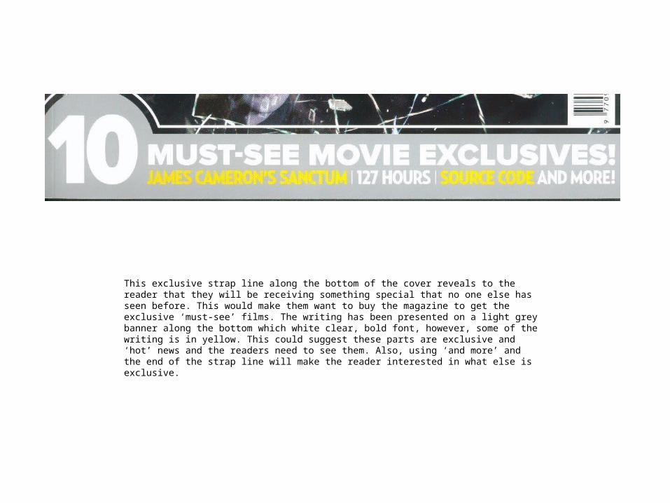
This exclusive strap line along the bottom of the cover reveals to the reader that they will be receiving something special that no one else has seen before. This would make them want to buy the magazine to get the exclusive ‘must-see’ films. The writing has been presented on a light grey banner along the bottom which white clear, bold font, however, some of the writing is in yellow. This could suggest these parts are exclusive and ‘hot’ news and the readers need to see them. Also, using ‘and more’ and the end of the strap line will make the reader interested in what else is exclusive.


