Embed Size (px)
Citation preview
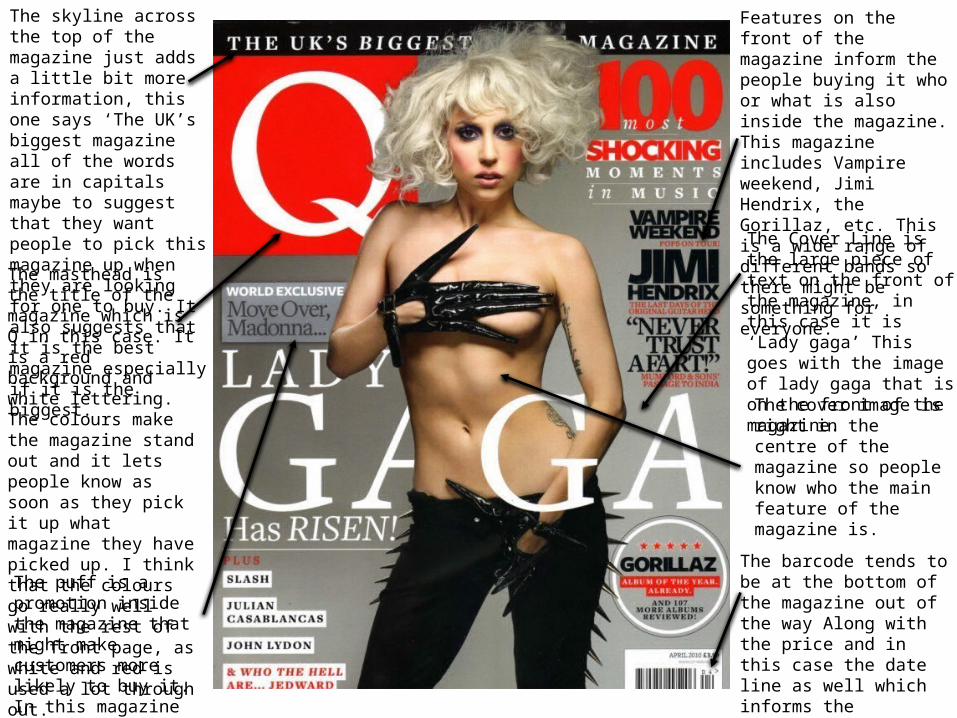
The skyline across the top of the magazine just adds a little bit more information, this one says ‘The UK’s biggest magazine all of the words are in capitals maybe to suggest that they want people to pick this magazine up when they are looking for one to buy. It also suggests that it is the best magazine especially if it is the biggest.
The masthead is the title of the magazine which is Q in this case. It is a red background and white lettering. The colours make the magazine stand out and it lets people know as soon as they pick it up what magazine they have picked up. I think that the colours go really well with the rest of the front page, as white and red is used a lot through out.
The barcode tends to be at the bottom of the magazine out of the way Along with the price and in this case the date line as well which informs the customers that buy the magazine when the issue was published
Features on the front of the magazine inform the people buying it who or what is also inside the magazine. This magazine includes Vampire weekend, Jimi Hendrix, the Gorillaz, etc. This is a wide range of different bands so there might be something for everyone.
The cover image is right in the centre of the magazine so people know who the main feature of the magazine is.
The Cover Line is the large piece of text on the front of the magazine, in this case it is ‘Lady gaga’ This goes with the image of lady gaga that is on the front of the magazine.
The puff is a promotion inside the magazine that might make customers more likely to buy it. In this magazine might be the ‘world exclusive’

The logo is put in the corner of the magazine, it is less subtle than the front page but it is still there and it makes it look like it’s saying ‘Q contents’ still saying that it is their magazine and their contents page even though people will already know this.
The big picture of lady gaga really takes to peoples eyes. The big ‘44’ informs people that her article is on page 44. Her name and a slight description is in the margin as well. The colours of red, white and black are still consistent even on to the contents page, this consistent colour is maybe the magazines way to stand out so people know that those colours link to Q Magazine.
This contents page is a double page spread which could suggest that there is a lot in the magazine and the customers need to be informed of every story that is in the magazine.
The contents page has also added other photos that aren’t Lady Gaga in it, loads of little photos create a intriguing looking contents page.
The image that is on the front page is on the contents page.
On this contents page there is a sub heading of every article inside the magazine a long with a small description of what is spoken about in each article.
The style of Q magazine contents page is almost the same in every issue they make just with different articles, this means that people recognise the magazine.
Q magazine get pictures of some of
the main articles that people may be more
interested in that any of the others and add
the page number in different sized numbers, this adds a good indie style to the magazine.
This suggest the bigger the number the more important the article is.
Even though there is a lot going on, on the contents page it is very easy to understand and the magazine have done a good job and getting every story in the contents page, this informs the customer straight away of everything that is included in the magazine.
As the contents is spread across to pages it could suggest that at the beginning of the magazine are the main story, However Lady gaga is on page 44, the magazine might have done this to get people to read more of the magazine instead of ready Lady Gaga and putting the magazine down.
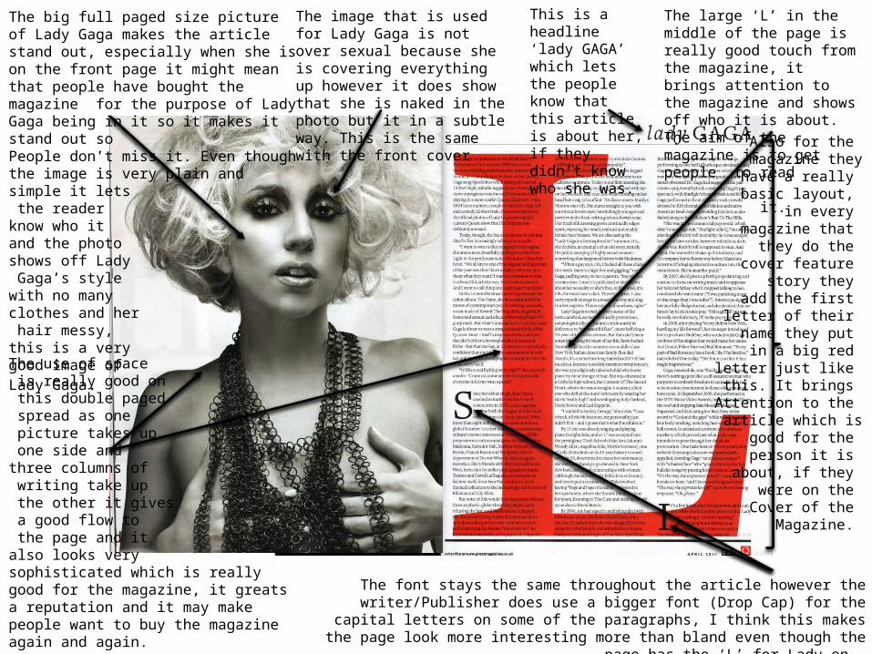
The large ‘L’ in the middle of the page is really good touch from the magazine, it brings attention to the magazine and shows off who it is about. The aim of the magazine is to get people to read it.
The big full paged size picture of Lady Gaga makes the article stand out, especially when she is on the front page it might mean that people have bought the magazine for the purpose of Lady Gaga being in it so it makes it stand out so People don’t miss it. Even though the image is very plain andsimple it lets the reader know who it and the photo shows off Lady Gaga’s stylewith no many clothes and her hair messy, this is a very good image of Lady Gaga.
The font stays the same throughout the article however the writer/Publisher does use a bigger font (Drop Cap) for the capital letters on some of the paragraphs, I think this makes the
page look more interesting more than bland even though the page has the ‘L’ for Lady on.
This is a headline ‘lady GAGA’ which lets the people know that this article is about her, if they didn’t know who she was.
The use of space is really good on this double paged spread as one picture takes up one side and three columns of writing take up the other it gives a good flow to the page and it also looks very sophisticated which is really good for the magazine, it greats a reputation and it may make people want to buy the magazine again and again.
Also for the magazine they have a really basic layout,
in every magazine that
they do the cover feature
story they add the first
letter of their name they put
in a big red letter just like this. It brings
Attention to the article which is
good for the person it is
about, if they were on the Cover of the
Magazine.
The image that is used for Lady Gaga is not over sexual because she is covering everything up however it does show that she is naked in the photo but it in a subtle way. This is the same with the front cover