Embed Size (px)
Citation preview
SINISTER FILM POSTER
Textual Analysis of
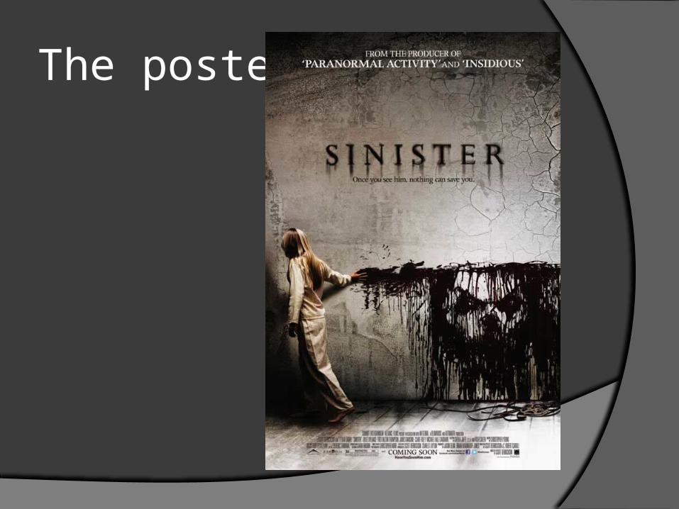
The poster
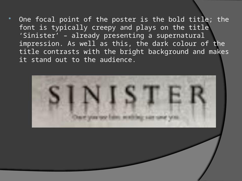
One focal point of the poster is the bold title; the font is typically creepy and plays on the title ‘Sinister’ – already presenting a supernatural impression. As well as this, the dark colour of the title contrasts with the bright background and makes it stand out to the audience.
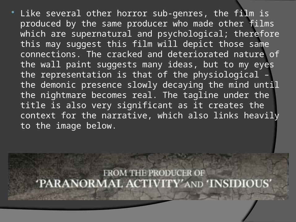
Like several other horror sub-genres, the film is produced by the same producer who made other films which are supernatural and psychological; therefore this may suggest this film will depict those same connections. The cracked and deteriorated nature of the wall paint suggests many ideas, but to my eyes the representation is that of the physiological – the demonic presence slowly decaying the mind until the nightmare becomes real. The tagline under the title is also very significant as it creates the context for the narrative, which also links heavily to the image below.
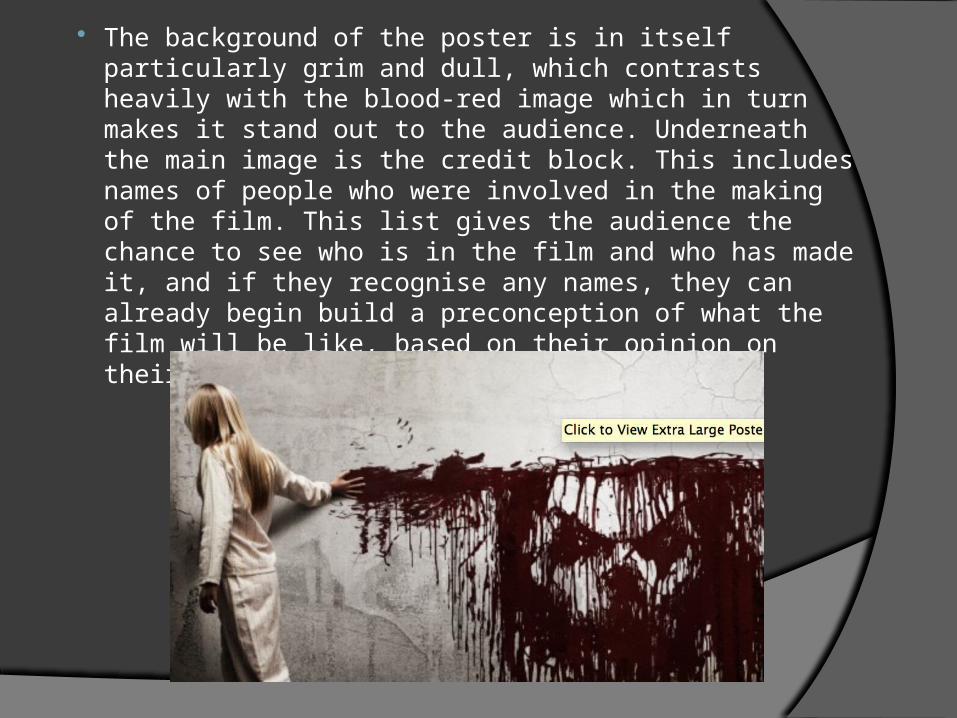
The background of the poster is in itself particularly grim and dull, which contrasts heavily with the blood-red image which in turn makes it stand out to the audience. Underneath the main image is the credit block. This includes names of people who were involved in the making of the film. This list gives the audience the chance to see who is in the film and who has made it, and if they recognise any names, they can already begin build a preconception of what the film will be like, based on their opinion on their previous films.
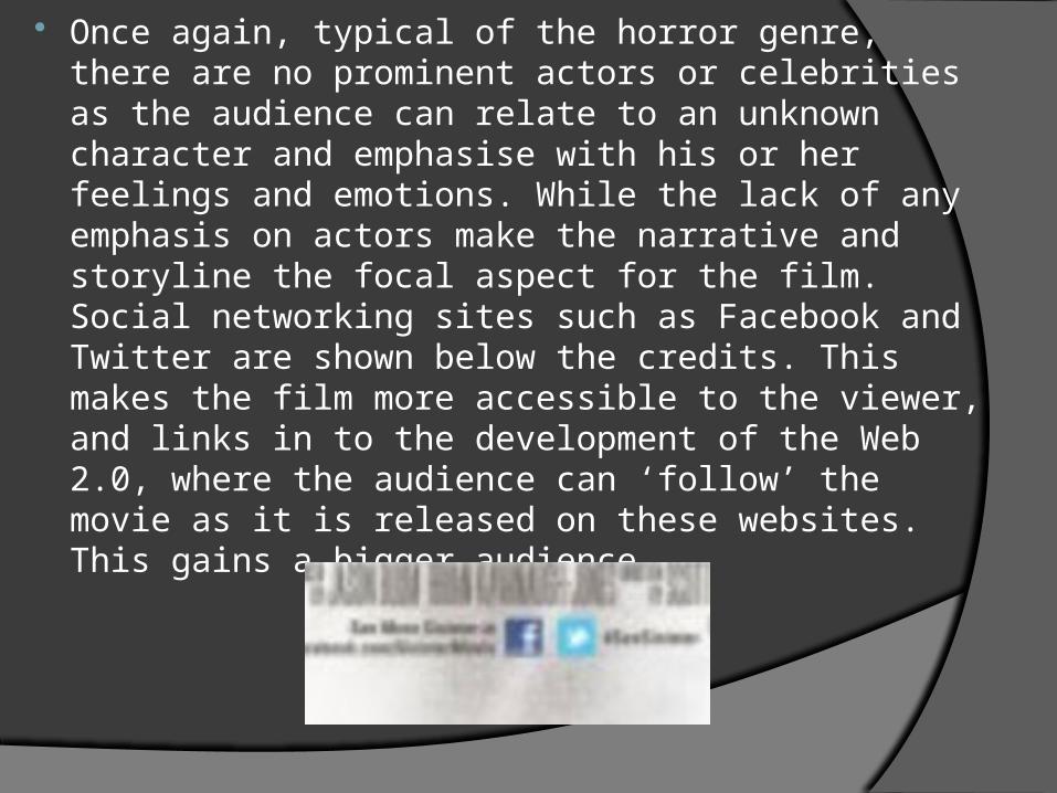
Once again, typical of the horror genre, there are no prominent actors or celebrities as the audience can relate to an unknown character and emphasise with his or her feelings and emotions. While the lack of any emphasis on actors make the narrative and storyline the focal aspect for the film. Social networking sites such as Facebook and Twitter are shown below the credits. This makes the film more accessible to the viewer, and links in to the development of the Web 2.0, where the audience can ‘follow’ the movie as it is released on these websites. This gains a bigger audience.
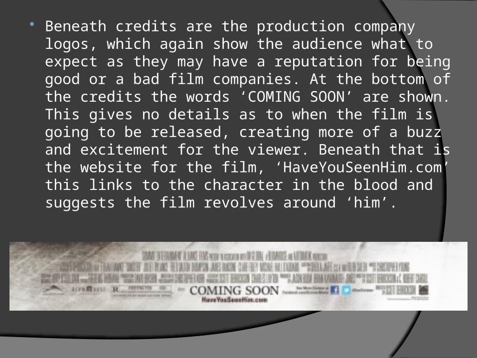
Beneath credits are the production company logos, which again show the audience what to expect as they may have a reputation for being good or a bad film companies. At the bottom of the credits the words ‘COMING SOON’ are shown. This gives no details as to when the film is going to be released, creating more of a buzz and excitement for the viewer. Beneath that is the website for the film, ‘HaveYouSeenHim.com’ this links to the character in the blood and suggests the film revolves around ‘him’.
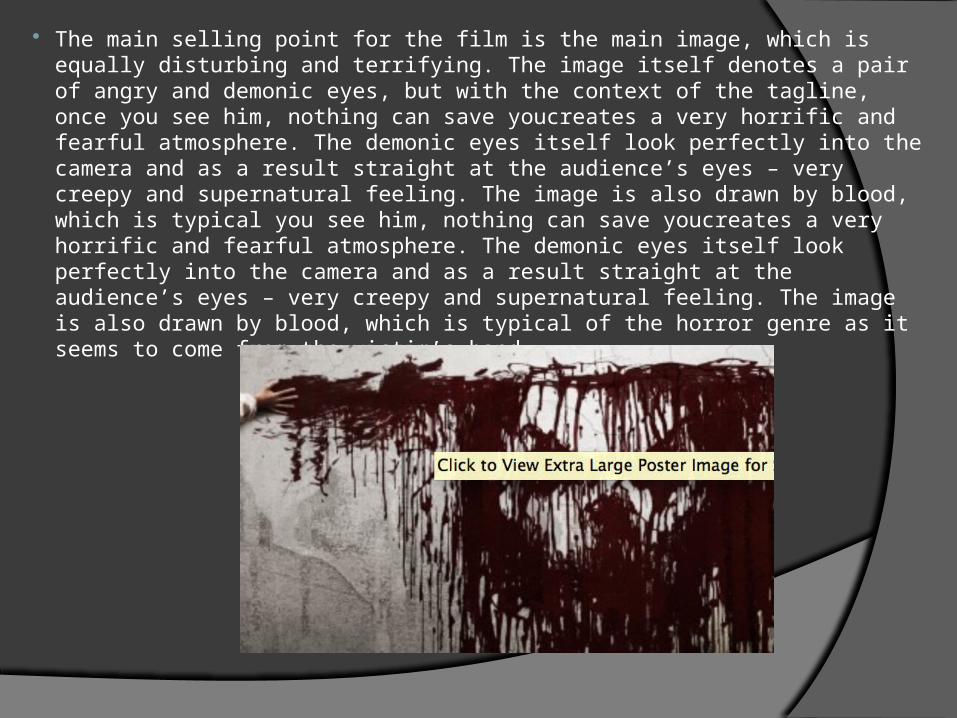
The main selling point for the film is the main image, which is equally disturbing and terrifying. The image itself denotes a pair of angry and demonic eyes, but with the context of the tagline, once you see him, nothing can save youcreates a very horrific and fearful atmosphere. The demonic eyes itself look perfectly into the camera and as a result straight at the audience’s eyes – very creepy and supernatural feeling. The image is also drawn by blood, which is typical you see him, nothing can save youcreates a very horrific and fearful atmosphere. The demonic eyes itself look perfectly into the camera and as a result straight at the audience’s eyes – very creepy and supernatural feeling. The image is also drawn by blood, which is typical of the horror genre as it seems to come from the victim’s hand.