Embed Size (px)
Citation preview

Australia’s Environment Explorera quick tour to get you going.

The map selectors allow you to choose the theme and type of map you want to
see

The legend explains the map you are looking at.

The map controls allow you to zoom in or out, search for a location, share the
current view, or bring up the help screen.

You can also use your mouse to drag the map around, zoom in (scroll or double-
click left) or zoom out (double-click right)

The chart panel allows you to look at regional or local data in three different ways.

To see more detail, you can switch to and from Full Screen mode

Note: If the site responds slow or bits of the map are missing, then data transfer speed is likely an issue. Try
changing to ‘region’ view and/or close the charts, if you don’t need to see them.
Changing, zooming or moving in grid map view will cause a new map to be downloaded. Similarly, clicking on a different location will cause
a new chart to be downloaded.

Let’s try some options.
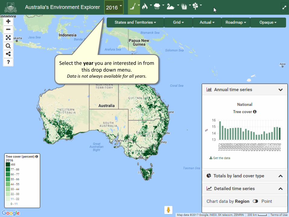
Select the year you are interested in from this drop down menu.
Data is not always available for all years.

Choose a theme from the choices that drop down from the top bar.

Choose a different type of region or boundary.

Choose whether to see a detailed grid map or numbers summarised by region.

Choose from actual values or the change compared to the previous year

Choose the background that suits you best

Choose the background that suits you best

Be aware that the background satellite image will often not be
from the year you have selected.The year mentioned here relates to copyright,
not necessarily the date of the image.

To see the background through the map, choose transparent

You can hover over the charts to see the actual numbers.
You can also download the numbers in the charts.
They are stored in csv format, which will open in MS Excel, for example.

To close or open a chart, use these buttons.
This chart shows the distribution of the regional total by Land cover class.Sometimes that’s easy to interpret, sometimes
not so much.
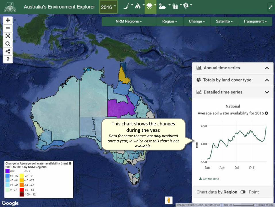
This chart shows the changes during the year.
Data for some themes are only produced once a year, in which case this chart is not
available.

To see any chart for a specific region, just click on it, and the
chart will change.

Select ‘Point’ if you want to use the mouse to see data for any single point.
Region totals by land cover type cannot be charted in this mode, but the time series can.
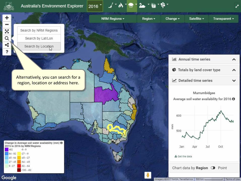
Alternatively, you can search for a region, location or address here.

Start typing and the address should appear. Select and click ‘Locate’ and
you will be taken there.

The chart has now automatically switched to ‘Point’ mode.

To get a feel for conditions on the ground, you can use the Google Streetview feature.
Just drag and drop the ‘pegman’

To get a feel for conditions on the ground, you can use the Google Streetview feature.
Just drag and drop the ‘pegman’

You can use the arrows and controls to look around you and zoom in.
Note that this photo will often not be from the year you have selected.

Don’t worry, you have not lost your map. You can click
the arrow to go back.

That was the tour, thanks for your visit. If you have anymore questions, let us know via
the link below.