ISTANBUL TECHNICAL UNIVERSITY ★ FACULTY OF CIVIL ENGINEERING
LA GRANDE ILLUSION: DO MAPS TELL THE TRUTH?
B.Sc. THESIS
Begüm BİLGİLER
010080364
Department of Geomatics Engineering
Geomatics Engineering Programme
Thesis Advisors:
Asst. Prof.Dr. Ahmet Özgür Doğru
Prof.Dr. Necla Uluğtekin
August 2015

ii
FOREWORD
I barely remember the day I entered ITU. Yet I clearly remember the feeling and my dreams,the projects that came to my mind about maps and so on. I was so determined to make myprojects real, combining my interests with my field. After a while, I lost this passion orI justgave up resisting because of several reasons. This bachelor thesis is my completion of theGeomatics Engineering program at Istanbul Technical University. After extending my licencedegree period, I wanted to finish my degree relieved and satisfied. My advisor, Asst.Prof.Dr.Ahmet ÖzgürDoğru has had a big role in this in that he supported me all the time, hada lot of patience with me and he was open-minded to my ideas all the time. I’d like express mysincere thanks to him.
Thanks to my co-advisor Prof.Dr.NeclaUluğtekin who first got me interested in cartographyand let me use her sources.
And thanks to all of my friends who supported me during this period. Especially thanks toZeynelFırat Aydın for his precious examples and knowledge about history, thanks toGamzeŞanlı who read my paper and helped me to edit, thanks to ErdalArslan and ÖzgeKanlıfor being such good working companies and thanks to Evrim Savaş and BülentTuğrulYükselfor their technical and psychological support.
Lastly, I’d like to thank my mother who raised me and gave me the self-confidence that can behard for her to find. She is the one who made me stubborn in my determination to achievewhat I desire to do and helps me to follow my ideas, dreams, and what I believe in.
August 2015 Begüm BİLGİLER

iii

iv
TABLE OF CONTENTS
Page
FOREWORD..............................................................................................................................ii TABLE OFCONTENTS...........................................................................................................ivABBREVIATIONS....................................................................................................................v LIST OFFIGURES...................................................................................................................viSUMMARY.............................................................................................................................. v i iÖZET.......................................................................................................................................viii
1. INTRODUCTION.........................................................................................................9
2. MAPS............................................................................................................................12
2.1 Definition......................................................................................................................12
2.2 Elements ofmaps..........................................................................................................12
2.2.1 Distance orScale...........................................................................................................12
2.2.2 Direction........................................................................................................................12
2.2.3 Legend...........................................................................................................................13
2.2.4 Title...............................................................................................................................13
2.2.5 Projection......................................................................................................................14
2.2.6 Cartographers................................................................................................................14

v
2.2.7 Date ofProduction........................................................................................................14
2.3 Type ofMaps................................................................................................................15
3. SOCIAL ROLE OFMAPS........................................................................................18
3.1 Propagation withmaps..................................................................................................18
3.1.1 Cartographic Education (official, education,media)....................................................18
3.1.2 Decision-Makers & Maps &Map-Users.......................................................................21
3.2 P o l i t i c a lMaps................................................................................................................24
3.2.1 Choice and CartographicSilence...................................................................................24
3.2.2 Colour............................................................................................................................25
3.2.2.1 Choroplethclassification...............................................................................................28
3.2.3 Titles &Names..............................................................................................................29
3.2.4 Symbols on the Map – Lines &Borders........................................................................31
4. CONCLUSIONS AND RECOMMENDATIONS…………………………………35
5. REFERENCES………………………………………………………………………36
6. APPENDICES……………………………………………………………………….40
CURRICULUM VITAE…………………………………………………………………….41

vi
ABBREVIATIONS
EP: European Parliament
EU: The European Union
GCHQ: The UK Government Communications Headquarters
ISIS: Islamic State of Iraq and Syria
NATO: The North Atlantic Treaty Organization
PKK: Partiya Karkerên Kurdistanê (Kurdistan Workers' Party)
UK: The United Kingdom
UN: The United Nations

vii
LIST OF FIGURES
Page
Figure 2.1 Scale Examples…………………………………………………………………12Figure 2. 2 Different type of north arrows…………………………………………………13Figure 2.3 Magnetic, True and Grid North………………………………………………...13Figure 2.4 A legend example………………………………………………………………14Figure 2.5 Topographic Map of Cuba……………………………………………………..15Figure 2.6 Thematic Map Example: Vegetation Map of Thailand………………………..16Figure 2.7 Special-Purpose Map Example: Moscow City Map…………………………...16Figure 3.1 ‘London View’ by SociétéRéaliste……………………………………………19Figure 3.2 Euro coin ………………………………………………………………………19Figure 3.3 Twitter post: The countries with flags of the highest ethnic minority group…..21Figure 3.4 Agloe on New York City map………………………………………………….22Figure 3.5 Agloe on Google Maps…………………………………………………………22Figure 3.6 Balkans on the map of The Economics…………………………………………23Figure 3.7 Kurdistan map….……………………………………………………………….25Figure 3.8 Map of ‘Areas with high proportion of Kurds’…………………………………25Figure 3.9 Crimea on Ukraine’s Google Maps…………………………………………….26Figure 3.10 Crimea on International Google Maps………………………………………..26Figure 3.11 ‘NATO in the World’ Map……………………………………………………27Figure 3.12 ‘NATO, NATO Member and Partner Countries’ Map………………………..27Figure 3.13 Two different choropleth maps examples……………………………………..28Figure 3.14 ‘Causes of concern’ Map on TheEconomist………………………………….29Figure 3.15 No Palestine on Google Maps………………………………………………....30Figure 3.16 Titling of the country names………………………………………………......30Figure 3.17 Symbolization examples………………………………………………………31Figure 3.18 EU Map on European Parliament website…………………………………….32Figure 3.19 EU Map on European Parliament website…………………………………….32Figure 3.20 Common sides of Euro coins………………………………………………….33Figure 3.21 Different representation of borders of ‘Kurdistan’……………………………33

viii
LA GRANDE ILLUSION: DO MAPS TELL THE TRUTH?
SUMMARY
Since the beginning of humankind people have felt the need to communicate with others and
with their environment. Since the cave paintings that first attempted to represent the
environment and geography to the photographs taken from space and the maps produced
today, there is a continuing, complicated and evolving process. The way in which we gain
knowledge about our place in the world, about geography or how we recognise our countries
and cities, the different ways in which we internalise and use this information are thanks to
maps, but also differ according to the maps that we come across. In this way, maps hold much
more significance in our lives than we think, especially in terms of our place in the world and
our political understanding of geography. In this thesis I will be questioning the whole
production process of maps, how they are used, who produced them and who uses them,
different cartographic methods and how these effect our knowledge and understanding to
create some awareness in this area. I will first define the concept of maps and the elements
used in them, and then expand on cartographic elements that play an important social role, the
influences on and motives of the people producing them and by doing so I will give a more
socio-political analysis.

ix
LA GRANDE ILLUSION: HARİTALAR GERÇEKLERİ SÖYLER Mİ?
ÖZET
İnsanlıkvaroluşununbaşlangıcındanberibirbiriyleveçevresiyleiletişimkurmaihtiyacıduymuştur. İlk
çağlarda çevreyi ve coğrafyayı tanımlayan mağara resimlerinden bugün uzaydan çekilen
fotoğraflar ve üretilen haritalara kadar uzun, karmaşık ve değişken bir süreç devam etmektedir.
Bilginin edinimi, işlenmesi ve farklı biçimlerde kullanımı, çevremizi ve bulunduğumuz konumu,
coğrafyayı, şehri ve ülkeyi tanımlamamızda haritalar sayesinde olmakta ve okuduğumuz,
karşılaştığımız haritalara gore farklılık gösterebilmektedir. Haritaların hayatımızdaki yeri ve
önemi sandığımızdan çok daha fazla ve bulunduğumuz coğrafyayı, dünyadaki yerimizi, politik
coğrafi algımızı büyük ölçüde etkilemektedir. Bu tezde haritaların tüm üretim ve kullanıcıya
ulaşması süreci, haritalarda kullanılan veriden, harita üreticisi, kullanıcısı, haritayı yaptıran
merciler ve farklı kartografik yöntemler, gösterimlerle birlikte algımız üzerindeki etkilerini
sorgulamak ve bu yönde bir farkındalık yaratmak amaçlanmıştır. Tezde genel olarak harita
kavramı ve elemanları açıklandıktan sonar haritaların hayatımızda oynadığı sosyal rol
kartografik elemanlar, harita üreticileri ve karar verici mercilerle birlikte genel olarak politik
haritalar üzerinden açıklanmıştır.

9
1. INTRODUCTION
Different ways of portraying the world has played a big role for us to understand it and have an
impact on our attitudes and behaviours. Mapping and cartography are at the centre of this
issue. Mapping technologies and applications have helped the maturation of the modern era,
enlightenment and innovation. With all of the lines drawn, margins, classifications, hierarchy
and the world are organized and modernized: Like Europe and others, The West and the
rest,or historic and non-historic societies (Pickles,2006).
Approximately 20 years ago Zelinsky(1973:1) claimed that there is no specific definition of
maps and the study of maps, the language of maps has just started. He adds the fact that we
had no proper information about the nature of the maps so we can’t have an idea of what we
actually see and think.
We, human beings always need and ask for a language/tool to understand each other and the
earth we live on, the universe we are in. From ancient times to today, people tried many ways
to understand each other and surroundings.
The appearance of the Homo sapiens could be marked as the first possible start of civilization.
With the use of cave paintings, they have been known to be the first people to artistically
represent their surroundings – and so to understand and reflect their world. These cave
paintings can therefore also be understood as primitive maps - rather than simply artistic
expression -dating back to c. 100, 000 years ago, which represent their environment
(Cosgrove, 2007).
According to the development of maps, it is possible to see the history of society, science and
technology, civilization and politics. As before, people just needed to describe the area they
live in, small areas, where they can hunt and feed themselves, get clean water etc. After
agricultural activities started and people started to draw boundaries and these became
important, so do maps. The start of agriculture meant the start of property. The start of
property became the start of wars and colonization. The earth, itself, became a belonging
ofsomeone, but not of every living being living on it.
From ancient times to today, human beings have needed a graphic representation to convey
geographical information for several reasons. Babylonian clay tablets have been generally

10
accepted as the oldest known maps which arepreserved from about 2300 B.C. Since then many
and different types of maps are produced all around the world.
Geographical maps can simply be defined as a two dimensional representation of the three
dimensional world. Geographical maps are used for many purposes to represent and explain
different facts; political, military, touristic, topographical, geological etc. Monmonier states
that maps have three basic attributes; scale, projection and symbolization which cause
distortion (Monmonier, 1996). So the ones who have the power and technology can use this
for their own benefit. There are many examples of this. For many of us, it’s just natural to see
the north hemisphere on the top, coming across with an Eurocentric map most of the time or
seeing the American continent on Google Maps wherever we are. The ones who use this
opportunity are mostly the ones who have the political power and money. So many groups and
states use maps to manipulate people’s point of view of the world, geography and international
relations. Thus, the importance of maps in a sociological way is a big case overall. For
example, how maps can be effective to capitalize and how map producers change our reality…
Due to the fact that maps seem more like a combination of maths, science and technology,
most people see it as more reliable. Yet, there is no map without errors, or distortions.
According to the choice of the scale, projection, symbolization and with the effects of
generalization, anyone can show or hide what they want.
Since the development of technology, computers became an indispensable tool for
cartographers. The usage and importance of digital mapping is increasing day by day.
Compared to hardcopy maps, for most people it is easier to access electronic maps and
thisgives more opportunities to interdisciplinary work. Technology gives the chance for more
people to reach maps and even to make their own map easier to create. This has both
advantages and disadvantages. It is easier to reach more sources and information but it is
harder to find and say which is true and reliable. The first sources and the information we come
across are also elected according to the priority, the money paid for advertisement, clicks got
so far, etc. Neither science nor the data is reliable.
Today, it is certain that there are more people studying about maps, not only the technical
issues concerning maps but also the theory of maps in relation to epistemology and ontology,
political propaganda with maps etc. Yet, still in academic education (at least in Turkey) there is

11
not enough criticism on maps. Generally in universities, studies are based on how to survey,
produce maps, applications, new technology on maps, remote sensing etc. The crucial
questions are very rarely asked. What is a map? Who needs maps? How do maps change our
perception of life and the world? Who - mostly - produces the map? Who are the map-makers,
decision makers and how do people see maps? Can we trust maps and do they tell us the truth?
If not, what is wrong and/or missing? What kind of manipulations, or distortions do we come
across? Are map-users aware of these? The purpose of this thesis is to ask more questions, to
criticize maps in a socio-political way and to have a closer look at the manipulative and
propagandist examples of maps. In the chapter on maps, the definition and elements of maps
are explained briefly. In the next chapter ‘Social Role of Maps’, the propagation with maps and
manipulations on political maps are explained.

12
2. MAPS
“The uses of maps in human communication continually increase and diversify, reflecting the
range of interests, knowledge, and aspirations. “
John Noble Wilford from The Mapmakers
2.1 Definition
According to Cynthia Lanius a “map is a set of points, lines, and areas all defined both by
position with reference to a coordinate system and by their non-spatial attributes.”(URL-1).
2.2. Elements of Maps
Virtually all maps, however, share the same common elements. These elements are; distance or
scale, direction, legend, sources of information and how processed, title, projection,
cartographer(s) and date of production. These fundamental elements also have a key
importance for the map users.
2.2.1 Distance or Scale
The map scale is defined as‘the relationship (or ratio) between distance on a map and the
corresponding distance on the ground’ (URL-2). The scale of the map has an important role on

13
the details and accuracy. Scales[Figure 2.1] can be expressed in words(verbal scale), as a
numerical ratio of map distance to ground distance (Representative Fraction or RF) or by a bar
scale (visual scale). Small scale shows a large area with little detail (1:250000). Large scale
shows a small area with more detail(1:20000).
Figure 2.1. Scale Examples
2.2.2 Direction
The directional indicator is another common map element which helps to determine the
orientation of the map. On some maps cartographers use an arrow that points to the North
Pole which is called the “north arrow”[Figure 2.2]. It is also possible to come across a
different type of directional indicator called a “compass rose,” with arrows pointing to all four
cardinal directions.
Figure 2.2.Different type of north arrows
Also the question ‘What is north?’ comes up since there are three different north definitions;
True North, Grid North and Magnetic North[Figure 2.3]. On the earth, true north is the
direction to the North Pole and it differs from the magnetic north which moves because of the
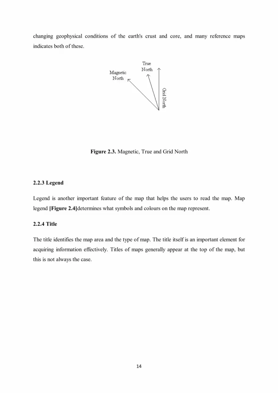
14
changing geophysical conditions of the earth's crust and core, and many reference maps
indicates both of these.
Figure 2.3. Magnetic, True and Grid North
2.2.3 Legend
Legend is another important feature of the map that helps the users to read the map. Map
legend [Figure 2.4]determines what symbols and colours on the map represent.
2.2.4 Title
The title identifies the map area and the type of map. The title itself is an important element for
acquiring information effectively. Titles of maps generally appear at the top of the map, but
this is not always the case.

15
Figure 2.4. A legend example
2.2.5 Projection
Map projections often try to represent the surface of the earth or a part of the earth on a
planesurface. Some failures in conformity, distance, direction, scale, and area are always akin
to these processes. Some projections minimize distortions in some of these featuresthrough a
process of maximizing errors in the other domains. Some projection methods only moderately
misrepresent these properties of the original surface (URL-3).
2.2.6 Cartographer(s)
In some – if not all – situations, it is important to note who the authority behind the production
of the map is in the first place. This can point to any reasoning or agenda that effects the
16
composition of the map. This is why most maps will include the name, initials or corporate
identity of the cartographer(s) (URL-4).
2.2.7 Date of production
Another important piece of information is the date of production. This is particularly necessary
for time sensitive maps, such as those used in relation to current affairs or weather reporting.
These maps can only be considered reliable according to their date of production. Other maps
may not require this, however it is still helpful to have this information as better or more
information for the map may be available afterwards.
2.3 Types of Maps
There are differenttypes of maps.It must be noted that there are several different interpretations
as to how to classify types of maps.It is possible to classify according to different features such
as scale, what they are attempting to show or how the map is produced.
One of the first ways to differentiate maps is by understanding what they are telling us. They
can illustratethe landscape such as showing diverse geographic features or roads, cities etc.
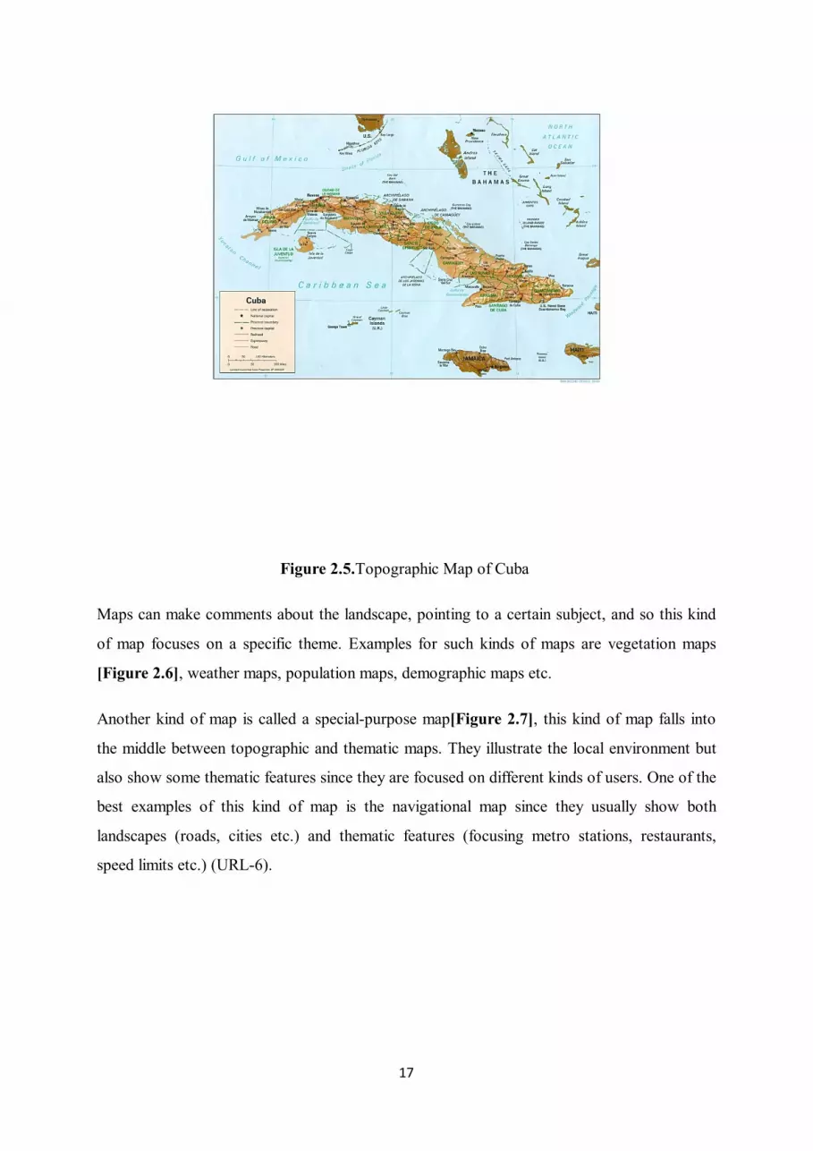
This type of maps are called topographic maps [Figure 2.5]or referencemaps (URL-5).
17
Figure 2.5.Topographic Map of Cuba
Maps can make comments about the landscape, pointing to a certain subject, and so this kind
of map focuses on a specific theme. Examples for such kinds of maps are vegetation maps
[Figure 2.6], weather maps, population maps, demographic maps etc.
Another kind of map is called a special-purpose map[Figure 2.7], this kind of map falls into
the middle between topographic and thematic maps. They illustrate the local environment but
also show some thematic features since they are focused on different kinds of users. One of the
best examples of this kind of map is the navigational map since they usually show both
landscapes (roads, cities etc.) and thematic features (focusing metro stations, restaurants,
speed limits etc.) (URL-6).

18
Figure 2.6.Thematic Map Example: Vegetation Map of Thailand

19
Figure 2.7.Special-Purpose Map Example: Moscow City Map
Maps can also be classified according to their scales, although this type of classifying is not
common, it can also be used on some occasions. There are three types of scale classification;
these are large scale maps, medium scale maps and small scale maps.
Large scale maps generally have scales 1:25,000 or higher, whereas medium scale maps have
scales between 1:100000 and 1:25000, and small scale maps have 1:100000 and smaller scales.
However this type of classification remains controversial, for example in city planning offices
large scale maps can mean scales 1:4800 and larger and small scales maps can have scales
1:24000 and smaller (Monmonier, 1996) Another example is that Brinker and Wolf (1984) - in
their work “Elementary Surveying” - classified small scale maps as 1:12000 and smaller
(URL-7).
Large scale maps are used in more detailed works yet smaller scale maps tend to be used in
less detailed works, so a cartographer who is using a small scale map must be more selective in
their work (Monmonier, 1996.).
Lastly maps can also be classified by examining how they are produced. There are two ways to
create a map: a cartographer either produces an original thematic or topographic map using
available resources, or he/she can reproduce a new map using information from another
existing map. Creating an original map is called “basic maps” while reproducing an existing
map is called “derivative maps”.

20
3. SOCIAL ROLE OF MAPS
Our mental geopolitical conception of the world is quite related with geography and the maps.
So cartography plays a key role here. All the international relations, borders, geographical
areas are mostly formed by maps and it affects our point of view to the world in general. Since
cartography has such a wide importance, we people as map users should interrogate the
background of maps more.
When do we see the first map in our life? Where do we come across the maps? Who makes the
maps? Who are the map makers and decision makers? Who uses the maps for which purposes
and how do they play with our perception of the world and so on? It is important to bear in
mind that these concerns must always be grounded in the complexity of their actual historical
contexts such as; unequal social and political power relations. The eminent historian of

21
cartography J. B. Harley states that , there are no empty space on the map, but rather our
social and political values are written all over the map (Harley, 1988). So that we should be
aware of neither science or maps are objective and while we are looking to and ask the
questions to ourselves “Whose science? Whose knowledge? Whose map is it?”
3.1. Propogation with Maps
“Unefrontièreça ne se voit pas, c’estune invention des hommes, la nature s’enfout.”
“A border cannot be seen, it’s a human invention, nature couldn’t care less.”
Jean Renoir, La grande illusion (France: Réalisationd'ArtCinématographique, 1937)
3.1.1 Cartographic Education
We see maps everywhere, from our time spent in elementary school with the maps on the
classroom walls up until the maps that we see on television while we are watching the weather
forecast. There are the official maps, educational maps, and maps that we see in the media.
There are multiple examples; on the walls of international institution offices, foreign ministries,
in newspapers, magazines and television, in schools and university textbooks, on money and so
on. So all of these encounters play an influence on us, advertently or inadvertently.
Cartographic images seen in our everyday lives can be powerful symbols that are used by
companies, politicians and even by artists as a piece of artwork to criticize the dominant
‘realities’ with a different point of view. As some use these images for their own benefits to
promote a specific agenda some use them to maintain a stance against dominant agendas.

22
Figure 3.1.‘London View’ by SociétéRéaliste
As it is seen in the last few years, in exhibitions and on biennials, there has been an increase in
the number of artworks that show cartographical images and different cartographical methods
to emphasize political issues about borders, wars, international relations and so on. One
example of this can be seen in the work “London View” by SociétéRéaliste[Figure 3.1], which
emphasises the temporal relations on the map of Europe and creates an interesting criticism
concerning the ‘sacredness’ and ‘unchangeable’ nature of borders. (URL-8)
In contrast to this, there are cartographical images created to promote specific agendas.
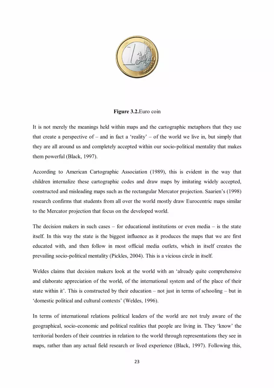
PauliinaRaento argues that the way in which images on coins and notes, such as the Euro
coins[Figure 3.2], ‘support the production and maintenance of national narratives’, which can
be seen as a way to promote ‘banal nationalism’ (Raento et al, 2004).
23
Figure 3.2.Euro coin
It is not merely the meanings held within maps and the cartographic metaphors that they use
that create a perspective of – and in fact a ‘reality’ – of the world we live in, but simply that
they are all around us and completely accepted within our socio-political mentality that makes
them powerful (Black, 1997).
According to American Cartographic Association (1989), this is evident in the way that
children internalize these cartographic codes and draw maps by imitating widely accepted,
constructed and misleading maps such as the rectangular Mercator projection. Saarien’s (1998)
research confirms that students from all over the world mostly draw Eurocentric maps similar
to the Mercator projection that focus on the developed world.
The decision makers in such cases – for educational institutions or even media – is the state
itself. In this way the state is the biggest influence as it produces the maps that we are first
educated with, and then follow in most official media outlets, which in itself creates the
prevailing socio-political mentality (Pickles, 2004). This is a vicious circle in itself.
Weldes claims that decision makers look at the world with an ‘already quite comprehensive
and elaborate appreciation of the world, of the international system and of the place of their
state within it’. This is constructed by their education – not just in terms of schooling – but in
‘domestic political and cultural contexts’ (Weldes, 1996).
In terms of international relations political leaders of the world are not truly aware of the
geographical, socio-economic and political realities that people are living in. They ‘know’ the
territorial borders of their countries in relation to the world through representations they see in
maps, rather than any actual field research or lived experience (Black, 1997). Following this,

24
political leaders have a significant influence on the production of maps, which Harvey divides
into two types; ‘external power’, with which decision makers determine what is shown or
hidden in maps, and ‘internal power’, with which they decide on the mapping process (Harley,
1989.) It is important to note that Western state maps often omit ‘sensitive’ locations such as
nuclear plants, submarine bases, and government buildings from their maps. For example, these
omissions were extended in the USA to cover even more locations after the attacks on the
World Trade Centre and the Pentagon in 2001 (Monmonier, 2005).
States and their decision makers – including politicians and corporations - not only have
influence on schools, but reach further into the media as well. This is important to consider, as
Mark Monmonier describes the media as ‘society’s most significant cartographic gatekeeper
and its most influential geographic educator’ (Culcasi, 2006).In this way, the state dictates to
the people as to how they should see their country, their borders, and their place in the world.
For example, in March 2015 the Minister of Finance of Turkey, Mehmet Şimşek, shared a
Twitter post with a map of Europe [Figure 3.3], which instead of the flags of the countries
themselves, shows the countries with flags of the highest ethnic minority group within that
country (URL-9). After Şimşek shared this image, a big nationalistic discussion started in
Turkey, about flags and borders. This shows how citizens can be sensitive about their officially
mapped-out homeland.

25
Figure 3.3.Twitter post: The countries with flags of the highest ethnic minority group
To sum up, all the maps we came across whether they are official maps, maps in the media or
maps we have seen during our education have a significant influence on how we construct our
reality of our perspective of the world.
3.1.2. Decision-Makers & Maps & Map-Users
Maps are to be found everywhere, more than we are aware of. There are different places and
circumstances that we come across or interact with maps. Maps have a significant influence on
the map-users. Our perspective of geography, geopolitics, the idea of unity and nationalism
could differ according to the maps that we see and how we interpret. They are more efficient in
the way we see maps everywhere such as; while we are looking for a direction to go, watching

26
weather forecast, during our education, in media in our daily lives. It is expected the world
shapes our maps of the world but John Green says ‘The way we map the world changes the
world.’ (URL-10) and gives the example of the ‘town’ Agloe [Figure 3.4] 120 miles from
New York City which doesn’t really exist in 1937 when the map is produced. The two
mapmakers Otto G. Lindberg and Ernest Alpers made up the fake place (a.k.a. paper town)
‘Agloe’ - as an anagram of their initials, O.G.L an E.A. - prevent other companies from lifting
their work without permission and it started appearing on maps of New York City after.
Figure 3.4.Agloe on New York City Map
This fake town idea which was in the middle of nowhere these years was just a copyright trap.
But after people kept going to Agloe, a shop called ‘Agloe General Store’ is appeared.
(URL-11). Even after the store closed -which was the only proof of the fiction town in real
world- you can still find ‘Agloe’ on google maps [Figure 3.5]. This shows the strong and
strange power of maps which can make an imaginary town real.

27
Figure 3.5.Agloe on Google Maps
As mapmakers can create paper towns and it might even be real afterwards, the other way
around is also possible. As Neocleous (2003) says, ‘to leave a state off a map is to deny its
existence’. In contrast Fotiadis (2009) writes to ‘put a state on the map is to affirm its
existence’ [Figure 3.6].

28
Figure 3.6.Balkans on the map of The Economics
Even some discourses can have a strong effect on politics. In 2005, previous president of Iran,
Mahmoud Ahmadinejad at the conference of ‘The World without Zionism’ said ‘Israel should
be wiped off map’ –according to the translator- during his speech (URL-12). Even a statement
about a metaphorical cartographic image can generate a controversial discussion in media
which shows the power of maps.
In other case authorities and decision-makers care more about the map itself rather than the
real geographical and demographic conditions. There are many cases such as; the colonial
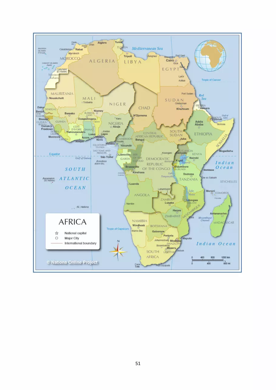
practices of western nations drawing borders on maps as it is seen clearly on Africa continent
[appendix A]. Fotiadis (2009) claims that maps are not the ground they depict therefore
decision makers should be conscious while they are moving their markers considering that it
might affect widespread destruction on the ground. As another example, the decision makers
of Sykes–Picot Agreement caused so much stress in Middle East even so that old caliph of
ISIS Abu Bakr al-Baghdadi in his speech in July 2014 at the Great Mosque of al-Nuri in Mosul
vowed that ‘this blessed advance will not stop until we hit the last nail in the coffin of the
Sykes-Picot conspiracy.’ blaming decision makers for his own destructive ways (URL-13). In
conclusion there is no map that can represent the real ground so map-makers, map-users and

29
decision-makers should be aware of the background of the issue concerning maps and how
their decisions or the way they take in information is influenced and the reasons behind this.
3.2. Political Maps
Political maps -which defines countries, states, and/or territories- are crucial in the point that
they shape our point of view about the countries, politics, international relations and power
dynamics. It is easy to manipulate people –not only the society but also the politicians- with
maps, intentionally or not. There are many choices about how to make a map and these choices
become more significant when we are talking about political world maps. According
mapmaker and the authorities we come across with cartographic silence, different usage of
colours and titling, unclear suspicious borderlines and so on.
3.2.1. Choice and Cartographic Silence
One of the most important facts that every map-user should be aware of is that there is no
perfect representation of the real world, the earth and the surface. Every map we come across
has its own generalization and they are sanitized simplifications of reality. Map-makers have to
choose what to show and how to show it. Some data and information are chosen in accordance
with the purpose. Furthermore, the purpose of the map depends on the organizations which
mostly have the power to control the cartographers. Mostly, these organizations that control
and have the power on maps are either states or international organizations such as NATO, the
Warsaw Pact, the EU, and the UN. For example, during the Cold War period, both the Soviet
Union and the West manipulated the contents of their maps where there might be a threat for
national security. For instance, Ordnance Survey maps in the UK do not show GCHQ
(Government Communications Headquarters) or nuclear sites. To give another example, after
9/11 the US became more sensitive about the locations they show on maps and started to
eliminate more information on them (Fotiadis, 2009).
Moreover, in the global media, the extent of the work by media corporations may misrepresent
some of the facts about international politics over a period. As it is seen in the example of
articles on The Economist magazines the area of Iraq, Iran, Turkey and ‘Kurdistan’ is

30
represented with significant changes over time because of their orientalist views about Middle
Eastern politics.
In the first instance from 1989, the mapmaker chose to depict an area called ‘Kurdistan’
[Figure 3.7] and showed a smaller area, in the second picture [Figure 3.8] a bigger territory is
shown with no name under it referring to it as ‘Kurdistan’ but just as ‘areas with high
proportion of Kurds’. This example shows how the media leads the general public’s view
about international relations and politics. The important reason for such a drastic change in this
particular media article, is the different view of the West to the Kurdish movement, there was a
western support for Kurds to their claims on a land called Kurdistan in 1989. However with
the progress of time, the West acknowledged the PKK as a terrorist organization and western
support for the Kurdish movement diminished (Culcasi, 2006).
Figure 3.7.Kurdistan mapFigure 3.8.Map of ‘Areas with high proportion of Kurds’
The Economist, vol. 311, no. 7608, 1989, p. 20. The Economist, vol. 386, no. 8569, 2008, p. 14.

31
As mentioned above maps can be used as propaganda by cartographers to strengthen certain
political ideas. Sometimes not showing a specific part of the map could make the same impact
on the public. For example in Ukraine Google Maps [Figure 3.9], Crimea is a part of Ukraine.
The line defining Crimea is the same kind of line parting other Ukrainian oblasts. This shows
no dispute in this particular area. On the other hand, in International Google Maps [Figure
3.10] the line defining Crimea is reflected in a dark dashed line, showing a contested territory.
The lack of depiction on Ukraine Google Maps about the political situation in Crimea is a
proper example of cartographic silence.
3.2.2. Colours
Colours are another way of creating symbolism on maps. For years, psychologists and
scientists have been studying and researching about the psychological effects of colours on
people. Colour on maps could be used to express facts such as; vegetation, elevation or some
political facts, results of elections, incomes of the people living in the area, rate of
violence/crimes etc.
Figure 3.9.Ukraine Google Maps Figure 3.10.International Google Maps

32
On physical maps, colours are used to show the different vegetation, most dramatically to
show changes in elevation. Blue is almost always chosen to represent oceans, lakes, streams; a
palette of light brown to dark brown is used to represent higher elevations, yellow is used for
built-up or urban areas, and black for roads, railroads, highways, bridges, place names,
buildings and borders. Occasionally on physical maps colours could have different readings.
For instance, green does not have to mean vegetation in every instance but also could connote
low elevation in a desert map. As it is seen this way on physical maps, on political maps
colours could have even more effects on our perception of geography, the world and
international relations. Monmonier (1996) claims that the use of colour by the mapmaker or
people in a position of power either consciously or unconsciously attempt to manipulate the
viewer but on account of the inter-subjective understandings of maps that depends on the
viewer’s cultural background.
Most colour psychologystudies focus on comparing red to either blue or green. According to
the effects of colour information obtained from California State University Stanislaus college
course study material, red conjures ideas of power, energy, aggression and danger(URL-14).
Red is also perceived as a representation of the idea of communism in western countries. On
the other hand blue symbolizes calm, neutrality, peace, Europe and UN
peacekeeping(Pastoureau, 1999).The “NATO in the World” [Figure 3.11] map is a good
example for comparing the usage of colours; red, blue and yellow. On this map, red is used for
the Communist Bloc to give an offensive feel and NATO countries are shown in the calm,
peaceful connotatively defensive blue. Other countries are represented in yellow which gives
the idea of neutrality. Not only the colour but also the choice of projection and the fact that the
Communist Bloc is at the top is another way to criticize it being propagandist. If we take a
look at the “NATO Member and Partner countries” [Figure 3.12] map, it is clear that Russia is
no longer red but a neutral beige colour. However, there are new countries that are coloured
reddish with the explanation “Mediterranean Dialog Countries” which raises questions. Why is
the colour red chosen for dialog countries since there are many of other colours to use?

33
Figure 3.11.‘NATO in the World’ Map

34
Figure 3.12.NATO, NATO Member and Partner Countries Map
The use of colour in maps also supports the idea of unity and solidarity whether of a state, of a
union, of states, of regions, or of organizations such as NATO. Jacob (2006) states that by
using a single colour for a state, the colour promotes the territorial homogeneity of that state.
The emblem and the map that the European Union uses is an obvious case in this regard
because colouring all of the EU countries with the same hue of Blue and Yellow gives the
feeling of unity. Furthermore the use of shades of green might be associated with Islam and
Arabic countries.
3.2.2.1 Choropleth classification
35
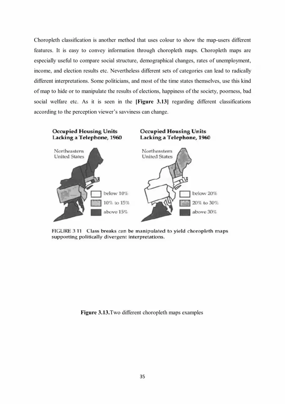
Choropleth classification is another method that uses colour to show the map-users different
features. It is easy to convey information through choropleth maps. Choropleth maps are
especially useful to compare social structure, demographical changes, rates of unemployment,
income, and election results etc. Nevertheless different sets of categories can lead to radically
different interpretations. Some politicians, and most of the time states themselves, use this kind
of map to hide or to manipulate the results of elections, happiness of the society, poorness, bad
social welfare etc. As it is seen in the [Figure 3.13] regarding different classifications
according to the perception viewer’s savviness can change.
Figure 3.13.Two different choropleth maps examples
36
3.2.3. Titles & Names
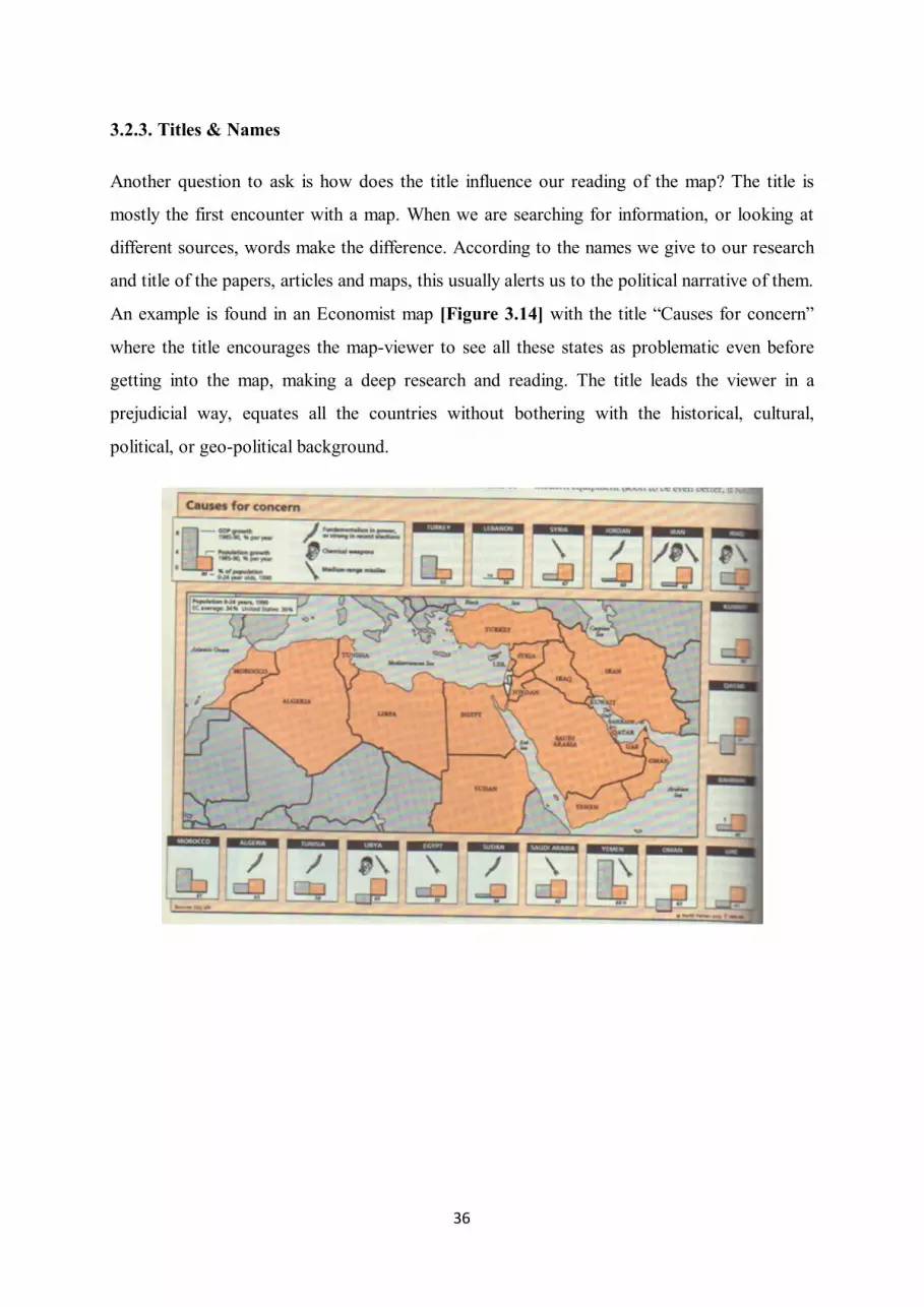
Another question to ask is how does the title influence our reading of the map? The title is
mostly the first encounter with a map. When we are searching for information, or looking at
different sources, words make the difference. According to the names we give to our research
and title of the papers, articles and maps, this usually alerts us to the political narrative of them.
An example is found in an Economist map [Figure 3.14] with the title “Causes for concern”
where the title encourages the map-viewer to see all these states as problematic even before
getting into the map, making a deep research and reading. The title leads the viewer in a
prejudicial way, equates all the countries without bothering with the historical, cultural,
political, or geo-political background.

37
Figure 3.14.‘Causes of concern’ Map on The Economist
Not only the titles and names but also ‘not naming’ a land or territory could be provocative.
For instance, on most of the current official, Western governmental web-sites, Google Maps
and interactive online maps Palestine is not shown. Instead, only the name of Israel is written.
If we search as ‘Palestine’ on Google Maps [Figure 3.15], it takes you to the area of West
Bank and Gaza strip, yet they are shown under no state name. This shows how manipulative
can maps be.
Figure 3.15.No Palestine on Google Maps
Toponymy is also a key feature of cartographic practice which is the study of place names
(toponyms), their origins, meanings, use, and typology.What language are the toponyms on the
map written in? English linguistic imperialism dominates the world and also the world of
cartography; the maps. Jacob (2006) claims that a ‘language that names all the places of the
world is symbolically appropriating them’. As stated by the research of Piers Fotiadis on The
Strange Power of Maps, NATO maps, educational maps, media maps, and maps in the UN
Cartographic section show a strong leaning to use the English names for places and the only
exception was on the map of Europe from the European Union website[Figure 3.16].

38
Figure 3.16.Titling of the country names
3.3.4. Symbols on the Map: Lines & Borders
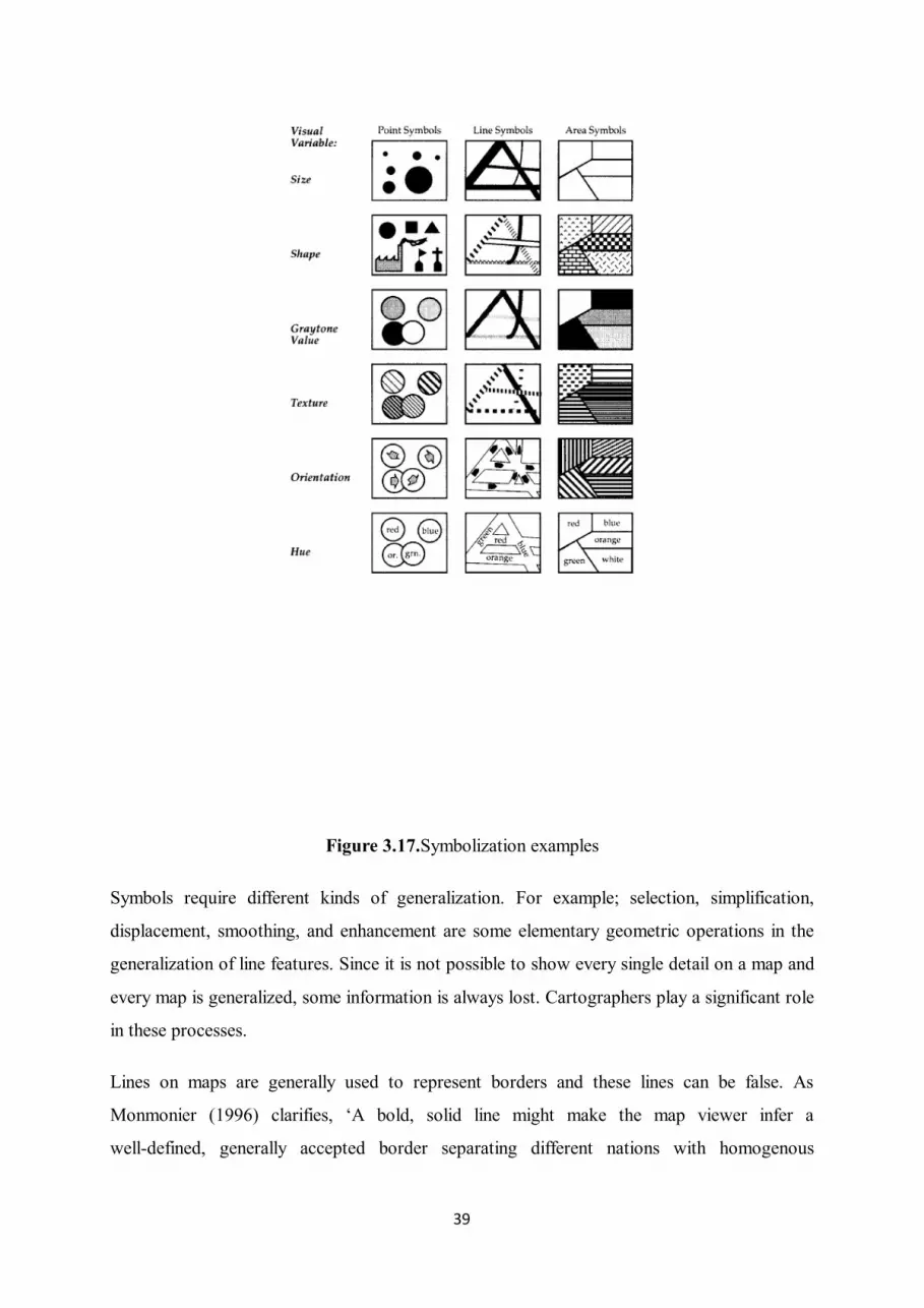
Maps need visual variables to portray geographic differences. And the way to convey these
differences are symbols which can be seen in different forms as points, lines, and area symbols
as well as the different sizes, shapes, textures, grey tone values, orientations, and hues of these
symbols. Every map needs generalization as do all of the symbols [Figure 3.17].
39
Figure 3.17.Symbolization examples
Symbols require different kinds of generalization. For example; selection, simplification,
displacement, smoothing, and enhancement are some elementary geometric operations in the
generalization of line features. Since it is not possible to show every single detail on a map and
every map is generalized, some information is always lost. Cartographers play a significant role
in these processes.
Lines on maps are generally used to represent borders and these lines can be false. As
Monmonier (1996) clarifies, ‘A bold, solid line might make the map viewer infer a
well-defined, generally accepted border separating different nations with homogenous

40
populations’. Solid lines identify the borders and states and therefore when there are no
borders between territories it creates the sense of the potential unity of these states. As shown
on the Europa website the European Union does not really depict the borders between states in
its maps[Figure 3.18].
Figure 3.18.EU Map on European Parliament website
Today on the same website there is the same map with different symbolizations. On the latest
map [Figure 3.19] accessed on the EU page, borderlines are more apparent yet the colouring
changes. While map-makers draw more distinct lines to define the borders, at time same time
they choose the same colour to represent the EU countries to keep the idea of unity.

41
Figure 3.19. EU Map on European Parliament website
Another example of Europe without border lines is that Euro coins have the cartographic
representation of the EU on the common sides of them[Figure 3.20].
Figure 3.20.Common sides of Euro coins

42
Borders of the same territory can differ constantly with the different political views and
the background of the map-maker. As it is seen on the [Figure 3.21], border lines are depicted
in three different ways depending on the references; the CIA, the Kurdish League Delegation
and the Atlas of the Arab World.
Figure 3.21.Different representation of borders of ‘Kurdistan’
The most recent polemical examples of lines and borders can also be seen on Google
Maps and Google Earth. Google Maps and Google Earth are important cases for this issue due
to the common usage around the world, their financial resources, their ability to update and
upgrade, and their use of the latest technology. As it is mentioned before on the Choice and
Cartographic Silence chapter, in the example of Ukraine Google Maps [Figure 3.9],Crimea is
a part of Ukraine. The line defining Crimea is the same kind of line parting other Ukrainian

43
provinces. This shows no dispute in this particular area. On the other hand, in International
Google Maps [Figure 3.10] the line defining Crimea is reflected in a dark dashed line, showing
a contested territory. The lack of depiction on Ukraine’s Google Maps about the political
situation in Crimea is a proper example of cartographic silence.

44
4. CONCLUSIONS AND RECOMMENDATIONS
In conclusion, maps play a big role in our lives, whether we are aware of it or not. We see
them everywhere, we look for maps to point out where we are on the ground, to build our
houses, to find the best spot and the best route for trips, or just to check for any traffic jams,
check them to understand the history and wars of countries, to understand the politics of today
and so on. It is essential to see the backstage of maps since they have such a significant
importance on our perception of the world and the way we see life itself. All the elements of
maps, all the individuals who have a part in producing the map and also the ones who
show/teaches about maps have their effects on us. So, anyone who interacts in some way with
maps should be aware of the fact that there is no objective way in which to draw a map. All
these influencing factors of maps such as; projections, surveying methods and technologies,
cartographical facts, map-makers and authorities, should be considered by us, the map-users
and map-lookers. We should also keep criticizing the idea of maps, the borders, countries and
politics all together considering the ways of produces and distributing in order to understand
the dynamics. At least for the geomatics engineering departments, there should be more classes
about maps in this sense, themselves, not only the technical part of it but also about the
complicated and inconsistent structure of them. Further research can (and should) focus on the
educational system from elementary schools up to universities about questioning maps, maps
on media and so on.

45
5. REFERENCES
American Cartographic Association (1989), The Case against Rectangular WorldMaps,CarthographicJournal, 26, pp. 156-157
Akerman, J.R. &Karrow, R.W. (2007), Maps: Finding Our Place in the World, (pp. 65-115)Chicago, University of Chicago Press
Black, J. (1997), Maps and Politics (p. 17, 146) London, Reaktion Books Ltd.
Culcasi, K. (2006), Cartographically Constructing Kurdistan within Geopolitical andOrientalist discourses, Political Geography, 25, p. 689
Fotiadis, P. (2009), The Strange Power of Maps, (pp. 30, 32) University of Bristol, School ofSociology, Politics, and International Studies
Harley, J. B. (1989), Deconstructing the Map, Cartographica Journal, pp. 1-20
Jacob, C. (2006), The Sovereign Map: Theoretical Approaches in Cartography throughoutHistory, (pp. 192, 212) Chicago, University of Chicago Press.
Monmonier, M. (1996), How to Lie with Maps, (pp. 17, 107, 170, 219-220) Chicago,University of Chicago Press.
Neocleous, M. (2003), Off the Map: On Violence and Cartography, European Journal ofSocial Theory, 6, p.442
Pastoureau, M., (1999), Dictionnaire des couleurs de notre temps, (p. 72), Paris, Bonneton.

46
Pickles, J. (2006), A History of Spaces: Cartographic Reason, (p. 25)London, Routledge.
Raento, P. &Hämäläinen, A. &Ikonen, H.&Mikkonen N. (2004), Striking Stories: APolitical Geography of Euro Coinage, Political Geography Journal, 23, p.929
Saarinen, T. F. (1988), Centring of Mental Maps of the World, American CartographerJournal, 12, pp. 103-111.
Weldes, J. (1996), Constructing National Interests, European Journal of InternationalRelations, 2, p. 280
Zelinsky, W. (1973), The first and last frontier of communication: the map as mystery, Bulletinof the Geography and Map Division, 94, pp. 2-8
URL-1: <http://math.rice.edu/~lanius/pres/map/mapdef.html>[Accessed 6 March 2015]
URL-2:
<http://www.ga.gov.au/scientific-topics/geographic-information/topographic-maps-data/basic
s/what-is-map-scale#heading-1>[Accessed 10 March 2015]
URL-3: <http://www.colorado.edu/geography/gcraft/notes/mapproj/mapproj_f.html>
[Accessed 27 April 2015]
URL-4: <http://www.colorado.edu/geography/gcraft/notes/cartocom/elements.html>
[Accessed 27 April 2015]
URL-5: <http://www.icsm.gov.au/mapping/maps_intro.html>[Accessed 2 May 2015]
URL-6: <https://www.e-education.psu.edu/geog486/node/1848> [Accessed 2 May 2015]
URL-7: <http://www.sfei.org/it/gis/map_interpretation/maps-and-scales>[Accessed 3 May
2015]
URL-8: <http://artnews.org/uqbar/?exi=17471>[Accessed 27 July 2015]
URL-9: <http://www.hurriyet.com.tr/gundem/28393266.asp>[Accessed on 20 July 2015]
URL-10: <https://www.youtube.com/watch?v=NgDGlcxYrhQ>[Accessed 29 July 2015]

47
URL-11:
<http://bigthink.com/strange-maps/643-agloe-the-paper-town-stronger-than-fiction>
[Accessed 29 July 2015]
URL-12: <http://www.theguardian.com/world/2005/oct/27/israel.iran> [Accessed 20 July
2015]
URL-13:
<http://www.ipcs.org/article/terrorism/of-lawrence-sykes-picot-and-al-baghdadi-4732.html>[
Accessed 30 July 2015]
URL-14: http://archive.csustan.edu/OIT/webServices/SupportResources/PsychofColor.html
[Accessed 15 April 2015]
IMAGE SOURCES
Figure 2.1: Drawn by the writer, Begüm Bilgiler
Figure 2.2:<http://knowledge.autodesk.com/support/autocad-map-3d/getting-started/caas/CloudHelp/cloudhelp/2016/ENU/MAP3D-Learn/files/GUID-F02A7EA3-7FFF-49BC-8ADE-A1A1439EF5C4-htm.html> [Accessed 21 March 2015]
Figure 2.3: <http://googlecompass.com/TypesofNorth.htm> [Accessed 10 April 2015]
Figure 2.4: <http://www.epa.gov/region1/er/iacp/maps.html> [Accessed 15 April 2015]
Figure 2.5: <http://www.lib.utexas.edu/maps/americas/cuba_rel94.jpg> [Accessed 29 April2015]

48
Figure 2.6: <https://www.e-education.psu.edu/geog486/node/1848> [Accessed 15 April 2015]
Figure 2.7:<http://www.map-library.com/maps/maps-of-europe/maps-of-russia/maps-of-moscow/large-detailed-road-map-of-moscow-city-center.jpg> [Accessed 29 April 2015]
Figure 3.1: <http://artnews.org/uqbar/?exi=17471> [Accessed 27 July 2015]
Figure 3.2: <https://www.ecb.europa.eu/euro/coins/common/html/index.en.html> [Accessed13 June 2015]
Figure 3.3: <http://www.hurriyet.com.tr/gundem/28393266.asp> [Accessed on 20 July 2015]
Figure 3.4:<http://www.radiolab.org/story/imaginary-town-becomes-real-then-not-true-story_kw/>[Accessed 29 July 2015]
Figure 3.5: <maps.google.com> [Accessed 29 July 2015]
Figure 3.6: The Economist, vol. 392, no. 8632, 2009, p. 39.
Figure 3.7: The Economist, vol. 311, no. 7608, 1989, p. 20.
Figure 3.8: The Economist, vol. 386, no. 8569, 2008, p. 14.
Figure 3.9: <maps.google.com.ua> [Accessed 6 May 2015]
Figure 3.10: <maps.google.com > [Accessed 6 May 2015]
Figure 3.11: <http://www.nato.int/history/nato-history-posters.html> [Accessed 7 May 2015].
Figure 3.12:<http://www.nato.int/nato_static/assets/pdf/pdf_publications/NATO_member_and_partner_countries-2011-ENG.pdf> [Accessed 7 May 2015].
Figure 3.13: Monmonier, M. (1996), How to Lie with Maps, (p. 41) Chicago, University ofChicago Press.
Figure 3.14: The Economist, Defence Survey, vol. 316, nos. 7670, 1990, p. 6.
Figure 3.15: <maps.google.com> [Accessed 9 May 2015].
Figure 3.16: <http://bookshop.europa.eu/en/the-european-union-pbIK3112132/> [Accessed 9May 2015].

49
Figure 3.17: Monmonier, M. (1996), How to Lie with Maps, (p. 20) Chicago, University ofChicago Press.
Figure 3.18: <http://www.europarl.europa.eu/parliament/public/nearYou.do> [Accessed 30July 2009]
Figure 3.19: <http://www.europarl.europa.eu/aboutparliament/en/information_offices.html>[Accessed 15 May 2009].
Figure 3.20: Raento, Pauliina, Anna Hämäläinen, Hanna Ikonen and NellaMikkonen, ‘Strikingstories: a political geography of euro coinage’, Political Geography, vol. 23 (2004) pp.929-956, p. 934.
Figure 3.21: Culcasi, K. (2006), Cartographically Constructing Kurdistan within Geopoliticaland Orientalist discourses, Political Geography, 25, pp. 680-706.
6. APPENDICES

50
APPENDIX A: Political Map of Africa

52
http://www.nationsonline.org/oneworld/map/africa-political-map.htm
Recommended