Embed Size (px)
Citation preview
Social Action and Community Media Production Evaluation
Bekki Asquith

Is your advertising campaign fit for purpose and why?
• The general aim of the existing SASH products are to inform people of the services that they provide and the help that they give to homeless people between the ages of 16-24. The purpose of my advertising campaign was to educate people about and make them aware of SASH as an organisation. It was also to advertise the services that they offer such as Nightstop, which is the subject of my leaflet.
• I think that my posters make people aware of the fact that homelessness is not just about the people that you see living on the streets; In reality, it can happen to anyone and at anytime. The statistics that I have included on my posters such as ‘Over 50% of young homeless people report that their parents told them to leave or knew they were leaving and didn’t care’ on the ‘Hannah poster’. I think that this feature makes people aware of situations that they wouldn’t otherwise know or even think about involving the issue of homelessness. Also, I think that I have made people aware of the work that SASH do as an organisation because of my leaflet contains lots of information about the Nightstop service, educating people about where they can go if they are stuck for somewhere to sleep on a night. It also educates people about what SASH do to help homeless people, so that they might relate to the cause and maybe donate to the charity or volunteer in some way.
• I think that my campaign is entirely fit for its purpose because it contains relevant and accurate information to make people aware of the charity, its aim and what it does. It also tells people how they can get involved and find out more information, which could lead to either donations or additional support. My posters and my leaflet match the purpose and aim of existing SASH products, therefore I think that they fulfill their purpose.
• The only thing I would say my campaign does not do is clearly and directly advertise for volunteers for SASH. This is a main aim of SASH as an organisation and I think is a big part of what they are advertising themselves for. Unfortunately, none of my products directly advertise for volunteers because I have focused on making them about other issues e.g. trying to show that homelessness can happen to anyone at any time, and also advertising the Nightstop service.
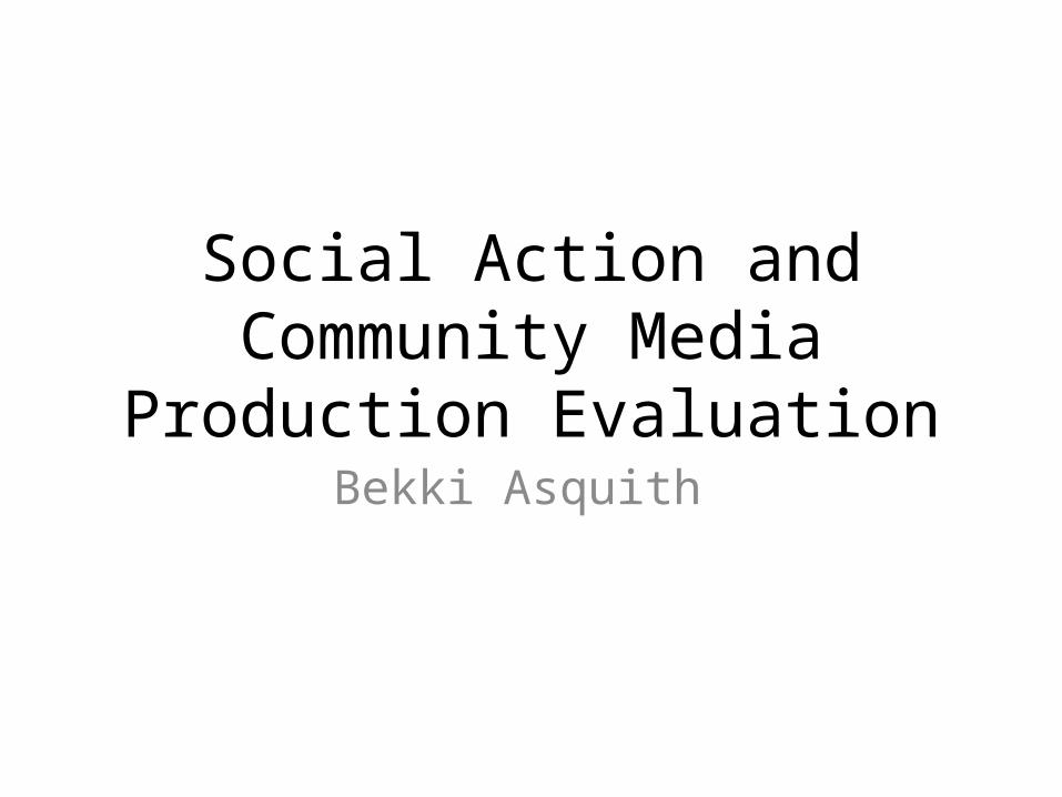
My Nightstop leaflet contains near enough the same headings as the existing SASH Nightstop leaflet. I have used their ideas and information to create my leaflet, I have just changed the layout and livened it up a bit.
The fact that I have kept the headings ad the general information the same means that the leaflet it fit for purpose because it is very similar to the original which fulfilled its purpose. Existing SASH Nightstop leaflet (outside)
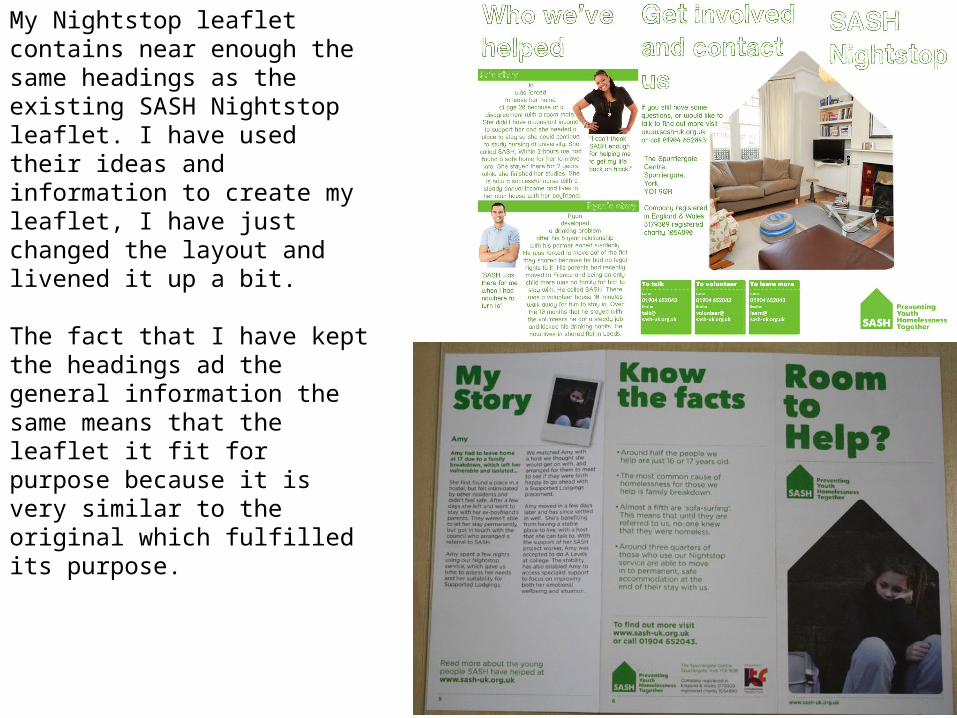
My headings for the pages here are the same as the original existing SASH leaflet. I have however changed the information.
I think that the inside of the original leaflet looked a bit boring and there was quite a lot of clear white space that could have been used to add more information to the leaflet.
I think that the font used in the original leaflet makes the headings stand out more . I like the font that I have used for my headings however, looking at it now and comparing it with the existing one, I think that I could have used one that stood out more and grabbed attention.
Existing SASH Nightstop leaflet (inside)
Does you campaign communicate your message clearly and why?
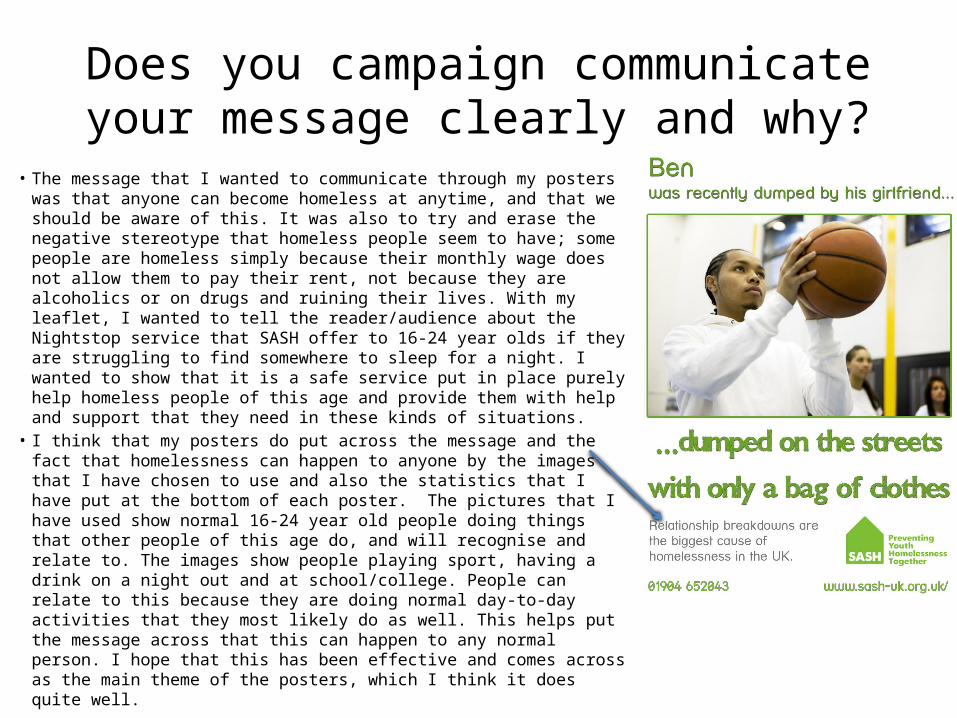
• The message that I wanted to communicate through my posters was that anyone can become homeless at anytime, and that we should be aware of this. It was also to try and erase the negative stereotype that homeless people seem to have; some people are homeless simply because their monthly wage does not allow them to pay their rent, not because they are alcoholics or on drugs and ruining their lives. With my leaflet, I wanted to tell the reader/audience about the Nightstop service that SASH offer to 16-24 year olds if they are struggling to find somewhere to sleep for a night. I wanted to show that it is a safe service put in place purely help homeless people of this age and provide them with help and support that they need in these kinds of situations.
• I think that my posters do put across the message and the fact that homelessness can happen to anyone by the images that I have chosen to use and also the statistics that I have put at the bottom of each poster. The pictures that I have used show normal 16-24 year old people doing things that other people of this age do, and will recognise and relate to. The images show people playing sport, having a drink on a night out and at school/college. People can relate to this because they are doing normal day-to-day activities that they most likely do as well. This helps put the message across that this can happen to any normal person. I hope that this has been effective and comes across as the main theme of the posters, which I think it does quite well.
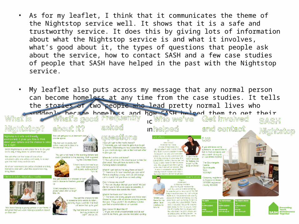
• As for my leaflet, I think that it communicates the theme of the Nightstop service well. It shows that it is a safe and trustworthy service. It does this by giving lots of information about what the Nightstop service is and what it involves, what’s good about it, the types of questions that people ask about the service, how to contact SASH and a few case studies of people that SASH have helped in the past with the Nightstop service.
• My leaflet also puts across my message that any normal person can become homeless at any time from the case studies. It tells the stories of two people who lead pretty normal lives who suddenly became homeless and how SASH helped them to get their lives back on track and get back to normal. This is the main message that I wanted to communicate through my products.
Is your campaign appropriate for your target audience and why?
• I think that there are certain aspects about my campaign that apply directly to my target audience, however some are not so obvious.
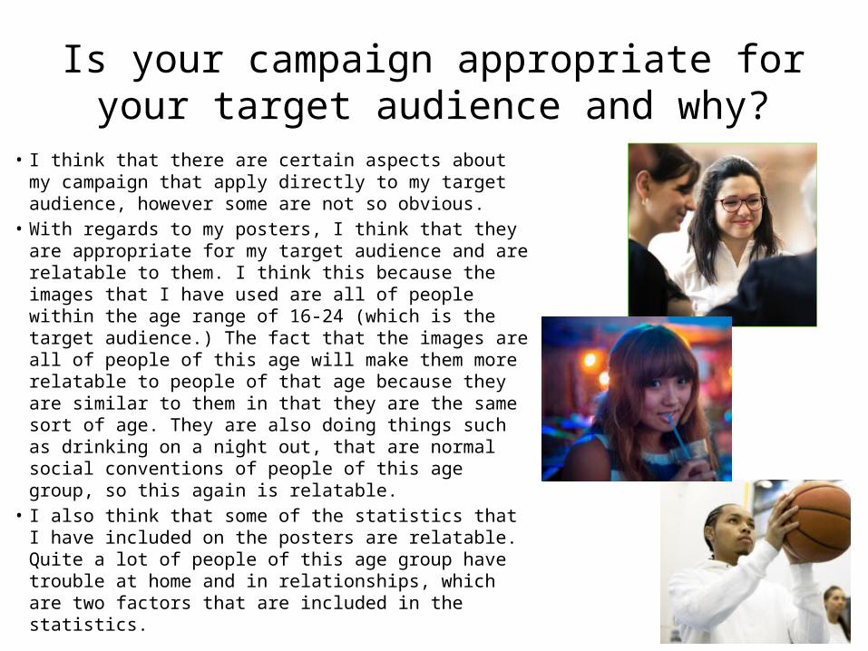
• With regards to my posters, I think that they are appropriate for my target audience and are relatable to them. I think this because the images that I have used are all of people within the age range of 16-24 (which is the target audience.) The fact that the images are all of people of this age will make them more relatable to people of that age because they are similar to them in that they are the same sort of age. They are also doing things such as drinking on a night out, that are normal social conventions of people of this age group, so this again is relatable.
• I also think that some of the statistics that I have included on the posters are relatable. Quite a lot of people of this age group have trouble at home and in relationships, which are two factors that are included in the statistics.
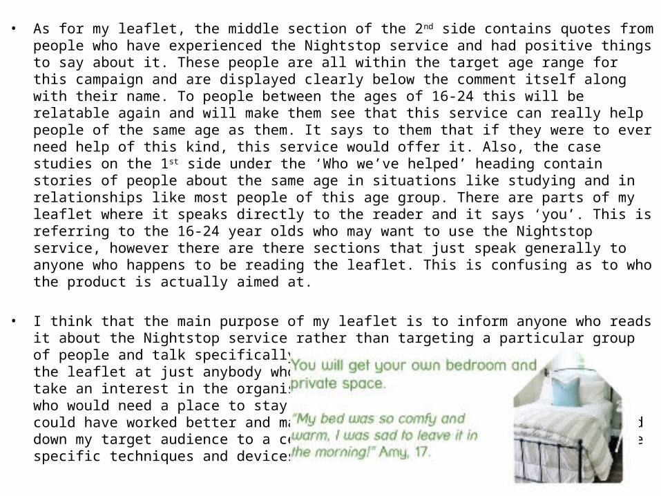
• As for my leaflet, the middle section of the 2nd side contains quotes from people who have experienced the Nightstop service and had positive things to say about it. These people are all within the target age range for this campaign and are displayed clearly below the comment itself along with their name. To people between the ages of 16-24 this will be relatable again and will make them see that this service can really help people of the same age as them. It says to them that if they were to ever need help of this kind, this service would offer it. Also, the case studies on the 1st side under the ‘Who we’ve helped’ heading contain stories of people about the same age in situations like studying and in relationships like most people of this age group. There are parts of my leaflet where it speaks directly to the reader and it says ‘you’. This is referring to the 16-24 year olds who may want to use the Nightstop service, however there are there sections that just speak generally to anyone who happens to be reading the leaflet. This is confusing as to who the product is actually aimed at.
• I think that the main purpose of my leaflet is to inform anyone who reads it about the Nightstop service rather than targeting a particular group of people and talk specifically to, like my posters do. I think I aimed the leaflet at just anybody who would want to help, volunteer, donate, take an interest in the organisation or anybody of the 16-24 age range who would need a place to stay for the night. I think that my leaflet could have worked better and maybe been more effective if I had narrowed down my target audience to a certain age range/group so that I could use specific techniques and devices to purely direct it at them.
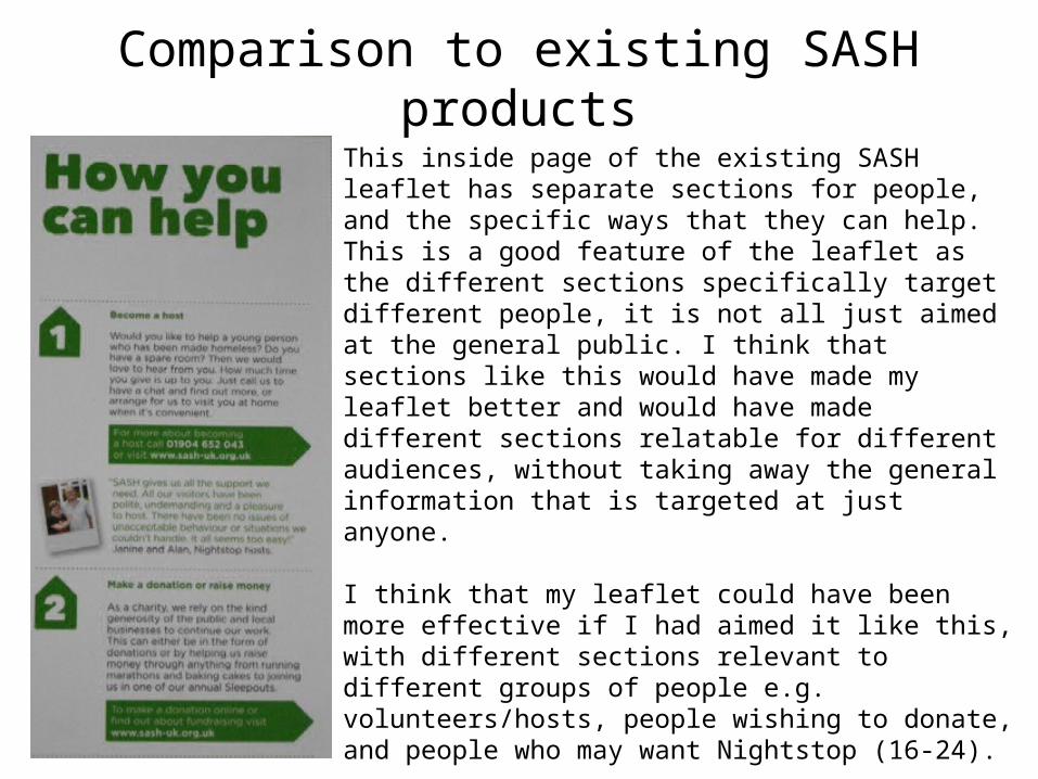
Comparison to existing SASH productsThis inside page of the existing SASH leaflet has separate sections for people, and the specific ways that they can help. This is a good feature of the leaflet as the different sections specifically target different people, it is not all just aimed at the general public. I think that sections like this would have made my leaflet better and would have made different sections relatable for different audiences, without taking away the general information that is targeted at just anyone.
I think that my leaflet could have been more effective if I had aimed it like this, with different sections relevant to different groups of people e.g. volunteers/hosts, people wishing to donate, and people who may want Nightstop (16-24).
My leaflet’s main purpose is to educate people, anyone who would be interested, about the service. I think it would have worked better if I had aimed it strictly towards to 16-24 year olds or had set my leaflet out in sections direct each section to different audience groups.
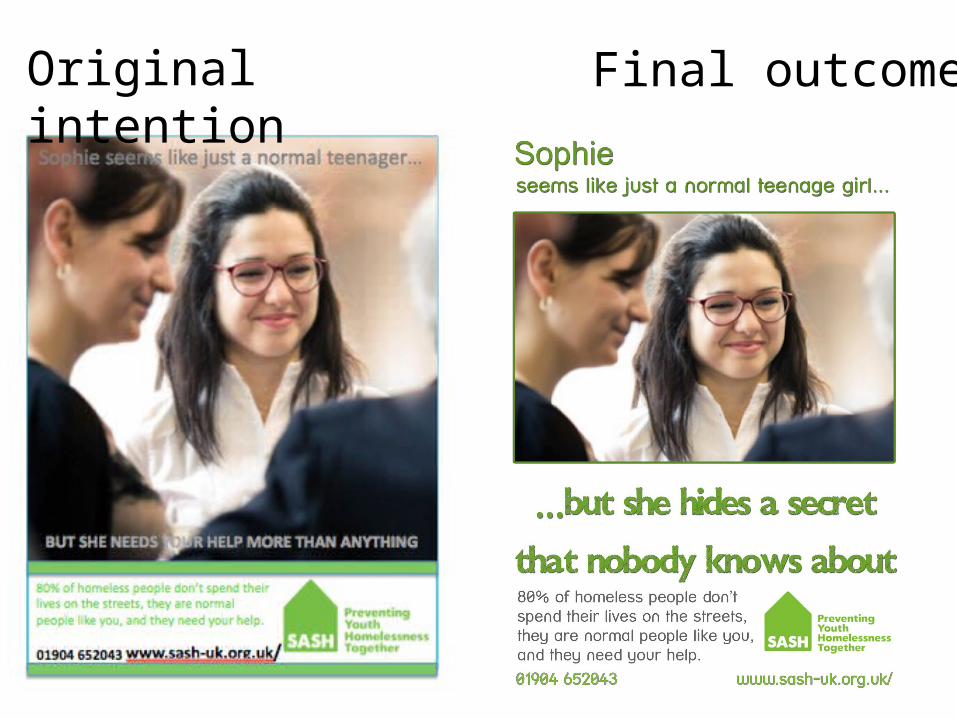
Original intention Final outcome
Compare and contrast your original intentions with the outcomes you arrived at.• My original intention for my posters is not too dissimilar to the design that I eventually
arrived at. I have still used the same types of images, (photographs of 16-24 year olds doing normal ever day activities to make the posters relatable to the target audience). I have kept the copy the same; I have used the statistic idea, and also the text that allows the audience to connect to the character and get to know them a bit. I think that this part is important because it makes the posters relatable to the audience.
• I changed the text layout on my posters from what I originally planned to do because when it came to putting the picture and the text together on Photoshop, it stood out more when the text was not overlapping the image.
• I decided to change the layout of the poster from a photograph straight onto a banner of text and information because I do not think that this was the most effective layout for the purpose. I think that posters for this purpose need to contain more text than images because they need to educate and inform the reader without going overboard and boring them.
• I also decided to change the colour of the fonts. I had originally planned to have the text that would be on the image as a grey colour and the statistic in green to match the existing SASH theme and colour palette. In the end, I decided to have the
• My font choices stayed the same. I think that the font ‘Street’ is clear and simple, it is also easy to read, this is why I kept it the same. The font ‘Window Crash’ has cracks and smashes in the letter body which makes it appear like a smashed window, like some kind of trauma has occurred. This reflects the issue of homelessness, this is why I have kept this the same.
• This was what I wrote in my final planning stages: “I want my campaign of posters to put across the message that anyone can become homeless at anytime and it cannot be stopped. It can happen to anyone and you might not know about it. I think that my posters will achieve this by using the images that I plan to. The photographs will show normal 16-24 year olds going about their daily business and doing what normal people of that age do.”
• Looking back at this, I would say that the message and theme of the posters has stayed the same through my production and this has not changed from my original plans to my final outcome products. I have achieved what I wanted to with regards to the message and theme of my posters.
How effective are the techniques that you have used and why? (Posters)
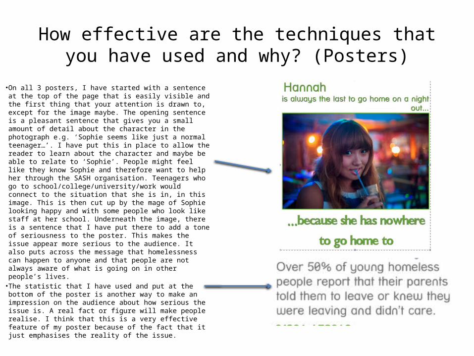
• On all 3 posters, I have started with a sentence at the top of the page that is easily visible and the first thing that your attention is drawn to, except for the image maybe. The opening sentence is a pleasant sentence that gives you a small amount of detail about the character in the photograph e.g. ‘Sophie seems like just a normal teenager…’. I have put this in place to allow the reader to learn about the character and maybe be able to relate to ‘Sophie’. People might feel like they know Sophie and therefore want to help her through the SASH organisation. Teenagers who go to school/college/university/work would connect to the situation that she is in, in this image. This is then cut up by the mage of Sophie looking happy and with some people who look like staff at her school. Underneath the image, there is a sentence that I have put there to add a tone of seriousness to the poster. This makes the issue appear more serious to the audience. It also puts across the message that homelessness can happen to anyone and that people are not always aware of what is going on in other people’s lives.
• The statistic that I have used and put at the bottom of the poster is another way to make an impression on the audience about how serious the issue is. A real fact or figure will make people realise. I think that this is a very effective feature of my poster because of the fact that it just emphasises the reality of the issue.
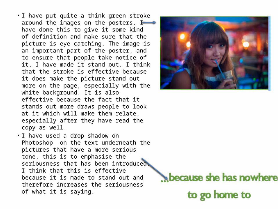
• I have put quite a think green stroke around the images on the posters. I have done this to give it some kind of definition and make sure that the picture is eye catching. The image is an important part of the poster, and to ensure that people take notice of it, I have made it stand out. I think that the stroke is effective because it does make the picture stand out more on the page, especially with the white background. It is also effective because the fact that it stands out more draws people to look at it which will make them relate, especially after they have read the copy as well.
• I have used a drop shadow on Photoshop on the text underneath the pictures that have a more serious tone, this is to emphasise the seriousness that has been introduced. I think that this is effective because it is made to stand out and therefore increases the seriousness of what it is saying.
How effective are the techniques that you have used and why? (Leaflet)
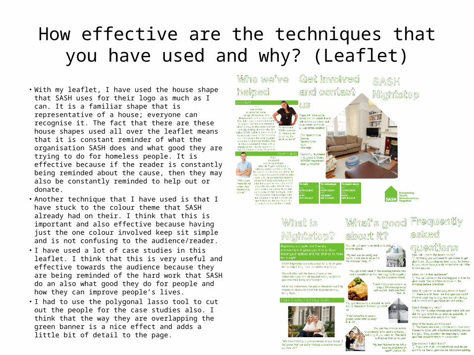
• With my leaflet, I have used the house shape that SASH uses for their logo as much as I can. It is a familiar shape that is representative of a house; everyone can recognise it. The fact that there are these house shapes used all over the leaflet means that it is constant reminder of what the organisation SASH does and what good they are trying to do for homeless people. It is effective because if the reader is constantly being reminded about the cause, then they may also be constantly reminded to help out or donate.
• Another technique that I have used is that I have stuck to the colour theme that SASH already had on their. I think that this is important and also effective because having just the one colour involved keep sit simple and is not confusing to the audience/reader.
• I have used a lot of case studies in this leaflet. I think that this is very useful and effective towards the audience because they are being reminded of the hard work that SASH do an also what good they do for people and how they can improve people’s lives.
• I had to use the polygonal lasso tool to cut out the people for the case studies also. I think that the way they are overlapping the green banner is a nice effect and adds a little bit of detail to the page.
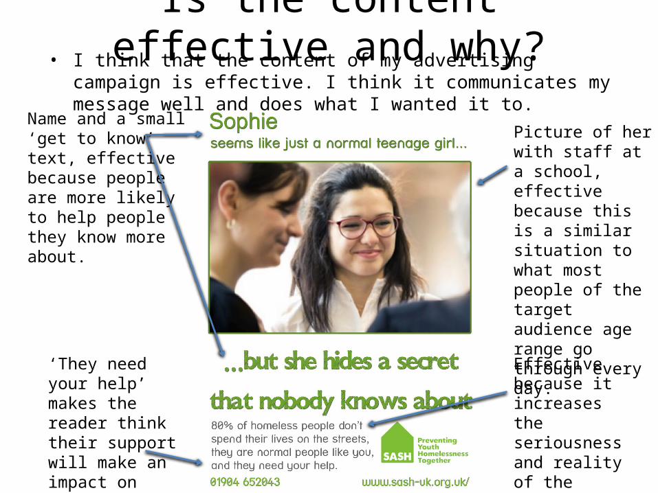
Name and a small ‘get to know’ text, effective because people are more likely to help people they know more about.
Picture of her with staff at a school, effective because this is a similar situation to what most people of the target audience age range go through every day.
‘They need your help’ makes the reader think their support will make an impact on their lives. Effective because it supplies emotion.
• I think that the content of my advertising campaign is effective. I think it communicates my message well and does what I wanted it to.
Is the content effective and why?
Effective because it increases the seriousness and reality of the situation.
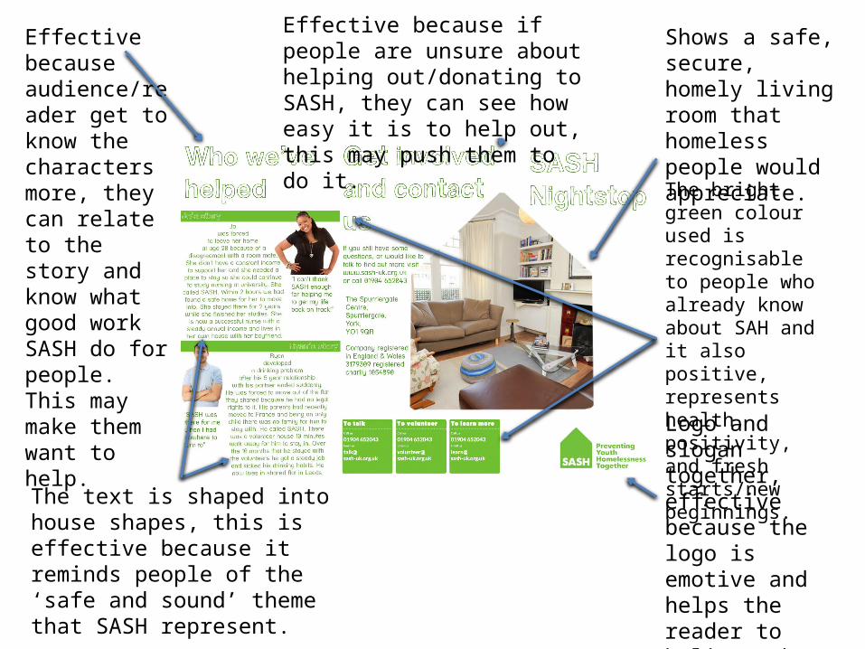
Effective because audience/reader get to know the characters more, they can relate to the story and know what good work SASH do for people. This may make them want to help.
Effective because if people are unsure about helping out/donating to SASH, they can see how easy it is to help out, this may push them to do it.
Shows a safe, secure, homely living room that homeless people would appreciate.
The text is shaped into house shapes, this is effective because it reminds people of the ‘safe and sound’ theme that SASH represent.
Logo and slogan together, effective because the logo is emotive and helps the reader to believe that SASH do good for people.
The bright green colour used is recognisable to people who already know about SAH and it also positive, represents health, positivity, and fresh starts/new beginnings.
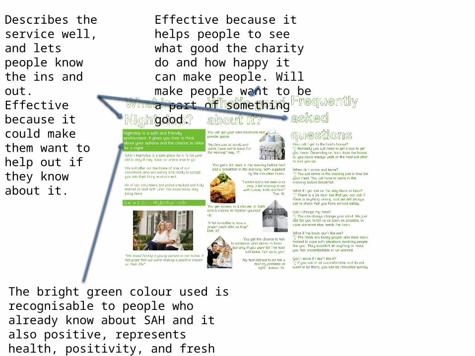
Effective because it helps people to see what good the charity do and how happy it can make people. Will make people want to be a part of something good.
Describes the service well, and lets people know the ins and out. Effective because it could make them want to help out if they know about it.
The bright green colour used is recognisable to people who already know about SAH and it also positive, represents health, positivity, and fresh starts/new beginnings.
What impact do you think the campaign will have on the public and why?
• I think that my campaign will have a big impact on the public. • I think that with the posters, they will be displayed on buses or on notice boards in schools,
doctor’s surgeries, colleges etc. This will make sure that the people who they apply to will be able to see them easily. I think that they will cause people to think more seriously about the issue of homelessness and how it can be happening to somebody without anybody else having any idea about it. People need help and they cannot always ask for it because maybe they are embarrassed or they just think that nothing can be done about the situation. I think that the most effective qualities of my posters are the statistics and the background stories of the characters that are introduced on them. I think this because these will be the parts of the poster that will hook people and make them want to help. From evaluating existing social action posters, I know that emotive language and shocking facts are the way to grab a reader’s attention.
• With my leaflet, I think that this will have a big effect on the public because it is very informative about the Nightstop service that SASH has to offer. The more the information, the more people want to know more and investigate and maybe even get involved and help the cause. I think that the leaflet would be the main cause of people getting involved with SASH and volunteering as hosts for homeless people. I think that the case studies and the other parts of the leaflet that allow the reader to get to know about people that SASH have helped e.g. the ‘What is good about it?’ section will be the most effective on the audience because they can get to know about the good work that SASH do for people, this will make them want to help towards a good cause and will therefore lead them to help.
What are the technical and aesthetic qualities of your work?
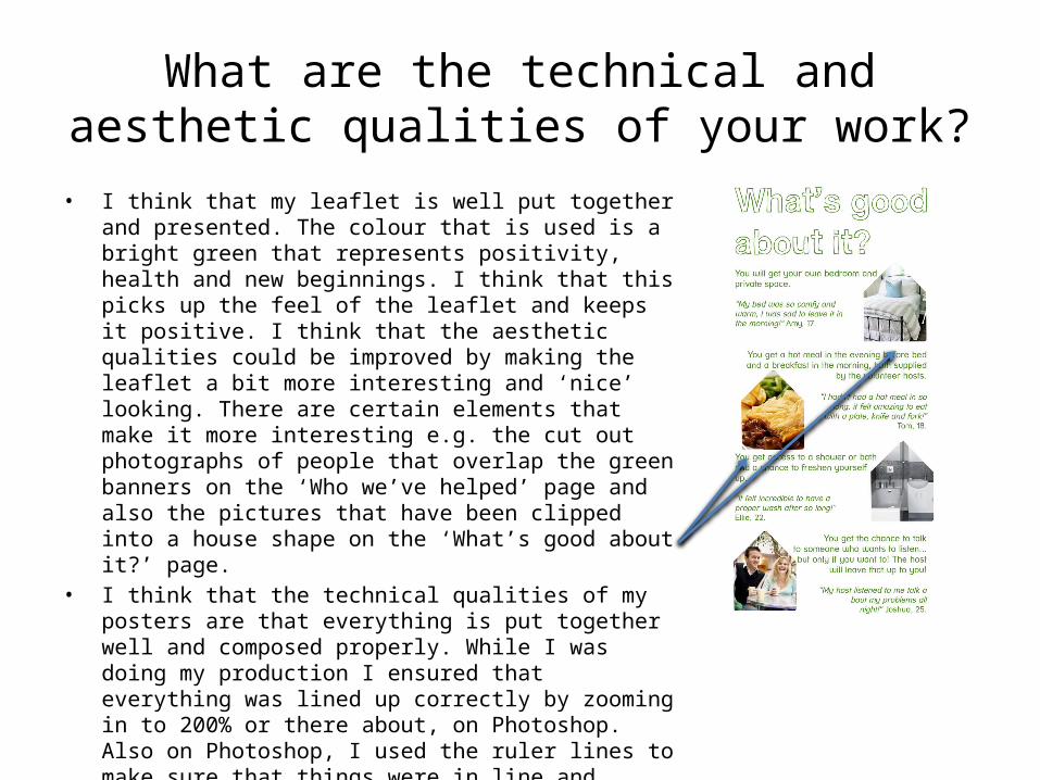
• I think that my leaflet is well put together and presented. The colour that is used is a bright green that represents positivity, health and new beginnings. I think that this picks up the feel of the leaflet and keeps it positive. I think that the aesthetic qualities could be improved by making the leaflet a bit more interesting and ‘nice’ looking. There are certain elements that make it more interesting e.g. the cut out photographs of people that overlap the green banners on the ‘Who we’ve helped’ page and also the pictures that have been clipped into a house shape on the ‘What’s good about it?’ page.
• I think that the technical qualities of my posters are that everything is put together well and composed properly. While I was doing my production I ensured that everything was lined up correctly by zooming in to 200% or there about, on Photoshop. Also on Photoshop, I used the ruler lines to make sure that things were in line and placed correctly. I made sure that everything matched up so that my worked looked to a professional standard. For example, the house shapes that I used for the pictures on the ‘What’s good about it?’ page, I copied the shapes by holding down the ‘Alt’ key and dragging it to where I wanted it. Then I added a new picture underneath each and created a clipping mask that would place the picture into this house shape.