Embed Size (px)
Citation preview

FLEXBOX
CHRIS SAUVE

LAYOUT STRATEGIES
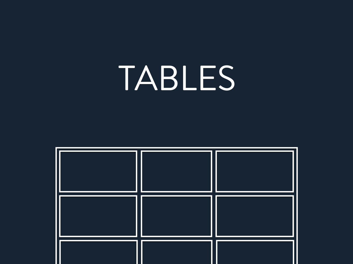
TABLES

JUST DON’T.
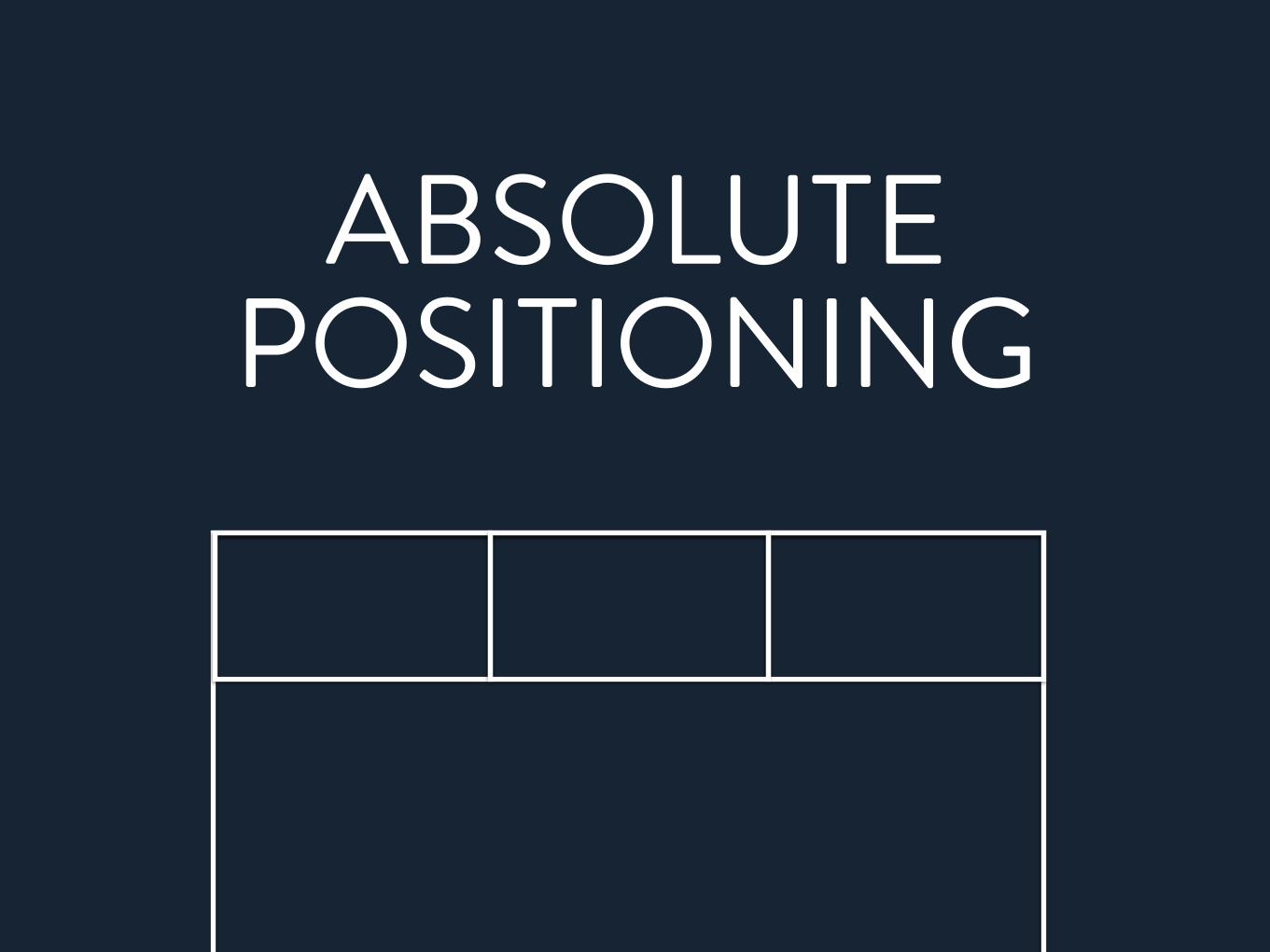
ABSOLUTE POSITIONING

INLINE BLOCK

FLOATS

THINK DIFFERENT

CONTENT-OUT LAYOUT

parent
child
1child
2child
3

1 2 3

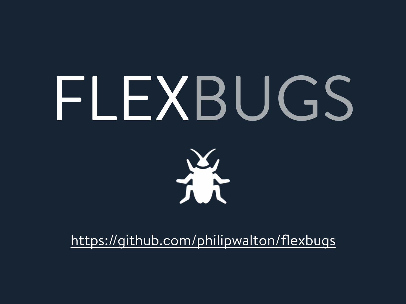
BROWSER SUPPORT

YES YES-‐webkit
YES10+ only-‐ms in IE10
YESeven in Mini!
YES YES-‐webkit
YES10+ only-‐ms in IE10
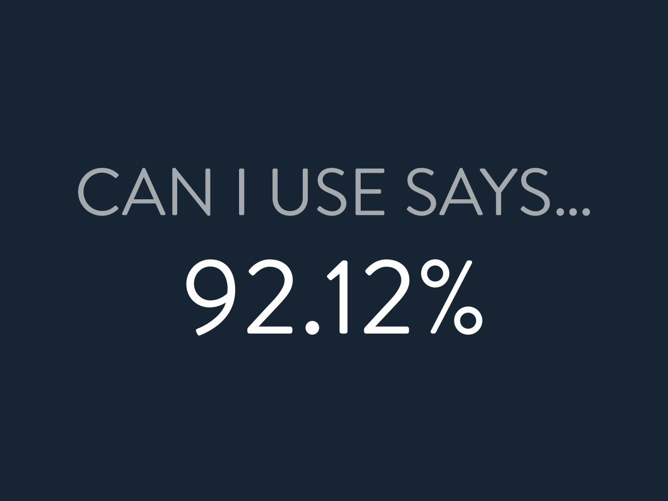
YESeven in Mini!CAN I USE SAYS…
92.12%
PARENT RULES

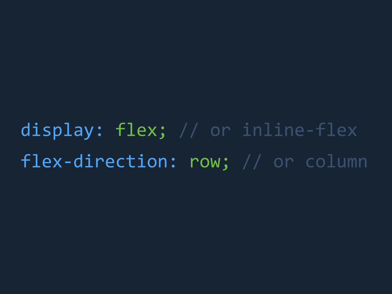
display: flex; // or inline-‐flex
flex-‐direction: row; // or column
1 2 3
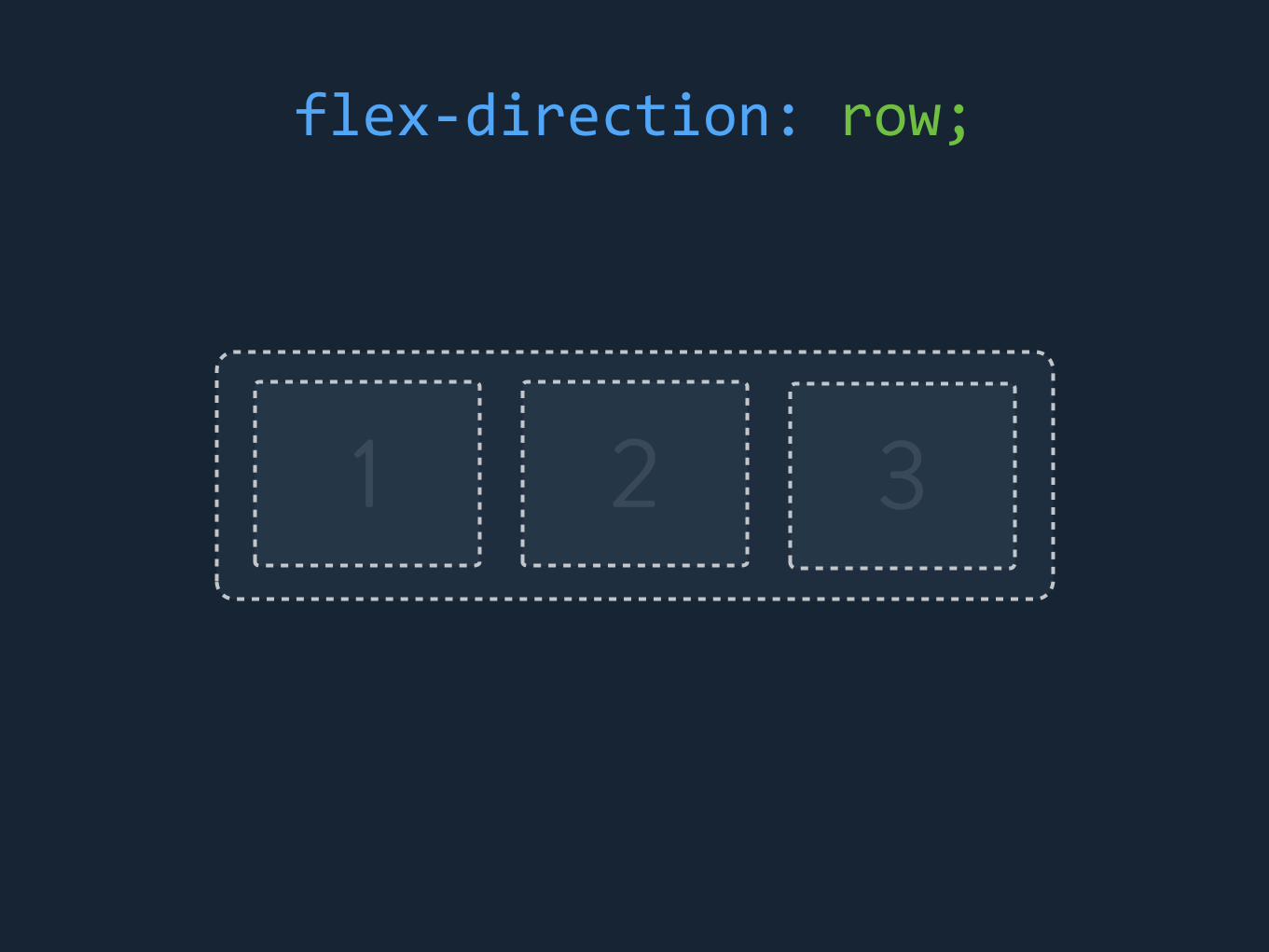
flex-‐direction: row;

1
2
3
flex-‐direction: column;
display: flex; // or inline-‐flex
flex-‐direction: row; // or column

display: flex; // or inline-‐flex
flex-‐direction: row; // or column
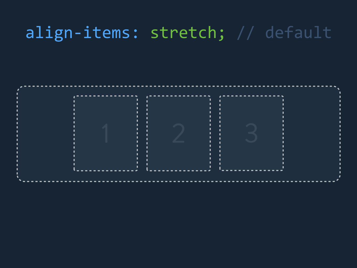
align-‐items: stretch;

1 2 3
Cross Axis
align-‐items
1 2 3
align-‐items: stretch; // default

1 2 3
align-‐items: center;

1 2 3
align-‐items: flex-‐start;

1 2 3
align-‐items: flex-‐end;

display: flex; // or inline-‐flex
flex-‐direction: row; // or column
align-‐items: stretch;

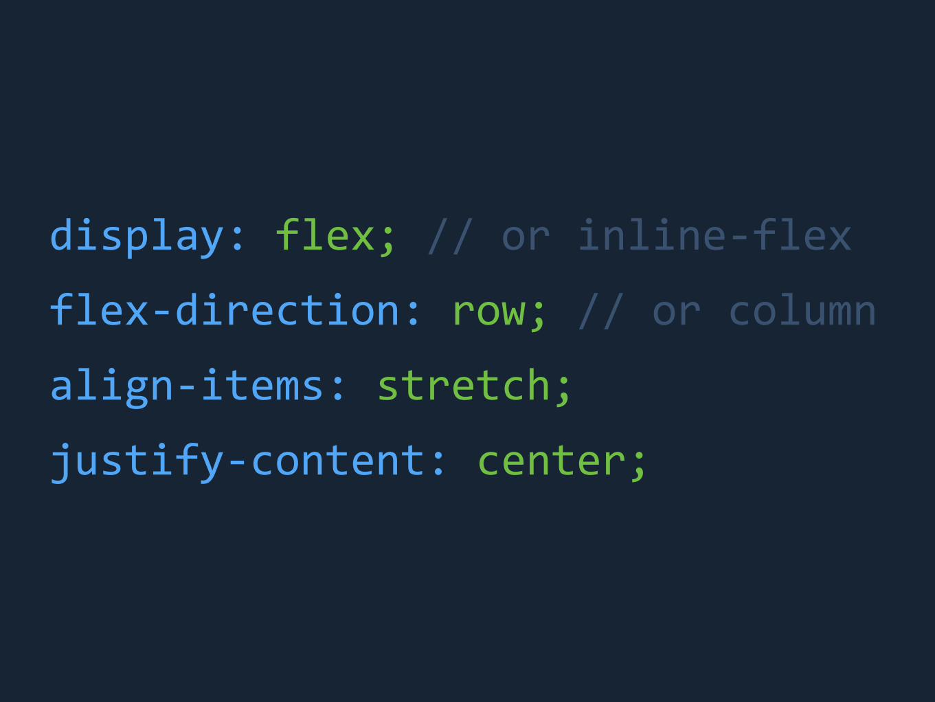
display: flex; // or inline-‐flex
flex-‐direction: row; // or column
align-‐items: stretch;
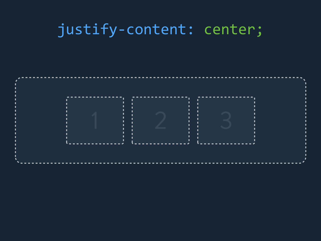
justify-‐content: center;
1 2 3
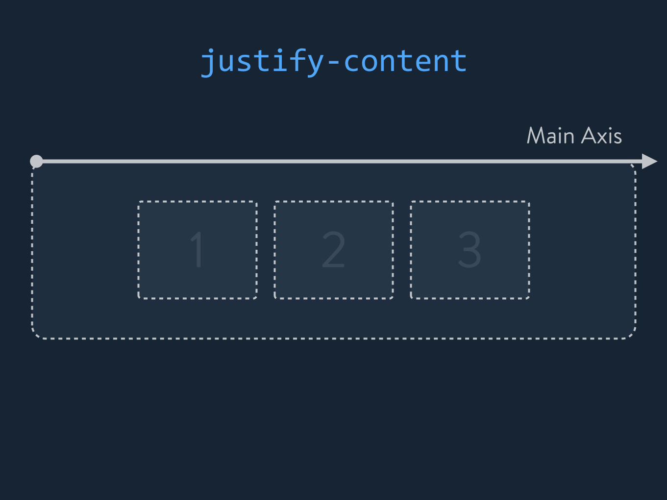
Main Axis
justify-‐content
1 2 3
justify-‐content: center;

1 2 3
justify-‐content: flex-‐start;
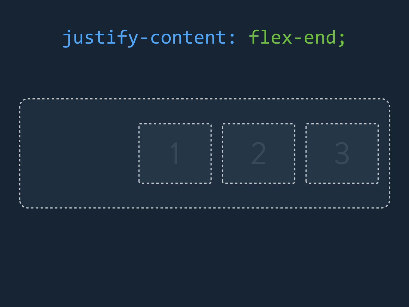
1 2 3
justify-‐content: flex-‐end;

1 2 3
justify-‐content: space-‐between;

1 2 3
justify-‐content: space-‐around;
display: flex; // or inline-‐flex
flex-‐direction: row; // or column
align-‐items: stretch;
justify-‐content: center;
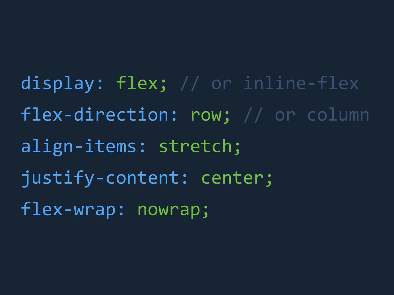
display: flex; // or inline-‐flex
flex-‐direction: row; // or column
align-‐items: stretch;
justify-‐content: center;
flex-‐wrap: nowrap;
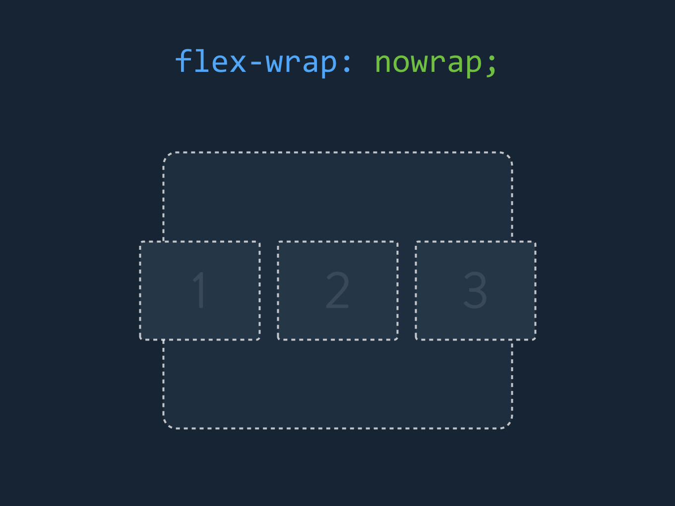
1 2 3
flex-‐wrap: nowrap;

1 2
3
flex-‐wrap: wrap;

CHILD RULES

flex-‐grow: 0;
flex-‐shrink: 0;
flex-‐basis: auto;

flex-‐basis: <number>;
flex-‐basis: auto;
width: <number>;
=

1 2 3
100px
20px 20px 20px

1 2 3
100px
20px 20px 20px
40px of “growth” available

1 2 3
flex-‐grow: 0; flex-‐grow: 0; flex-‐grow: 0;

1 2 3
flex-‐grow: 1;
13px of growthflex-‐grow: 1;
13px of growthflex-‐grow: 1;
13px of growth

1 2 3
flex-‐grow: 1;
10px of growthflex-‐grow: 2;
20px of growthflex-‐grow: 1;
10px of growth
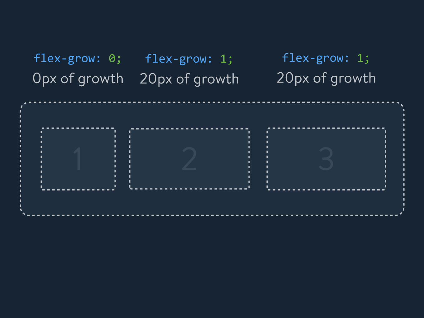
1 2 3
flex-‐grow: 0;
0px of growthflex-‐grow: 1;
20px of growthflex-‐grow: 1;
20px of growth
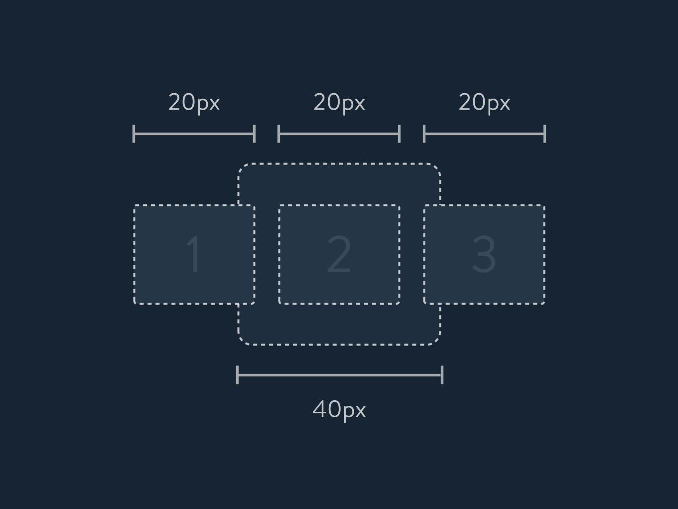
1 2 3
40px
20px 20px 20px

1 2 3
40px
20px 20px 20px
20px of “shrink” available

flex-‐shrink: 0; flex-‐shrink: 0; flex-‐shrink: 0;
1 2 3
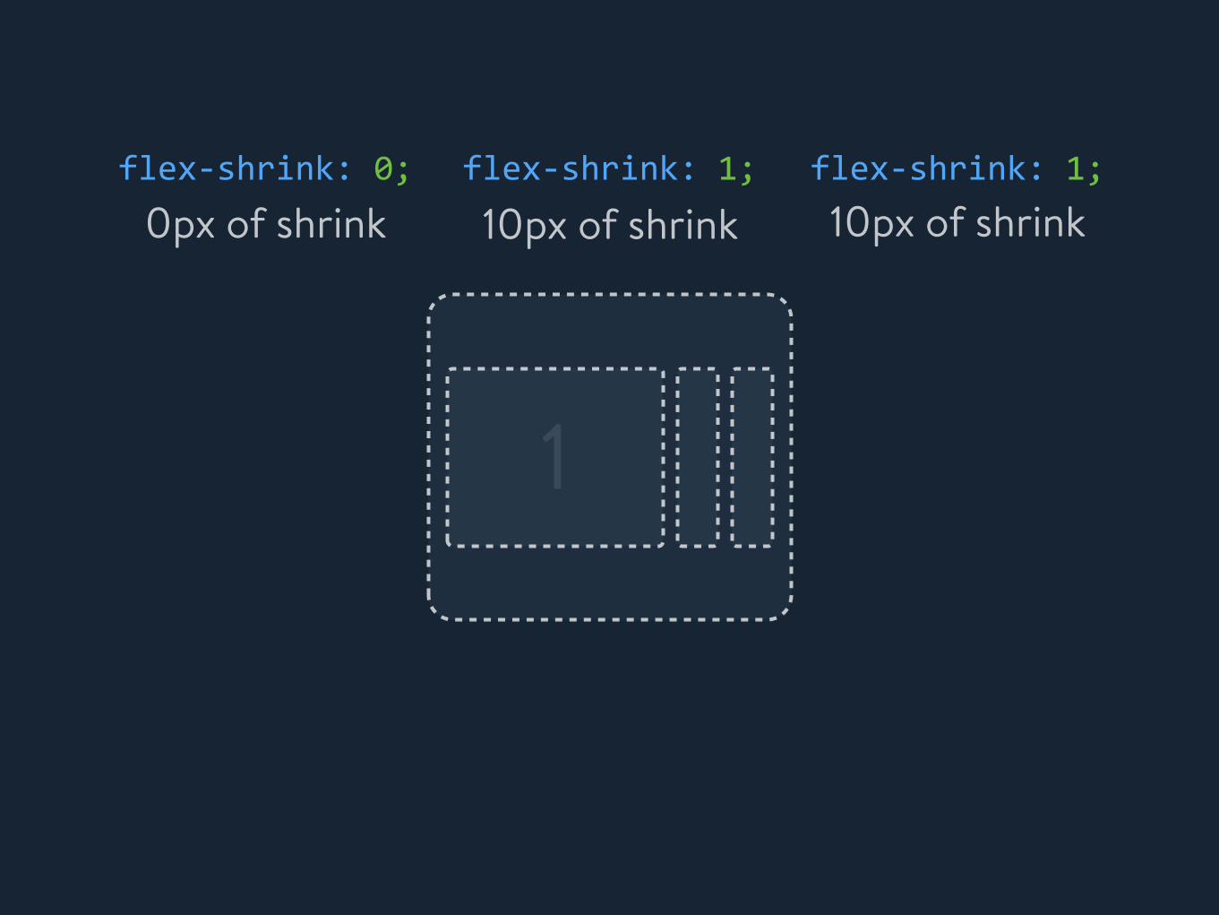
flex-‐shrink: 0; flex-‐shrink: 1; flex-‐shrink: 1;
1
0px of shrink 10px of shrink 10px of shrink

NO SILVER BULLET

FLEXBOX @SHOPIFY

GRID SYSTEM

.next-‐grid { display: flex; }
.next-‐grid__cell { flex-‐grow: 1; flex-‐shrink: 1; flex-‐basis: 0; }
.next-‐grid__cell .next-‐grid__cell
.next-‐grid

TABS
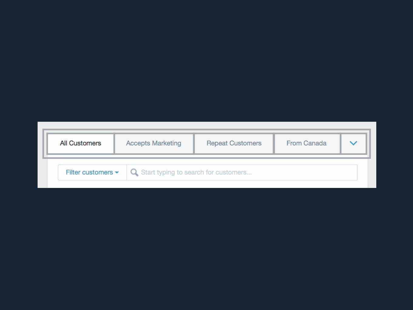
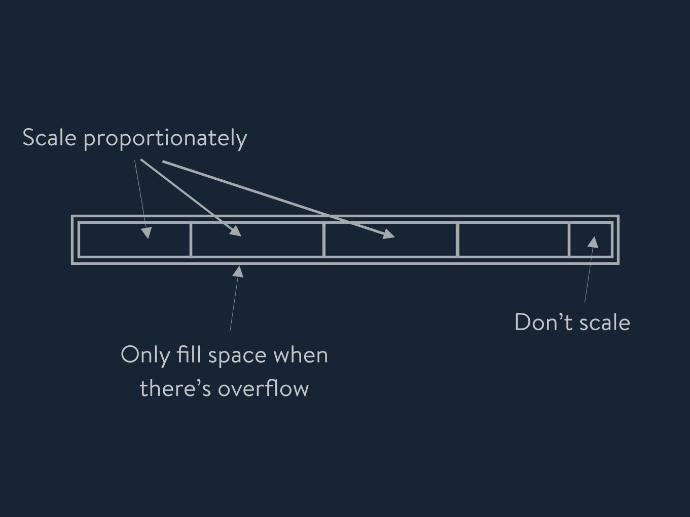
Scale proportionately
Don’t scaleOnly fill space when
there’s overflow
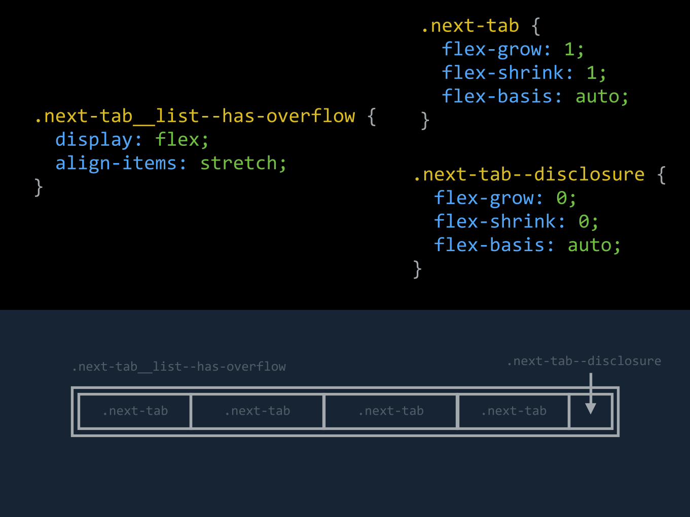
.next-‐tab { flex-‐grow: 1; flex-‐shrink: 1; flex-‐basis: auto; }.next-‐tab__list-‐-‐has-‐overflow {
display: flex; align-‐items: stretch; }
.next-‐tab__list-‐-‐has-‐overflow
.next-‐tab .next-‐tab .next-‐tab .next-‐tab
.next-‐tab-‐-‐disclosure
.next-‐tab-‐-‐disclosure { flex-‐grow: 0; flex-‐shrink: 0; flex-‐basis: auto; }

POPOVERS


Max Height
Scrollable, fill available space
As small as possible, always visible
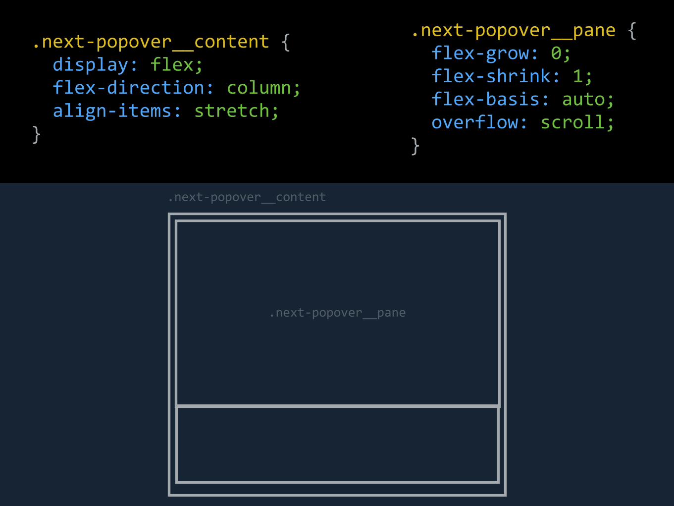
.next-‐popover__pane { flex-‐grow: 0; flex-‐shrink: 1; flex-‐basis: auto; overflow: scroll; }
.next-‐popover__content { display: flex; flex-‐direction: column; align-‐items: stretch; }
.next-‐popover__content
.next-‐popover__pane

.next-‐popover__pane-‐-‐fixed { flex-‐grow: 0; flex-‐shrink: 0; flex-‐basis: auto; overflow: hidden; }
.next-‐popover__content
.next-‐popover__pane
.next-‐popover__pane-‐-‐fixed

LIVE DEMOS

https://css-tricks.com/snippets/css/a-guide-to-flexbox/
CSS-TRICKS REFERENCE

THANKS EVERYONE!