Embed Size (px)
Citation preview

How we’re thinking about mobile and responsive in
2015
Chad Capellman
Digital Strategist, Taoti Creative
@chadrem | @taoticreative

About Taoti Creative
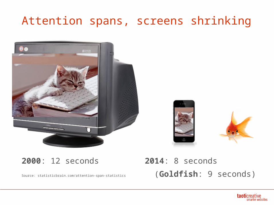
Attention spans, screens shrinking
2000: 12 seconds 2014: 8 seconds
Source: statisticbrain.com/attention-span-statistics (Goldfish: 9 seconds)
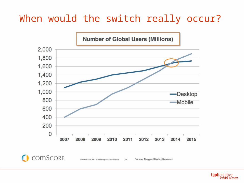
When would the switch really occur?
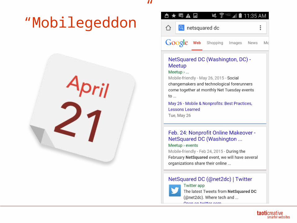
“Mobilegeddon”
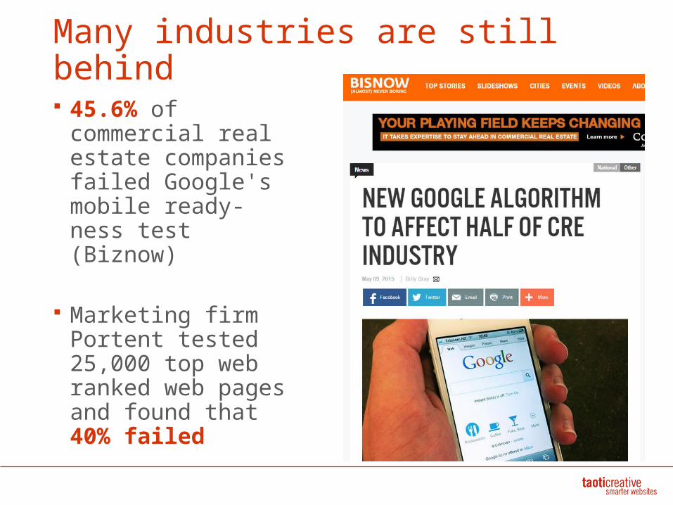
Many industries are still behind
45.6% of commercial real estate companies failed Google's mobile ready-ness test (Biznow)
Marketing firm Portent tested 25,000 top web ranked web pages and found that 40% failed
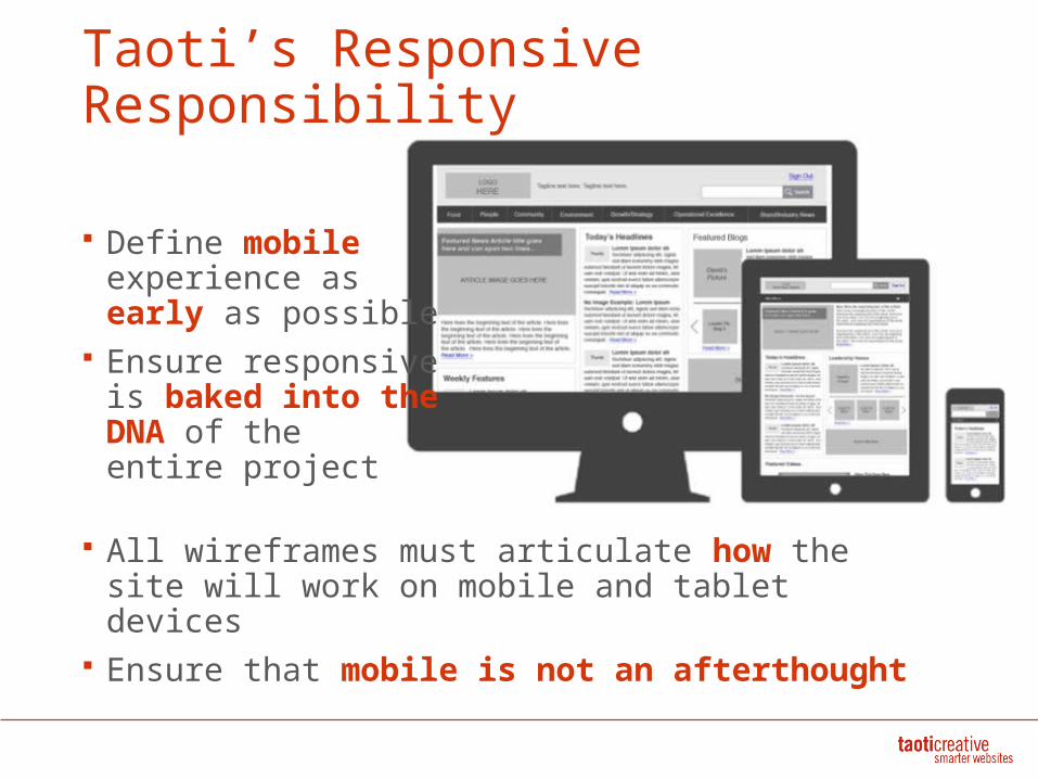
Taoti’s Responsive Responsibility
Define mobile experience as early as possible
Ensure responsive is baked into the DNA of the entire project
All wireframes must articulate how the site will work on mobile and tablet devices
Ensure that mobile is not an afterthought
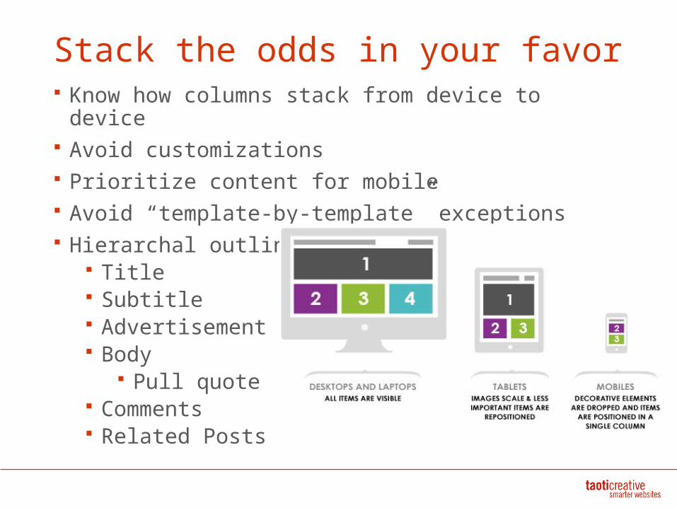
Stack the odds in your favor Know how columns stack from device to
device Avoid customizations Prioritize content for mobile Avoid “template-by-template” exceptions Hierarchal outlines
Title Subtitle Advertisement Body
Pull quote Comments Related Posts

Apps, Mobile sites and Responsive
Organizations must speak same language
“App” not shorthand for mobile site
“Mobile digital presence”
Tread carefully before
going the app route
Many hurdles for apps: Cost Platforms Approvals Adoption rate
Getting out of the app biz
“Now that we have updated our site to be responsive it has become clear that the mobile browser experience
is superior to our apps.”
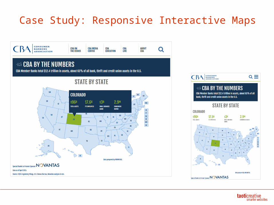
Case Study: Responsive Interactive Maps
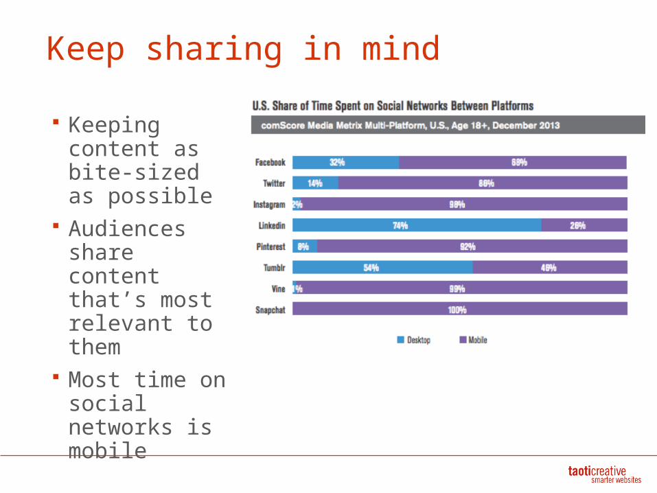
Keep sharing in mind
Keeping content as bite-sized as possible
Audiences share content that’s most relevant to them
Most time on social networks is mobile
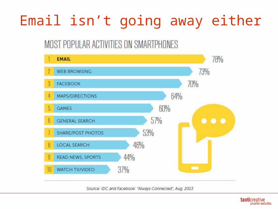
Email isn’t going away either
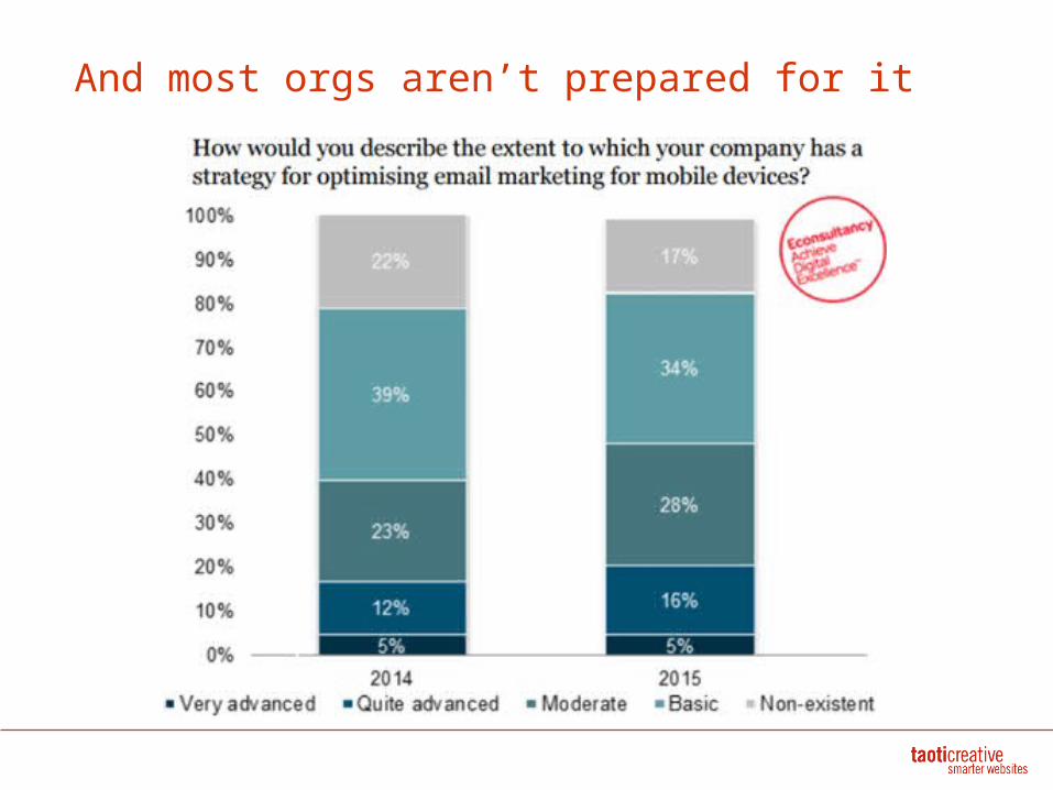
And most orgs aren’t prepared for it

To succeed in mobile, live mobile


![Front End Programming in Designing Responsive Web ... · structure on the needs of customers instead of the company's own internal thinking. [12: 214] 2.2 Responsive Web Usability](https://img.pdfslide.net/doc/110x75/5f2de2294c49eb64db04938c/front-end-programming-in-designing-responsive-web-structure-on-the-needs-of.jpg)