Embed Size (px)
Citation preview
Music mag cover analysis
Jake Broad
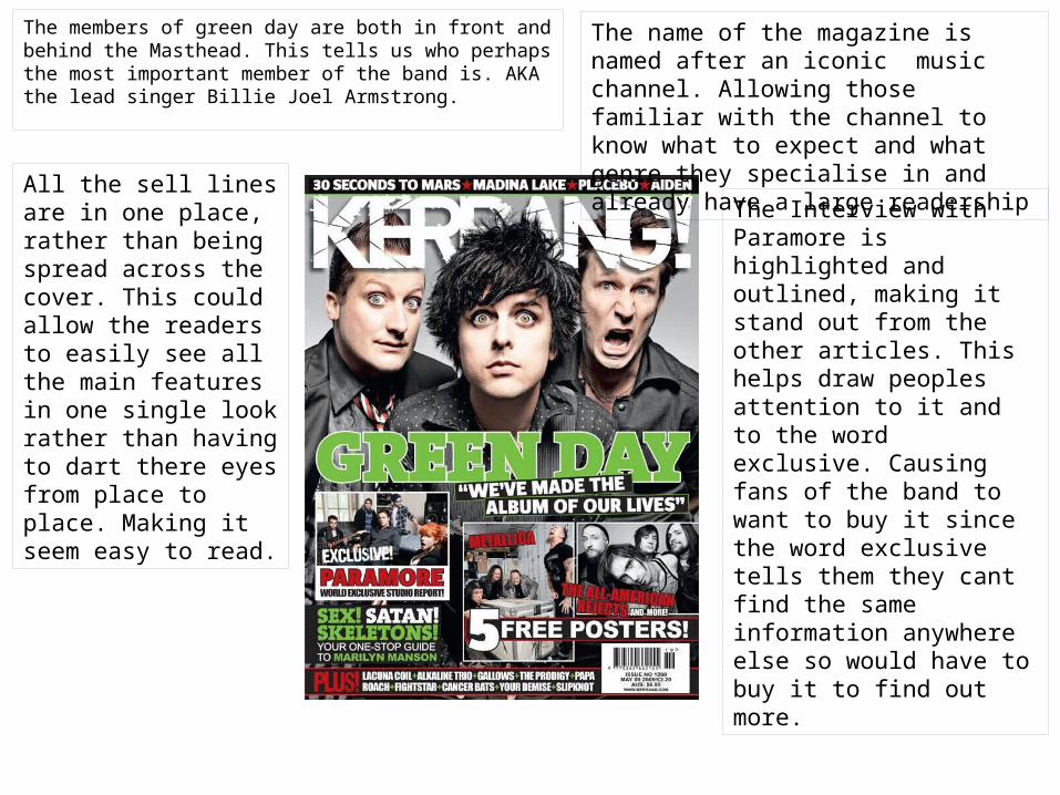
The members of green day are both in front and behind the Masthead. This tells us who perhaps the most important member of the band is. AKA the lead singer Billie Joel Armstrong.
All the sell lines are in one place, rather than being spread across the cover. This could allow the readers to easily see all the main features in one single look rather than having to dart there eyes from place to place. Making it seem easy to read.
The name of the magazine is named after an iconic music channel. Allowing those familiar with the channel to know what to expect and what genre they specialise in and already have a large readership
The Interview with Paramore is highlighted and outlined, making it stand out from the other articles. This helps draw peoples attention to it and to the word exclusive. Causing fans of the band to want to buy it since the word exclusive tells them they cant find the same information anywhere else so would have to buy it to find out more.
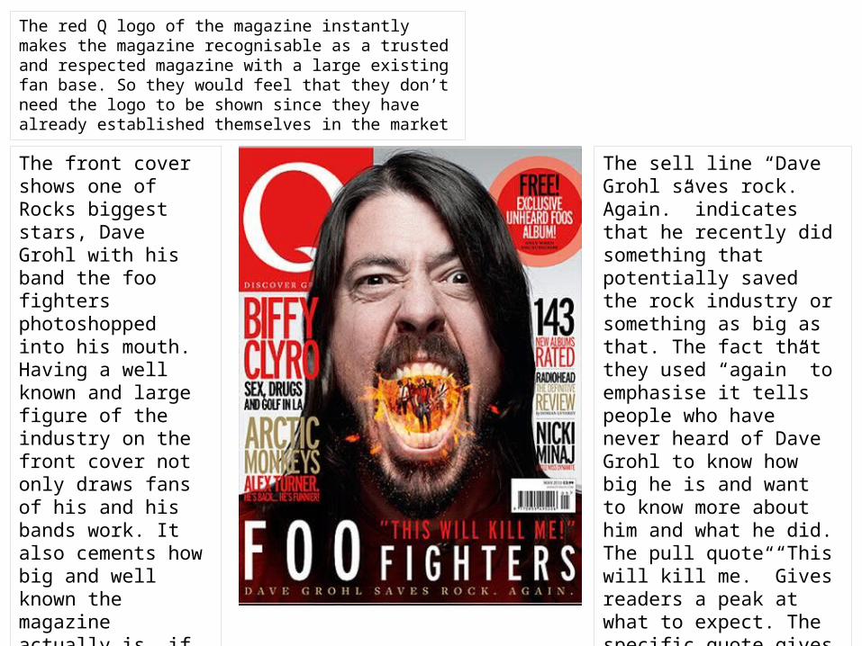
The red Q logo of the magazine instantly makes the magazine recognisable as a trusted and respected magazine with a large existing fan base. So they would feel that they don’t need the logo to be shown since they have already established themselves in the market
The front cover shows one of Rocks biggest stars, Dave Grohl with his band the foo fighters photoshopped into his mouth. Having a well known and large figure of the industry on the front cover not only draws fans of his and his bands work. It also cements how big and well known the magazine actually is, if they actually managed to secure an interview with such a key industry figure.
The sell line “Dave Grohl saves rock. Again.” indicates that he recently did something that potentially saved the rock industry or something as big as that. The fact that they used “again” to emphasise it tells people who have never heard of Dave Grohl to know how big he is and want to know more about him and what he did. The pull quote “This will kill me.” Gives readers a peak at what to expect. The specific quote gives the impression of something either dangerous or long and exhausting.
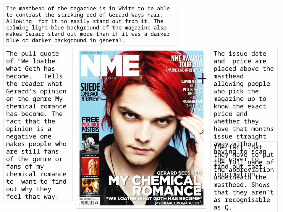
The masthead of the magazine is in White to be able to contrast the striking red of Gerard Ways hair. Allowing for it to easily stand out from it. The calming light blue background of the magazine also makes Gerard stand out more than if it was a darker blue or darker background in general.
The pull quote of “We loathe what Goth has become.” Tells the reader what Gerard's opinion on the genre My chemical romance has become. The fact that the opinion is a negative one makes people who are still fans of the genre or fans of my chemical romance to want to find out why they feel that way.
The issue date and price are placed above the masthead allowing people who pick the magazine up to know the exact price and whether they have that months issue straight away without having to scan the cover to find out that information.
The fact that they have to put the full name of the abbreviation underneath the masthead. Shows that they aren’t as recognisable as Q.