Embed Size (px)
Citation preview
Design Tips to Help your Event
Marketing
Design is an essential part of everything you produce, from your blog posts to your Tweets & your event website. It can also one of the most challenging,
especially for those of us who aren’t designers. These days design is more important than ever, it helps you stand out from the crowd & get notice. So it’s time to
get serious about design.
So whether it’s web design, print design or event branding, here’s a few simple design tips that may help.
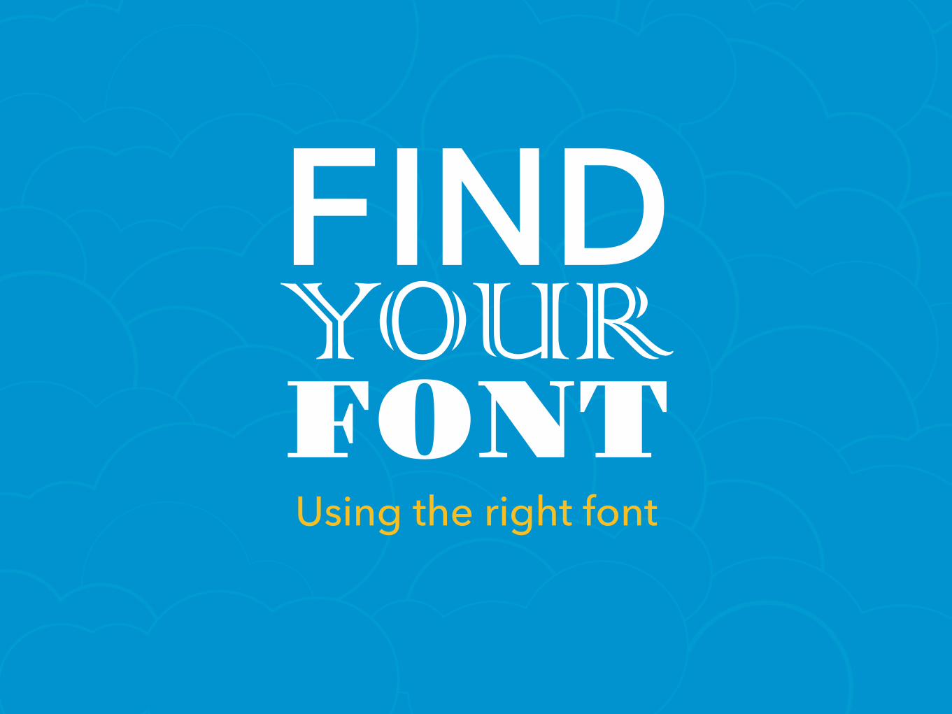
FIND YOUR FONTUsing the right font
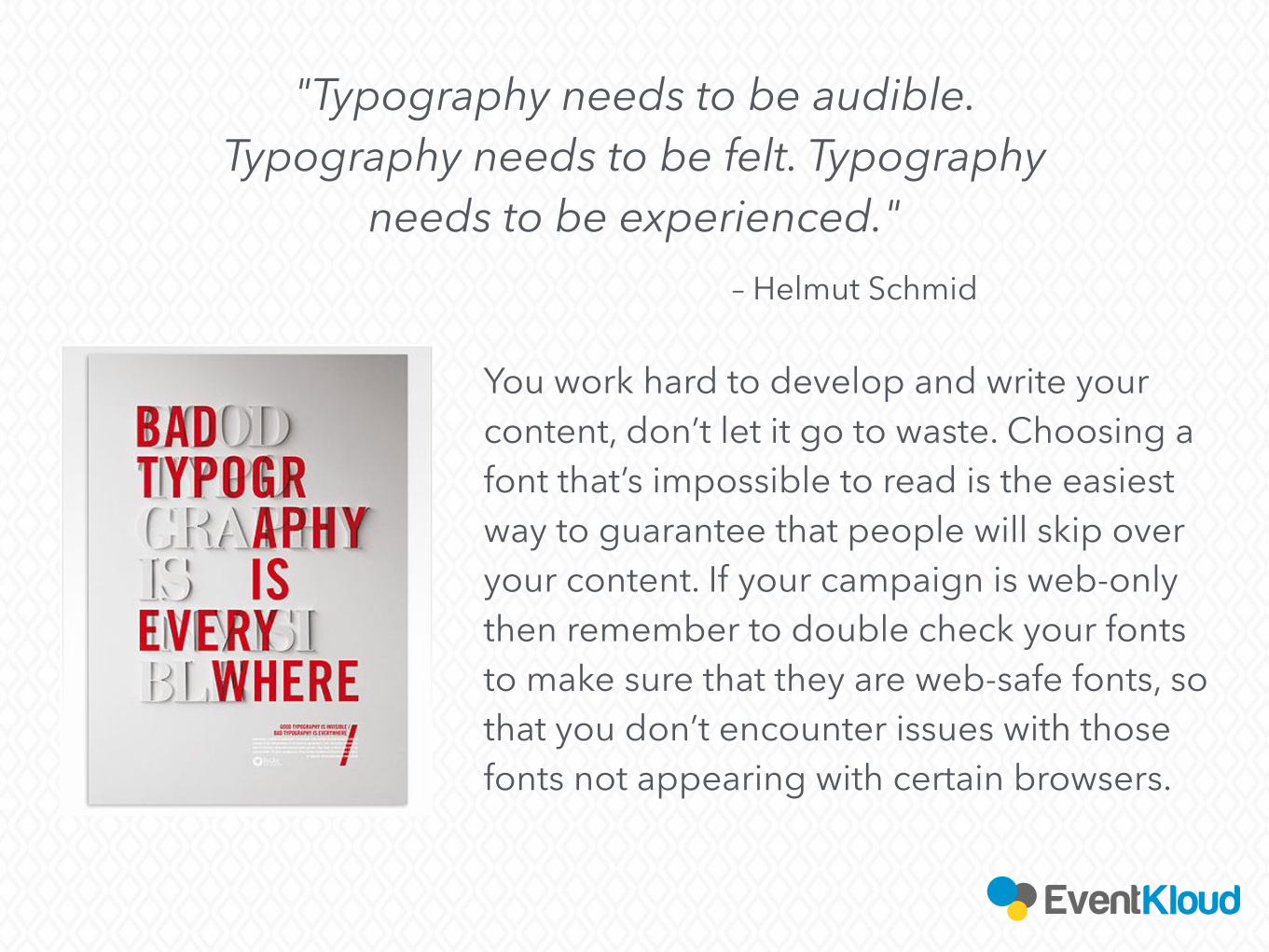
"Typography needs to be audible. Typography needs to be felt. Typography
needs to be experienced."– Helmut Schmid
You work hard to develop and write your content, don’t let it go to waste. Choosing a font that’s impossible to read is the easiest way to guarantee that people will skip over your content. If your campaign is web-only then remember to double check your fonts to make sure that they are web-safe fonts, so that you don’t encounter issues with those fonts not appearing with certain browsers.
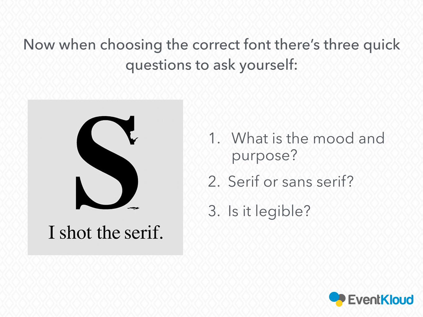
Now when choosing the correct font there’s three quick questions to ask yourself:
2. Serif or sans serif?
3. Is it legible?
1. What is the mood and purpose?
KEEP IT CLEAN & FOCUSED
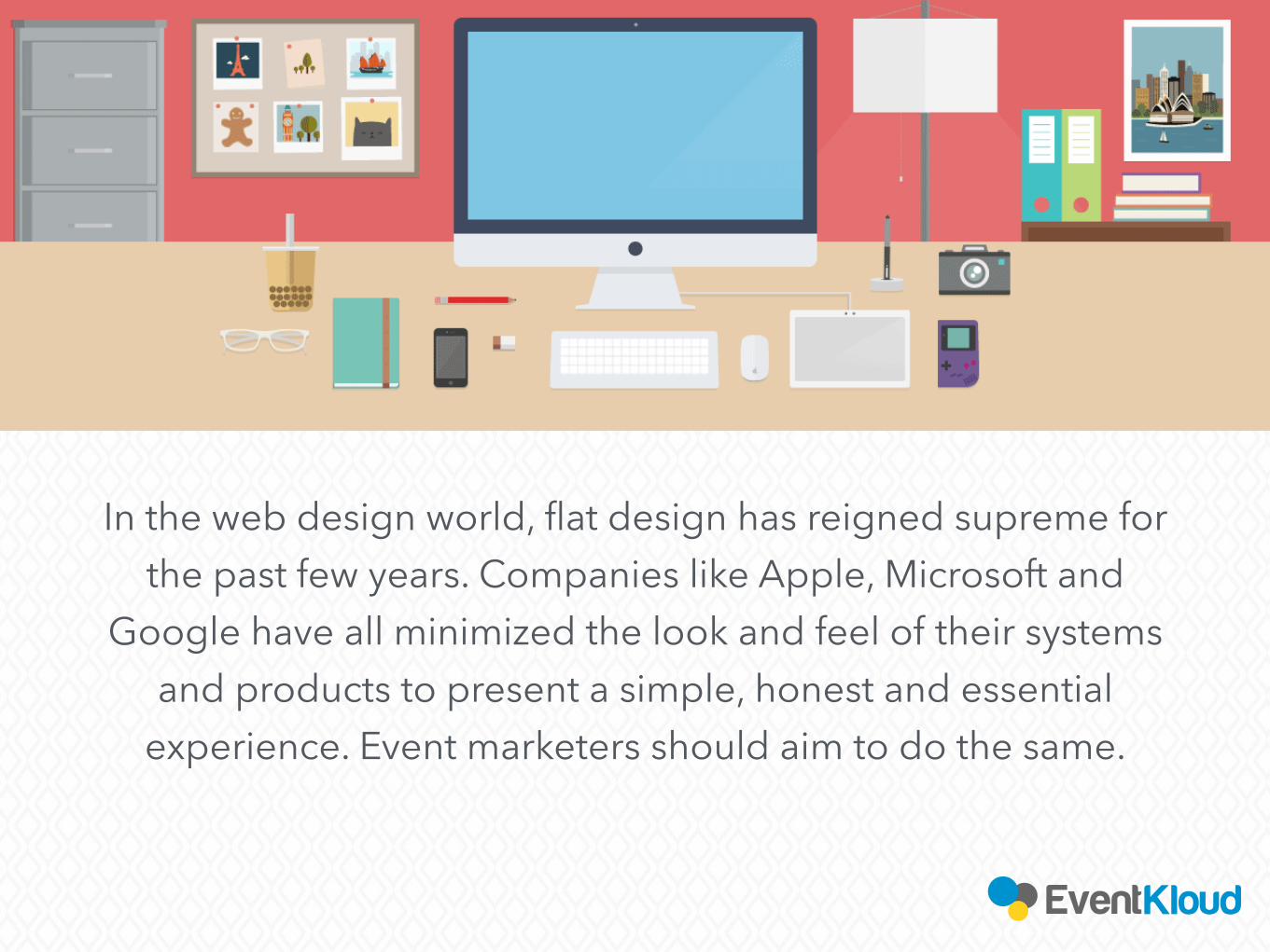
In the web design world, flat design has reigned supreme for the past few years. Companies like Apple, Microsoft and
Google have all minimized the look and feel of their systems and products to present a simple, honest and essential
experience. Event marketers should aim to do the same.
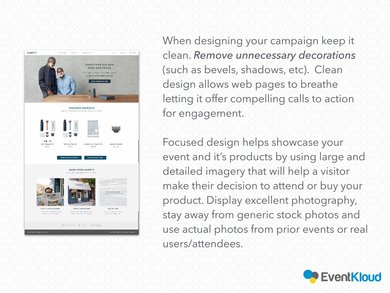
When designing your campaign keep it clean. Remove unnecessary decorations (such as bevels, shadows, etc). Clean design allows web pages to breathe letting it offer compelling calls to action for engagement.
Focused design helps showcase your event and it’s products by using large and detailed imagery that will help a visitor make their decision to attend or buy your product. Display excellent photography, stay away from generic stock photos and use actual photos from prior events or real users/attendees.
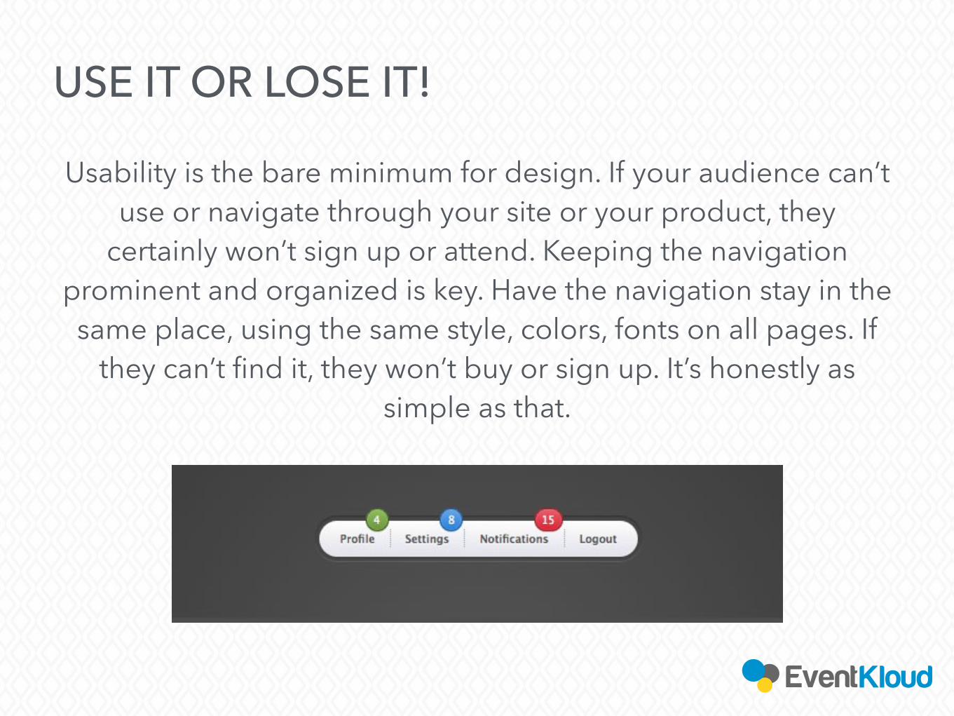
USE IT OR LOSE IT!
Usability is the bare minimum for design. If your audience can’t use or navigate through your site or your product, they
certainly won’t sign up or attend. Keeping the navigation prominent and organized is key. Have the navigation stay in the same place, using the same style, colors, fonts on all pages. If
they can’t find it, they won’t buy or sign up. It’s honestly as simple as that.
This one is more catered to web design and your events website. Calls to actions are an integral part of event or content marketing. In general
your site layout or design should have a minimal number of calls to action. The less CTA’s there are on the page the more likely your visitors
are going to click on that one button. But if you’re throwing in five different buttons all over the place, leading to different deals, content,
or information, you will confuse and scatter the viewer.
Most importantly a page full of buttons is not aesthetically pleasing from a design standpoint. Keep them one color, one size and one style,
and people will notice them more easily.
YOUR CONTENT HAS MORE CALLS TO ACTION THEN CONTENT
There are, of course, much tips and design tricks to keep in mind when event marketing. There are plenty of more resources you can
find online or if you have more detailed questions or would like a personal
consultation for your specific event, please don’t hesitate to reach out to the EventKloud
team. Best of luck with your next event!
QUESTIONS?For more info on best practices & event marketing
Subscribe to our newsletter
Join our next webinar
Interested in learning more about our event marketing platform?
Let’s talk!(855)438-5568
Check out our blog
Visit us!eventkloud.com
REQUEST A DEMO!