Embed Size (px)
Citation preview

Website ReviewBy: Helen Lialias

Analyze, evaluate and compare the following websites
bayer.com jnj.com
Legend
J&J: Johnson&Johnson
Each criteria was given a rating from 1-5:
Rating Scale
1 – Poor 2 – Fair 3 – Good 4 – Very good 5 – Excellent
Introduction

Design
Criteria Bayer J & J Notes
Branding 5 3 • Bayer has the same bright vibrant brand colors used throughout the site. Uses responsive website design.
• J&J site uses its brand colors but they appear very dull and use different hues of blue. Also uses responsive website design.
Imagery 4 3 • Bayer uses relevant real life images & refreshing animation. Images are interactive and at times move on rotating banners .
• J&J images are almost all real life and some feel very ad-like. Images are static and predictable.
Consistency 4 4 • Bayer uses consistent brand colors that are pleasing to the eye & bold simple headings accented with the brand colors.
• J&J is extremely consistent with the design & colors of each page. This makes it easy to navigate.
Font 3 4 • Bayer uses very small text size which is tiring to read. No option to enlarge. One universal typeface for content.
• J&J has three options to enlarge the text size and has a text only option on each page. One universal font for content.
Layout 5 2 • Bayer uses different layouts on each page. Makes use of columns, banners, grids, drop downs & call out boxes.
• J&J uses the same boring layout on each page. Does not hold the attention of the reader. No creative use of organizing information.

Design
Criteria Bayer J & J Notes
Whitespace 3 4 • Bayer does not use whitespace well. Every page is very busy with lots of information overload.
• J&J uses lots of white space and has minimalist approach.

Ease of UseCriteria Bayer J & J Notes
Navigation& Links
4 3 • Bayer uses unique keyword anchor text on most pages to make internal navigation easier. Link integrity is good, suggested links offered on the right side but some links take you offsite. Branded masthead content navigation & sub navigation are straightforward. Use of breadcrumb navigation makes the site user friendly. Logo icon takes you to home page.
• J&J uses very few if any keyword anchor text. Branded masthead content navigation is difficult as it is organized in themes which means more clicks guessing where to get answers. Link integrity is poor as many links take you offsite, do not load fast or are broken. No breadcrumb navigation. Logo icon take you to home.
Cross Platform/Browser
4 4 • Bayer is mobile-friendly with some pinching and scrolling required. Desktop & laptop friendly. Compatible with IE & Chrome, shows better in IE.
• J&J is mobile, desktop & laptop friendly. Also compatible with IE & Chrome.

Ease of UseCriteria Bayer J & J Notes
Speed 5 3 • Bayer pages and audio/visual materials load fast in less than 2 seconds.
• J&J loads slower as a lot of pages direct you to PDF’s or offsite and I found some pages that use outdated flash.
Search 5 2 • Search navigation is visible in middle top right. Search gives you immediate and suggested results when you type a phrase. Allows you to search all Bayer’s sites or only the main site. There is also an advanced search option with many filters like file format, language, or by date.
• J&J search is very poor. Although the search bar is visible at the top middle right it does not yield results. When I typed in “job” the first result is “supplier diversity”. Search does not complete queries for you like Bayer. No advanced search option.
Sitemap 5 5 • Bayer has an extensive detailed sitemap with main headings and subheadings. I didn’t need it as much because of the helpful breadcrumb navigation .
• J&J also has an extensive detailed sitemap. The sitemap was the only tool I could use to find many hidden pages that are not easy to get to.

Ease of UseCriteria Bayer J & J Notes
Accessibility 2 4 • Bayer is not disability- friendly.• J&J has a Read Speaker option. It reads each page to you aloud.
There are also three options to enlarge text.
UpdateFrequency
4 3 • Bayer date stamps each page when it was last updated. Most pages have been updated in the last few weeks.
• J&J also has a date stamp on each page with today’s date but some of the blogs posts were a month old.
CopywritingCriteria Bayer J & J Notes
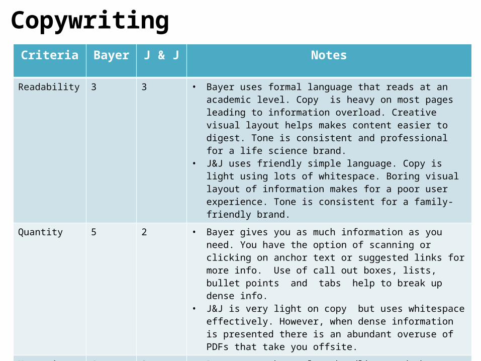
Readability 3 3 • Bayer uses formal language that reads at an academic level. Copy is heavy on most pages leading to information overload. Creative visual layout helps makes content easier to digest. Tone is consistent and professional for a life science brand.
• J&J uses friendly simple language. Copy is light using lots of whitespace. Boring visual layout of information makes for a poor user experience. Tone is consistent for a family-friendly brand.
Quantity 5 2 • Bayer gives you as much information as you need. You have the option of scanning or clicking on anchor text or suggested links for more info. Use of call out boxes, lists, bullet points and tabs help to break up dense info.
• J&J is very light on copy but uses whitespace effectively. However, when dense information is presented there is an abundant overuse of PDFs that take you offsite.
Messaging 4 3 • Bayer uses short clear headlines and abstracts well to introduce info. Infographics help to explain complex topics. Punchy taglines are memorable i.e. “Working on behalf of a better life” or “Act Safe Respect Life”
• J&J’s messaging is very warm and caring. At times some of the language is very “marketese” i.e. “…so that we can improve our products and you can have complete peace of mind whenever you bring them into your home”
CopywritingCriteria Bayer J & J Notes
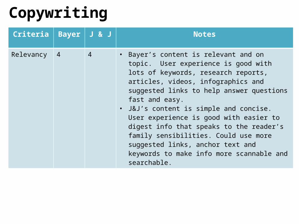
Relevancy 4 4 • Bayer’s content is relevant and on topic. User experience is good with lots of keywords, research reports, articles, videos, infographics and suggested links to help answer questions fast and easy.
• J&J’s content is simple and concise. User experience is good with easier to digest info that speaks to the reader’s family sensibilities. Could use more suggested links, anchor text and keywords to make info more scannable and searchable.
On-Page OptimizationCriteria Bayer Notes
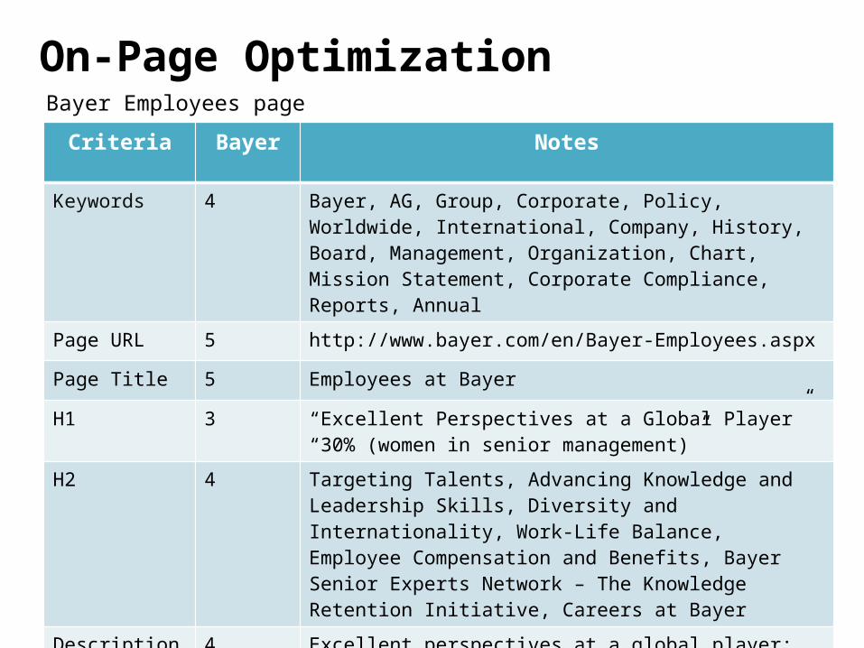
Keywords 4 Bayer, AG, Group, Corporate, Policy, Worldwide, International, Company, History, Board, Management, Organization, Chart, Mission Statement, Corporate Compliance, Reports, Annual
Page URL 5 http://www.bayer.com/en/Bayer-Employees.aspx
Page Title 5 Employees at Bayer
H1 3 “Excellent Perspectives at a Global Player”“30% (women in senior management)”
H2 4 Targeting Talents, Advancing Knowledge and Leadership Skills, Diversity and Internationality, Work-Life Balance, Employee Compensation and Benefits, Bayer Senior Experts Network – The Knowledge Retention Initiative, Careers at Bayer
Description 4 Excellent perspectives at a global player: The Bayer Group employs more than 113,000 people worldwide. Our motto: Passion to innovate | Power to change.
Bayer Employees page
On-Page OptimizationCriteria J & J Notes
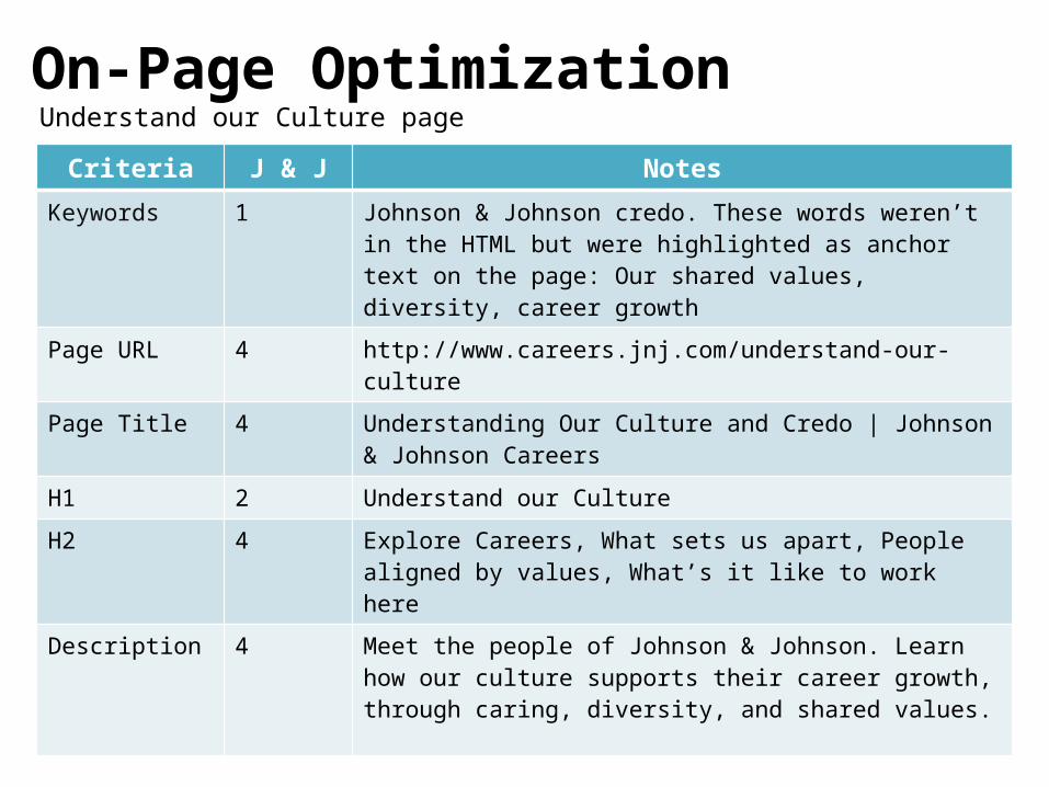
Keywords 1 Johnson & Johnson credo. These words weren’t in the HTML but were highlighted as anchor text on the page: Our shared values, diversity, career growth
Page URL 4 http://www.careers.jnj.com/understand-our-culture
Page Title 4 Understanding Our Culture and Credo | Johnson & Johnson Careers
H1 2 Understand our Culture
H2 4 Explore Careers, What sets us apart, People aligned by values, What’s it like to work here
Description 4 Meet the people of Johnson & Johnson. Learn how our culture supports their career growth, through caring, diversity, and shared values.
Understand our Culture page

On-Page Optimization
Criteria Bayer Notes
Keywords 5 Bayer, AG, Group, innovation, research, research costs, development, development, costs, subgroups, TV, research, activities, production, processes, Bayer, innovation, GmbH, BIG, HealthCare, Crop Science, Material Science, costs
Page URL 5 http://www.bayer.com/en/Bayer-HealthCare.aspx
Page Title 5 Research at Bayer HealthCare - Bayer
H1 4 Research at Bayer HealthCare, 10 (Target of Bayer HealthCare in 2015: Transition of more than 10 new molecular entities into development)
H2 4 Examples of New Active Ingredients from Pharmaceuticals Research, Extensive Information on Research and Development at Bayer HealthCare, Further Information on Research at Bayer HealthCare Can Be Found in Our research Scientific Magazine
Description 4 Bayer HealthCare combines the activities of the Animal Health, Pharmaceuticals, Consumer Care and Medical Care divisions
Research at Bayer Healthcare page

On-Page Optimization
Criteria J & J NotesKeywords 0 None I could find in the HTML
Page URL 4 http://www.jnj.com/our-giving/mdg/increasing-research-and-development-for-new-medicines
Page Title 3 Our MDG Commitment, Increasing Research and Development for New Medicines to Treat HIV, TB & NTDs
H1 2 Our MDG Commitment
H2 3 Increasing Research and Development for New Medicines to Treat HIV, TB & NTDs
Description 0 None I could find in the HTML
Increasing Research and Development for New Medicines Page

ContentCriteria Bayer J & J Notes
Videos 5 3 • Bayer has a Video Center that opens on a separate site. The site is all black and has a very different style than the main site. Has a wide variety of high quality videos in a grid layout. Videos load fast and use animation and real life images. Bayer also has a number of YouTube channels.
• J&J’s videos are mainly located on their Media Center page. There is a small selection and not much variety . A lot of the videos have boring speeches and no animation. The videos load fast.
Photos 5 3 • Bayer’s photos are conveniently available for hi-res download in their media section. The photos are all neatly organized by topic i.e. historical, research, or technology services. Images save quickly.
• J&J’s photos are also available in their media section. Images are not neatly organized. There is no option to download the images. Some images load slowly. Photos are mostly pictures “in the field” or political.
Audio 0 0 • Bayer’s site has no unprompted audio. Only on some publication sites.
• J&J has also followed the trend of less noise on the page with no unprompted audio.
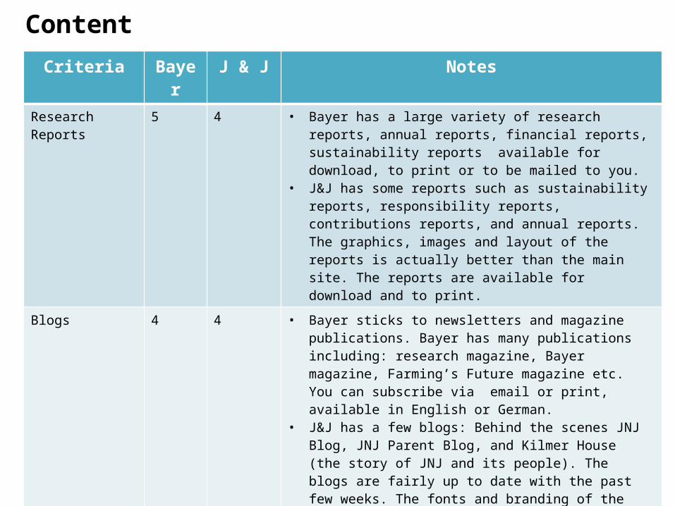
ContentCriteria Bayer J & J Notes
Research Reports 5 4 • Bayer has a large variety of research reports, annual reports, financial reports, sustainability reports available for download, to print or to be mailed to you.
• J&J has some reports such as sustainability reports, responsibility reports, contributions reports, and annual reports. The graphics, images and layout of the reports is actually better than the main site. The reports are available for download and to print.
Blogs 4 4 • Bayer sticks to newsletters and magazine publications. Bayer has many publications including: research magazine, Bayer magazine, Farming’s Future magazine etc. You can subscribe via email or print, available in English or German.
• J&J has a few blogs: Behind the scenes JNJ Blog, JNJ Parent Blog, and Kilmer House (the story of JNJ and its people). The blogs are fairly up to date with the past few weeks. The fonts and branding of the blogs are more stylish but inconsistent with the main site.
Infographics 4 5 • Bayer’s infographics are effective but hard to find on the site. They are not available all in one place. One cool infographic I found was an interactive timeline showing the journey through the history of Bayer.
• J&J has a section of infographics on their media center page. The infographics are effective showing facts and figures in a simple engaging way. They are easy to find on the site and load fast.

InteractivityCriteria Bayer J & J Notes
Calls to Action 5 3 • Bayer has a print and share option on every page. You can share instantly on FB, Twitter, Google + etc. Their social media channels are buried in the middle right side of the page.
• You can subscribe to the Bayer newsletter, podcasts or Investor RSS Newsfeeds
• J&J has an email, print, RSS feed and social media share on each page in a highly visible spot.
• Their social media channels are also buried in the bottom right of the home page.
• J&J’s company publications are mainly all annual reports in the form of PDFs. You cannot subscribe to them. The only publications you can subscribe to are their blogs.
Downloads 4 3 • Bayer has a Download Center where you can quickly select the year and document you want easily. This section is mainly for investors. There is also a collected documents section which allows you to combine all your downloads into one zip folder.
• J&J has a download library in the Investor section as well. You can select the year and type of document. There are not as many variety of documents available compared to Bayer. J&J also has a document request section where you can request printed copies.

InteractivityCriteria Bayer J & J Notes
Apps 5 4 • Bayer has a large selection of fun interactive relevant apps for smartphones and tablets for free. The apps are organized under different sections like agriculture and animal health. Some examples are seed planner apps for farmers and a monthly me app that tracks the aches and pains of your menstrual cycle. The apps are compatible with iPad, iPhone, Android and iPod
• J&J has a much smaller collection of relevant apps available for free. Their apps are more related to health and wellness. For example there is an app for donating to good causes, monitoring your baby’s sleep patterns, or even tracking what flus and colds are trending in your location! The apps are compatible with Apple, Google Play and Windows.
Services 5 3 • Bayer Mobile Service allows you sign up to their SMS services to receive the latest IR news and headlines and share price and they also an event reminder service.
• Bayer has a neat interactive chart generator where you can compile data over the past 5 years.
• A really cool service Bayer has is the their E-cards. You can send an electronic greeting card for free by selecting your favorites from numerous images from the Bayer world.

InteractivityCriteria Bayer J & J Notes
Services (con’t) 5 3 • J&J services are mainly on the Investor page. You have access to its podcasts and presentations. You can request E-delivery of various company reports. There is a shareholder briefcase icon that lets you ccollect, zip and download files from the Investor Relations website. There is also a snapshot icon which shows you their company profile and stock information.
Chat 0 0 • Bayer has no live chat feature which makes sense as it is not in the retail sector. Most of conversations with customers occur though their many social media channels.
• J&J also has no live chat feature. There are contributions from parents on their family blog sharing stories about how they’ve cared for their children in need. This is an effective way for J&J to interact with its customers as it is a family-friendly company.

Conclusions & Recommendations
After comparing and contrasting both sites, Bayer has the better website by a large margin. Bayer scored high in a number of categories that provided a better user experience overall compared to Johnson & Johnson’s website. In terms of design, Bayer has a far more polished and professional branded website with consistent use of bright green and blue (their brand colors), for headlines and graphics. In contrast, Johnson & Johnson’s (J&J) website design had a very grey boring feel with poor use of their brand colours selecting a dull red and inconsistently using different hues of blue.
The images used all over Bayer’s site are high-resolution, interactive and relevant. Their photos are high-quality, professional, unique and refreshing to their industry as they use more than just pictures of products and scientists in the field, but also animated images as well. The images in Johnson’s & Johnson’s website are average and could use a refresh. They are predictable generic stock images of scientists and volunteers in the field helping improve lives and there are way too many political photos that don’t fit in with the family-friendly brand. The only good graphics and images are hidden in report PDFs and offsite J&J pages.

Bayer could benefit from enlarging the font size on their website or at least have the option like J&J’s site. The small font is tiring on the eyes and gives the illusion of information overload. However, Bayer’s selection of typeface is clean and easy to read across devices and browsers.
Bayer’s responsive design creates a good user experience across platforms and browsers. However, I had trouble with the website randomly switching the language to German on a number of occasions on certain pages. I would recommend keeping on top of those performance bugs when you have language options as it disrupts the user flow.
Bayer’s website is very effective with the layout of information. Although their site is very cluttered with lots of content, the use of lists, columns, banners, grids, drop downs & call out boxes makes absorbing information easier and holds your attention longer. I would recommend Bayer uses more whitespace as a lot of pages are very busy, making it confusing where the focal point should be. In contrast, although J&J’s website uses whitespace well and has a minimalistic approach, it is very static and uses the same boring standard horizontal paragraph layout on almost every page. There is also way too much overuse of PDF icons, which looks clunky.

Another layout recommendation is to put the Bayer logo on the more common top left main navigation, not on the right. Lastly, Bayer should also put their social media icons on the main navigation at the top. Bayer really misses the mark by putting them below the fold buried in the far right bottom corner of the page.
Bayer’s website excels at search and navigation. The primary and side bar navigation menus are detailed and clear and their breadcrumb navigation means users spend less time searching and clicking and more time staying on the site. The main search bar gives you suggestions as you begin to type and there is also a helpful advanced search option to filter your queries. I had a terrible time trying to find information on Johnson & Johnson’s site. Their search kept asking me to rephrase or enter my query again, in which case I had to rely heavily on their detailed sitemap.
In terms of accessibility, Bayer could improve and make more accommodations. There are no audio recordings to read content for the visually impaired, or text enlarging options for the visually impaired. There is the option of changing the language of the website, but only to German. There are also no time or text alternatives to consuming media. Since Bayer has a lot of interactive media and rich content to offer, they would benefit from making their website more accessible to those with disabilities. Johnson & Johnson is a good example of a website that tries to be accessible offering text enlarging and read speakers on every page.

Bayer’s copywriting is formal and reads at an academic level. I would recommend being more concise and using more simple conversational language to make already complex scientific content easier to digest. There is a strong use of headings and subheadings to break up dense information as well as good use of anchor text, keywords, and suggested links on each page. There could be stronger calls to action as most calls to action are found on their investor page or prompting you to sign up to their publications.
Bayer’s information architecture is excellent. I found myself referring to their detailed site map to find hidden gems. The link integrity is good and I stayed on the site longer with all the alternative link suggestions I was presented with. The only recommendation I would have is to keep the user on the same main site when you click on their products or other divisions and find a way to combine them. Too often my user experience was disrupted as I was diverted offsite to a completely different branded site which I would have no idea was owned by Bayer otherwise.