Embed Size (px)
Citation preview

Cristiano Rastelli - Consumer Team
Adaptive, Responsive, Mobile.A liquid web.

Index• Premises
• Responsive. Adaptive. Mobile.
• Liquid web. Numbers.
• Tools & Techs.
• VisualDNA.

WEBWe are talking about
+ +
* but not only
*

ResponsiveAdaptiveMobile*
* first

www.alistapart.com/articles/responsive-web-design/

www.abookapart.com/products/responsive-web-design

www.lukew.com/ff/entry.asp?933

www.abookapart.com/products/mobile-first

twitter.com/lukew/status/262920585938612224/photo/1/large
RESPONSIVEVs.
ADAPTIVE

RESPONSIVEVs.
ADAPTIVE
RWDMDWDMFWDRESSPRD

ADAPTIVE
RESPONSIVE

ADAPTIVERESPONSIVE
FRAMEWORKboilerplate
PATTERNlibraries
MOBILEFIRST

The RWD effect

bradfrostweb.com/blog/web/mobile-first-responsive-web-design/

futurefriend.ly

techcrunch.com/2012/10/27/tablet-first-mobile-second/

www.welcomebrand.co.uk/thoughts/the-responsive-web-will-be-99-9-typography/

The RWD limits

markboulton.co.uk/journal/gridset-and-the-red-pill
Responsive design is time-consuming. Not just writing the code, but all the way back to content requirements, typography, layout,
managing client needs and expectations, Q.A and bug testing.
Making websites this way adds time. In some cases, too much. Or rather, we’re spending
time on the wrong things.
Mark Boulton

If you’re making websites, chances are you’ve given some thought to what constitutes a
responsive-friendly design process — and you’ve probably found that adding a mockup for every breakpoint isn’t a
sustainable approach.
www.alistapart.com/articles/responsive-comping-obtaining-signoff-with-mockups/

Using a predefined grid seems to make as much sense as using a
predefined colour scheme.
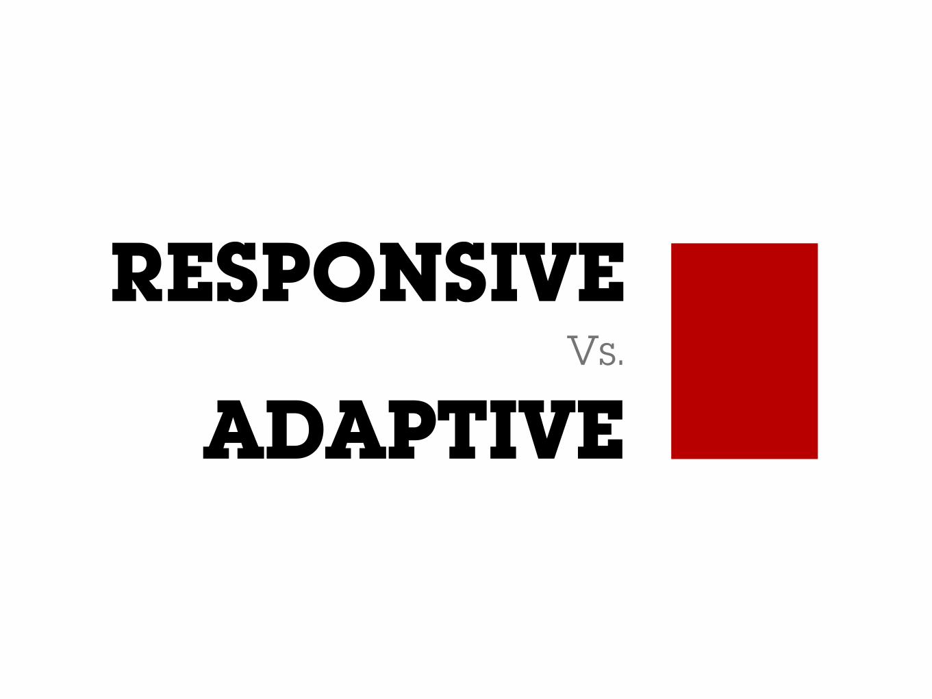
www.alistapart.com/articles/the-infinite-grid/

Luke Wroblewski
twitter.com/lukew/status/268406393944559616

one design fits all sizes

www.zeldman.com/2011/12/29/state-of-the-web-of-apps-devices-and-breakpoints/
Zeldman
Responsive design is not dead; it has only begun. It is not a panacea but was never intended to be. It is simply the beginnings of an approach.

Why Liquid?

web


user

Ryan Singer
twitter.com/rjs/status/323880906559459331

PC vs. Smartphone Shipments
Source: Canalys 2011

Global Mobile vs. Desktop Internet Users
Source: Morgan Stanley 2011
overtaking this year?

Source: http://www.lukew.com/ff/entry.asp?1597

Where are people using mobile devices?
Source: Compete's Quarterly Smartphone Report
84%
80%
76%
69%
64%
62%
47%
at home
during miscellaneous downtime throughout the day
waiting in lines of waiting for appointments
while shopping
at work
while watching TV
during commute in to work

twitter.com/gluca/status/312849923466985472
Gianluca Diegoli
I realized that it's the mobile experience that determines what then I use in my desktop. For example, Pinterest for iOS is lousy, and then…

hbr.org/2013/01/how-people-really-use-mobile

googlemobileads.blogspot.co.uk/2011/04/smartphone-user-study-shows-mobile.html

google.com/think/research-studies/creating-moments-that-matter.html

www.google.com/think/research-studies/the-new-multi-screen-world-study.html
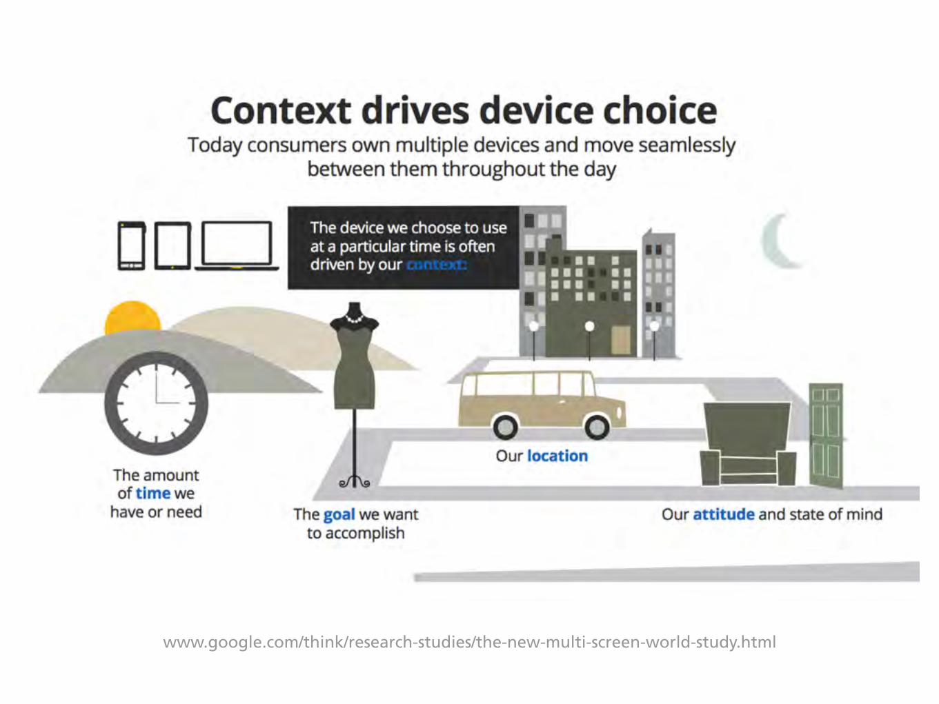
www.google.com/think/research-studies/the-new-multi-screen-world-study.html

www.google.com/think/research-studies/the-new-multi-screen-world-study.html

www.google.com/think/research-studies/the-new-multi-screen-world-study.html

Money. Not only user-experience!

CONTEXTA shift in the
of web usage

we

www.slideshare.net/yiibu/pragmatic-responsive-design/

Test with real devices!


others

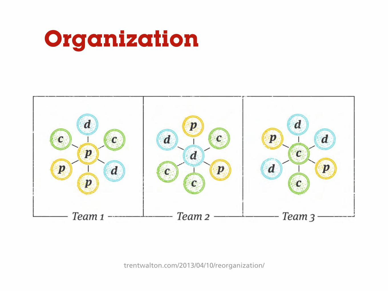
trentwalton.com/2013/04/10/reorganization/
Organization
trentwalton.com/2013/04/10/reorganization/
Organization

viljamis.com/blog/2012/responsive-workflow/
Workflow

viljamis.com/blog/2012/responsive-workflow/
Workflow

daverupert.com/2013/04/responsive-deliverables/
Deliverables

styletil.es
Deliverables

styletil.es
Deliverables

Tools & Techs

Patterns
mobiledesignpatterngallery.com

Patterns
mediaqueri.es

Patterns
mobilepatterns.com

Patterns
bradfrost.github.com/this-is-responsive/patterns.html

Designing Tools
html.adobe.com/edge/reflow/

Designing Tools
easel.io

Designing Tools
uxpin.com

Designing Tools
gridsetapp.com

Prototyping Tools
solidifyapp.com

Prototyping Tools
proto.io

Prototyping Tools
popapp.in

Prototyping Tools
plunkapp.com

Testing Tools
studiopress.com/responsive/
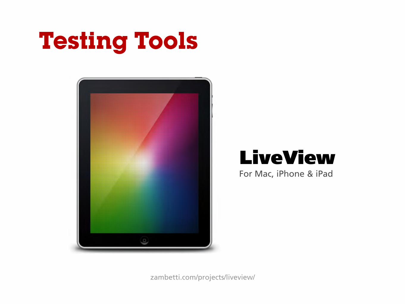
Testing Tools
LiveViewFor Mac, iPhone & iPad
zambetti.com/projects/liveview/

NO!

VisualDNA

• Context is changing. We must embrace it.
• Measure/track users in specific devices.
• Different approach to quiz & data analysis.

mobile.visualdna.com

Cristiano Rastelli - Consumer Team
THANK YOU

http://www.zeldman.com/2011/12/29/state-of-the-web-of-apps-devices-and-breakpoints/http://www.slideshare.net/yiibu/pragmatic-responsive-design/http://www.netmagazine.com/opinions/responsive-web-design-boringhttp://viljamis.com/blog/2012/adaptive-vs-responsive-whats-the-difference.phphttp://markboulton.co.uk/journal/gridset-and-the-red-pillhttp://www.netmagazine.com/opinions/responsive-web-design-boringhttp://www.slideshare.net/pkattera/design-process-for-responsive-web-designhttp://37signals.com/svn/posts/3285-the-typography-and-layout-behind-the-new-signal-vs-noise-redesignhttp://www.cloudfour.com/where-are-the-mobile-first-responsive-web-designs/http://trentwalton.com/2013/04/10/reorganization/http://viljamis.com/blog/2012/responsive-workflow/http://www.google.com/think/research-studies/the-new-multi-screen-world-study.html
Must-Read
Nice-to-Read
Some references:
http://www.lukew.com/ff/entry.asp?1394http://www.lukew.com/ff/entry.asp?1562http://www.lukew.com/ff/entry.asp?1436http://www.alistapart.com/articles/responsive-web-design/

http://www.alistapart.com/articles/responsive-comping-obtaining-signoff-with-mockups/ http://www.alistapart.com/articles/the-infinite-grid/http://www.alistapart.com/articles/uncle-sam-wants-you-to-optimize-your-content-for-mobile/http://www.smashingmagazine.com/responsive-web-design-guidelines-tutorials/http://mobile.smashingmagazine.com/2012/10/24/beyond-common-media-query-breakpoints/http://coding.smashingmagazine.com/2011/01/12/guidelines-for-responsive-web-design/
http://www.slideshare.net/livefront/responsive-design-7877412http://www.slideshare.net/KMcGrane/adapting-ourselves-to-adaptive-content-12133365http://www.slideshare.net/bradfrostweb/for-a-futurefriendly-webhttp://www.slideshare.net/pkattera/design-process-for-responsive-web-designhttp://www.slideshare.net/pekkos/mobile-experienceshttp://www.slideshare.net/bradfrostweb/beyond-media-queries-anatomy-of-an-adaptive-web-designhttps://speakerdeck.com/scottjehl/responsive-responsiblehttps://speakerdeck.com/erunyon/rebuilding-a-university-homepage-to-be-responsive-twice-in-less-than-a-yearhttps://speakerdeck.com/m83/responsive-webdesing-and-the-little-dirty-secret-behind-fluid-grids
http://markboulton.co.uk/journal/adaptive_content_managementhttp://uxdesign.smashingmagazine.com/2012/11/08/ux-design-qa-with-christian-holst/http://bradfrostweb.com/blog/mobile/planting-the-seed-for-a-responsive-future/http://www.quora.com/Responsive-Design-vs-Adaptive-Designhttp://www.html5rocks.com/en/mobile/responsivedesign/http://www.sazzy.co.uk/2012/02/why-i-cant-design-in-the-browser/
Nice-to-Read (cont.)

http://bradfrostweb.com/blog/mobile/planting-the-seed-for-a-responsive-future/http://techcrunch.com/2012/10/27/tablet-first-mobile-second/ http://www.jordanm.co.uk/post/32866575759/the-airfix-responsive-workflowhttp://blog.cloudfour.com/css-media-query-for-mobile-is-fools-gold/http://www.guardian.co.uk/help/developer-blog/2012/oct/18/responsive-design-guardian-introductionhttp://digital.cabinetoffice.gov.uk/govuk-launch-colophon/
Nice-to-Read (cont.)
http://responsive.is/http://bradfrost.github.com/this-is-responsive/http://mediaqueri.es/http://futurefriend.ly/http://www.mobiledesignpatterngallery.comhttp://www.mobilepatterns.com
Resources
http://html.adobe.com/edge/reflow/http://html.adobe.com/edge/inspect/http://zambetti.com/projects/liveview/http://popapp.inhttp://www.solidifyapp.comhttp://proto.iohttps://gridsetapp.com
Tools


![[funka] Adaptive Images in Responsive Web Design](https://img.pdfslide.net/doc/110x75/55a6027a1a28abbf498b47dc/funka-adaptive-images-in-responsive-web-design.jpg)