Embed Size (px)
Citation preview

M.dot Extinction: The Next Evolution
of Mobile Web

Since the dinosaurs died out 65 million years ago,
the cause of the extinction has been speculated
and debated.
While there are many theories, we still don’t know
the definitive reason for the extinction. There are
a wide range of theories including climate change,
volcanism, sifting continents, an extraterrestrial
impact - as well as some more far-fetched ideas
like decimation by aliens, dinosaur “wars,” and
“paläoweltschmertz” (the idea that dinosaurs just
got tired and went extinct).
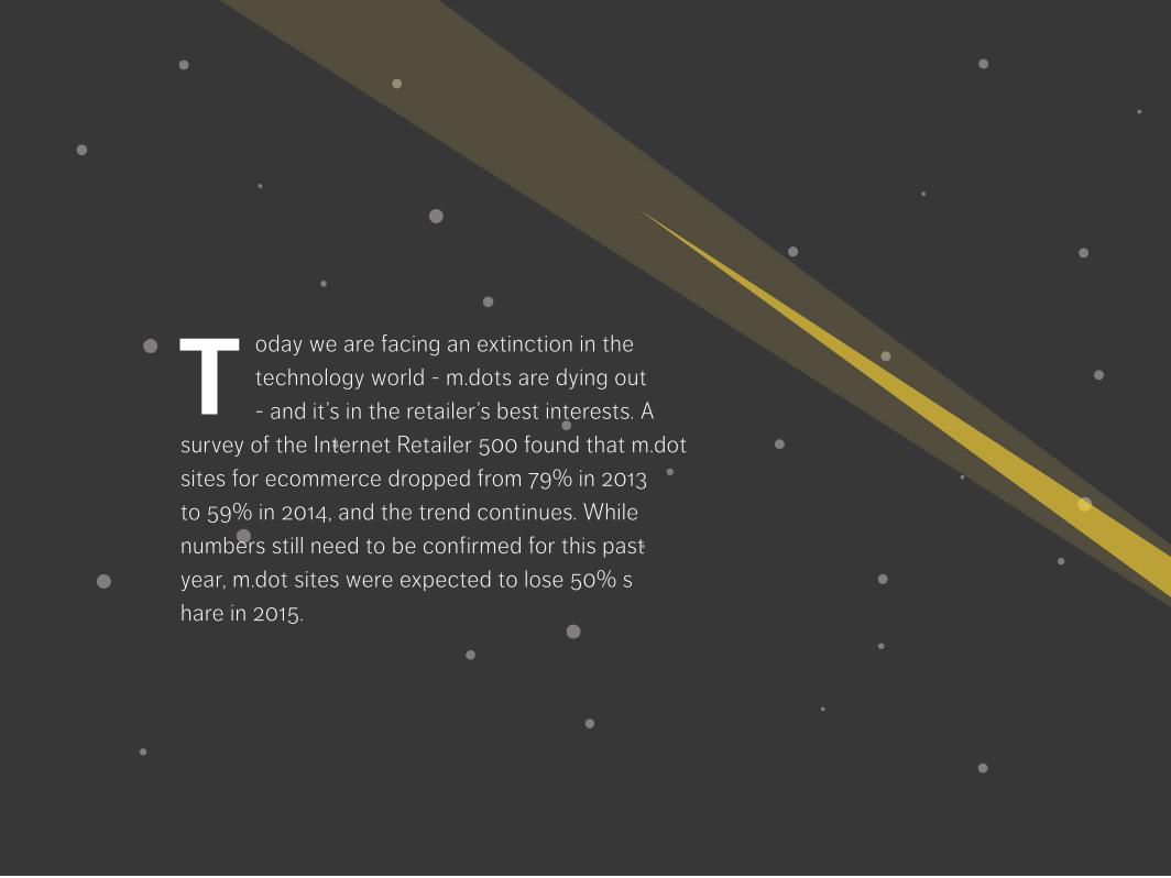
oday we are facing an extinction in the
technology world - m.dots are dying out
- and it’s in the retailer’s best interests. A
survey of the Internet Retailer 500 found that m.dot
sites for ecommerce dropped from 79% in 2013
to 59% in 2014, and the trend continues. While
numbers still need to be confirmed for this past
year, m.dot sites were expected to lose 50% s
hare in 2015.
T

Unlike the dinosaurs, the cause of this extinction
won’t be a mystery. M.dots are an outdated
technology with many limitations. When the need
for mobile websites emerged, retailers created
separate m.dot sites to create a better user
experience for customers on mobile devices.
While this was a huge improvement to serving the
desktop site to mobile shoppers, m.dots have failed
to evolve with customers’ rising expectations and
advancements in technology. As a result, they’re
disappearing from the online world - here are the
5 causes of the m.dot extinction.

Poor SEOThe nature of an m.dot site results in poor SEO.
Since m.dot sites are a separate entity with
duplicate content, they have the more SEO
compliance issues than any other mobile web
solution. Google doesn’t like redirects and it
penalizes page rankings unless every page and
linkable asset is meta tagged with rel=canonical
tags that point to which link is the original, desktop
or mobile. The effort to implement and maintain
this tag strategy is often under resourced or not
undertaken at all by retailers leading to poor search
engine visibility, lower traffic, and less conversions.

Slow PerformanceM.dot sites have a slower initial load time due to the
redirect, this doesn’t allow for perfectly live content
as the requests need to go back and forth between
an intermediary server. Today’s customers expect
speedy performance and won’t have the patience
to wait for a slow m.dot site to load - 40% of
consumers will abandon a website that takes more
than 3 seconds to load.

Social Sharing IssuesTwo separate URLs also leads to issues with social sharing. If a potential
customer on their desktop clicks a link which a friend shared from a
mobile device, they will encounter a tiny m.dot site on their large deskop
screen. This poor user experience could result in a lost opportunity to
create a loyal customer - wrongly executed redirections cost enterprise
retailers $34,000 per month on average.

Multiple Screen SizesM.dot sites are optimized for a specific screen size, but mobile
devices today have a wide range of screen sizes. A layout that
is optimized for the screen size of an iPhone 5, may not be the
optimal layout for the screen size of an Android Galaxy S6. This
issue becomes even more prominent when looking at tablets. A
good mobile web solution should be scalable and customizable
to optimize the site across all devices and screen sizes.
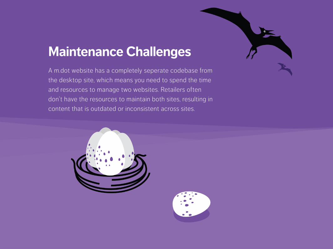
Maintenance ChallengesA m.dot website has a completely seperate codebase from
the desktop site, which means you need to spend the time
and resources to manage two websites. Retailers often
don’t have the resources to maintain both sites, resulting in
content that is outdated or inconsistent across sites.

Just as life evolved and flourished after the extinction of dinosaurs, next-
generation mobile web solutions have emerged to address the limitations
associated with m.dot websites. Mobify’s modern adaptive design approach
uses a single tag to modify the desktop content to deliver mobile-optimized
experiences across devices and screen sizes. The single URL ensures optimal
SEO, effective social sharing, and zero redirects. Maintenance is also made
easy as any content updates to the desktop version automatically appear in the
mobile version of the website.
Contact Mobify today to learn more about our modern adaptive design
approach to mobile web, visit www.mobify.com or contact us via [email protected] or 1-866-502-5880.