Embed Size (px)
Citation preview
Dunn Solutions Group
Chicago | Minneapolis | Raleigh | Bangalore
(847) 673-0900
Responsive Web Design and Development
1
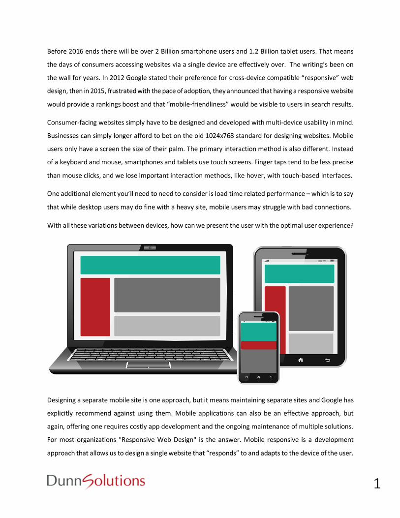
Before 2016 ends there will be over 2 Billion smartphone users and 1.2 Billion tablet users. That means
the days of consumers accessing websites via a single device are effectively over. The writing’s been on
the wall for years. In 2012 Google stated their preference for cross-device compatible “responsive” web
design, then in 2015, frustrated with the pace of adoption, they announced that having a responsive website
would provide a rankings boost and that “mobile-friendliness” would be visible to users in search results.
Consumer-facing websites simply have to be designed and developed with multi-device usability in mind.
Businesses can simply longer afford to bet on the old 1024x768 standard for designing websites. Mobile
users only have a screen the size of their palm. The primary interaction method is also different. Instead
of a keyboard and mouse, smartphones and tablets use touch screens. Finger taps tend to be less precise
than mouse clicks, and we lose important interaction methods, like hover, with touch-based interfaces.
One additional element you’ll need to need to consider is load time related performance – which is to say
that while desktop users may do fine with a heavy site, mobile users may struggle with bad connections.
With all these variations between devices, how can we present the user with the optimal user experience?
Designing a separate mobile site is one approach, but it means maintaining separate sites and Google has
explicitly recommend against using them. Mobile applications can also be an effective approach, but
again, offering one requires costly app development and the ongoing maintenance of multiple solutions.
For most organizations "Responsive Web Design" is the answer. Mobile responsive is a development
approach that allows us to design a single website that “responds” to and adapts to the device of the user.
2
Best Practices for Responsive Web Design
How does responsive web design and development work? The driving force behind responsive design is
the ability to use browser properties to determine the correct display parameters for the website's layout
and content. For example, a tablet user would see a resized version of the desktop layout, compressed to
fit the space, whereas a smartphone user would see a one column layout with an expanding navigation.
One popular strategy for optimizing website layouts when using responsive design is to rely on breakpoints.
Many devices fall into one of four standard device widths:
960 pixels – Desktop devices
720 pixels – Tablets in portrait mode
480 pixels – Smartphones in landscape mode
320 pixels – Smartphones in portrait mode
The above widths can be used as breakpoints for our website design. For example, if the browser width is
greater than or equal to 960 pixels, we could use a 920 pixel width, three column layout. So if your browser
width is 480 pixels or less, the site’s width will respond by changing to 480 pixels and a one column layout.
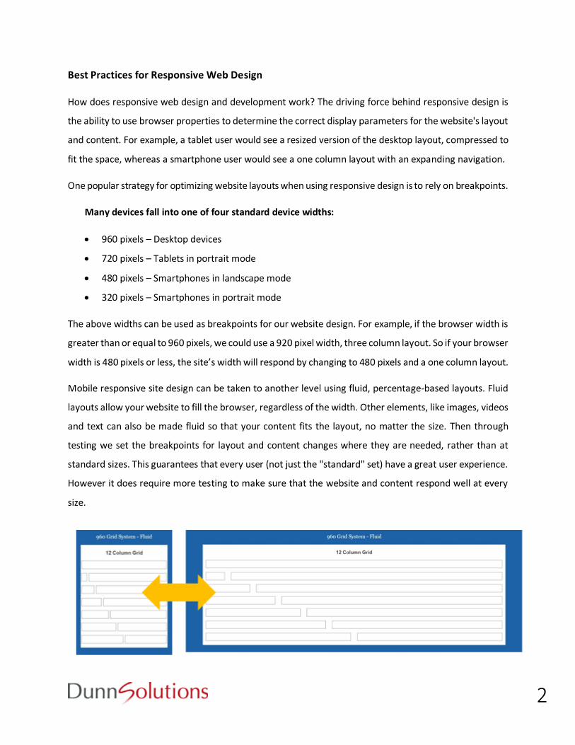
Mobile responsive site design can be taken to another level using fluid, percentage-based layouts. Fluid
layouts allow your website to fill the browser, regardless of the width. Other elements, like images, videos
and text can also be made fluid so that your content fits the layout, no matter the size. Then through
testing we set the breakpoints for layout and content changes where they are needed, rather than at
standard sizes. This guarantees that every user (not just the "standard" set) have a great user experience.
However it does require more testing to make sure that the website and content respond well at every
size.
3
Designing a Mobile-Friendly Content Strategy
When working with existing websites to make them mobile responsive, our designer and developers use
a top down method – optimizing the content as we shrink it down in size. Starting with your desktop-
friendly site, we’ll modify the layout and content so the site will display and function well on mobile devices.
Then, as we scale from a large desktop to a small device, content typically changes in one of three ways:
1) Mobile Responsive Content Shifts: As the screen gets smaller, columns become narrower.
Sidebars and other secondary content blocks move from the side to below the main column(s).
Rows of six images become three, and then two, and then one, etc. This is all done so users won't
have to pinch, expand, and move around a website regardless of the size of their mobile device.
The flow of your website’s content, though, will still need to make sense to mobile visitors
depending on their screen size shrinks. Interdigitation is the weaving of content in a way that
keeps the information most relevant to users easily available. A product summary that, on a
desktop device, floats on the right side of the page gets pushed under a main photo so users still
get information quickly. A large navigation, on smaller pages, may be pushed to the bottom of a page.
2) Mobile Responsive Content is Hidden: Content that would otherwise take too long to skim by
scrolling or just doesn't fit well in the layout can be hidden. One way to keep important
information easily accessible is to make some content expand when mobile visitors want to view it.
In addition to keeping price information and the "add to cart" link at the top, reviews are viewable
only by expanding the reviews section. Doing so will prevent your sites most important links – the
ones that allow mobile visitors to buy products – from getting buried by secondary information.
3) Mobile Responsive Content is Removed: Generally, this is avoided. Ideally every mobile user
should be able to access all site features, regardless of the devices they use. On some sites mobile
users lose the ability to post jobs, find prices, and learn about the website when they use a tablet
or smartphone. This puts the site at a disadvantage because most mobile users expect to be able
to do as many things as a desktop user. Therefore, it is important not to hide important content.
However, in the name of esthetics, reduced scrolling or lower page load times, some site content
can be hidden from users on particularly small mobile devices. If you make the decision to remove
content is made, it should be backed by solid evidence that indicates it's actually the best decision.
4
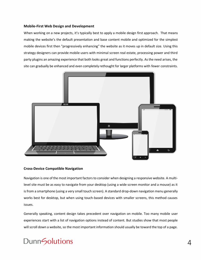
Mobile-First Web Design and Development
When working on a new projects, it’s typically best to apply a mobile design first approach. That means
making the website’s the default presentation and base content mobile and optimized for the simplest
mobile devices first then "progressively enhancing" the website as it moves up in default size. Using this
strategy designers can provide mobile users with minimal screen real estate, processing power and third
party plugins an amazing experience that both looks great and functions perfectly. As the need arises, the
site can gradually be enhanced and even completely rethought for larger platforms with fewer constraints.
Cross-Device Compatible Navigation
Navigation is one of the most important factors to consider when designing a responsive website. A multi-
level site must be as easy to navigate from your desktop (using a wide screen monitor and a mouse) as it
is from a smartphone (using a very small touch screen). A standard drop-down navigation menu generally
works best for desktop, but when using touch-based devices with smaller screens, this method causes
issues.
Generally speaking, content design takes precedent over navigation on mobile. Too many mobile user
experiences start with a list of navigation options instead of content. But studies show that most people
will scroll down a website, so the most important information should usually be toward the top of a page.
5
Making Site Visits Easy for Mobile Users
In addition to tackling layout, content and navigation from a mobile first perspective, there are a variety
of other considerations developers will take into account when designing mobile responsive websites:
Buttons and Touch-Based Interactions
Buttons, links and other such elements should be easy to select with a finger tap. The general rule
is to make them the size of a fingertip (the people at Apple define this as 57 pixels square). There
must also be adequate space left around the element, so nearby items won't be selected
accidently
Hover on Touch Screen Mobile Devices
In the past, hovering has been used on elements like navigation bars and general links to show that
something is clickable. Since the popularization of touch-screen mobile devices, this approach has changed.
Links should always be obvious now that they cannot rely on hovering to be discovered
Clickable actions such as arrows you typically see on a site slideshows cannot be designed to only
appear when hovered over because this makes them inaccessible on touch screen mobile devices
Effects that rely on hovering should probably be avoided. On The Inspiration Grid website, for
example, headlines for each image only appear when hovered over. This works nicely on a desktop
device, but on a tablet or phone users have to click through to the detail screen to see the content
Forms on Touch Screen Mobile Devices
Forms can easily be made aesthetically pleasing on a tablet or phone, but mobile usability can become an
issue on those devices. Here are some general rules to follow to make site forms as easy to use as possible:
Designers use checkboxes, radio buttons, and drop down menus to facilitate mobile usability
whenever possible. The less mobile users have to fill in, the easier completing a site form will be
Check for errors in text input fields as users are filling out a form. This is especially helpful on long
forms
Responsive Web Design and Load Times
One of the most important aspects of making websites cross-device compatible involves keeping load
time low. Designers and developers have several options available when attempting to cut down load times:
6
Lazy loading is when content is loaded as a visitor scrolls down a page. This allows users to
download only as much as they’ll use. Lazy loading’s useful for sites that have content like lists of
articles because new articles can load as a visitor scrolls instead of loading once a user has clicked
to see another page. This may be easier than having users tap a "next" button every few articles
Conditional loading is when the type of media content that is loaded depends on a given visitor's
screen size and resolution. This allows mobile users to download small file sizes while desktop
users can get the full experience on a site
Using CSS Styling Instead of Images When Possible
The release of CSS3 gave web designers and website developers a new range of styling options
previously accomplished using hacks and images. Things like drop shadows, rounded corners and
gradients are now achievable with a single line of code, allowing us to keep our designs small and
fast-loading. Occasionally, some CSS3 styles may not render correctly in older browsers, and in
these cases, fallback options are available
Let us design and develop a mobile responsive site for you! Contact us at [email protected] today!

