Embed Size (px)
Citation preview
Magazine analysis:Contents
Analysis of the contents of three magazines: Q, KERRANG and UNCUT
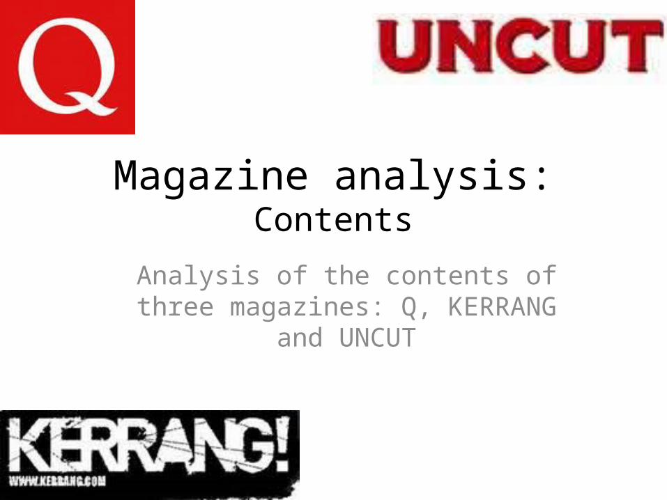
Picture of cover(2)
Cover lines separate(3)
Multiple, overlapping
images(8)
Logo and issue number(1)
Pull quote from interview(6)
Colour scheme and style(9)
Overall tone(4)Issue’s main
features(7)
Main articles(5)
1. The logo and issue number are large and much easier to spot than on the cover. On the cover they will often be smaller and out of the way, so as not to upset the aesthetics of the magazine, but the contents makes it much easier for anybody who wants this information to find it.
2. There is a picture of the front cover just above the section discussing it. This then makes it easier for the reader as they can be reminded what articles they were interested in. Small touches like this make magazines a lot more successful as it makes it seem more personal, this is the same reason that direct gaze is used on front covers.
3. Having the cover lines separate makes it a lot easier for the reader to find articles that peaked their interest on the cover. These articles are often placed close to the centre so that the reader has to go through a number of pages to find the article. This then means that they see a number of other articles.
4. This page has a very friendly tone, through its use of bright colours, overlapping pictures and friendly language it creates a peaceful friendly tone that is encouraging for the reader.
5. The main articles are at the front of the magazine as they are often the ones that are most important for the magazine-they often deal with things to do with their chosen subject directly, in this case, rock music
6. Having a pull quote from an interview that was not mention on the cover holds connotations that there is a lot more to the magazine than the reader originally believed. Their choice of a quote also gives it an air of exclusivity, as the quote chosen is not exactly polite.
7. The issues main features are boxed up separately from the rest of the choices as these are the aspects of the magazine that keep it unique. They are the reason the reader chose this magazine over another and it is important that they can find these features.
8. Multiple, overlapping images gives an aura of rebellion, of gentle fun and mischief. Arranging the images in such a way enforces the idea of having a friendly sense to the magazine.
9. The colours used on this page are not just the normal everyday house style but also include photos. On the first page a large piture of Elton John, with a lot of pink, create s friendly aura. While on the second page the greys and blacks of the picture create a darker aura.
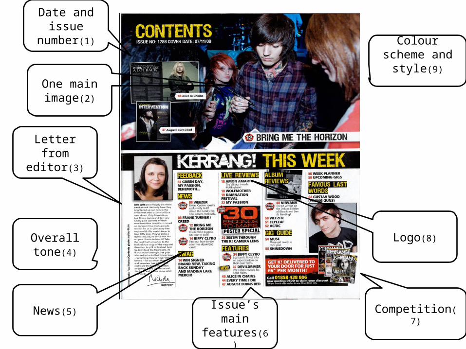
Letter from editor(3)
Logo(8)
Colour scheme and style(9)
Overall tone(4)
Issue’s main features(6)
News(5)
Date and issue number(1)
One main image(2)
Competition(7)
• 1. The date and issue number are large and much easier to spot than on the cover. On the cover they will often be smaller and out of the way, so as not to upset the aesthetics of the magazine, but the contents makes it much easier for anybody who wants this information to find it- such as collectors.
• 2. one main image coupled with smaller ones shows the importance of the larger one, but suggests that that is not all there is to the magazine.
• 3. A letter from editor makes it seem more personal, even though they will have sold thousand of copies, having a letter from the editor makes it seem like the magazine was made for you alone.
• 4. Overall, the tone of the page is fun but dark, showing that it deals with a heavier branch of rock than Q.
• 5. Having a news section suggests that this magazine is for people who care about an follow the music world closely. This also has the effect of making it seem more exclusive as it seems they have their own sources of information.
• 6. Unusually the main features have been put towards the back of the list. This then suggests that the reader focuses on other aspects of the magazine.
• 7. Like the cover, the contents page offers rewards is the form of a competition. It grabs the readers attention and then directs them to see the rest of the page. Many magazines employ this tactic as more people will buy something is they believe they can get something out of it.
• 8. The logo is repeated on this page, showing what magazine it is and reminding the reader. This then can cause brand loyalty as the reader better associates their reading to the magazine.
• 9. The colour scheme is darker than other magazines, but this is because it deals with a darker branch of rock than other magazines. Other than yellow it follows the rules of the sub-genre, rock magazines mostly use red, white and black. Kerrang’s only difference is the yellow which it uses to its advantage, as a bright attention grabbing colour.
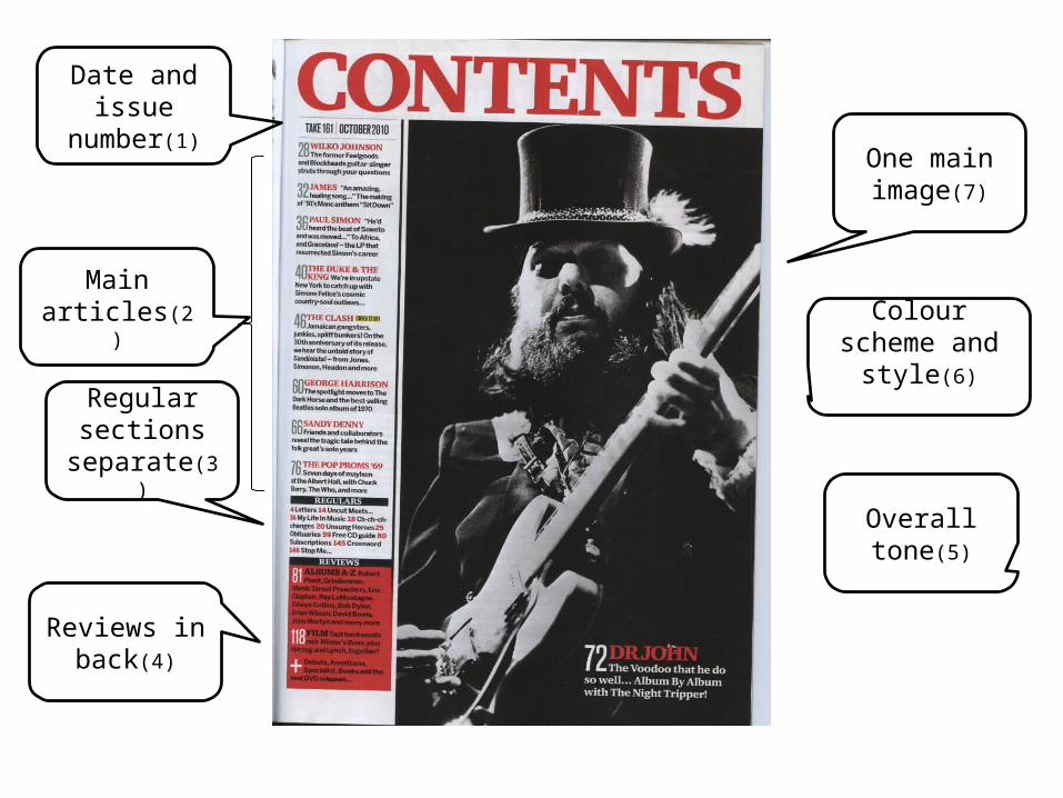
One main image(7)
Regular sections
separate(3)
Main articles(2)
Reviews in back(4)
Date and issue number(1)
Colour scheme and style(6)
Overall tone(5)
• 1. Being in large black letters the date and issue number stick out, this then makes it a lot easier for anybody who would want this information to find it. On the front cover of a magazine the date and issue number are often small and harder to find- as it is what sells the magazine- but the contents page is to direct the reader to the corresponding article.
• 2. The main articles are often the most important ones and are therefore found the easiest; they are both at the top of the table of contents and at the front of the magazine. This is because these articles are often the heart of the magazine, it shows the way they approach the sub genre and most readers are looking for this.
• 3. On the other hand, some readers are looking for a personal touch- something to set the magazine out from its competition. This is where the regulars come in, this section is for the regular reader or people who want to get their take on rock- opening themselves to a new opinion. This section is smaller and underneath the main section, suggesting that this is a much smaller number of people and the bulk are after the information within the articles.
• 4. Being in the back makes it easy to find, while connoting it’s unimportance. The fact that it is a review section is important as not everybody wants to read this so putting it in the back of the magazine and bottom of the tale of contents seems like a good idea. Having it in the same red as the logo shows that it is less to do with rock and more to do with the magazine and its editors.
• 5. The overall tone of this magazine appears to be quite blunt, matter of fact and cold. This does not seem personal, very factual and methodical. The colour scheme is mainly black and white, which leaves the page looking empty. The picture is also in black and white, suggesting it is for an older audience.
• 6. The colour scheme is black, white and red. Though it is mainly black and white, leaving a cold logical feel, it uses red when talking about the magazine (titles and reviews.) This then allows readers to better distinguish between musical information and magazine related information
• 7. The page has one main image, which suggests it is important. There are no smaller images, like in kerrang, which shows that all the attention is on it. This is then explained by the text at the bottom right of the picture; that the corresponding article is in the issue.