Embed Size (px)
Citation preview
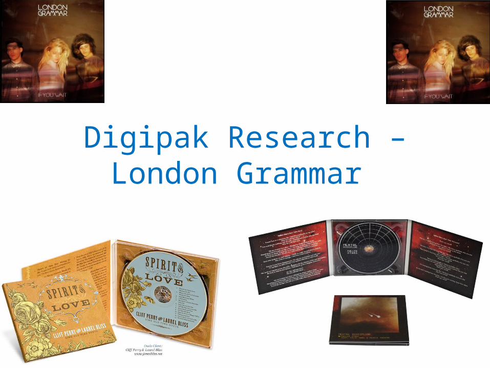
Digipak Research – London Grammar
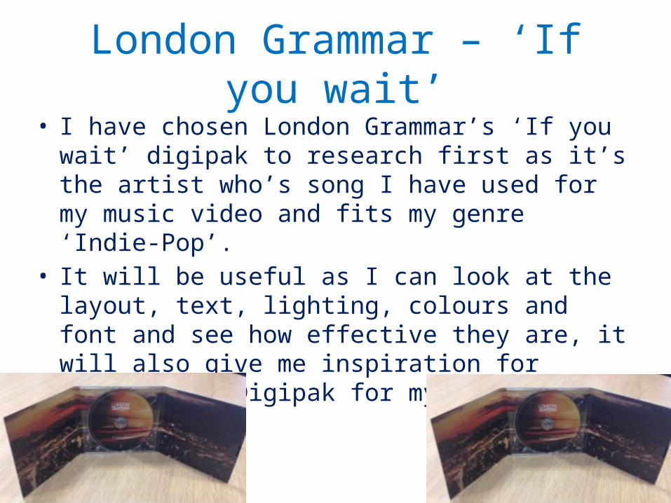
London Grammar – ‘If you wait’• I have chosen London Grammar’s ‘If you wait’ digipak
to research first as it’s the artist who’s song I have used for my music video and fits my genre ‘Indie-Pop’.
• It will be useful as I can look at the layout, text, lighting, colours and font and see how effective they are, it will also give me inspiration for creating my Digipak for my Ancillary task.
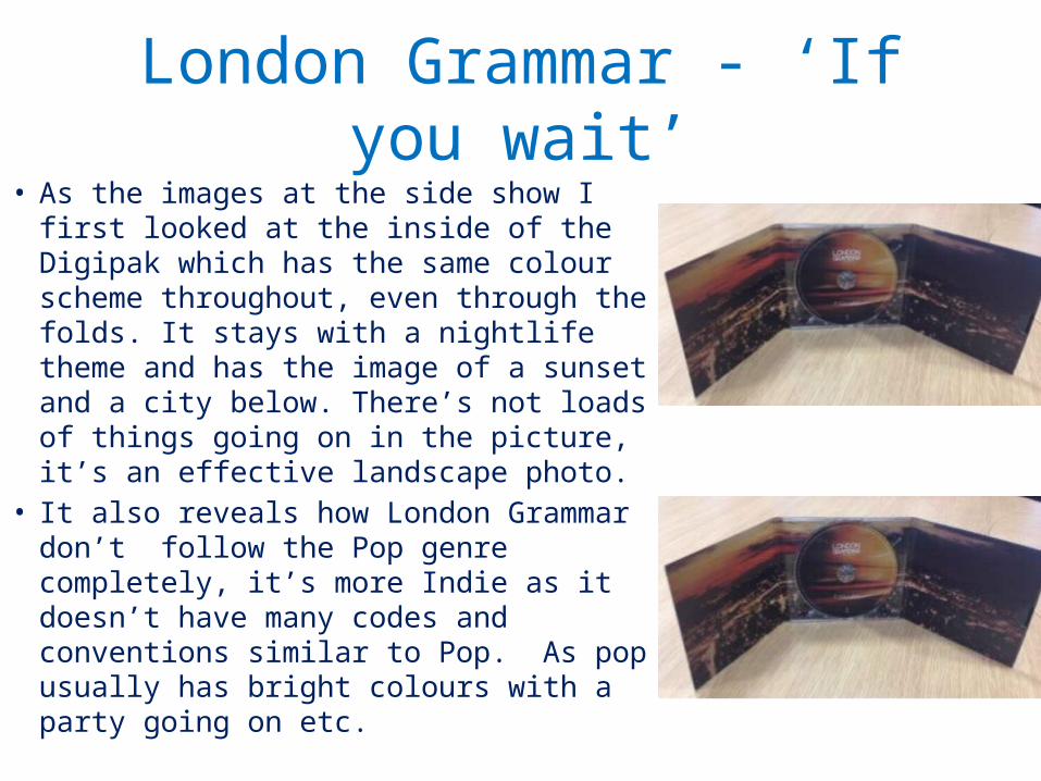
London Grammar - ‘If you wait’• As the images at the side show I first
looked at the inside of the Digipak which has the same colour scheme throughout, even through the folds. It stays with a nightlife theme and has the image of a sunset and a city below. There’s not loads of things going on in the picture, it’s an effective landscape photo.
• It also reveals how London Grammar don’t follow the Pop genre completely, it’s more Indie as it doesn’t have many codes and conventions similar to Pop. As pop usually has bright colours with a party going on etc.
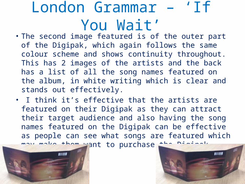
London Grammar – ‘If You Wait’• The second image featured is of the outer part of the
Digipak, which again follows the same colour scheme and shows continuity throughout. This has 2 images of the artists and the back has a list of all the song names featured on the album, in white writing which is clear and stands out effectively.
• I think it’s effective that the artists are featured on their Digipak as they can attract their target audience and also having the song names featured on the Digipak can be effective as people can see what songs are featured which may make them want to purchase the Digipak.
COLOURS & LIGHTING:
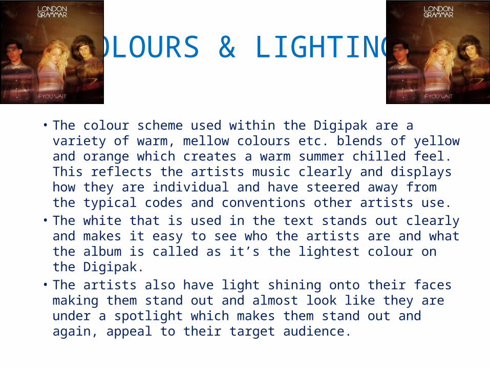
• The colour scheme used within the Digipak are a variety of warm, mellow colours etc. blends of yellow and orange which creates a warm summer chilled feel. This reflects the artists music clearly and displays how they are individual and have steered away from the typical codes and conventions other artists use.
• The white that is used in the text stands out clearly and makes it easy to see who the artists are and what the album is called as it’s the lightest colour on the Digipak.
• The artists also have light shining onto their faces making them stand out and almost look like they are under a spotlight which makes them stand out and again, appeal to their target audience.
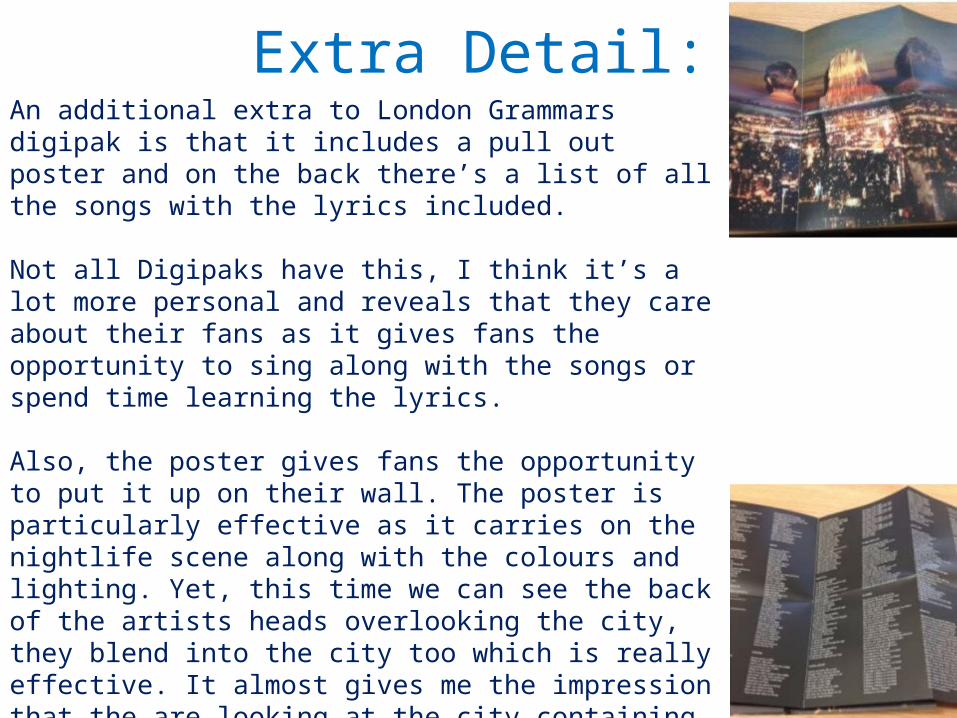
Extra Detail:An additional extra to London Grammars digipak is that it includes a pull out poster and on the back there’s a list of all the songs with the lyrics included.
Not all Digipaks have this, I think it’s a lot more personal and reveals that they care about their fans as it gives fans the opportunity to sing along with the songs or spend time learning the lyrics.
Also, the poster gives fans the opportunity to put it up on their wall. The poster is particularly effective as it carries on the nightlife scene along with the colours and lighting. Yet, this time we can see the back of the artists heads overlooking the city, they blend into the city too which is really effective. It almost gives me the impression that the are looking at the city containing their fans and creating ideas for future songs perhaps.
Personally, I think this makes their Indie genre particularly stand out as it’s different and simple yet effective.