Embed Size (px)
Citation preview
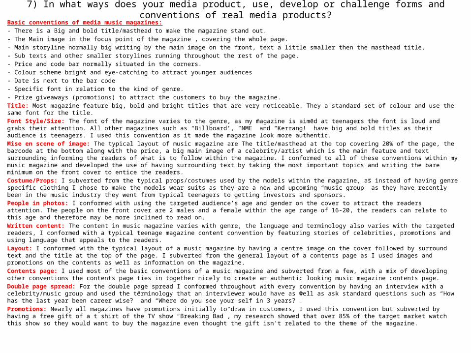
7) In what ways does your media product, use, develop or challenge forms and conventions of real media products?Basic conventions of media music magazines:- There is a Big and bold title/masthead to make the magazine stand out.- The Main image in the focus point of the magazine , covering the whole page.- Main storyline normally big writing by the main image on the front, text a little smaller then the masthead title.- Sub texts and other smaller storylines running throughout the rest of the page.- Price and code bar normally situated in the corners.- Colour scheme bright and eye-catching to attract younger audiences- Date is next to the bar code- Specific font in relation to the kind of genre.- Prize giveaways (promotions) to attract the customers to buy the magazine. Title: Most magazine feature big, bold and bright titles that are very noticeable. They a standard set of colour and use the same font for the title. Font Style/Size: The font of the magazine varies to the genre, as my magazine is aimed at teenagers the font is loud and grabs their attention. All other magazines such as “Billboard’, “NME” and “Kerrang!” have big and bold titles as their audience is teenagers. I used this convention as it made the magazine look more authentic. Mise en scene of image: The typical layout of music magazine are The title/masthead at the top covering 20% of the page, the barcode at the bottom along with the price, a big main image of a celebrity/artist which is the main feature and text surrounding informing the readers of what is to follow within the magazine. I conformed to all of these conventions within my music magazine and developed the use of having surrounding text by taking the most important topics and writing the bare minimum on the front cover to entice the readers. Costume/Props: I subverted from the typical props/costumes used by the models within the magazine, as instead of having genre specific clothing I chose to make the models wear suits as they are a new and upcoming “music group” as they have recently been in the music industry they went from typical teenagers to getting investors and sponsors. People in photos: I conformed with using the targeted audience’s age and gender on the cover to attract the readers attention. The people on the front cover are 2 males and a female within the age range of 16-20, the readers can relate to this age and therefore may be more inclined to read on. Written content: The content in music magazine varies with genre, the language and terminology also varies with the targeted readers, I conformed with a typical teenage magazine content convention by featuring stories of celebrities, promotions and using language that appeals to the readers. Layout: I conformed with the typical layout of a music magazine by having a centre image on the cover followed by surround text and the title at the top of the page. I subverted from the general layout of a contents page as I used images and promotions on the contents as well as information on the magazine. Contents page: I used most of the basic conventions of a music magazine and subverted from a few, with a mix of developing other conventions the contents page ties in together nicely to create an authentic looking music magazine contents page. Double page spread: For the double page spread I conformed throughout with every convention by having an interview with a celebrity/music group and used the terminology that an interviewer would have as well as ask standard questions such as “How has the last year been career wise?” and “Where do you see your self in 3 years?”.Promotions: Nearly all magazines have promotions initially to draw in customers, I used this convention but subverted by having a free gift of a t shirt of the TV show “Breaking Bad”, my research showed that over 85% of the target market watch this show so they would want to buy the magazine even thought the gift isn't related to the theme of the magazine.
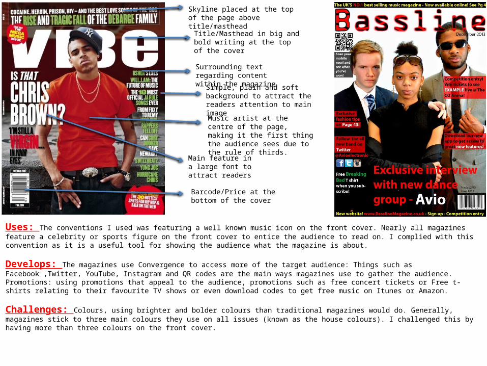
Skyline placed at the top of the page above title/masthead
Title/Masthead in big and bold writing at the top of the cover
Surrounding text regarding content within the magazine
Simple, plain and soft background to attract the readers attention to main image
Music artist at the centre of the page, making it the first thing the audience sees due to the rule of thirds.
Main feature in a large font to attract readers
Barcode/Price at the bottom of the cover
Uses: The conventions I used was featuring a well known music icon on the front cover. Nearly all magazines feature a celebrity or sports figure on the front cover to entice the audience to read on. I complied with this convention as it is a useful tool for showing the audience what the magazine is about.
Develops: The magazines use Convergence to access more of the target audience: Things such as Facebook ,Twitter, YouTube, Instagram and QR codes are the main ways magazines use to gather the audience. Promotions: using promotions that appeal to the audience, promotions such as free concert tickets or Free t-shirts relating to their favourite TV shows or even download codes to get free music on Itunes or Amazon.
Challenges: Colours, using brighter and bolder colours than traditional magazines would do. Generally, magazines stick to three main colours they use on all issues (known as the house colours). I challenged this by having more than three colours on the front cover.
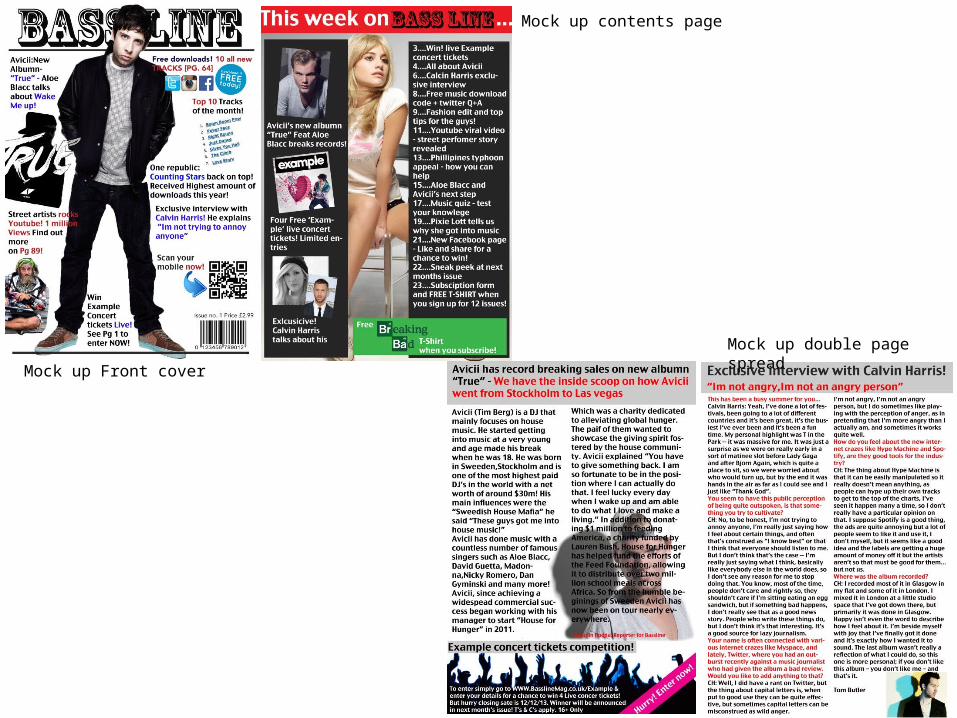
Mock up Front cover
Mock up contents page
Mock up double page spread
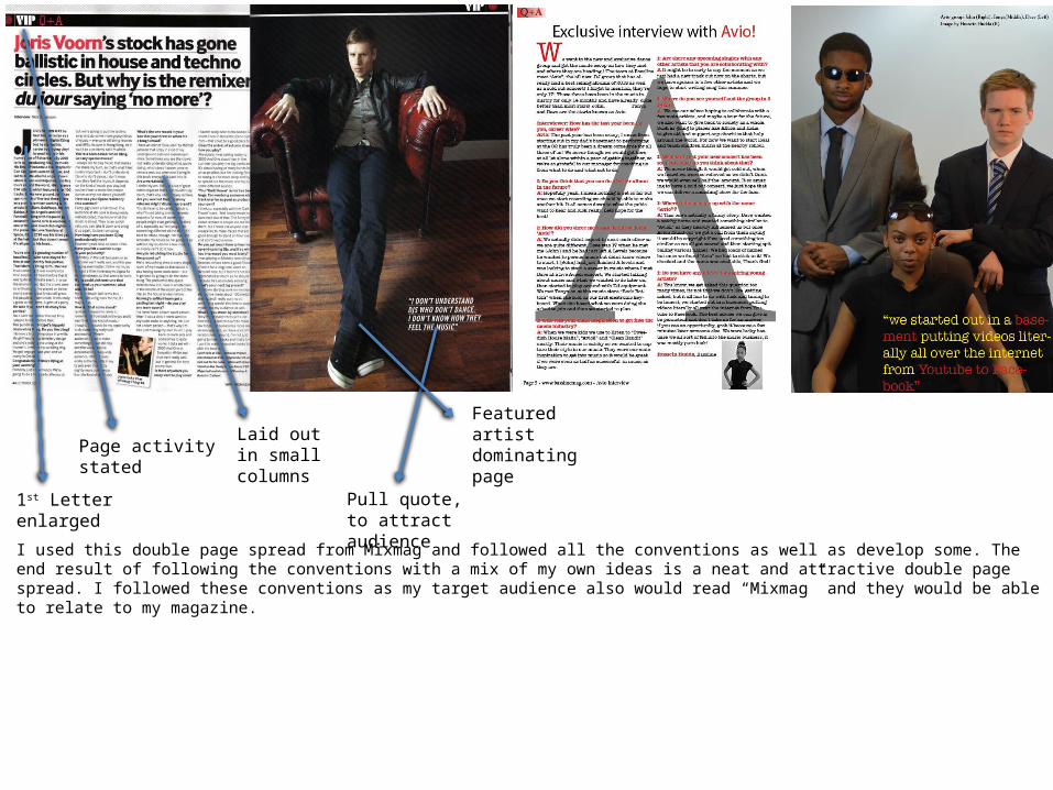
Featured artist dominating page
Pull quote, to attract audience
Laid out in small columnsPage activity stated
1st Letter enlarged
I used this double page spread from Mixmag and followed all the conventions as well as develop some. The end result of following the conventions with a mix of my own ideas is a neat and attractive double page spread. I followed these conventions as my target audience also would read “Mixmag” and they would be able to relate to my magazine.