Embed Size (px)
Citation preview

Magazine Analysis

Date And Price: this is a common assembly that would
be expected to be in all the magazines. With popular
magazines like this one, they usually display the price in
a smaller font as the company don’t want it to stand out
as it is not appealing to the audience. It is £2.40 which
is quite expensive for a magazine so explains why it is
very small.
Sub Heading: A good use of
onomatopoeia which Is catchy in order to
gage the audiences attention. Also, the
red background brings more focus to the
text because of the contrast of colours.
The positioning of the band members also make the
magazine cover look interesting and exciting as they
take up the whole page but they are also looking
straight into the camera which helps hold the
audiences attention.
Mumford And Sons are the main focus of the
magazine which shows why they are dressed
casually/smart, making it more appealing to a wider
audience.
Colour Scheme: the colours of black, white and red are
contrasting colours as they make each other stand out, Also, it
doesn’t make the cover look more confusing so people won’t
read it. The brightness of the white and red attract the audience
because they are NME’s trademark colours. The gender neutral
red colouring infers that there isn’t a specific target audience

Masthead: the magazine uses a Sans serif font which
is straight forward and informal. The red font contrasts
against the white/grey background which is used to
make it stand out. In addition to the title being
abbreviated it is really effective as it is quicker and
easier to remember. The name of the magazine is
written in the same place on each magazine and uses
the same font , making it familiar to people looking for
it.
Main Image: The image connotes the band ‘Mumford
and sons’ wearing casual clothing and using direct
address by looking into the camera, making the
audience feel more involved with the image. They are
the main focus to the front cover which attracts the
audience to read it.
Using a well-Known band as the front cover also
entices people to take a look which is why the
magazine has a high readership and circulation. The
image takes up most of the front cover.
Feature Headline: This is the second largest sans serif text used
and is designed to grab the target audiences interest but also is a
great way to sell the magazine because Mumford And Sons are
popular and if people are fans then they will like the idea of them
‘taking over’.
Barcode: A common convention
used on the front cover in order
for the consumer to purchase the
magazine, it is essential for the
magazine.

The size of text on this magazine cover are
different which gives the magazine more variety.
Some of the text are in banners and outlined
making it look more like a magazine but also so
that it isn't confusing to the readers and everything
Is separated out as it would be harder to read if it
was in chunks.
The list of other bands attracts the target audience
just in case the readers see their favourite artist,
encouraging them to buy it.
Layout: Plain colours used such as red, black and white in order to show that they are passionate about the music
and bands that they feature in the magazine. The strapline at the top draws attention because ‘WIN’ is in bold and
is the first word that they see, interesting the audience.
Sub image: this gives the audience a sneak peak of what
is included inside the magazine so that the consumer
continues to read the magazine in order to find out more
information. This also gives the audience more options as
to what they can read if they aren't too interested in the
main feature, letting them know it isn't all about them.
The ‘free posters’ section draws attention of the target
audience and encourages them to buy it to let them know
they are gaining something from buying it.

Masthead: the magazine uses a Sans serif font
which is straight forward and informal but with effect
of it wearing away or has been smashed which
reflects the genre of music and the people who
listen to it as it is an idea of rebellion .
The white font contrasts against the red background
which is used to make it stand out. In addition to the
title having the idea of rebellion this links with the
prominent colours of red, black, white and yellow.
Puff: ‘All Time Low’, using this at top of the magazine promotes bands that are linked with the magazine and it is
highlighted in a different colour to draw the attention of the reader making it stand out more. It also makes the front
cover look more full to show the audience that there is a lot of information contained, enticing them to buy it. In
addition to this it doesn't give a lot of information at the top which can draw their interest.
Colour Scheme: the colours of black, white, red and
yellow are contrasting colours as they make each other
stand out, they have been used to design the front
cover as they are aesthetically pleasing when used
together. These colours are usually put together on
Kerrang magazines because of their trademark colours
as they are easily recognisable to viewers who usually
buy it. It appears that the largest fonts are the most
important

Feature Headline: This is the largest serif text used
and is designed to grab the target audience’s interest.
If the viewers are interested as to what reads then it is
a great way to sell the magazine. The band ‘30
Seconds To Mars’ have been chosen as they are the
genre of music that the magazine includes but also it
reveal the target audience of the consumer which is
young adults.
The colour of the text and the faint arrows are linked
with the overall colour scheme of the magazine but
also breaks up the text. The first ‘We Salute’ connects
with the main image of Jared Leto as he is saluting in
his pose. The Bold writing could also associate with the
type of music because it is loud and has a big impact.
The writing is slightly on a slant to make it differ from
the masthead and the sub-headings but also makes it
more interesting.
Date And Price: This is a common assembly that would be expected to be in all the magazines. When popular
magazines like this one, they usually display the price in a smaller font as the company don’t want it to stand out as it
is not appealing to the audience. The magazine also displays a barcode at the bottom right corner which is used in
order for the consumer to purchase it.
Buzz Word: Using words such as ‘Exclusive’
draws in the audience as it makes the
audience feel more involved as it they are one
of the first people to know what is happening. It
is also implying that it is the only magazine to
have the information that is printed.

Sub image: for the audience to buy the magazine
they include images on the side to let the reader know
what is included in the magazine. The ‘5 Posters
Inside’ is similar to giving away a freebie, making the
reader feel as though they are receiving a gift or
getting something out of buying it besides reading it.
Using 5 posters makes them unique and different
because other companies usually include 1 or 2. The
other images however gives the audience more
options as to what they can read if they aren't too
interested in the main feature, letting them know it isn't
all about them.
Main Image: The main image displays Jared Leto, the main
singer from ‘30 Seconds To Mars’ against a red
background. He has made direct address as he is looking at
the reader whilst informally posing a salute sign making the
reader feel more involved. This is a form of interaction as
the audience may feel connected .
His hair is stereotypically ‘punk rock’ which is the genre of
music which relates to the magazine. By presenting him like
this means that the viewers will think he is quite cool so
people may wan to be like him, which also relates to the
type of music they listen to as it is normally the same genre
of music as to what band or artist is presented on the front
cover.
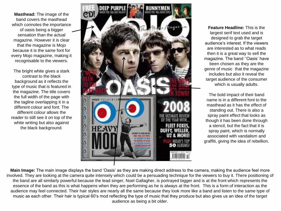
Main Image: The main image displays the band ‘Oasis’ as they are making direct address to the camera, making the audience feel more
involved. They are looking at the camera quite intensely which could be a persuading technique for the viewers to buy it. There positioning of
the band are all similarly powerful because the lead singer, Noel Gallagher, is portrayed bigger and is at the front which represents the
essence of the band as this is what happens when they are performing as he is always at the front. This is a form of interaction as the
audience may feel connected. Their hair styles are nearly all the same because they look more like a band and listen to the same type of
music as each other. Their hair is typical 60’s mod reflecting the type of music that they produce but also gives us an idea of the target
audience as being a bit older.
Feature Headline: This is the
largest serif text used and is
designed to grab the target
audience’s interest. If the viewers
are interested as to what reads
then it is a great way to sell the
magazine. The band ‘’Oasis’ have
been chosen as they are the
genre of music that the magazine
includes but also it reveal the
target audience of the consumer
which is usually adults.
The bold impact of their band
name is in a different font to the
masthead as it has the effect of
standing out. There is also a
spray paint effect that looks as
though it has been done through
a stencil, but the fact that it is
spray paint, which is normally
associated with vandalism and
graffiti, giving the idea of rebellion.
Masthead: The image of the
band covers the masthead
which connotes the importance
of oasis being a bigger
sensation than the actual
magazine. However it is clear
that the magazine is Mojo
because it is the same font for
every Mojo magazine, making it
recognisable to the viewers.
The bright white gives a stark
contrast to the black
background as it reflects the
type of music that is featured in
the magazine. The title covers
the full width of the page with
the tagline overlapping it in a
different colour and font. The
different colour allows the
reader to still see it on top of the
white writing but also against
the black background.

The black and white colour scheme
is continued throughout the page
because they blend well with the
contemporary colours of the main
image. Half of the band are wearing
glasses so we don’t know if they are
looking at the camera giving a
sense of mystery behind the band
which is reflected in the sub-
headings ‘dark side’. Their facial
expressions could be a sign of
social rebellion because they are
well known for being arrogant.
Freebie- The free CD covers nearly half of the front cover which
entices people to buy it but also a great way for the audience to feel as
though they are gaining something out of purchasing the magazine.
The bold ‘Mod’ connects with the style of music that Oasis produce.
The idea if including a CD breaks up the writing and makes it less
confusing and less to read.
Layout: The front cover is structured really
well because it appears very neat without
using too much writing so it doesn’t confuse
the viewers or put them off reading it. The
picture is the biggest aspect of the front
cover as it makes it look aesthetically
pleasing increasing the chance of people
looking at it for longer or drawn to it. By
doing this it immediately lets the reader
know what the edition of the magazine is
about and what they can read inside.
Puff: the free CD sign matches
the colour scheme of the actual
CD that the are giving away
which makes it easier for the
reader to see that they are linked
and to let them know that it is in
fact free. Instead of using more
boxes to outline bands and
giveaways , the magazine have
used a contrasting colour to the
background to make it stand out
but to also match the colour
scheme.
‘Deep Purple’ and ‘Bunny men’
are the same genre of music to
the main band Oasis which the
viewer can infer from the pictures
placed beside them. This lets the
reader know that there are other
bands included in the magazine.

The title of the magazine is at the
top instead of writing contents page
compared to other magazines
showing their unique style but also
by using ‘this week’ it is letting us
know what is new in the issue the
reader has to keep them updated.
The contents of the different pages featured in the articles are split up in
different sections to make it easier for he reader to find what they are
looking for but to also let them know the amount of articles that are included.
The sub-headings are highlighted in cold capitals enabling the reader to find
the article they want to read faster which is a good structural factor as they
make it look more appealing. It is clear to understand as it is organised well
but it reflects on how the magazine are experienced with the industry.
The magazine includes a central image which breaks up
the text and the advertisements so that it is simpler but
to also add colour. Instead of following the style of other
magazine companies and using many pictures to fill the
page, the one image makes it look more organised and
unusual.
Unlike magazines which use airbrushed and photo
shopped images it is a real picture of the bad Kasabian
playing music reflecting the type of magazine which
promotes the music industry.
The contents page includes a band index which links into
the music genre of the magazine. The vibrant red colour
which links in with the colour scheme and matches ‘NME’
showing it links with the bands that NME is all about. Also, it
shows the audience the number of bands which are
featured throughout the magazine with the given page in
which they are in.
The fact that it is structured at the left hand side of the page,
gives it a more sophisticated look and to show that they
have order within the magazine. By giving the reader a list
of bands, it enables them to find their personal favourites
without too much confusion as it makes it easier to find out
where they are instead of flipping through the pages.

The adverts in which are placed at the bottom of the contents
page promote the subscription of the magazine which may
appeal to some readers who feel like the deals are worth it.
This also entices the reader into purchasing the next issue.
Also, the use of having the advertisement in a bold yellow
colour makes it stand out the readers because it doesn’t link
with the rest of the colour scheme.
The whole advert doesn’t connect with the contents but it
isn't like other magazines in addition to when they advertise
products that do not link in any way. The pictures inside the
advertising box show different issues of the same magazine
which helps them widen the target market and hope that the
reader will buy it if they like what is on the front cover.
The main subheadings of different sections are in bold
capitals which makes it clear and easier to find. The font
is sans serif because it matches the same style as the
NME sign.
Having the date placed at the top of the
page lets the audience know what edition
of the magazine they are buying as it is
clear from the text size in comparison to
the size on the front cover which is printed
with the price in a very small font. Also by
having it right underneath the ‘This Week’
heading it lets the reader know if they are
updated and in fact reading ‘This Weeks’
magazine in the week of the date it says.
The arrows at the side of the page suggest that there is more
information on different pages that are not present on the contents
page. These graphic features give a more modern vibe which
appeals to the target audience because NME use upcoming and
popular artists. The big red arrow stands out at the bottom of the
page because this is where people turn the page over and will see
the contrasting white writing and might follow what is on ‘page 58’.

The first thing we see at the top is the contents page as it stands out
against the black background. It is the same font as the Kerrang!
Front cover which gives it a more sophisticated look because they
match. They use the same colour scheme throughout the magazine
which means that it will be more recognisable for the readers.
The main image takes up half of
the page which is appealing as it
breaks up most of the text. It is a
very dark picture which reflects
the type of music featured in the
magazine. His facial expressions
however are happy which can be
questioning due to the fact he is
dressed in all black. The
sunglasses reveal his eye
contact with the camera which
makes us think he is looking at
the us tempting the reader to buy
it.
There is an editors article on
the left side of the page which
gives the reader an interesting
insight as to what they will
expect to see featured in the
magazine but it gives a sense
of trust as to what he is saying
and giving the latest info. It is
more informal and makes it
more personal having an
article include by the editor.

Kerrang has a unique style with
their contents pages as they
differ from other music
magazines due to the fact that
rather having lots of dense text
it is clear and formal and instead
of taking up the whole page
there's minimum writing making
it more visual. The columns
used structure the page and the
issues to keep it more organised
In addition to the other
magazines the sub-heading ‘this
week’ gives a list of the issues
as to what is new and up to date
reassuring the reader has
bought the correct magazine for
the week they want to read,
which is also why it I features
the date at the top of the page.
The colour scheme for this contents page is black and yellow because these are predominant colours that are used
several times in Kerrang! magazines. The colour black also connotes the genre of music featured. The bold yellow
font is used for the titles and headlines showing that they have thought about the layout and if it is yellow it means that
it is a subheading so the readers know what sections to look at. Most of the descriptive writing is black which links in
with the picture but it is also easier to read as it is against the white background.

In addition to the title being a bold black, the page has
split articles in the magazine into sections which are
under black subheadings. It gives the reader an insight as
to what information is on that page and the people who
they are interviewing. This will draw the reader in as they
will read this and usually want to read more so they will
buy the magazine so they can read more and find out the
rest of the story.
The deep yellow writing is a key element to the colour scheme and
it also breaks up the writing, mojo is aimed at an older target
audience which is why a deep yellow is used and no vibrant
colours, this way it is easier to read as they aren't too bright. The
numbers are separated from the sub headings because it is
clearer to understand what pages they are on.
MOJO usually include a cover story magazine on the contents
page with a well known musician so the more popular they are, the
more sales the magazine will have . They have made the cover
stand out by separating it from the other article sections and by
putting a yellow boarder around it. It also looks more important as
there is more information underneath it meaning that the MOJO
magazine find that if there is more information, more people are
likely to read it.
The date can be seen on the same line as the issue. It is placed at
the top of the contents page to make it clear to the reader what
edition of the magazine they are reading and if they are up to date.
The choice of clothing is significant as it contrasts against the grey background making it stand out more. It is the only
other colour which is dominantly featured in addition to the yellow writing for the text. In a way this puts all the attention
to him as he is the focus of the contents page.

The high angle shot is almost like empowering us, in a
way that we can go to any page without reading it
start to finish. It gives the reader more control as to
what to read. The man is looking directly at us making
the readers feel more involved which attracts them into
reading the story.
The picture is the main focus on the page which is
done to break it up from the text but also to make it
look simpler and less confusing. By doing this it also
makes it look more attractive and appealing to read.
The main title is placed at the top where they have their brand Mojo
clear and big to attract the reader into looking at it. It is contrasting
against the grey background so the reader can immediately see it. By
having the title of the magazine it is clear that what they are looking at
is MOJO. Underneath the title are cities in which the magazine is
iconic for music making the reader feel more connected.
Providing the issue number informs the reader what issue they are
actually reading which could be helpful to them if they have missed
an issue but it also shows how successful the magazine is as it is
on their ‘193rd’ issue. It has been running for a certain amount of
time but this gives them an insight as to how popular they are.
They have used a small quote at the bottom of the contents page which shows the reader a quote from one of the articles inside the
magazine. This technique is used to attract the attention of the reader into reading this article if they find it interesting. Besides this, it
is also in a different font the rest of the page to make it stand out.
By using the previews it is clear that the magazine wants the reader to look at it because it is different to everything else on the
contents page making it more exciting and interesting for them.

The only image on this
page is the popular
musical artist ‘Florence
And The Machine’ which
is a long shot of her.
From this we are able to
see the strong black
clothing choice indicating
a side to her we haven't
seen as it symbolises
aggression but it also
emphasises the contrast
between her red hair and
the stripes on the flag.
She is in a seductive
pose which may attract a
wider audience.
The image has been
laid out so it is the first
thing you see when you
turn the page. They
have used Florence
Welch so the reader
knows what the article
is about. It says how
successful she is in
America which is why
she is sat on the
American flag.
This double page spread has its statement colours of red and
monochrome colours which gives it a more sophisticated look because
they are the same as the NME logo colours which are featured on every
NME magazine. The Background is off white which stands out against
the image of Florence in black clothes suggesting how she stands out
from other artists. This idea of being different from other artists can also
be seen through the use of blue writing to highlight her name as it
differs from the colour scheme used.

The text with the story is
structured into 3columns
which makes it look more
organised but it is also
easier for the reader to look
at. It isn’t cluttered so when
the reader is reading it they
don’t get distracted by little
images. It also looks more
attractive compared to a
block of writing.
She has been placed
over the ‘USA’ part of
the title referencing
how she dominated
America with her music
in significance to her
popularity.
The main title is in a sans serif feminine font on the
right hand side to take some attention away from
the image to the text. The use of this font is quite
contradicting as she is shown as an independent
woman and the girly font showing that she has two
sides to her and she can be who she wants. The
‘Got the love’ has been used because her hit single
was ‘you’ve got the love’ which is used as a play on
word with USA as it is about how she made it in
America
The introduction about the article
will interest the audience to read
more as it is a bit of information
about her and is a starter to the
article. Underneath is the article
and it is clear when it stars due to
the capital ‘D’ in the bold italic
which links with the headline
above.

In addition to the NME double
page spread Kerrang use the
same technique of starting the
article with a capital letter so
that the text looks more
appealing. The target audience
of Kerrang is young people so
less amount of text will entice
them to read it more.
The main image has been placed over half of the
double page spread showing that she is the main
feature of the article. Although she is in a band
which is stated in the article, it is clear that it is
more about her and her personal life due to the
lack of band members and it just featuring her.
Taylor is dressed in all black and has heavy dark
eye makeup showing her personality and not
dressing as something she is not. She is looking
directly at the camera making the reader feel
more involved. Her position gives the sense of
rebellion because she gives off the impression
like she doesn’t care in addition to the main title
‘Wild Child’. The image also blends in with the
background because of her jacket.
The colour scheme consists of pink white
and black. The pink represents her
femininity as she is against a black
background and dressed in all black
showing a different side to her but also is
relative to the type of music that is
featured in Kerrang magazine.
The main title for this article is ‘Wild Child’, by
calling Taylor a wild child it is interesting for the
reader to find out why she is given that name and
what she does in her lifestyle to make them read
the article. The font of the word ‘wild’ is significant
because it is in a wild font compared to the word
‘child’.

The text is arranged on the right hand side in 2 columns making it easier
to read. It is also in little paragraphs so the reader wont lose focus. The
text is white and pink. The pink shows the questions being asked to
Taylor who's responses are in white. Using this technique makes it less
confusing for the reader to identify the questions and answers.
At the top of the page they have put the band name
which Taylor is in which could be used for people who
are unfamiliar with the band and want to know more
about them. It can also be helpful for readers to identify
that she in fact belongs to that band. As well as this it
can promote the band and make them more popular.
The introduction to the article is
placed underneath the main title
in white and pink bold writing
which stands out to the rest of
the writing. Her name and her
band is in pink which makes it
more noticeable for the reader to
identify her more easily.
The quote on the left stands out because it
has been placed with the picture and away
from the text. It has been taken from the
main article which is like a sneak peak as to
what is talked about in the article.
It is on a vibrant background in comparison
to the black and is in the same font as the
top right corner where it says what band she
is in. the word ‘mistake’ is highlighted but in a
darker colour suggesting the mistakes she
has made are bad which makes the reader
want to find out about them.

The image is of Alex Turner and Miles Kane from two
different bands. This can be seen as they are on two
different pages showing that they aren’t together. The
positioning of Miles (left) gives the impression of him
being quite honest and open in comparison to Alex (right)
who isn’t looking at the camera meaning he isn’t as
bothered which gives the reader a sense of his
personality
The name of the magazine
is featured at the bottom of
the page where the page
numbers are found. When
researching music
magazines I have found
that most of them use this
convention in order to let
the reader know what they
are reading
The name of the photographer and writer of the page is included
in the double page spread which is a great way for people to
know directly who has written the article they are reading
without having to go to the back to find out. Writing it in bright
colours also helps it stand out so it lets the audience know who
has written it if they enjoy certain pieces of their work.
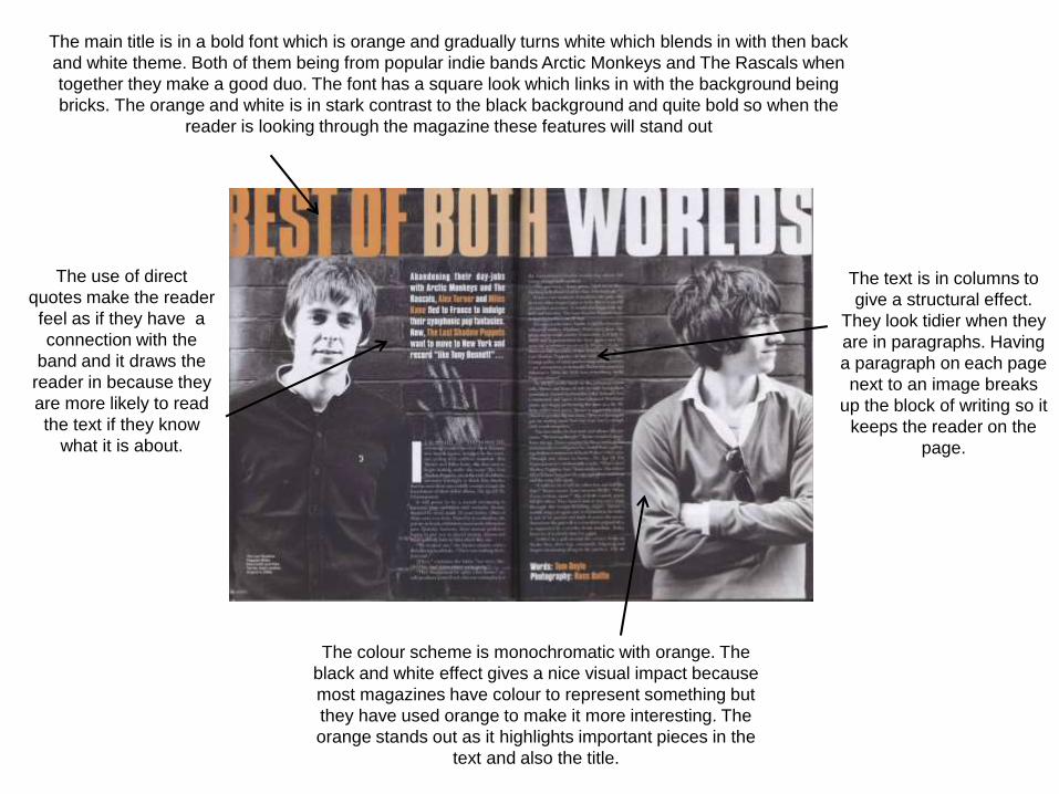
The text is in columns to
give a structural effect.
They look tidier when they
are in paragraphs. Having
a paragraph on each page
next to an image breaks
up the block of writing so it
keeps the reader on the
page.
The colour scheme is monochromatic with orange. The
black and white effect gives a nice visual impact because
most magazines have colour to represent something but
they have used orange to make it more interesting. The
orange stands out as it highlights important pieces in the
text and also the title.
The main title is in a bold font which is orange and gradually turns white which blends in with then back
and white theme. Both of them being from popular indie bands Arctic Monkeys and The Rascals when
together they make a good duo. The font has a square look which links in with the background being
bricks. The orange and white is in stark contrast to the black background and quite bold so when the
reader is looking through the magazine these features will stand out
The use of direct
quotes make the reader
feel as if they have a
connection with the
band and it draws the
reader in because they
are more likely to read
the text if they know
what it is about.