Embed Size (px)
Citation preview
Music Magazine Audience Feedback
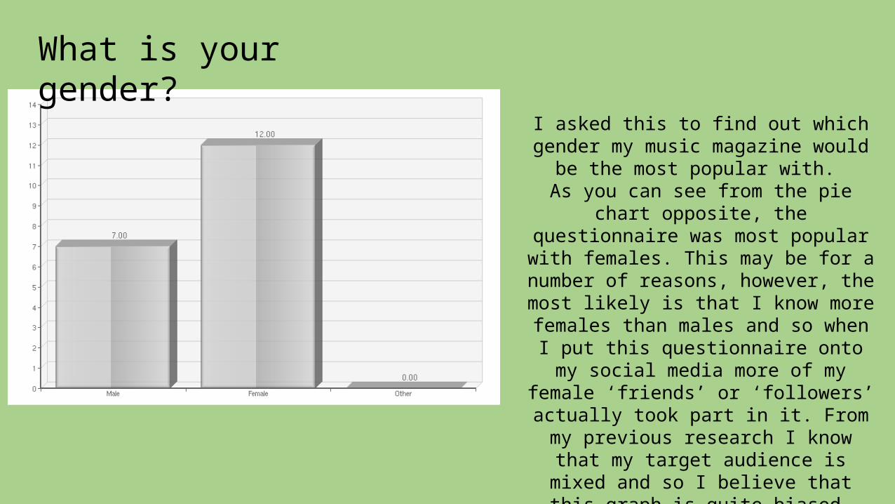
What is your gender?
I asked this to find out which gender my music magazine would be the
most popular with. As you can see from the pie chart
opposite, the questionnaire was most popular with females. This may be for
a number of reasons, however, the most likely is that I know more
females than males and so when I put this questionnaire onto my social media more of my female ‘friends’ or
‘followers’ actually took part in it. From my previous research I know
that my target audience is mixed and so I believe that this graph is quite
biased.
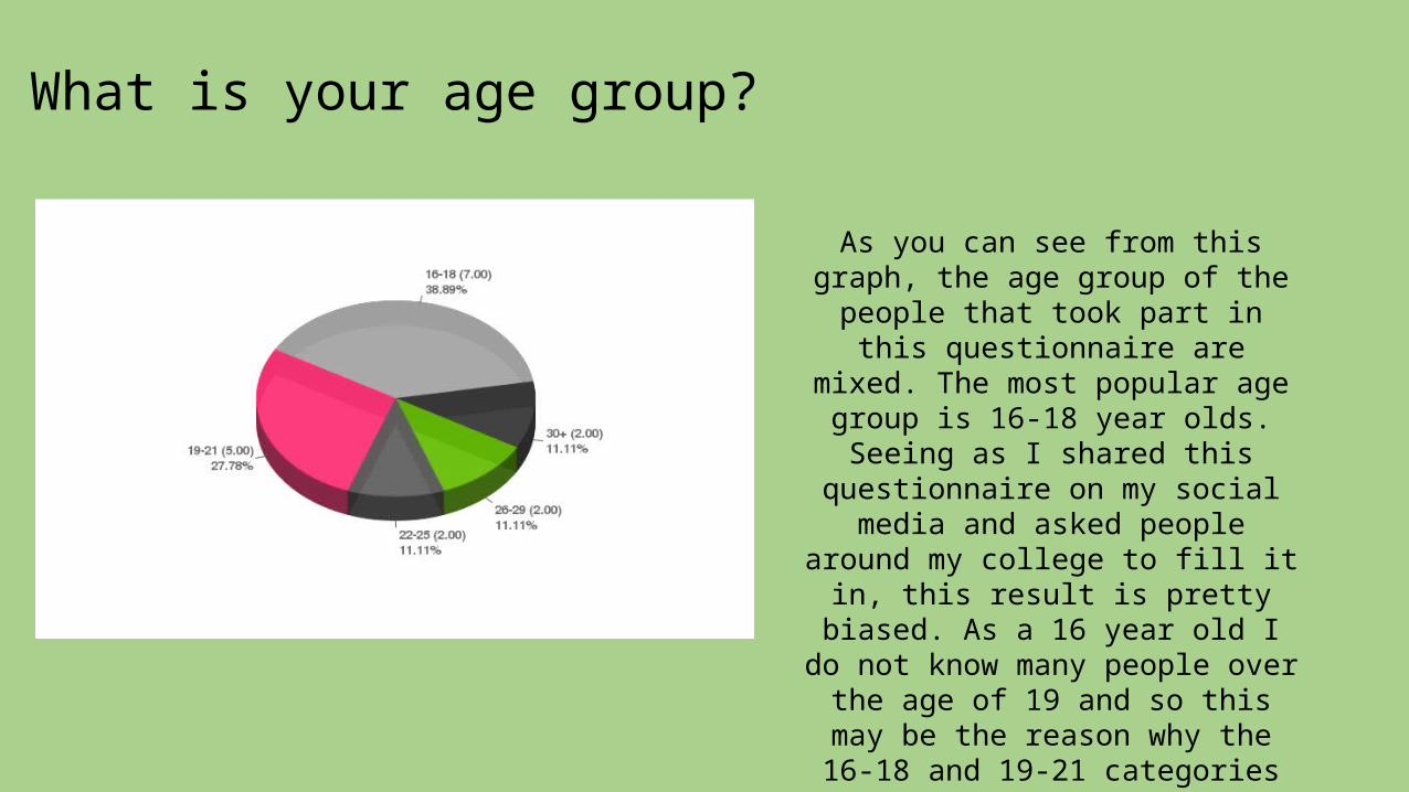
What is your age group?
As you can see from this graph, the age group of the people that
took part in this questionnaire are mixed. The most popular age
group is 16-18 year olds. Seeing as I shared this questionnaire on
my social media and asked people around my college to fill it in, this
result is pretty biased. As a 16 year old I do not know many
people over the age of 19 and so this may be the reason why the 16-18 and 19-21 categories are
the most popular.
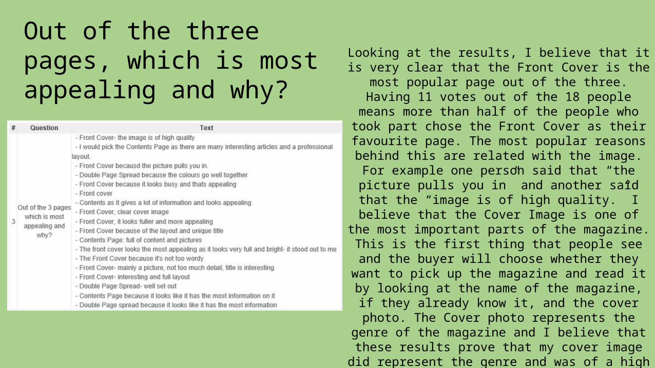
Out of the three pages, which is most appealing and why?
Looking at the results, I believe that it is very clear that the Front Cover is the most popular
page out of the three. Having 11 votes out of the 18 people means more than half of the people who took part chose the Front Cover as their
favourite page. The most popular reasons behind this are related with the image. For
example one person said that “the picture pulls you in” and another said that the “image is of high quality.” I believe that the Cover Image is
one of the most important parts of the magazine. This is the first thing that people see and the buyer will choose whether they want to pick up the magazine and read it by looking at
the name of the magazine, if they already know it, and the cover photo. The Cover photo
represents the genre of the magazine and I believe that these results prove that my cover
image did represent the genre and was of a high enough quality to bring the potential readers in.
The least popular of the pages is the Double Page Spread. This may be because there is less detail on the page due to the fact that one page
is taken up just by writing and the other a photograph. This makes the page less
interesting than the Cover and Contents page as there is less variety of fonts and images.
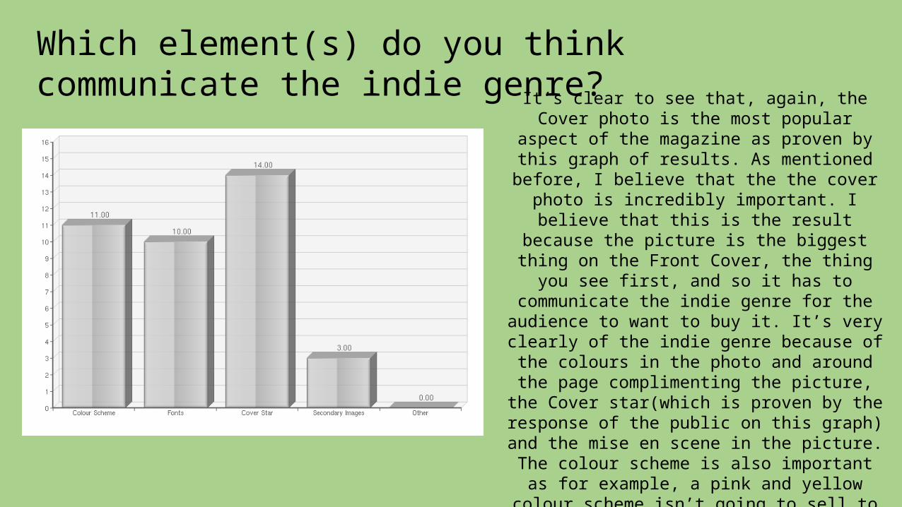
Which element(s) do you think communicate the indie genre?It’s clear to see that, again, the Cover photo
is the most popular aspect of the magazine as proven by this graph of results. As
mentioned before, I believe that the the cover photo is incredibly important. I believe that this is the result because the picture is
the biggest thing on the Front Cover, the thing you see first, and so it has to
communicate the indie genre for the audience to want to buy it. It’s very clearly of the indie genre because of the colours in
the photo and around the page complimenting the picture, the Cover
star(which is proven by the response of the public on this graph) and the mise en scene
in the picture. The colour scheme is also important as for example, a pink and yellow
colour scheme isn’t going to sell to my target audience as those colours are seen to
be more childish and happy whereas my genre is stereotypically more mature and moody. The idea that the colour scheme is important is proved by the results of this graph as it was the second most popular
result.
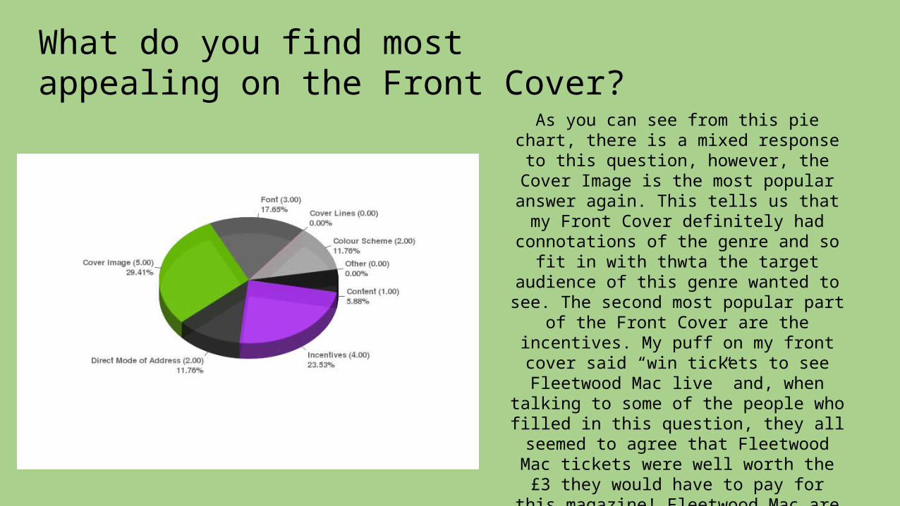
What do you find most appealing on the Front Cover?
As you can see from this pie chart, there is a mixed response to this
question, however, the Cover Image is the most popular answer again. This tells us that my Front Cover definitely
had connotations of the genre and so fit in with thwta the target audience of
this genre wanted to see. The second most popular part of the Front Cover
are the incentives. My puff on my front cover said “win tickets to see Fleetwood Mac live” and, when talking to some of the people who filled in this question,
they all seemed to agree that Fleetwood Mac tickets were well worth the £3 they would have to pay for this
magazine! Fleetwood Mac are a typically indie group and so this
response from my target audience show that my ideas for the magazine
and its content were accurate as it was what they wanted to see on the
magazine.
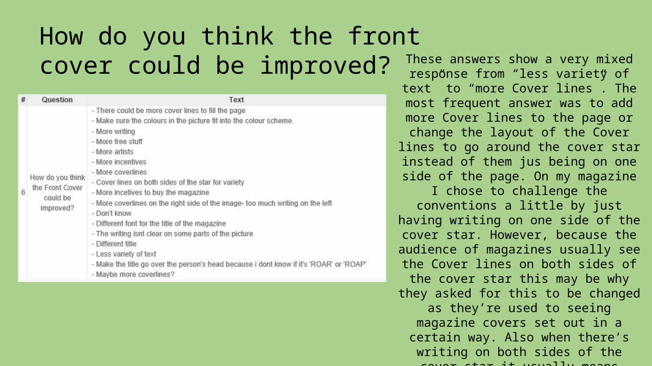
How do you think the front cover could be improved? These answers show a very mixed
response from “less variety of text” to “more Cover lines”. The most frequent answer was to add more Cover lines to the page or change the layout of the
Cover lines to go around the cover star instead of them jus being on one side
of the page. On my magazine I chose to challenge the conventions a little by just having writing on one side of the
cover star. However, because the audience of magazines usually see the Cover lines on both sides of the cover star this may be why they asked for
this to be changed as they’re used to seeing magazine covers set out in a
certain way. Also when there’s writing on both sides of the cover star it
usually means there’s more writing on the page. This is another thing my
target audience asked for and so if I was to create this page again I would add more Cover lines in to give them
more of an incentive to buy it.
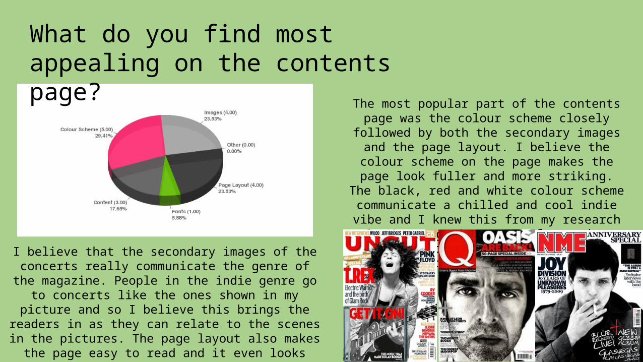
What do you find most appealing on the contents page?
The most popular part of the contents page was the colour scheme closely followed by both the secondary images and the page layout. I believe the colour scheme on the page makes the page look fuller and more striking. The black, red and white colour
scheme communicate a chilled and cool indie vibe and I knew this from my research of
other magazines. My colour scheme is similar to many other Front Covers from popular
music magazines as shown below.I believe that the secondary images of the concerts really communicate the genre of the magazine. People in the indie genre go to concerts like the ones shown in my picture and so I believe this brings the readers in as they can relate to the
scenes in the pictures. The page layout also makes the page easy to read and it even looks that way as well making it more appealing. Also it makes
the page look fuller giving the reader more choice of articles to choose from.
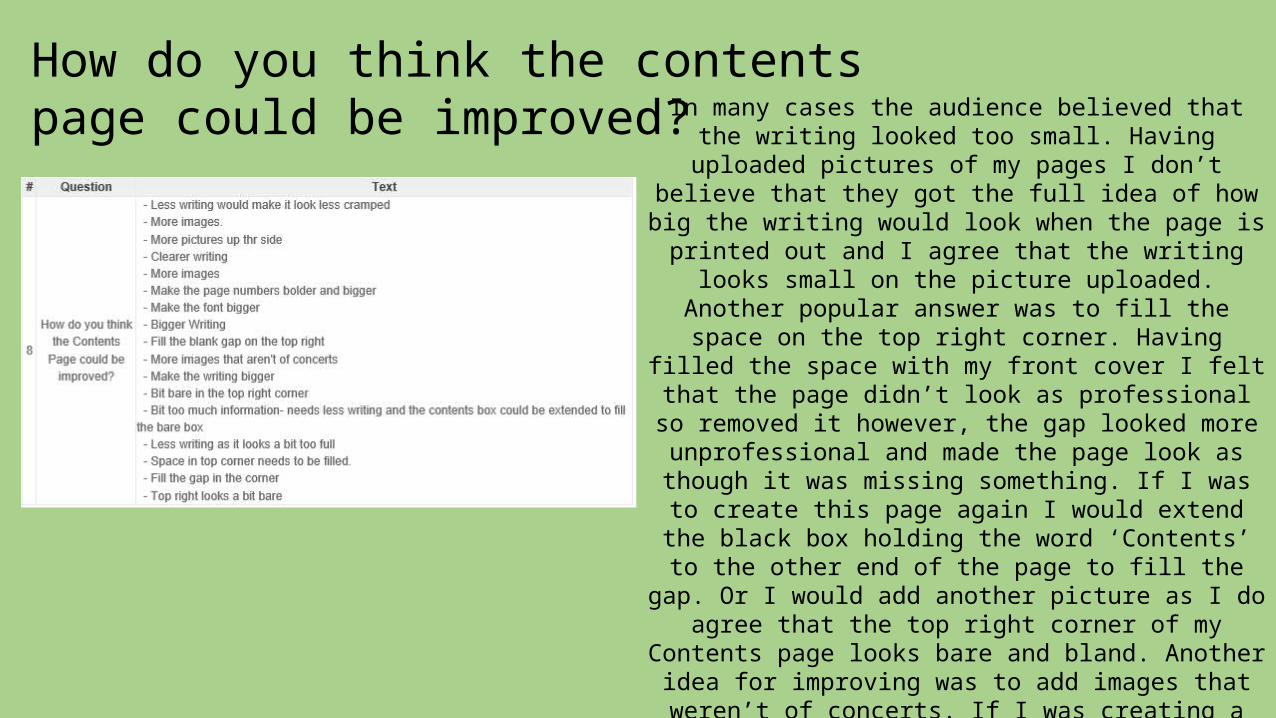
How do you think the contents page could be improved? In many cases the audience believed that the
writing looked too small. Having uploaded pictures of my pages I don’t believe that they got the full idea of how big the writing would look when the page is printed out and I agree that the writing looks small on the picture uploaded. Another
popular answer was to fill the space on the top right corner. Having filled the space with my front
cover I felt that the page didn’t look as professional so removed it however, the gap looked more
unprofessional and made the page look as though it was missing something. If I was to create this page again I would extend the black box holding
the word ‘Contents’ to the other end of the page to fill the gap. Or I would add another picture as I do
agree that the top right corner of my Contents page looks bare and bland. Another idea for improving was to add images that weren’t of
concerts. If I was creating a professional magazine I would be able to use interviews of a whole
number of famous artists and add them to my Contents page, however, seeing as I had to use picture I took myself, I couldn’t use pictures of famous artists on my page. If I was making it
professionally I would definitely add other types of pictures on as the theme of concert images was
used a little too often on this page.
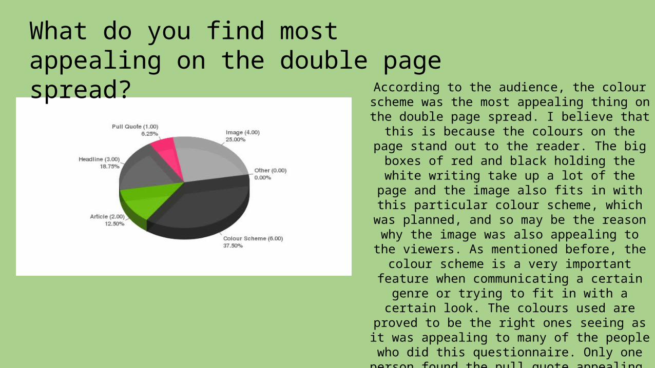
What do you find most appealing on the double page spread?
According to the audience, the colour scheme was the most appealing thing on the
double page spread. I believe that this is because the colours on the page stand out to
the reader. The big boxes of red and black holding the white writing take up a lot of the
page and the image also fits in with this particular colour scheme, which was
planned, and so may be the reason why the image was also appealing to the viewers. As
mentioned before, the colour scheme is a very important feature when communicating
a certain genre or trying to fit in with a certain look. The colours used are proved to be the right ones seeing as it was appealing
to many of the people who did this questionnaire. Only one person found the
pull quote appealing, this may be because, after reading how the target audience
believed this page could be improved, a bigger and clearer pull quote was suggested
and so I am not surprised at this result.
How do you think the Double Page Spread could be improved?
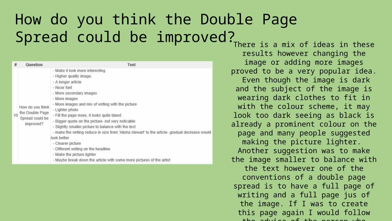
There is a mix of ideas in these results however changing the image or adding
more images proved to be a very popular idea. Even though the image is
dark and the subject of the image is wearing dark clothes to fit in with the colour scheme, it may look too dark
seeing as black is already a prominent colour on the page and many people suggested making the picture lighter. Another suggestion was to make the
image smaller to balance with the text however one of the conventions of a double page spread is to have a full page of writing and a full page jus of the image. If I was to create this page again I would follow the advice of the person who suggested breaking down
the article with more images of the artist. I think this would make the page look a lot more interesting as the first suggestion was to make the page look
more interesting as someone else pointed out that the page looked quite
bland.
What other magazine(s) would you associate my magazine with?
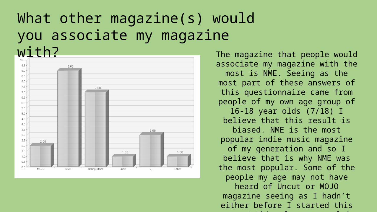
The magazine that people would associate my magazine with the most is NME. Seeing as the most
part of these answers of this questionnaire came from people of my own age group of 16-18 year
olds (7/18) I believe that this result is biased. NME is the most popular
indie music magazine of my generation and so I believe that is why NME was the most popular. Some of the people my age may not have heard of Uncut or MOJO
magazine seeing as I hadn’t either before I started this course! This
also may explain the fact that Uncut is the least popular magazine out of them all, it’s less well known than
magazines such as NME and Rolling Stone which have been running for
a long time.
Which feature(s) do you think look most professional?
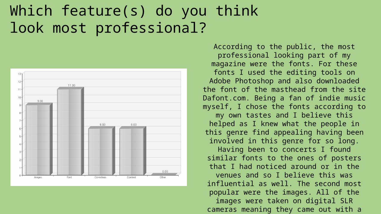
According to the public, the most professional looking part of my magazine were the fonts. For these fonts I used the
editing tools on Adobe Photoshop and also downloaded the font of the masthead from the site Dafont.com. Being a fan of indie
music myself, I chose the fonts according to my own tastes and I believe this helped as I
knew what the people in this genre find appealing having been involved in this genre for so long. Having been to concerts I found
similar fonts to the ones of posters that I had noticed around or in the venues and so I believe this was influential as well. The
second most popular were the images. All of the images were taken on digital SLR
cameras meaning they came out with a clear quality and so I believe that is why they looked professional. Also, some of the
pictures were taken at actual concerts of indie bands that I had actually been to and, having taken these on a digital camera, the
colours and lighting on the stages really stands out which appeals to the audience.
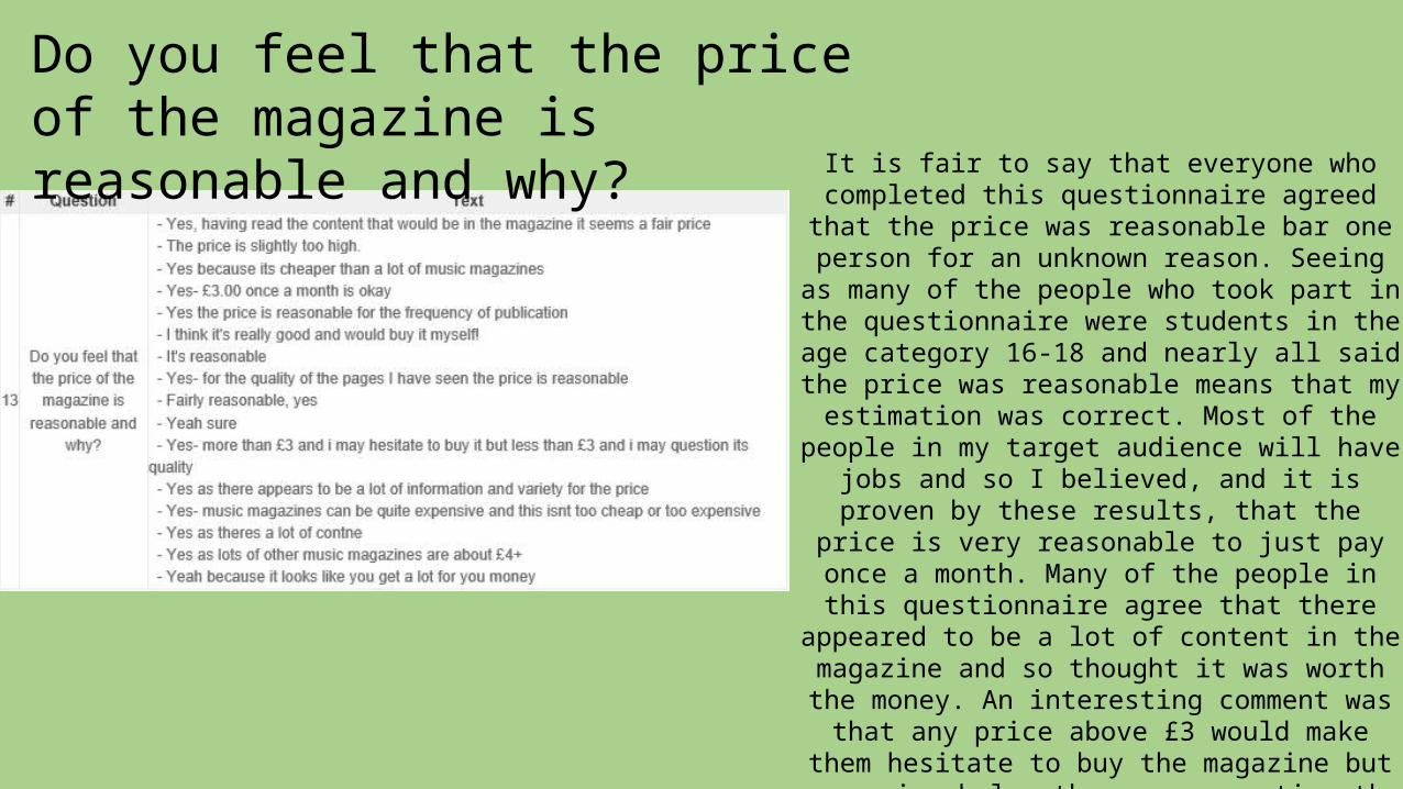
Do you feel that the price of the magazine is reasonable and why? It is fair to say that everyone who completed
this questionnaire agreed that the price was reasonable bar one person for an unknown reason. Seeing as many of the people who
took part in the questionnaire were students in the age category 16-18 and nearly all said
the price was reasonable means that my estimation was correct. Most of the people in
my target audience will have jobs and so I believed, and it is proven by these results, that the price is very reasonable to just pay
once a month. Many of the people in this questionnaire agree that there appeared to be a lot of content in the magazine and so
thought it was worth the money. An interesting comment was that any price
above £3 would make them hesitate to buy the magazine but any price below they may question the quality of the magazine. This is
interesting as many music magazines are above £3 meaning they hesitate to buy their favourite magazines because of the price. I
believe that if my magazine was real it would sell well because the price isn’t too low but
isn’t too high.